By Kirye

and P Gosselin
In our last post, we examined how cooling was transformed into warming in Australia by NASA GISS.
We plotted the data from six Australian stations that went back to the late 19th century. The comparator that follows shows the plots of GISS Version 4 “unadjusted” data compared to the Version 4 “adj homogenized” data:
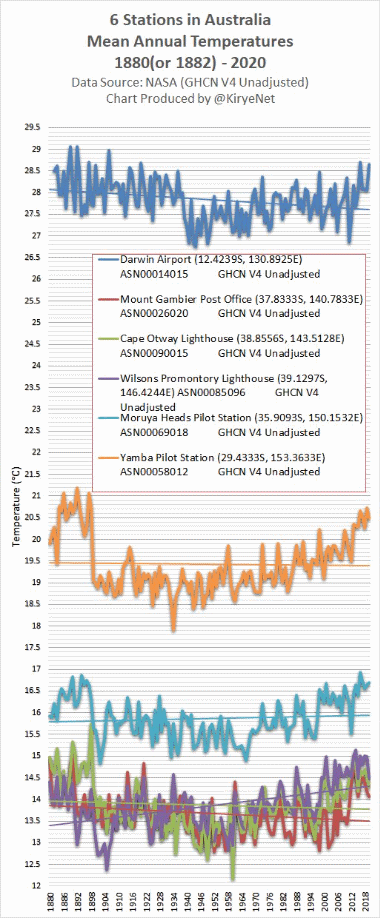
Data: NASA GISS
Cooling: now you see it, now you don’t. Once NASA GISS “adjusted” the data, Orwellian style, the cooling disappeared and all 6 stations showed warming.
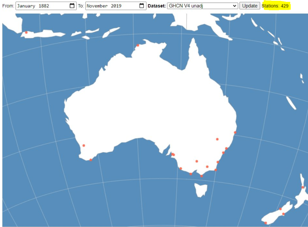
TODAY, we suddenly find they now have 17 stations showing V4 unadj data from January 1882 to November 2019 for Australia, meaning 11 new stations suddenly appeared:
So we plot 10 of 11 of these “new” stations as a comparator, again to show the difference between V4 unadjusted and and V4 “homogenized”:
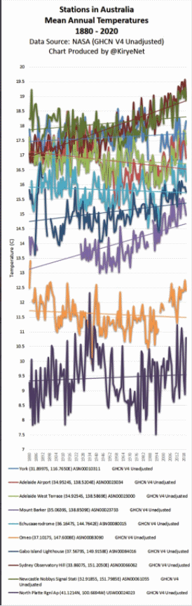
Data: NASA GISS
The 11th station, Albany, was left out due to a huge data gap,and it doesn’t have the adjusted data.
Before homogenization, 8 of 16 (total) stations showed no warming trend in GHCN V4 unadjusted, but NASA “homogenized” the data and now all 16 of 16 stations have warming trend in GHCN V4 adj – homogenized. This is how climate scientists come up with “warming”.
Rarely do we see data homogenized so that a warming trend gets changed to a cooling trend. It’s always the other way around.
No doubt many parts of the globe warmed since 1880. But NASA data alterations make it look like it’s more than it actually is.


It seems there is a problem with the title : ” … from warming to cooling …”
Regards
Bloody hell, you’re right – now changed.
But note that it’s still in the URL – can THAT be fixed or replaced?
The lower graphic is burred but it looks like Sydney Observatory and Adelaide West Terrace are cases where the rising trend has been reduced but still rising, possibly ‘adjusting’ for presumed UHI effect given where the stations are situated.
Overall the ‘adjustments’ change a disordered group into a tidy and satisfying result confirming what the compilers know must be happening anyway (pardon the sarcasm but what else can one do).
My understanding is that NASA/GISS has a “trend correction” built into their homogenization method.
In other homogenizations methods they check for trends (e.g. if one weather station drifts compared to the surrounding stations).NASA/GISS assumes a trend a priori, which means that all temperature data is supposed to be effected by this trend.
The trend they use is a “climate trend”. If e.g. the temperature data from a station is constant, NASA/GISS´s method assumes that there is something wrong with the data since the temperature has not increased. The “true” value should have been higher. The policy in the method is to keep the present temperature unadjusted. Thus they have to reduce the historical data with the trend in order to get the homogenized data.
Their trend correction is rather obvious from Tony Heller´s data analysis. He has several times showed that the adjustment is a factor that is proportional to the carbon dioxide concentration in the atmosphere.
The use a method that a priori assume that CO2 increase the temperature. The result is that they get curves showing temperature increase with increasing CO2 concentration. Surprise ?
The meteorology service in Sweden (where I live) do not use this “climate trend correction” in their homogenization model.
It’s confirmation bias at its worst done by charlatans :
The models can’t be wrong, thus the data must be incorrect (remember, this is what said J. Hansen years ago when the pause appeared to be obvious. Kevin Trenberth spoke about the pause as a travesty for climate science and he was wright).
In actual science, when a model is inconsistent with observations or experiments, the model HAS to be discarded.
Instead, the henchmen of the climastrology decided to “homogenize” and “adjust” the data to reflect the fake models results.
Welcome in the realm of climastrology :
– the realm of pseudo-science and charlatanism.
It’s actually acceptable to challenge data – provided you have good grounds for doing so.
Did that twice early in my career, correctly. One time the one piece of measured data simply made no sense, and in the other there were three data points that, in a particular plot, should have been on a straight line (by basic physics), but weren’t even close to that.
In both cases, re-measurement showed that the original data were not correct – and the re-measurement produced proper numbers (that made sense on the one hand, and provided a straight line in the other).
If these clowns can show that, say, measuring instruments used in the past were systematically faulty and were measuring values that were warmer than reality, I’m willing to listen. But they haven’t done anything with respect to the metrology involved.
(E.g., one can make an argument that data collected using “spring thermometers” may be suspect, as the springs tend to weaken over time… however, in that situation, the measured data would be cooler than reality rather than warmer.)
I’m not a Ph.D., not even close, but if data recorded decades ago is considered unreliable don’t change it, simply don’t use it.
I’ve looked at a lot of those data. They are reliable.
All this data-diddling is just an admission by the thermophobes that the data show NOTHING SIGNIFICANT HAPPENING over the past 150 or so years, for which we have measured-and-recorded temperature data…
As I pointed out in the previous post, the adjustments you’re showing aren’t being performed by NASA, they’re performed by the NOAA. The adjusted data are then used by NASA in their surface temp analysis. It’s important to understand the sources of the data we are discussing.
Additionally, every one of the stations you highly has a glaring step-discontinuity that makes up almost the entirety of the adjustment, extremely obvious for the Darwin Airport station, for example, in the mid-1930s. It is difficult to envision a justification for leaving the discontinuity in place, since it will unquestionably introduce a spurious trend into the record.
[…] 8 NASA/GISS-Fälschungen gehen weiter: Aus Abkühlung wird Erwärmung […]
[…] it has been shown that NASA has been busy changing long-term cooling into long-term warming by altering the […]
[…] it has been shown that NASA has been busy changing long-term cooling into long-term warming by altering the […]
The 1880-1890’s were hot in the south because of increased El Nino conditions during the centennial solar minimum.
[…] it has been shown that NASA has been busy changing long-term cooling into long-term warming by altering the […]