The most dangerous Big-Government Qango of all may well be the Central Banks (not the NIH). Money drives all the incentives across national economies, but one small unelected group decides the price of money, and all corruption flows downstream from there. Ponder how they set the temperature that drives the global currents of goods, resources and opportunity. They feed Big Government, Big Pharma and Big Tech.
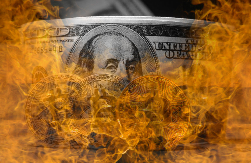
Saddle Up: There is no hiding inflation. Despite the global economy grinding to a halt in a pandemic, house prices set surging records and paradoxically the Dow hit all times highs.
It is just supply and demand. As more dollars are printed, a bigger supply of money competes for the same number of goods. And boy, have they been printing money.
It’s a temporary spike they say:
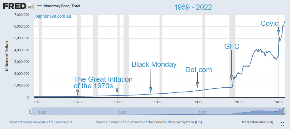
This is the money base of USD, a rough measure of “how many dollars there are”.
US St Louis Federal Reserve, Money Base graph 1918-2008 | Source
For perspective, below is the history of the growth in US Dollars since 1918 up until the GFC. The US left the Gold Standard in stages between 1913 and 1971, and the growth in money supply since then is obvious. But as fast as this appeared to grow in ninety years, it was nothing compared to what would come in the 14 years since.
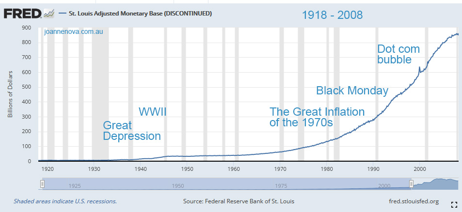
US St Louis Federal Reserve, Money Base graph 1918-2008. Source
All the market-rattling crashes of history shrank when compared to the GFC and the Pandemic, which change the whole scale of the graph. The Occupy Crowd, and the Tea Party both recognized something was very wrong with the bail-out of 2009. But the Occupy Crowd have no understanding of what drives the inequality they hate and oppose.
The corruption of the dollar feeds all the other corruption
The people that benefit are the ones that borrow the money and spend it first. The people who lose are those holding their money in cash. Did your wage grow sixfold from 2008 to 2021?
Printing money-for-nothing is always the politically easy way to win votes. Voters like to vote themselves the treasury, so what Treasurer wants to promise austerity?
But inflation eats away at the strength of the economy. The incentives during inflation favor high risk speculation and punish the hourly wage earner and the savers. Inflation makes possible and rewards the mergers and hostile takeovers, thus conglomerating power and reducing competition. It feeds the predators like Amazon, Facebook and Google. Like acid, it destroys the benefits of competition as the big fish swallow up the little fish. It feeds inequality, and of course, it feeds Big-Government.
Worse than World War II
The graphs above are not log graphs, so they don’t show the proportionate shift. But the percentage change in money base shows the “seismic” surges in money supply. The GFC and the Pandemic have clearly shaken the value of the American Dollar more than The Great Depression and World War II.
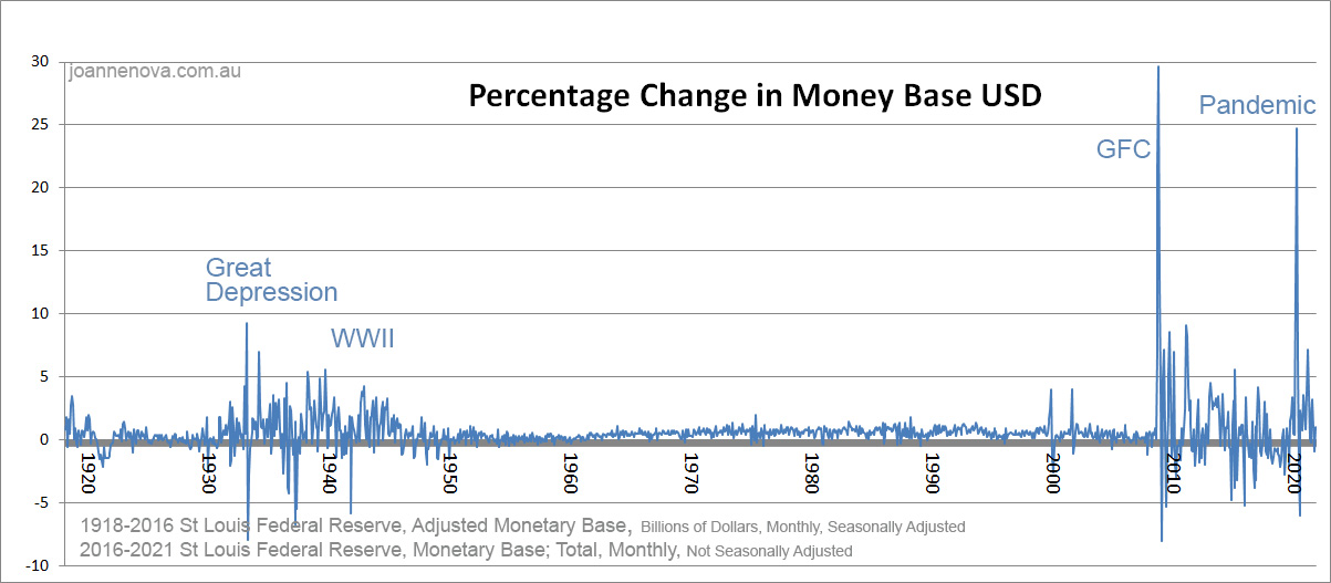
Percentage Monthly Money base change, USD, St Louis Federal Reserve.*
Is it the end of an empire? We hope not. But We The People need to plan accordingly. The Chinese Communist Party is. China is buying gold.
The Treasury officials are doing their best to hide inflation. Just as with climate change, the bureaucrats keep adjusting their inflation indicators so they can keep getting away with the game of silent theft. Big Government lives off silent inflation. Gold or any other real and timeless asset is an anti-cheating device. If currencies were pegged to something real, it’s much harder for governments to grow.
REFERENCE and DATA
St Louis Federal Reserve: AMBSL and BOGMBASE
*To show both the Great Depression and recent era, the last graph crudely, brutally, connects the Adjusted Money base (seasonally adjusted) to 2016 to a different series (not seasonally adjusted) in the last 5 years. But the bodgey nature of this meld still captures the overall effect of the percentage changes quite accurately. Checking the FRED graph edits, at the links above, with “percent change” show that it’s a fair representation. If the Fed Reserve didn’t “discontinue” long data series just when things get interesting, this sort of dodgy splicing wouldn’t be needed.
This article originally appeared at JoNova