Nieman Foundation at Harvard


MIT Tech Review recently rebranded its print edition from just a collection of articles, into a product that doesn’t simply republish content that was posted online a month later, but has its own attitude and way of telling stories.
“When you publish six times a year, you really can’t pretend you’re doing your audience any favors putting all this stuff into a print format,” said Elizabeth Bramson-Boudreau, CEO and publisher of MIT Tech Review.

A print subscription, including online access, to MIT Tech Review is $29.95 per year. A three-month online-only subscription is $9.99. A single digital version of the print issue is $6.99 (the new digital print edition will be $9.99 an issue). The “Insider Plus” package — print, digital, and a discount on events, plus an ad-free online experience — is $79.95 per year, and Bramson-Boudreau, who has been leading the publication for a little more than a year, felt that a more “compelling” argument was needed to convince reader to pay for that package. Hence the redesign and rebrand.
The 119-year-old magazine is modeling its redesign after mid-century revolutions. In the 1960s, its graphics were bold and bright, inspired by Bauhaus and American abstractionism. “It seemed only fitting that we approach MIT Technology Review’s redesign by appropriating the best ideas from our past and updating them for modern media,” Eric Mongeon, the publication’s chief creative officer, wrote last week.The magazine’s new typeface, Neue Haas Grotesk, is based off Helvetica, the font that MIT Tech Review used in the sixties. The modern tendency toward robotic or blockish fonts reminiscent of command-boxes (as seen in the graphics of FiveThirtyEight) will also be employed. “Fifty years ago, this institution occupied a place at the vanguard of American graphic design,” Mongeon wrote. “With this redesign, we intend to honor — and aspire to reclaim — that heritage.”
The finished product is something like a book. The revamped Tech Review is about the same length as it used to be, and it will still publish six times a year. But in addition to the change in content, the new print edition will feature heavier paper and an emphasis on graphic design and will be, as Bramson-Boudreau put it, “a whole different visual experience.” The marriage of art and data will be emphasized throughout the magazine.
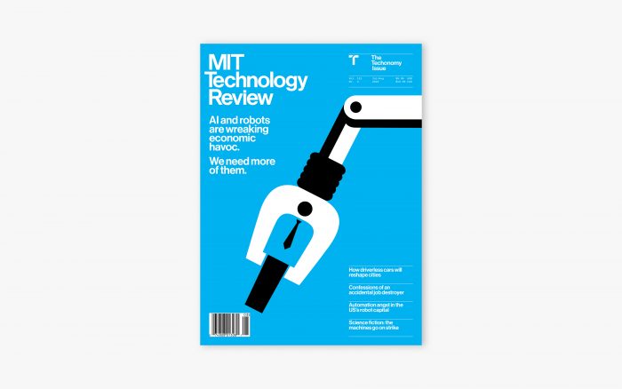
From now on, each print issue will also focus on one subject in the tech and science realm (first up: AI and robotics, which will be published in the July/August issue). “It’s not simply a case of the temporal becoming permanent in print,” Bramson-Boudreau explained. “How do we tackle a thorny, or complex, or widely misunderstood subject area from a whole bunch of different perspectives?”
Each issue will be broken into three parts: the “How,” the “Now,” and the “Next.” The “How” ensures each reader is on the same playing field of discussion, before moving onto current-day discussions around a technology (the “Now”). The “Next” tracks said technology to the future, with academic articles but also a science fiction story about the featured technology “that’s a fun thing that enables us to explore the events around what this might mean for the future,” Bramson-Boudreau said.
The redesign follows a reshuffling in recent months. Meghan McCarthy took over as executive editor in February, and Gideon Lichfield was named editor-in-chief in November 2017.
“Our ambitions for MIT Technology Review are huge,” Bramson-Boudreau said. “Part of the rationale behind the rebrand was to have a product that we have the confidence to put out to our aggressive market.”


