This is the third part of my blogpost series “7 aspects that improve the UX of your app” in which i summarize a presentation that i gave a few times this year.

Navigation is an essential part of the user experience. There are many different options and you should choose one that suits your content best.
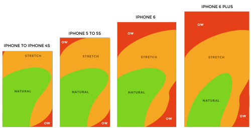
This nice illustration by Scott Hurff shows which areas of the screen can be touched naturally and which need stretching of your hand, and the red ones are those that hurt:
To me, this is so important that i switched from an iPhone 7 to an iPhone SE - just to be able to use my phone more comfortably with one hand and to reach into the corners easily.
Context
When designing an app you have to think of the context in which your users use it. On top of that, phones keep getting larger and larger. Therefore we have to keep in mind how people will hold their device when using your app.
According to research by Steven Hoober, 49% of people use their thumb to tap/navigate, while holding the phone in one hand.
- right thumb on the screen: 67%
- left thumb on the screen: 33%
Only about 10 % of people are left-handed so the 33 % suggest that people use their phone while doing something else with their right hand. (source)
So what can we do, knowing about these challenges?
- Easy to reach area: Design for the thumb zone, the natural part. You should put important navigation items there, which are used most often.
- Hard to reach area: keep infrequently used actions there and place negative actions (such as delete) in the hard to reach red zone, because you don’t want users to accidentally tap them.
- Swipe gestures: when you have a back button in the top left corner, always implement swiping from left to right as well, to give the user this option to navigate. Drawer menus can also be implemented in a way that allows the user to swipe it in, for example from right to left.
Finding the right navigation style for your app
A tab bar (also called „bottom bar“) is suitable in many situations, especially if you have three/four main features. A drill down menu/navigation (structuring the views in a hierarchy from the top downwards) might be a good choice if you don’t have a very complex app. The burger menu (three horizontal lines) should be avoided because it can be problematic as it hides a lot of information. It is even considered by many as the main reason for poor user engagement. A gesture based navigation is tricky because it’s hidden, but since Tinder and Snapchat many people are used to it. I guess it really depends on your target group.
what should you consider for your navigation?
- because of big screens: the navigation bar (in the top area of the screen) should more often be replaced with more reachable navigation
- make it consistent, don’t change the location of navigation controls
- the navigation should communicate the user’s current location in the app
- make it finger-friendly, not to small touch targets, keep enough spacing between controls