
Correlating Technical Replicates
Are some transitions worse than others?
Short answer: Yes.
Long answer: Emma suggested that I regress my second batch of technical replicates against my first batch to see if there were certain transitions that are messier than others. I used this R script to plot the regressions. The final plots can be found in this folder.
*Random gold star moment 1: My for loop for making all my plots worked the first time I wrote it #WIN * *Random gold star moment 2: I used a relative path to set my working directory #LEARNING *
I added the adjusted R-squared value to the top left corner of each plot. There are definitely potential outliers and leverage points in each plot, and some transitions have higher R-squared than others. I also see that some samples are continually those potential outliers and leverage points. Generally, the three transitions associated with each peptide have the same R-squared values.
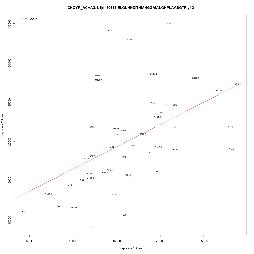
Figure 1. Transition with the lowest adjusted R-squared value.
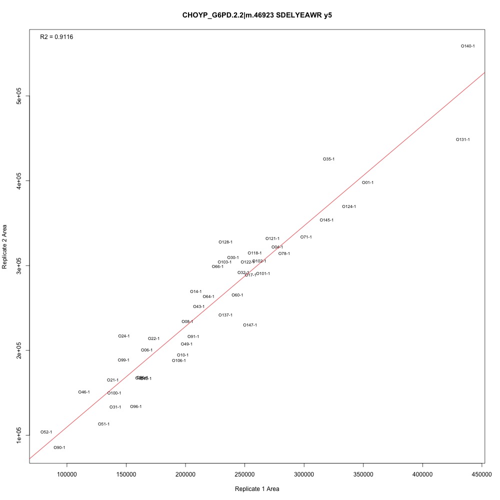
Figure 2. Transition with one of the higher adjusted R-squared values.
The next step is to consult Emma and Steven to create a selection criteria. Here are two ideas:
- Establish an R-squared cutoff. Any transitions with adjusted R-squared values lower than the cutoff should be eliminated.
- Identify outliers and leverage points in each plot. Remove these points and re-plot to see if the R-squared value increases.
My guess is that we’ll use some combination of methods to determine which transitions to keep. While I work on this, I’m also reviewing my SRM protocol for reproducibility and making an NMDS plot with just the PRTC peptides to see if that provides us with any additional information.