Dodgy Microsoft Graphics
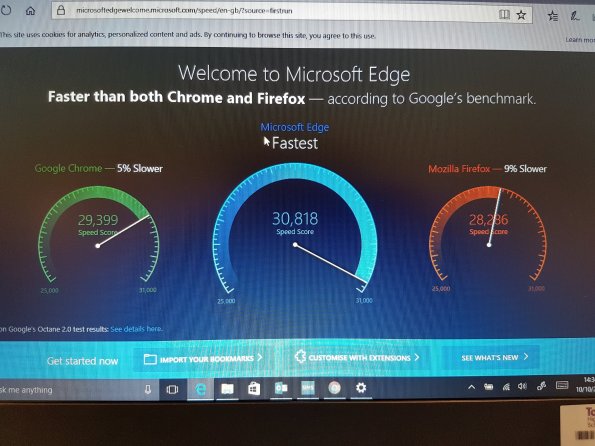
So my new laptop arrived today and I quickly set about using it. It’s a Windows 10 laptop and as such has all the usual Microsoft stuff preloaded in it. I was going to set chrome as the default browser when it suggested I try Microsoft edge as it’s apparently faster and made for Windows 10. When I opened it it showed me this graphic:
Immediately I called shinanegans. The 5% difference between the green and the blue looked far too big. Initially I thought it was just down to the scale starting from 25000 and the size, but looking deeper there are also 4 extra sets if 5 notches on the blue which further add a to the illusion.
All in all a terrible diagram. Poor form Microsoft. Poor form.
Categories: #MTBoS, Commentary, Maths, Teaching, Uncategorized
dodgy graphs, Maths, Microsoft

Presumably quicker because it doesn’t do half the stuff the others do. Like searching with Bing is quicker since it misses out most of the Web!
Look out for the bit in Explorer where what you expect to be “open new tab” is now “open Edge”; you can disable this feature in Advanced Settings.