Ending the Infographic Plague
Now that Obama's dog has won the War on Christmas, or something, it's time to get down to a war that really matters: the war on terrible, lying infographics, which have become endemic in the blogosphere, and constantly threaten to break out into epidemic or even pandemic status.
The reservoir of this disease of erroneous infographics is internet marketers who don't care whether the information in their graphics is right ... just so long as you link it. As a Christmas present to, well, everyone, I'm issuing a plea to bloggers to help stop this plague in its track.
Below the break, a tour of some of the more egregious examples, and some thoughts on why they've become so prevalent.
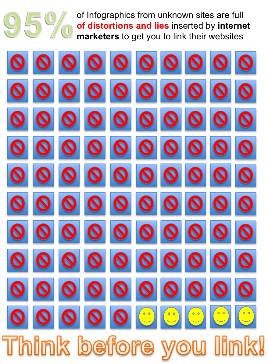
For those of you who can't sit through all that boring writing, however, I will first deliver my message in--ahem!--a more visual format:
Remember this gem?


What is wrong with our values?!


Now, this should set off all sorts of alarm bells to anyone who has read any news reports about employment data. Or met any people. Do we think it is true that only 12% of employed men in the United States are working as little as 40 hours a week? Let's do some math here. Women are roughly half the labor force. So the average of all those work hours has to be the sum of this equation:
.5(.858Fulltimem + .142PartTimem) + 5(.66Fulltimew + .34PartTimew)
Assume that every single person working "more than 40 hours a week" is working only 41 hours. This gives you
.5(36.1 + .12PartTimem) + .5(27.1+ .34PartTimew)
For simplicity's sake, let's assume that women and men work the same number of part time hours and solve for a single "X":
.5(35.1 + .12X) + .5(27.1 + .34X) = 33.6
17.6 + 13.6 + .6X + .17X = 33.6
.23X = 2.4
X = 10.5
How likely is it that the average part time worker is working only 10.5 hours a week? Possible. But not likely. And that of course assumes that not one person in the "more than 40 hours a week category" worked more than 41 hours, which is obviously untrue; I work more hours than that almost every single week, and I'm sure, so do many of you.
As you allow the hours worked above 40 to creep up, the average workweek of part time workers has to go down even more dramatically, because there are fewer of them; it takes a bigger decline to drag down the average. By the time you allow the average hours of those working more than 40 hours a week to go as high as 45, the part timers have to be working negative hours.
As a check--in 1998, when labor demand was near its absolute peak, the percentage of men working more than 40 hours a week was 40.2%. I am very skeptical that that percentage has more than doubled in the intervening years.
And indeed, if go to the source, you find that the International Labor Organization does indeed claim that 88% of men work these sorts of hours. However, there is no source for that claim (update: a commenter says that they are using "full time workers"--and defining "full time" as "more than 30 hours a week"). And you will see that this is supposed to apply to all males over the age of 15. This seems, to put it mildly, wildly implausible. After you add in all the high school guys working at chicken shacks, and the retirees working as greeters at Wal-Mart, you still have 85.8% of all men working more than 40 hours?
A search of their database reveals a more plausible dataset, which shows that nothing like a majority of either sex are working over 40 hours per week.

If you look at these lovely, lying infographics, you will notice that they tend to have a few things in common:
They are made by random sites without particularly obvious connection to the subject matter. Why is Creditloan.com making an infographic about the hourly workweek?
Those sites, when examined, either have virtually no content at all, or are for things like debt consolidation--industries with low reputation where brand recognition, if it exists at all, is probably mostly negative.
The sources for the data, if they are provided at all, tend to be in very small type at the bottom of the graphic, and instead of easy-to-type names of reports, they provide hard-to-type URLs which basically defeat all but the most determined checkers.
- The infographics tend to suggest that SOMETHING TERRIBLE IS HAPPENING IN THE US RIGHT NOW!!! the better to trigger your panic button and get you to spread the bad news BEFORE IT'S TOO LATE!
The infographics are being used to get unwitting bloggers to drive up their google search rankings. When they get a link from Forbes, or a blogger like Andrew Sullivan--who is like Patient Zero for many of these infographics--Google thinks they must be providing valuable information. Infographics are so good at getting this kind of attention that web marketing people spend a lot of time writing articles about how you can use them to boost your SEO (search engine optimization).
Every time you use an infographic from creditloan dot com, you're helping to send some poor fool into the arms of a debt consolidation scheme that is quite likely to leave them worse off than they were when they were merely drowning in consumer debt.
Obviously, debt consolidation lenders do not have any particular incentive to provide accurate, well researched data to the public. In fact, quite the opposite. Actual facts (biking is a good idea, but it's not very well correlated with either national obesity rates, or air pollution redution) are messy. Extreme lies, on the other hand, are attention grabbing. (OMG, we spend more on prison than Princeton!) I don't think it's a coincidence that the infographics that go viral so frequently seem to be the ones with serious factual problems.
So before you pick up that infographic, give it a good, hard look. Is it from a site with no real reason to be publishing it? Do some quick mental math checks make the "data" look pretty unlikely? Have the sources been made deliberately hard to check? If so, take your hand off the mouse before you post it to facebook, your blog, or your favorite email list. Remember: only you can prevent viral media from spreading.
This Christmas, let's all give the world the gift of better data.
Update: this post has been corrected to fix math typos and add in an explanation for the International Labor Organization's numbers.