The Hamburger Menu-Icon Debate
Most mobile sites feature the three-lined symbol, which readers can click to see more content. Does this design choice actually make sense?
Insiders call it "the hamburger": Three stacked lines, usually in the top left- or right-hand corner of a website, which people can click to see a menu of pages on the site. Once considered an industry standard, the icon has been getting a lot of attention lately—and not all positive. Here at The Atlantic, it seems like someone emails around an article about the pros and cons of hamburger use nearly every day.
Recent favorites include Luis Abreu's comprehensive explanation of why hamburgers should be avoided, Ricardo Bilton's views on publishers hiding site navigation, and Josh Constine's call to kill the hamburger.
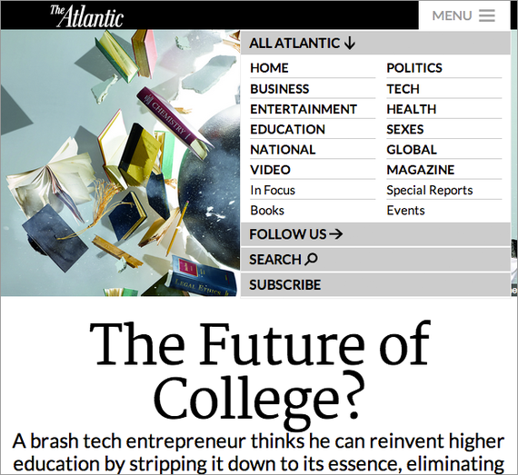
Our team has a tricky relationship with the hamburger. While The Atlantic has a dedicated mobile site, we are in transition with our desktop site. We're gradually redesigning pages and sections to be responsive, including Features and Video. These pages include a hamburger icon for navigation, although we added the word "menu" to encourage clicks. In general, our team is pro-hamburger for sections of the site that have to do with things like social media, search, and subscriptions.
Then again, the hamburger isn't a magical button that gets people to click everything featured on our site.
Atlantic web developer Carl Johnson says the hamburger debate is really a larger discussion about goals. "The hamburger can lead design teams astray by letting them avoid making hard choices about priorities," he said. "What's more important: showing channel navigation or meta-pages? Well, let's just shove them all into the hamburger menu because they're all top-top priority!"
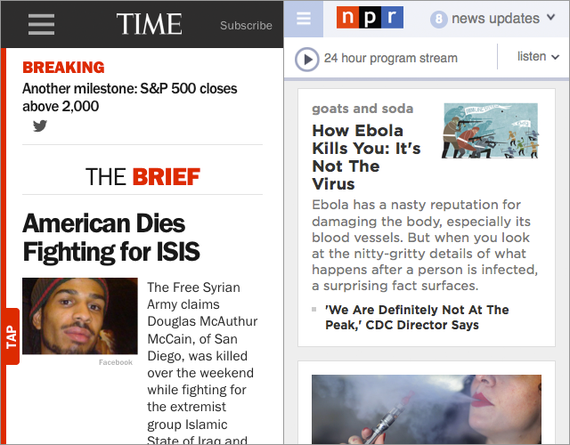
Other sites have chosen to highlight their priorities within the ever-precious real estate of the navigation bar that shows up at the top of most mobile apps. "Time has a 'Subscribe' button," pointed out Atlantic web developer Jason Goldstein. "NPR puts a 'news updates' drop-down in their nav bar, which is a really nice touch. If you’re an email app, the main action is sending an email. If you're a news site, the main action is finding something new to read."
Frankly, when it's your own website, only you care about what's hidden in your menu. Whether your hamburger is dressed with categories, sections, tags, or pickles, readers are probably finding stories in ways other than through the navigation bar.
"I agree that hiding the menu does make content less discoverable," said Atlantic tech lead Josh West. "For a website like ours, I think that links to either related articles or the most popular articles are more effective at increasing depth than anything we do with menus."
So is the hamburger icon really the problem, or is it indicative of a broader problem with traditional navigation? It's possible we're projecting all of our traffic issues onto one little graphic.
"Most of the negative arguments against the hamburger have focused on its lack of use and/or a lack of comprehension by users in testing," said Kim Lau, the vice president of Atlantic Digital. "I'd argue that the use of navigation is always fairly low, and that generally when you put things on a second screen, you are implicitly indicating that the information behind it is secondary to the primary purpose of the page. By this nature, the use of the menus is low, or should be."
As sites turn more attention to mobile, the ideas behind traditional desktop navigation will inevitably have to shift. Betsy Ebersole, The Atlantic's senior product director, made the case for doing a little soul-searching during this process. "Criticism of the hamburger is more criticism of overly complicated information architecture. Sites need to take a thoughtful look at their IA, especially as viewers move to smaller screens."
One solution might be meeting people where they already are: reading articles. This might involve rethinking the placement of links and most-popular boxes, for example. But in general, designers need to be more creative about directing readers to interesting articles without interrupting the flow of what they're already reading. This is becoming even more difficult as screens shrink and more people read on their phones.
But that doesn't mean the hamburger is dead—or should be. If nothing else, we could follow Josh's advice on improving the icon: "Cheeseburger menu. Because everything is better with cheese."