This Artist Matches Pantone Swatches to Real Life
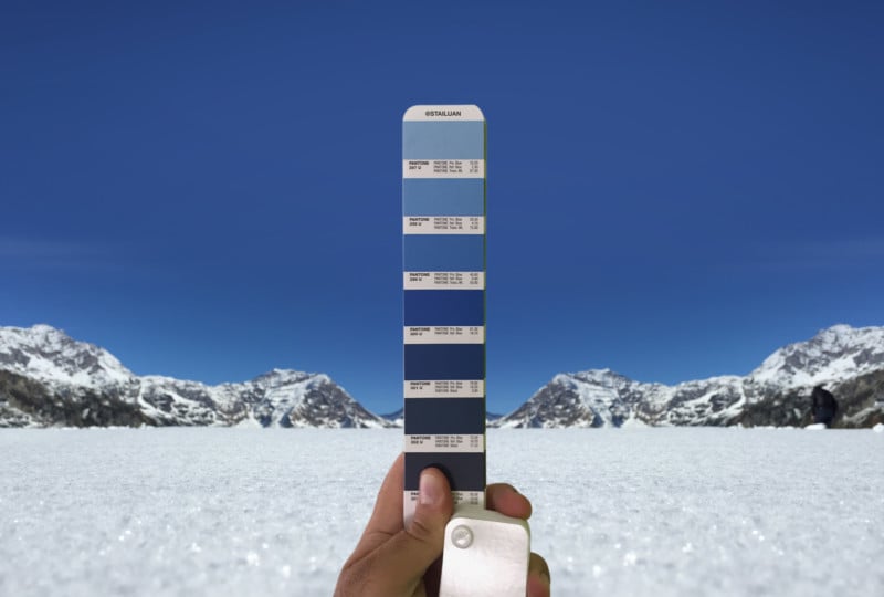
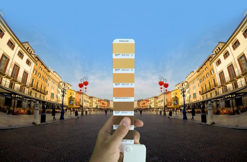
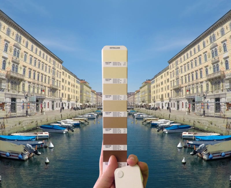
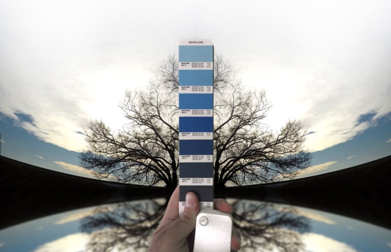
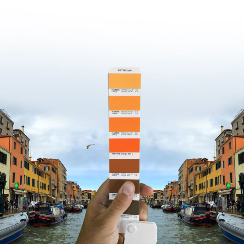
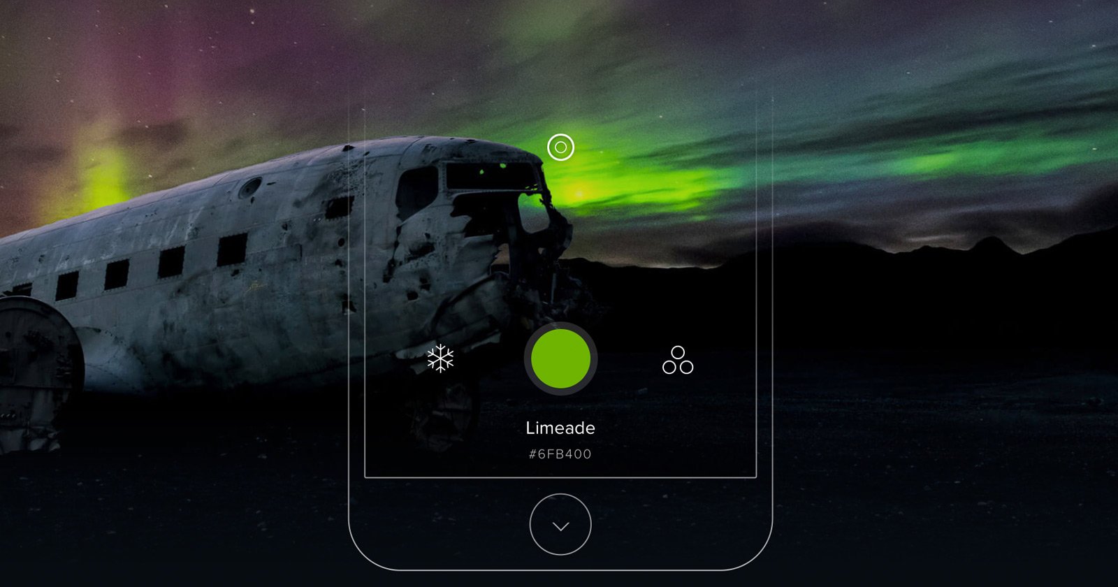
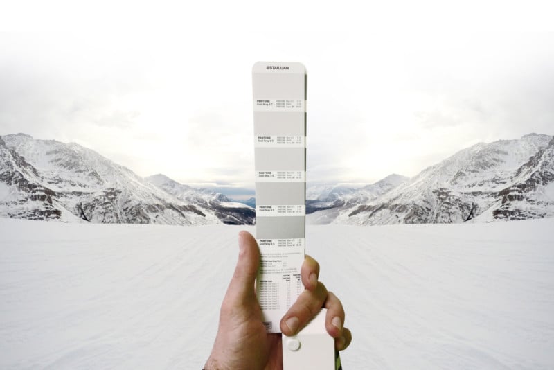
Pantone’s quest is to become the universal language of color. The Pantone Matching System allows printers everywhere in the world to ensure they’re producing colors accurately. Artist and graphic designer Andrea Antoni has found a different use for this language of color: matching it to photographs taken in his home country of Italy.
Antoni manipulates his photographs to better evoke his experiences of his home countries, as he told Creators:
While it is definitely these same places in the pictures, it is also not them; colors have changed, buildings are cut out and presented in different ways. The result is a world that is unreal from one point of view, but extremely true from another. That’s the place of memory; real and recreated at the same time.
Following are a selection of images from Antoni’s series. You can find the entire collection along with his other photography and photo manipulation work on his Instagram.