Your website is your business’s online home base.
It’s where all the magic happens; it’s where sales are made, services are booked, and trust is built through blog posts and portfolio views.
So it’s really important that your website makes a positive first impression through design and functionality.
There are a lot of opinions out there about what your website should look like and how it should function.
But what are the facts?

Here are a few that might surprise you:
38% of people will stop engaging with a website if the content/layout is unattractive (source). Is your website visually pleasing?
After reaching a company's website via a referral site, 50% of visitors will use the navigation menu to orient themselves (source). Does your navigation menu make sense? Or is it overwhelming and confusing to new visitors?
Once on a company's homepage, 86% of visitors want to see information about that company's products/services (source). Is your homepage doing a good job of pointing people to your offerings and explaining what you do?
Mobile devices now account for nearly 2 of every 3 minutes spent online (source). Is your website mobile friendly?
47% of website visitors check out a company's products/services page before looking at any other sections of the site (source). Are your product and service pages easily accessible? Does the layout and content on those pages encourage people to make a purchase?
Do these stats worry you about the work you’ve done on your site?
If so, you should highly consider checking out Squarespace.
Squarespace is a website platform that’s not only visually pleasing and mobile friendly, but it’s extremely easy to use.
It’s what I use for the Elle & Company site and for all of my client sites, and I’ve written a ton of posts on the platform throughout the last 3 years.
And while those posts are informative, nothing is quite as convincing and helpful as a live walk-through of how to build your Squarespace site from the ground up.
And that’s exactly what I did in last week’s Ellechat webinar. I covered:
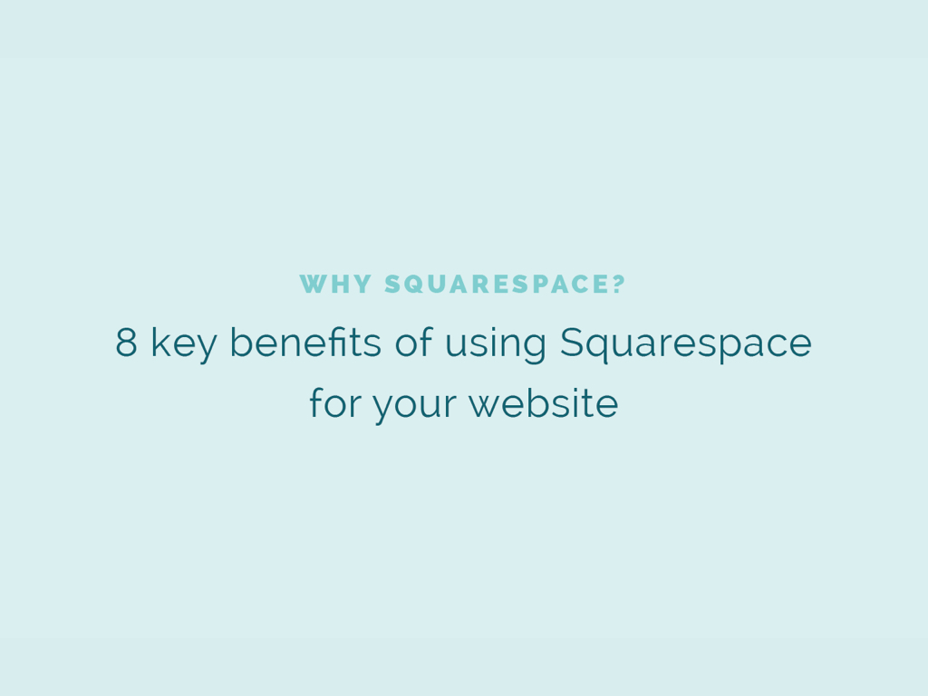
- 8 key benefits of using Squarespace
- Transferring an existing site to Squarespace
- Choosing the right template
- Setting up pages and navigation
- Customizing the design of your site
Are you curious about creating a beautiful, functional website with Squarespace? Do you need a little more direction with your current Squarespace site?
Watch the Ellechat replay by registering through the Crowdcast window below, or keep scrolling and take a look at the slides, links, and transcript.

Transcript
Lauren Hooker: Hello, everyone, and welcome to this week's Ellechat on getting started with Squarespace.
Squarespace is one of my very favorite topics to blog about and teach on. I've done a lot of posts on Squarespace over the last few years, but I figured it would be helpful to go back to the very beginning. For those of you who are just getting started with Squarespace, or are curious to learn more about it, or a lot of designers are also tuning into this webinar who are interested in designing Squarespace sites for their clients, so I thought it would be helpful just to go back to the very beginning, go back to the basics, and cover the benefits of Squarespace, how to switch over to Squarespace if you're moving over from a site like Blogger or WordPress, how to get pages and navigation set up in Squarespace, and then how to customize it. That's where we're headed within the course of this webinar. I'm just going to dive right in to the content.
The Benefits of Using Squarespace
All right. Getting started with Squarespace. First I'm just going to cover some of the benefits of using Squarespace. I've narrowed it down to eight. There are many more that I continue to come across but these are the eight main reasons that I use Squarespace for my site, why I recommend that my clients use Squarespace for their site, and why I would highly recommend for you all to use it for your site as well. I'm going to go through these pretty quickly.
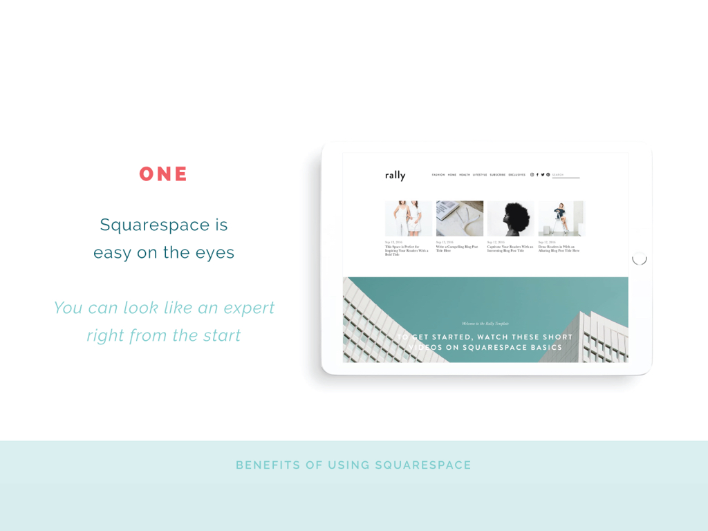
1 | Squarespace is easy on the eyes
All of their templates are really beautiful. They've done a great job of being selective in what their templates look like and how they function. Another reason I love Squarespace is that just because you might be starting your business doesn't mean you have to look like you just started your business. A lot of Squarespace's templates, if you go in and you drop your images and you make slight changes with text, you kind of learn, make it your own, but with their beautiful templates, you can look professional right from the start. You don't have to look like a novice, which is a huge plus.
2 | Squarespace is user friendly
This is one of the biggest benefits of using Squarespace. Some of you may be on WordPress right now. I know when I was over on WordPress the backend was really tricky. It wasn't super intuitive. I didn't enjoy it. It was more frustrating than anything else. I find Squarespace to be super user-friendly. This isn't only a plus for me, using it for my own site, but as a designer recommending it to my clients, I feel comfortable and confident handing off their site, showing them how to use it, doing a tutorial for about an hour, an hour and a half, and then they can run with it. I don't get very many questions from past clients on how to update content. They have a really easy drag-and-drop widgets and intuitive page layouts that are super helpful on the backend. They've done a great job of designing the backend of your website so that you can do a better job of designing your website and setting it up the way you want it.
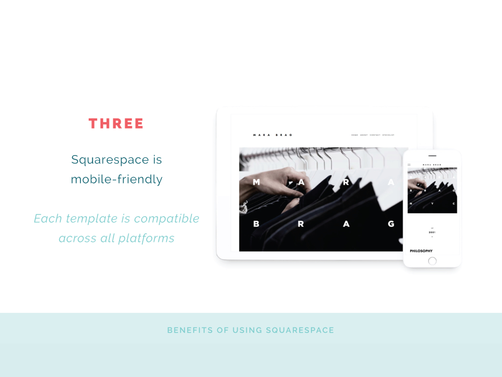
3 | Squarespace is mobile-friendly
Nowadays, and I don't have the statistic right off the top of my head but I just shared it in this week's newsletter, how many people they're viewing websites from their phone. Most of the time when people visit your website it's going to be from a mobile device or a tablet, not necessarily from a desktop, and so your site needs to be mobile-friendly. Every Squarespace template is mobile-friendly and compatible across all platforms or all devices, so desktop, tablet, mobile. Even when you're designing in the backend of your site, you can see what your site will look like across all devices.
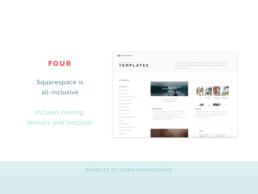
4 | Squarespace is all-inclusive
This means that you don't have to go to GoDaddy and buy a domain. If you already have a domain, that's fine. You can transfer it over. You don't have to buy hosting anywhere. That's included in your Squarespace subscription. You don't have to go elsewhere and buy a template and bring it into Squarespace. All of it is included right in Squarespace. If you have an annual plan for Squarespace, you get a free domain included in it, there's no hosting, so everything is all in one place, which is less to keep up with and just easier on your end.
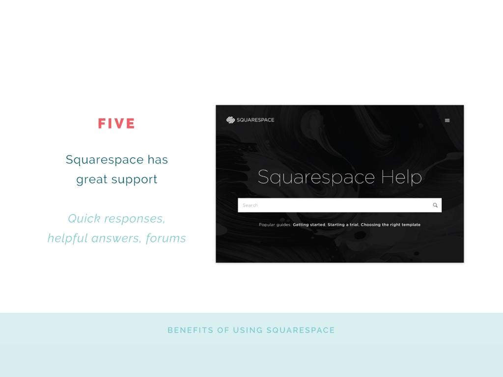
5 | Squarespace has great support
For me, if I have a question about my website, I want it answered pretty quickly, and they have quick responses. They have helpful answers every time. Helpful forums. I love the Squarespace help forum. I've been really pleased with their customer support.
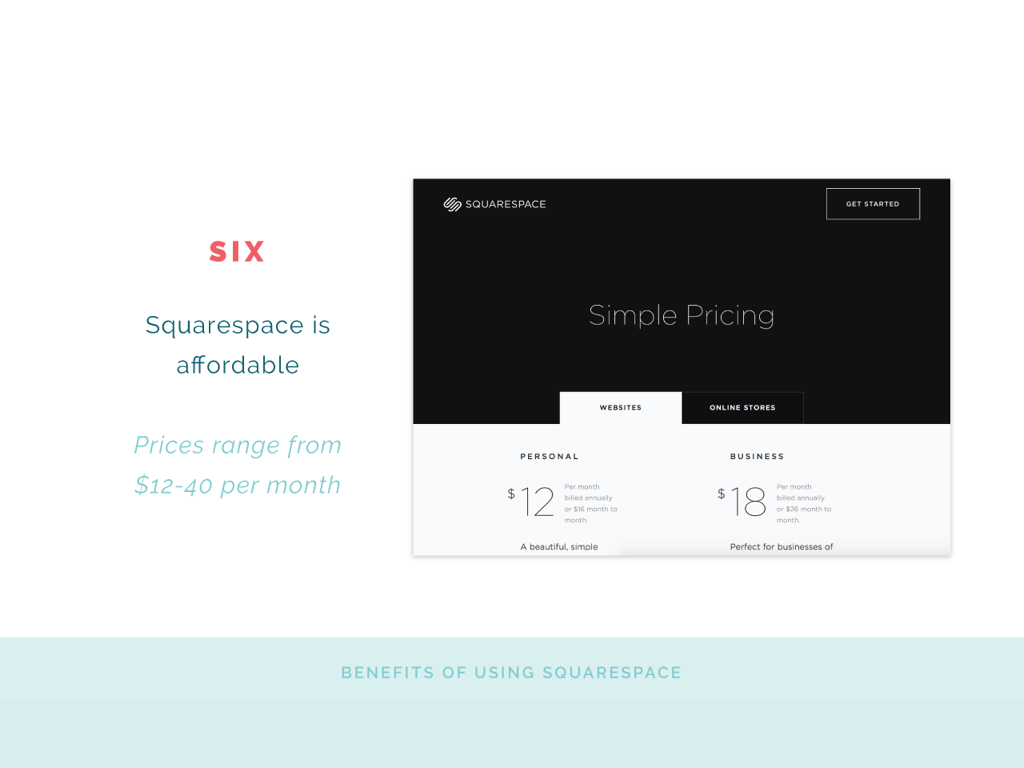
6 | Squarespace is affordable
Plans start at $12 a month. That's usually if you don't have a ton of pages on your website and you aren't doing e-commerce. You can start with a personal plan. It has 20 pages, that's the max, I think, but unlimited storage. It should be pretty quick. I know there was a question about that in the questions section that I hope I can get to at the end of the webinar. They start at $12 a month. I'm on the business plan, the $18 a month. That's the annual cost. It's pretty sweet. Squarespace is affordable and you can look at all of their plans on their website.
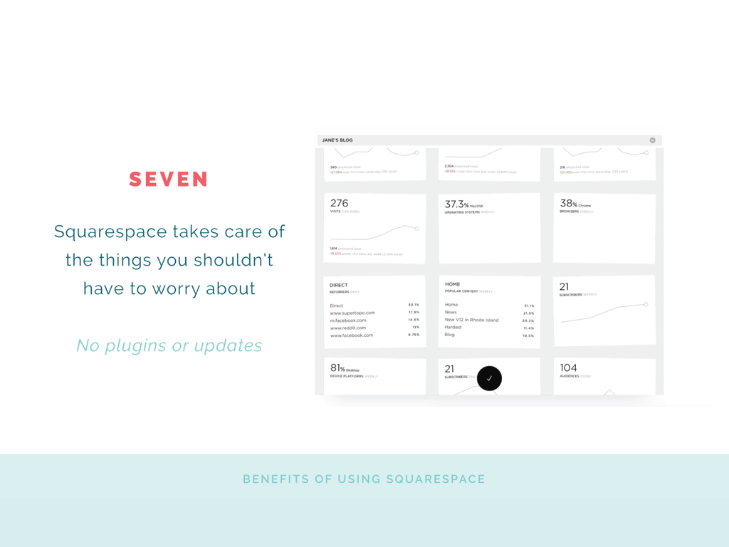
7 | Squarespace takes care of the things that you shouldn't have to worry about
There aren't any plugins that you have to update very often. They go ahead and make those updates for you so your website can function the way you want it to.
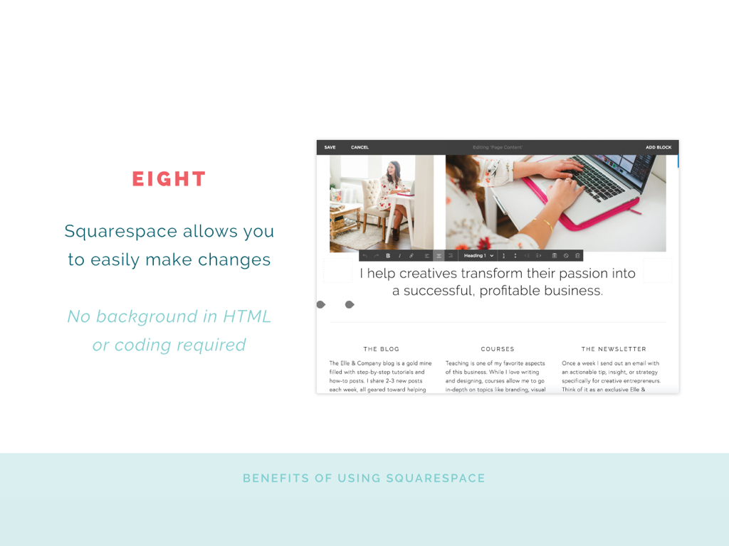
8 | Squarespace allows you to easily make changes on your site
There's no HTML necessarily, although if you do know some HTML and CSS you can add that to your site, but you don't have to, which is really nice for people like me who know enough code to be dangerous.
Those are my biggest benefits of using Squarespace, although I continue to come across more and more everyday. I should also say I'm not affiliated with Squarespace in any way. Sounds like I'm hardcore selling them. I just really love using their platform.
Transferring an Existing Site to Squarespace
If you already have a site on WordPress or on Blogger, how easy is it to make the switch from Squarespace? Are you going to lose all your content? How do you switch your domain name? How do you do that? I'm going to go over that really quickly. I actually wrote a blog post on this not too long ago so I'm borrowing from that a little bit.
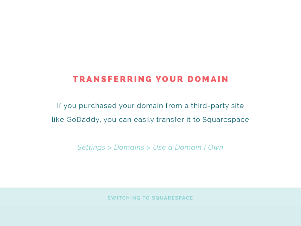
Transferring your domain is really easy. If you already have your domain and you purchased it from a third-party site like GoDaddy, you can easily transfer it over to Squarespace. All you have to do is go under Settings in your main menu, click domains, and then walk through the process under, "Use a Domain I Own". It'll usually recognize where you bought the domain name from, whether it was Namecheap, GoDaddy, wherever. They pretty much have them all listed there and they'll walk you through exactly how to transfer it over and all those details. It's super easy. Don't fret if you already have a domain name through somewhere else. If you don't already have a domain name, you can purchase an annual plan and get the domain right from Squarespace.
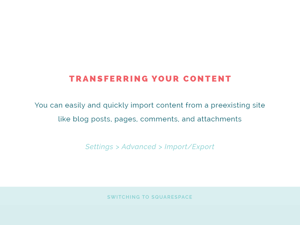
Transferring your content. Say you have blog content that you want to import into Squarespace. You can easily do that as well. Any blog posts, pages, comments, even attachments, you can go ahead and just easily import into Squarespace. You can do that through, again, Settings in your main menu, which I'll show you in just a moment. I'm going to do a demo. You go under the advanced tab and then import/export, and it'll walk you through exactly how to import your content into Squarespace. You won't lose those blog posts. You won't lose even the comments on those blog posts. Squarespace will go ahead and import them right in from Blogger or from WordPress.
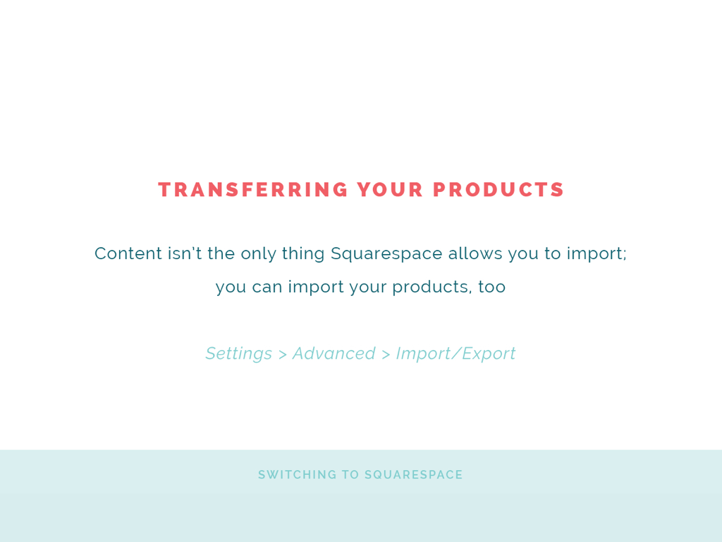
Then also you can transfer your products. If you do have a shop, and e-commerce is important to you or is an important function of your Squarespace site, you can transfer those products over easily. Say you have 60 products in your Etsy shop right now. You don't have to go through and get all those images, then all that content, and enter it in Squarespace one by one. You can actually import all of that information, all the photos and all the details, right into your Squarespace site. You can do that under Settings and then advanced and then import/export as well. I'm going to be sharing all these slides with y'all as well in next week's blog post, so stay tuned for that if you want to come back to these step-by-step instructions for importing things.
You can import your content, you can import your products, and you can transfer your domain name really easily through Squarespace, so don't fret if you're worried about making the switch. All right. I know I'm moving through this pretty quickly but I want to get to the demo.
Choosing the Right Template
You decide to move over to Squarespace or you decide to get started with Squarespace after seeing these benefits and seeing how easy it is to make the switch. How do you choose the right template for your Squarespace site? They continue to add more templates. It can be a little overwhelming looking through them all and trying to decide which one is right for you. I have some steps on how to go about choosing the right one.

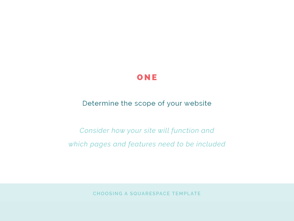
1 | Determine the scope of your website
How do you want it to function? Which pages and which features need to be included in your site? I usually recommend making kind of a site map or even just brainstorming what are the functions, what are all the pages. Of course you might need a homepage, about page, contact page, but do you need service pages? Do you need archives? Do you need a blog sidebar? Is that important to you? All of this is something that you need to consider before you choose a template because you want to make sure that those features are included. A blog sidebar isn't included in every Squarespace template, so if that's important to you, you don't want to go and design your site and go to "add sidebar" and then figure out that you can't do it. Same thing with blog-post excerpt images. If you want blog-post excerpts, make sure that your template, whatever you choose, has that feature. Go ahead and figure out the scope of your website and how you want it to function before you even look at the templates is what I would suggest.
Oh! I should mention, back to number one before I forget it, don't only think about how you want your website to function right now, think about how you want your website to function two years from now. If you have any thought of, "Well, maybe some day I might open a shop for digital products," go ahead and take that into consideration when you're choosing your template. Not that it's the end of the world if you need to change your template. It's just a little inconvenient. Keep that in mind right from the get go.
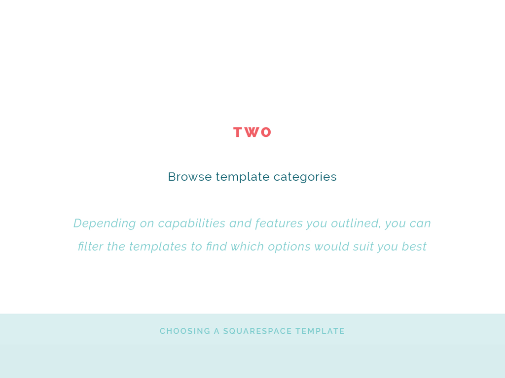
2 | Browse the template categories
I'll show you where these are in just a moment. Depending on the capabilities and the features that you may have outlined in step number one, you can filter the templates. You can see which templates are best for galleries and portfolios and that sort of thing. Be sure to take a look there but don't just limit yourself with template categories. Some of the other templates might work just as well for you in one category than they do in another, but that is helpful that they have it there.
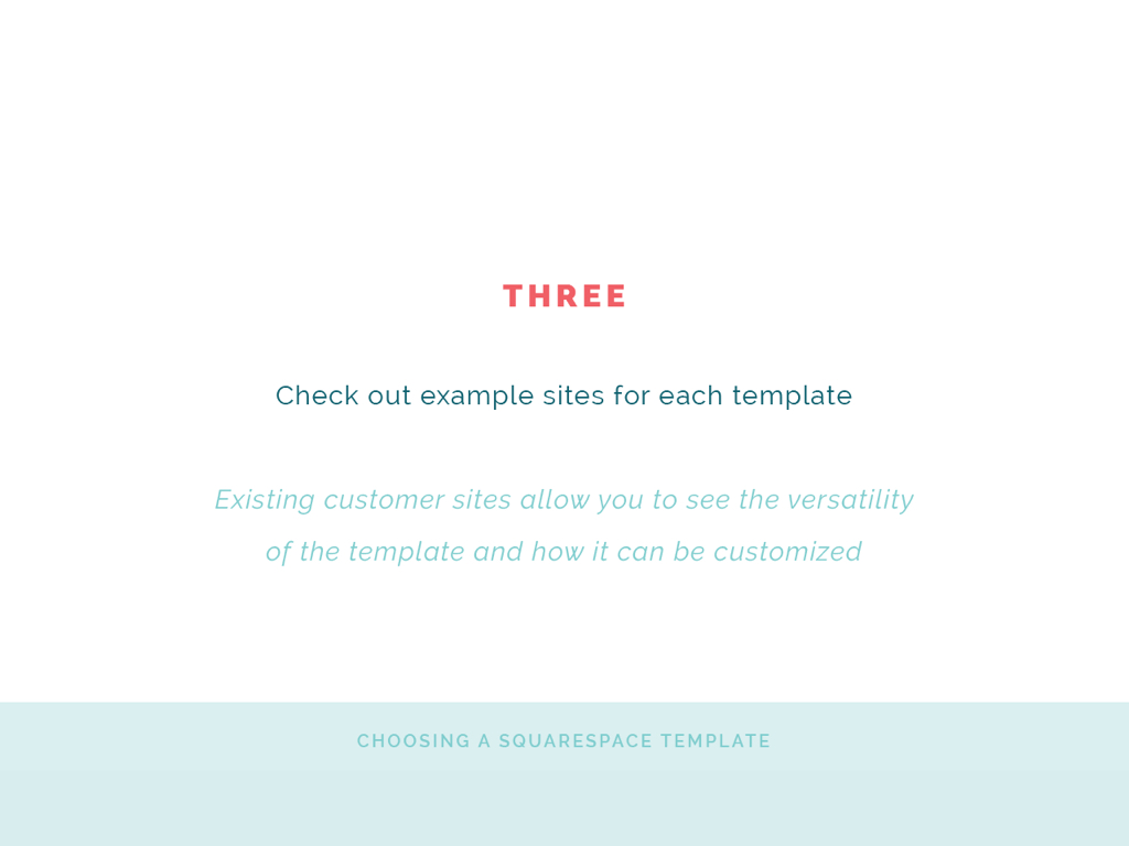
3 | Check out example sites for each template
In the older templates, like Avenue or Bedford or maybe even Hayden, if you keep scrolling on that template page when you're checking out the demo and all of that stuff, if you keep scrolling, you'll see that they have listed existing customer sites, and so it's really helpful to see how versatile that template is and to see what other people have done with it. A lot of times I'll skip the demo because I know that they usually make it look really pretty. I want to see how people have actually used it, and so I keep scrolling. I want to see example sites. I'll show you that in just a moment as well.
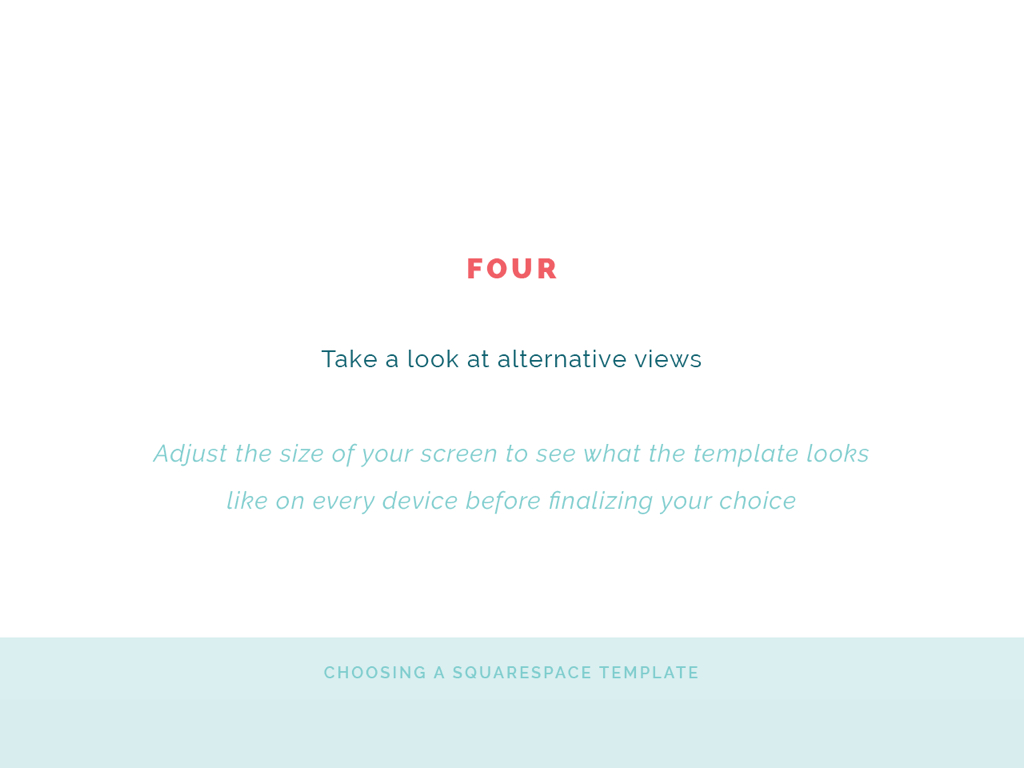
4 | Take a look at alternative views
Don't just look at in desktop mode. Also be sure to look at it on mobile and be sure to look at it on tablet. An easy way that you can do that is to click on the demo mode on your desktop and then drag the size of the window down to a tablet size and then drag it down to mobile size. You don't have to pull it up on your phone or pull it up on your tablet. All you have to do to see what the website looks like is decrease the width of the screen and you can see exactly what it's going to look like.
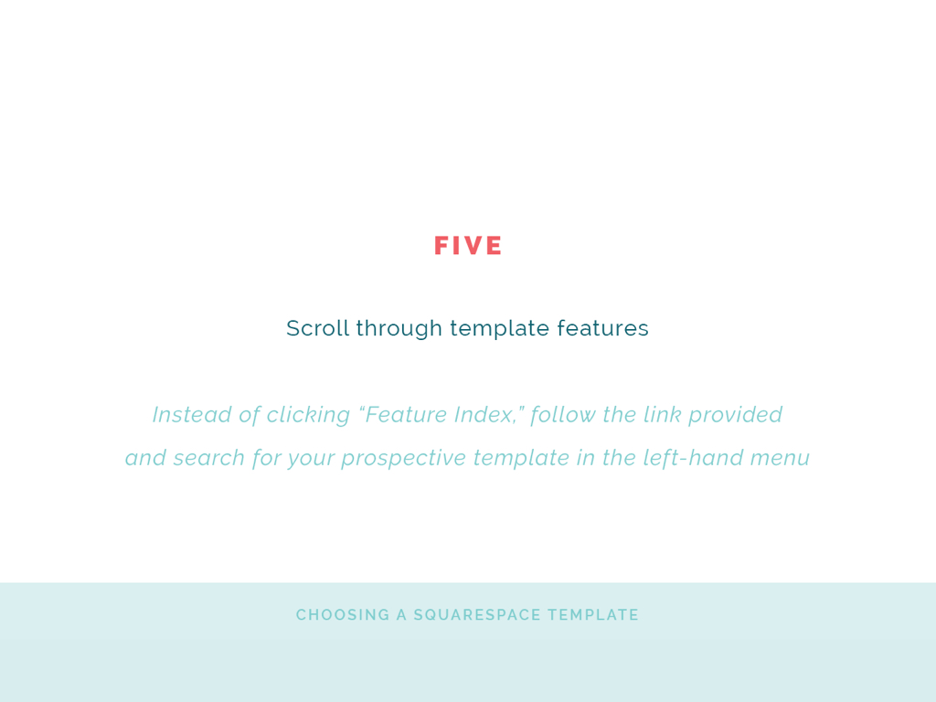
5 | Scroll through the template features
Instead of clicking the feature index, which again I'll show you in just a moment, I'm going to show you a link that you can go to that shows all the template's capabilities. If you just look at the feature index, it's going to be the exact same for each template. Instead go to Squarespace help and look up the template that you're interested in. That'll be more helpful for you. You'll see all of its features, its real features.
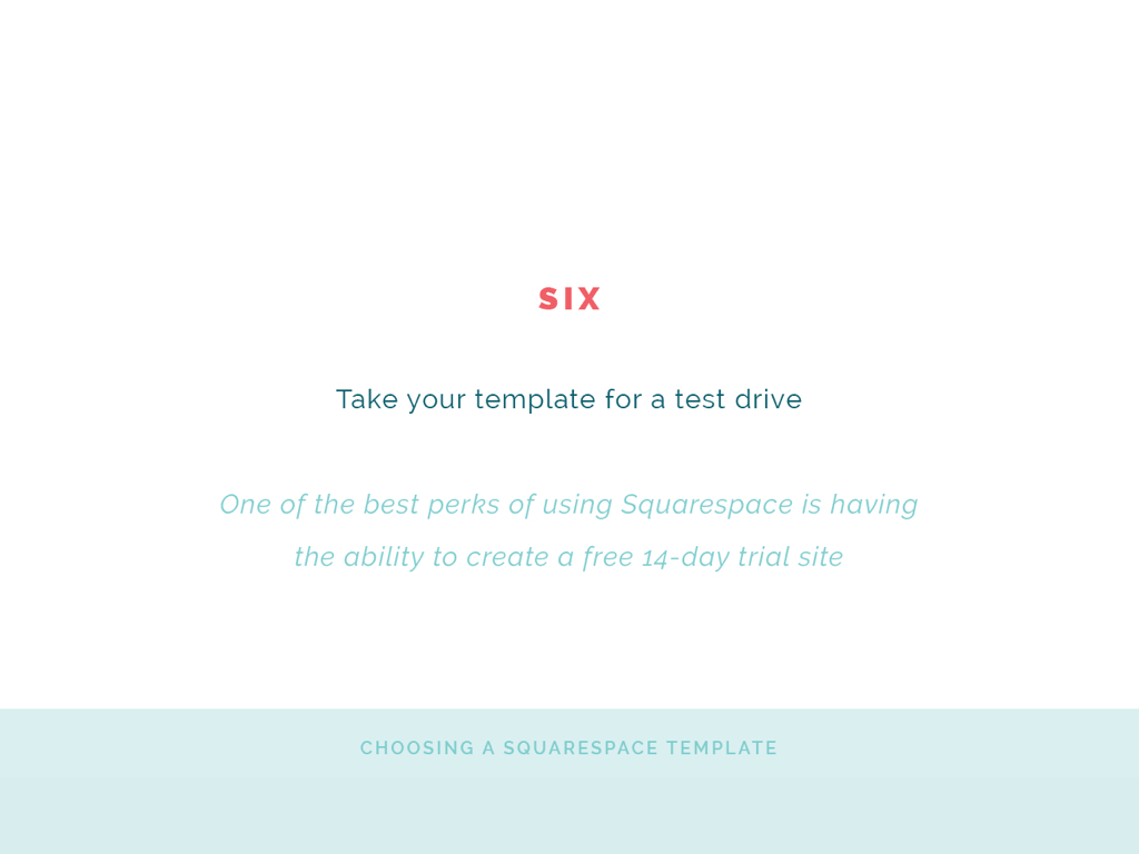
6 | Take your template for a test drive
Squarespace allows you to have a 14-day trial site. Before you commit and pay for your Squarespace site, take it for a test drive. Date your site or date your template for a little while. That's allowed. Be sure to play around with it and see how it functions before you commit to it.
Setting Up Pages and Navigation
All right. We're going to go over setting up pages and navigation in Squarespace in just a second but I do want to give you a look at the templates. Bear with me while I change screens really quickly. All right. I'll just share my entire screen. Hopefully y'all aren't getting tunnel vision. Okay. Oops. Did not mean to do that. All right. Here we are. Here is just the regular squarespace.com landing page. If I click "Get Started", I can show you into the templates a little bit.
You see here they have all the categories, which are helpful. Art & Design. Creative Services. If you click on them, you can see all the beautiful templates that would work well for those in creative services, which I'm guessing are many of you tuning in today.
A little secret. I use the Hayden template. If I click on it, I can see what the Hayden template looks like easily desktop, tablet mode, or on the phone, but if I click preview Hayden, and hopefully y'all can see this, if I drag in the size of the screen ... Ooh, there we go. A little bit of tunnel vision but you can see it. Now you can see what it looks like on tablet view. Oops! Did not mean to click out of that. Then you can see what it looks like in mobile view. You can see how it functions, which is super helpful, just by dragging the size of the screen.
That's helpful to see, but, like I said, it's also helpful to see how other people have used this template. If you keep scrolling down, you can see examples of how other businesses and websites have used the Hayden template and maybe even get some inspiration. A lot of times when I'm looking for templates for my clients I'll look here way more than I even will up here. That's helpful.
Another thing to look out when you're choosing a template is just the Squarespace help article. I'll share this link with you in just a second in the Crowdcast window. It's going to show you the special features involved. Avenue has an index page and it explains what that is. It explains how it uses headers and footers, page boarders and all of these great details. Be sure to take a look at that too. Before I forget, this one's for Avenue but in the side bar you can find the template that you're using, so be sure to check that out as well.
All right. Once you choose a template and you go into the backend, even if you're in trial mode, I'm going to take you into the backend of the Elle & Company site instead of starting from scratch, you will see this left-hand menu. One of the things that I love, I told you that I love that Squarespace is so easy to use. Maybe I'll make this a little bit bigger. Bear with me one second. Let's see here. There it is. Okay. Sorry for the brief tunnel vision. All right. We're back. One of the things I love the most is that I can see the changes as I'm making them. I don't have to go out of the window and preview anything. I can see all the changes right here. I can see my live site and then I can make changes based on this menu.
Before you get started with anything else, even from the template view, your template's going to pull up. It's going to have sample content based on the template that you chose, but I recommend coming into Settings first and just setting up your general information, business information, even permissions if you have multiple people who are collaborating on your site. Just go through here with your domains.
Even your connected accounts. If you click on connected accounts, you can connect all of your social-media accounts here that you want to show up on your website. The order that they're even in here is the same order top to bottom as left to right across the screen. You can switch those around. If I wanted Twitter to come first, it's going to go ahead and refresh, now Twitter is before Facebook. A lot of people get confused about how to connect their social-media accounts. You do it through connected accounts. Just go ahead and set all of that up in the settings section. Some of these you won't have to worry about. Maybe you don't have to worry about anything under the advanced tab, but go ahead and set that up.
Once you have that set up and you put your business name and maybe even your address and all of that fun stuff, you can come into pages and start setting up your pages and navigation. From the very get go, you should have listed the pages that you want to include on your site back before you were even choosing a template to see how you want it to function, and before you even mess with the design or the content of the pages I recommend figuring out how you want to set up your site's navigation.
The main navigation menu that every template has is up here toward the top of your screen, whether it's in a little hamburger menu with little lines or if it's listed out to the right or in the middle or to the left. Whatever your template looks like, your main navigation is going to be at the top of your screen. The order that it's listed in from top to bottom is the same order that it's going to be listed in from left to right across your screen. You can see that in the main navigation. Some templates have a secondary navigation. Mine does but not everyone does. That's going to for this template be down here.
Then you're going to have a not-linked section. Everyone has a not-linked section as well. These are pages that aren't going to be linked to in your navigation but they're pages that are still on your website. This is a little humbling but you can see I have a lot of unlinked pages down here. You might as you go along have a lot of unlinked pages too. These are really helpful for pages that you don't want necessarily accessed from your main navigation or even your secondary navigation, but pages that you want to link to from these pages or maybe just give people a specific URL for. That's very helpful.
If you want to add a new page, you can see these plus icons at the very top. I'm going to create a not-linked page for the sake of demonstration. You can see that different page options appear. I can create just a blank page, which I'll do in just a second, a product page, which is helpful for e-commerce, cover page, there's a lot of different options down here. The ones I use the most are a regular page, a blog page, and then we also have a folder.
A folder creates a drop-down menu in your navigation. People who are on the Elle & Company site might be a little confused by this but I'm just going to show you. If I wanted to create a folder, and I call it Information, or maybe I'll just do Details, then I click off. I can drag pages in here. Maybe I want About and Contact to go under details. I can click and drag, everything is all click and drag, and I can move Contact underneath this folder too. Now if anybody scrolls down to the bottom of the Elle & Company website and they scroll over Details, my about page and my contact page are now in a drop-down, or this one is really a drop-up because it goes up. You can see that those pages are hidden underneath the name of this folder. That's really helpful for the sake of space if you want a drop-down menu.
If you want to get rid of that, you can just click and drag out of this folder. I can hover over this details page. You can see this little trashcan icon. I can click it. It's almost back to normal. There we go. This isn't a good page to show you on because archives page is pretty long, but now it's in the right order again.
You can just drag and drop the order. You can create folders if you want to but I recommend setting up your navigation first just to figure out what pages need to be on your site and how you want it to function. I usually recommend, just from a usability standpoint and user-experience standpoint, to have the least amount of items in your navigation as possible. Usually as a rule of thumb no more than five, max six, in your main navigation. Now you might have one that's a drop down and that's totally fine, you can tuck more pages underneath there, but if you have a lot of options it can be really overwhelming to visitors on your site and they don't know where to go next, so be selective and intentional about what you include especially in your main navigation.
You can set up all of your navigation here and your pages. Once you set up a page here ... We'll do another sample page. I'm going to set up a not-linked page. This time I'm going to set up an actual page, just a blank page. We'll call this page title, "New Page". So creative, but for the sake of demonstration, we'll do that.
Squarespace fairly recently did an update where they have sample layouts all ready to go for you, so you can start with a just plain blank page or, as you scroll down, you can see page layouts all ready. Here's one for an about page if you want to use it. Here's another one for an about page that already has the content there for you, the box there for you. Contact examples. You can find one in here ... I love this one. This one's great for a services page, or something like that, or product page. I think it is really clean and simple and I like the layout. I might choose that one for features. Again, you can scroll through here. They even have a sort menu at the very top. Then click "start editing".
Now that you have your navigation all figured out, now it's time to set up the pages. I recommend setting up the content on your pages before you ever mess with the design. I think that it's better just to get the content on there and then you can worry about how it's styled. It's like building a house. You don't worry about the color of the walls at the very beginning, although if you're like me I probably would at least be thinking about it, but you want to make sure that it has a sound structure. That's where pages and navigation come in. Then you can add the content and then you can add the design on top of that.
They already have sample text in here. If I click on this text block, I can go in and edit any of this text with the help of this tool panel right here. Squarespace already has headers built in for you. If I want to make this header a little smaller, this one is Heading One, I can click and change it to Heading Two. Again, you can change the style of all of this in the backend, which I'll show you about in just a second. Or I can make it Header Three. All of that is already built in. Take it back to Header One. You can easily edit the text in here.
Squarespace sets up pages by units called blocks. Right now we are in a text block that's all ready for us. These over here, as I hover over them, this is an image block. All three of these are image blocks. You can see more text blocks down here. If I click, I can make changes to them. You can even see a block here for a button. This whole page is made up of blocks. If you want to change the blocks, so say I want to add an image, you can hover over it and click edit or, a lot of times for these blocks, you can just double-click them. If you double-click, more options are going to appear in this pop-up window.
The great thing about Squarespace too is that it walks you through how to edit each one of these blocks and customize them and make them your own. You can add an image by clicking "Add an Image". I might just choose this "Getting Started with Squarespace" image just as an example. It's going to go ahead and process it and resize it for me so that it fits right here on the screen.
I always recommend naming your files because if someone pins this image whatever you name this file is going to show up in the pin description. Usually if it's something like a blog post I'll do the name of the blog post dash Elle & Company. At the very least, if someone forgets to write a pin description, it's there. Some people ask me about Squarespace SEO too. A lot of times it just comes down to simple, monotonous things like naming your images. There's more to it of course than that but naming your images is definitely helpful. Just get into the practice of doing that and you can do it right here.
Up in the top, well, there's usually more options, more block options. If you click on Design, there's a few different options for how the image appears on the page. You might want it to appear like a poster with text written over top or a card or overlap. These are fairly new features as well. I from a design standpoint would just choose in-line. To me that looks the nicest but you might change it and that is totally fine. You can see just more options here. You can enable light box so that if somebody clicks on it it shows up larger on the screen.
Then, something that's really helpful, maybe I want this image to be a button. You can add a click-through URL right here. I can add a link to whatever page I want this button to go to. I can choose, "Open in a New Window" if I want to. Or say that it's actually a page on my own site that I want to link to. I can click on content and I can choose one of my pages right from here. I don't have to hunt down the URL to the about page. I can just select my about page and it will link to my about page. Or, and this is how I have the Elle & Company library set up, which is super helpful because I can keep it all on my site, I can link to a file. Say I want this, when someone clicks it, to take them to a PDF for something like a content upgrade or something like that. Of course, maybe not a content upgrade because you want their e-mail address, but maybe on a protected page or something like that. You can add an actual file. Even Adobe Illustrator files I've added to pages like this before. That is super helpful as well.
Make sure with any of these blocks that you go into all the options for the content of the block and the design, click apply, and you are good to go. You can do the same editing any of these other blocks down here. Same thing with the button block. It kind of drives me crazy that it's left-centered, so I can double-click on this button block, have this pop-up window appear. Maybe I want to change the text from "Learn More" to "About Lauren". We linked it to my about page up ahead so that's what we'll do. I can have a click-through URL right here. Again, I can link it to files, an external link, or just to my about page down here. I can change the size of it. Maybe I want it to be a little bit larger. You can see I made it larger. I want it to be center-aligned. You can walk through all the options, click apply, and it's as easy as that.
Say I want to get rid of some of this content. Maybe I'm changing my mind about this template. You can easily do that too. If you hover over any one of these blocks, there's a little trashcan icon that you can click or you can just click and drag the block down to the bottom of the screen. You'll see a little trashcan and you can drop it right there. Maybe I want to get rid of this last one. Maybe I only have two products. I can click and drag that as well. Now it snaps into place and I only have two.
Let's say I want it back or I wanted to add another feature or another block. You can see, if I hover over any one of these blocks, there's little insertion points and a line appears. That allows you to add another block. Maybe I want to add another image block. You can click on that insertion point and a whole lot of other block options appear. Main ones you'll probably use are text and image, maybe even video and probably some of these gallery and summary blocks. If you keep scrolling you can add a form, you can add a newsletter block for opt-ins, you can add a map, buttons, archives. I don't necessarily set up my archives that way but you could totally do that. You can see all of the different options. Oops! I scrolled off of it. You can have your social links, your Instagram feed, your Twitter feed, so there's a lot of options to choose from. I'm going to choose an image block.
You can see that that window automatically appears. I can add my image there and walk through all of the options I just showed you a minute ago. I'll click apply. Now we have a problem. It got a little wonky here with me adding that block. The good thing is that I can just drag and drop it into place. If I click and drag, I want this block to appear essentially where it was before. I want the three images in a row kind of to form columns. You can see this black line that's appearing on the right side of the screen right here. That lets me know that this block is going to fit right beside this content. Now if I drag it up here you can see that black line is going to make the block go next to this content, or if I click back down here the block is going to snap to that content.
Maybe I want this block to be a little bit larger. If I put my mouse in between the two blocks right here, you might not be able to see it too big on your screen, but my mouse turns into a line with two arrows on either side. If I click and drag, it's going to change the size of these blocks. I can edit it to be as big or as small as I want them to.
Again, I can click that insertion point, add text. I'll just copy and paste for the sake of time. Feature three. If I want to add another button, I can click and scroll down to the button block. We'll make that one "Learn More". Center, apply. You can see it's super easy to edit pages and content on your Squarespace website. The same goes for blog posts. If you're writing a blog post, you set it up with blocks just like you'd set up any of your interior pages. I'll click save. You can see what that page looks like right on the Elle & Company site. If you want to see any of your other pages or edit another page, you can click on the page and see exactly what it looks like live. If you hover over it, you can just click edit and go in and edit the content on your page and click save, or I'm going to click cancel.
Another thing that's really helpful is, and I know I'm moving quickly but this is just for the sake of time, if you hover over each new page, you can click on this little gear, which is the settings of each page, and you can change the navigation title if you want to.
The description is super helpful for SEO purposes. I say that and I don't have a description myself. No one sees this except Google can crawl it. You can put a description in there. It's not going to show up on the actual page itself but it's helpful on the backend if you want to give that page a description.
You can come down here and change the slug, the URL slug. Right now, it's set up that this page is elleandcompanydesign.com/products, is the URL for this page. I can change that here if I would like.
If I want it to be password-protected, I can just go in here and add a password and it'll automatically be password-protected. If you have any content on your site that you don't want anyone to see or maybe it's for a client you can password-protect the page just by adding a password in here. If you want to un-protect it or disable the password you can delete it and then save your settings here.
You can set this page as your homepage if you want to under any page setting, or if I really love the layout of this products page, and I want to use it as a layout on one of my other pages, and I don't want to start from scratch, I just want to save time, I can click, "Duplicate Page." It'll duplicate the page for me. I can just go in and edit the content.
Always be sure to click through these other options as well just to see what's underneath there for every single pop-up in Squarespace. I'm going to click cancel. That's pages and navigation. Really quickly, I'm going to go through design and then I'm going to answer some of your questions. Let me make sure y'all are still with me. Awesome. Okay.
Customizing the Design of Your Site
Now that you have your pages and navigation set up and you have the content on your pages, now you might want to make it look a little bit more like your own brand. That's where these design features come in handy. No CSS is required. All you have to do is go underneath design.
Before you get to the style editor, you can go into logo and title. Here is where you're going to drop your logo image. The image that's right here up at the top is right here. Little note about that: always, always, when you're uploading your logo to your website, upload it as a transparent PNG. You want it to have a transparent background because if you don't ... Sometimes it's tricky because the background color might look white but it might be a little off-white. When you go to upload your logo and it has this white box around it, it's going to look pretty jarring next to the off-white background or whatever color you're going to change it to, so make sure you have a transparent PNG.
I always recommend sizing up, sizing too big, because Squarespace will automatically size it down. A lot of people complain about their logo looking grainy on their website and it's probably because they haven't saved it large enough or they didn't save it as the right file type, so make sure that you size it large enough.
A browser icon, or a favicon, you can add here. This is a fun little detail. Again, I say this every time I say this word, I don't know if it's "fave-icon" or "fav-icon", but I'm going to go with "fave-icon". It's this little icon up here on the browser tab. You can see that Squarespace has their little logo right here. If you don't change it, it's going to be this black box that's kind of ugly. This is a fun way just to add a touch of character even to the browser tab and brand your website so be sure to add that there.
That's under design and then "Logo and Title" but you're going to change the most of the design settings under your style editor. This is where the magic happens. This is where you can make changes to the type that you're using, the fonts and the colors and even just the sizes and spacing of your website. Based on your template and even the page you're on in your template, you're going to find different settings underneath here.
You can see header background color is set to white. You can see all kinds of things. Nav link color is black, unless it's an active link color like we're on the products page and it's blue. If I want to change that color, I can click and change the color in here. If you know your brand color values, even hexadecimal colors, you can delete all of this, add the hexadecimal with the hashtag in the front of it, and get your brand colors. You don't have to guess.
Same thing for fonts. There's a little arrow. You can click and change the font here. Adobe Type Kit and Google Fonts are includes in Squarespace so there's a pretty good chance that your brand fonts are in here. You can search for the fonts up here or you can scroll forever and try to find your fonts as well. You can even see, "Show All Fonts". It's going to have a huge list. Squarespace has a ton of awesome fonts. You can change the font weight. You can see all of the different options available to you in here.
If you don't want to search for something, like I don't want to search for Header One to change it, I can just click. It says, "Heading One Font". I can change it right here. I can change the color. If I want to get all the options back, I can just click, "Show All" and all the options will appear. That's super helpful.
Something that you're not going to see, I get asked this question a lot, you're not going to see any blog sidebar options here or any blog options here because I'm not on the blog page. If I click back out of design, I click on the Elle & Company blog page, and then I go into the style editor, in the style section, there we go, if I keep scrolling the blog, I'll have different options here. Make sure that you are on the page that you want when you're setting things up in the style editor. Things like your heading fonts and body text and background color and all of that are going to stay the same no matter what page you're on, but if you're looking for specific options, especially for your blog, you need to be on the blog page and the style editor at the same time.
All right. I know I breezed through that. Maybe I need to do some more Ellechats on Squarespace, but I want to leave enough time for questions, so let me go back to Crowdcast. There we go. Okay. We're back. I'm going to leave this up just in case I need to do a demo. Maybe I'll just x out of that right now. Okay. Great. Well, I'm sure we have some questions. If you all want me to do more Squarespace-related Ellechats, let me know in the comment section, specifically what you're interested in, and I'm happy to take that into account in the coming months as we plan out our content calendar. All right. We have some questions. I'm going to try to get through as many of these as I can. Okay.
Suzanne, I just saw quickly in the comments, that you asked if unlinked pages count in the max number of 20 pages for the personal plan. Yes, they do. You might want to upgrade to the business plan, which is what I have. It has unlimited pages. I think one's $12 a month, the 20-page option, and then the other is $18 a month for the annual plan.
All right. Nanette asks, "Do you use SEO feature? I heard SEO is not possible on Squarespace and that WordPress is better."
SEO is possible on any platform but WordPress does have a lot of plugins for SEO. Squarespace has an SEO option. If you go under Settings, there's an SEO tab. I actually have a Squarespace post or a post on the blog about that, I'm going to link to it, I had to find it real quick, that walks you through step by step of how to set up SEO with Squarespace. It does come down to naming your images in the backend, to having those page descriptions, setting up a sitemap on Google, which that post that I just shared will walk you through. Really it comes down to your content. That's another reason that I highly recommend blogging.
Funny story, really quickly, I started blogging about Squarespace just to show people about the ins and outs of using Squarespace and honestly to convince my clients to use Squarespace. I started a Squarespace series and wrote a few posts. It was a few years ago when Squarespace wasn't as popular as they are now. I never expected to show up on the first page of Google for Squarespace, but now if you type in "blogging with Squarespace" or "Squarespace blog" Elle & Company appears on the first page. That's simply because of blogging and having Squarespace pop up in the key words. I know you didn't tune in to hear about blogging, but that is super helpful as well. Be sure to go to that post. I might even write an updated post on Squarespace SEO in the coming months as well so stay tuned for that. Maybe that'll be an Ellechat. Maybe I'll do that one as an Ellechat.
All right. Suzanne says, "I have the comment system a bit complicated and keeping people from leaving comments. For instance, how is it possible for someone who leaves a comment to get a notification when there are new comments to a blog post? Any other great advice on using the comments in Squarespace?"
Squarespace has a few different commenting system options. One is Disqus. You can trade out Squarespace's commenting system for Disqus, which is what a lot of WordPress blogs use, or people can sign in through different options. Now when you go to leave a comment in Squarespace you can sign in with your Squarespace account, which is usually the easiest way to go about it, or you can add your name and e-mail. I think the last time I tried there was an option to be notified if there were new comments on the blog post but I'd be happy to check on that for you, Suzanne, because it's been a while since I left comments on Squarespace sites, although people leave comments on mine all the time so I should look into that.
On the backend, though, if you use Squarespace's platform, and this I can show you if I share my screen ... One second. All right. If I go into the backend of my site, on this page I can see comments and I can see all of the comments all at once. It's taking a second to load. I don't have to go back to all of my old blog posts and try to keep up with comments. I can see all the comments right here and reply to them all. Super, super helpful. I can click on one and click reply and easily reply right from the backend of Squarespace. From my end they make it really easy. I need to go back in and see what it looks like on your end. That's really good to hear or good to know about. Let me x out of that. Okay. Great question, Suzanne.
All right. Kristin says, "I love the look and easy navigation of your Elle & Company archive page." Thank you! I'm glad you like it. She says, "The blog post on how to create it is fantastic. I was wondering if Squarespace has since come up with a way in which your most recent posts are auto-archived instead of the blogger having to go and update it each time."
What I've been doing for that archive page is having summary blocks for each one and just adding a tag. Every time I go and create a new Elle & Company post, or now my assistant Marissa does it for me because she's wonderful, she will tag it "Apr 2017". It's 2017. She'll tag it. I already have a summary block on that page ready to go. I just do it once a month. I separate it by that "April 2017" tag, or I need to because I haven't done an April post yet, and it'll automatically upload. Your post will automatically show up if they're tagged or categorized accordingly as the most recent ones. The only thing you have to do on your end is go and update the summary block once a month if you post often. If not, you might just have a regular summary block for your blog post and do it that way. Great question.
Moving through these kind of quickly. Want to get through as many as possible. All right. Mallika asks, "Is it possible to use Squarespace as a platform for an online course with video modules and downloads?"
Yes, it is! I actually did that for my Freelance Academy class and my Adobe Illustrator class by using, oh, man, MemberSpace. It left me for a second. I used MemberSpace. What I did, and I have a blog post on this as well ... Actually, I'm going to link to my Squarespace archive for you because you can find it underneath there, you can find it in the comments. I'll leave it on the comments on your actual question as well. You can go in and add the pages just as not-linked pages. You might password-protect them if you just want to give people the password or you can use something, a third party like MemberSpace, and protect your pages that way.
I will say people have been able to bypass MemberSpace, which is why I currently moved over to Teachable, but it was a sad move because I really loved having my course look like the rest of my site. I liked driving even more traffic to my website when students would log onto the course. You can, and I've written a blog post on exactly how to do it, but if you want your course to be super well-protected and you want each person to have their own log-in you might go through a platform like Teachable instead.
Amelia asks, "I am designing websites in WordPress and I'm thinking of starting with Squarespace as well because I love the minimal and clean design of their themes and I hear so much about it. However, to be honest, I don't really know why I should switch or start doing both as I don't know the advantage of Squarespace. I'm hoping to find some answers in your Ellechat."
Really what it boils down to is the backend and the versatility in customization of the site. For me and why I wanted to use Squarespace with my clients instead of using WordPress was that I wanted to be able to pass off the site and be totally confident that they would be able to navigate the site and make updates on the backend. I wanted not only a beautiful site but I also didn't want clients e-mailing me all the time asking me, "A plug-in stopped working," or, "This isn't working," or, "How do I upload a new image?" Just the maintenance on the backend.
Also with code. I didn't want to have to have somebody else code the sites for me after I designed them. That process takes a really long time. With Squarespace I can easily go in and change the design. I know a little bit of CSS to make customizations that aren't necessarily available in the style editor and I can do it really quickly. I can turn projects around a lot quicker, and I know that I'm providing a product with a really good backend too. They always feel comfortable using the backend of Squarespace.
John, tuning in, said, "I'll second that, Lauren. Teaching someone Squarespace is ten times easier than teaching them WordPress." Yes, I totally agree with that. It just depends on whether you feel comfortable limiting the amount of customization, if that's worth it to you, to turn around sites quicker and provide a better client experience on the backend. Yeah, a lot less time teaching and instructing and correcting when using Squarespace.
All right. Andrea said, "I'd like to know how to make images more responsive/mobile friendly on Squarespace. I've seen a lot of websites look amazing on the computer, but once you access those same sites on a cell phone and you look at the screen the images are cropped in a weird way and so are graphics. Sometimes you can't even read what's written on a banner because half of it has been chopped off the screen. How to fix that?"
Yes. It depends on your template. A lot of the templates that are gorgeous on desktop have those huge banners, the photo banners that go across the entire screen, but then of course when you have a banner that's really narrow and horizontal, when you squish that down you're going to naturally crop off a bunch of that image if it spans the width of the page, so you need to keep that in mind. A lot of times it's not helpful to add an image there that already has text on it if you want it to be seen on mobile. From a design standpoint, keep that in mind and always use the banner text that they provide if it's a banner that spans the whole width of the page.
If not, you can kind of get away with ... If you don't have a banner that spans the width of the page and instead you add an image into a block on the site, then it'll size down and keep the proportion and you might be able to have text on it that's legible. I'm working on some side updates for a client right now and that's the case. I recommend when you are designing to always go from desktop mode to tablet mode to mobile mode so that you can see what it looks like on everything. The biggest hang-up are those banner images so keep that in mind. Great question, Andrea.
All right. Last question because I want to be respectful of your time, but it looks like I might need to do another Squarespace Ellechat soon. Corrine asks, "I used to use WordPress and switched to Squarespace last year. One feature I really miss is being able to preview your WordPress page before publishing it. Is there a way to do something similar in Squarespace?"
Yes. Actually, you can see the changes as you make them, which is really helpful. If you don't want the changes to be seen, you can just click cancel. Or I would highly recommend creating the page as an unlinked page before anyone sees it, if you're creating it from scratch, and make the changes to it and drag it up to your main navigation or secondary navigation. Or if you want to make some simple changes but you don't want anybody to see it just yet create a copy of what you already have. Maybe it's your about page that you're wanting to make edits to. Duplicate the page under Settings, under the page settings like I showed you earlier, drag it down to unlinked pages, make the updates you want to, and then when you're ready switch those pages out. You might have to change the URL slug like I showed you how to do earlier but that would be a way to do that. Great question.
All right. Yes, there is an enable or disable mode too in the settings. That probably would be the easiest way, but there are three options for you, so I hope at least one of them is helpful. Great question there.
All right. Sorry that I didn't make it through all the questions but I hope this was helpful for you as you work with Squarespace and hopefully switch over to Squarespace in the near future. Yeah, if you all would like me to do more Squarespace Ellechats, I would be happy to jump on.
Actually, before I get off of here, for those of you who are in the Charlotte area or in North Carolina or are willing to come down to the Charlotte area, I'm going to share my entire screen with you, there is a super cool business in Charlotte, now in Raleigh, and they're going on tour too so they might be coming somewhere near you, called SkillPop. They teach pop-up classes in the Charlotte and Raleigh area. I teach a few of them. One is on blogging basics. I teach one just bare-basics Squarespace class on setting up your Squarespace. I'm also teaching a master class. If you want to dive deeper and go past just the basics and you want to get into setting up opt-ins and really customizing your site, there are only eight seats left. I will look at your site specifically, it's a really small workshop-type of class, and help you customize it to meet your needs. If you're interested, I'm going to drop this link right in here. You can see more details on that. SkillPop is the name of the company. If you want to come and learn about blogging from me or dive in deeper to Squarespace, you can do that as well.
Thank you all so much for taking the time to tune in today. I hope you found it helpful and I hope to see you in another Ellechat very soon. Happy Thursday. Bye, guys.