 Get 10 Free
A functional website is no longer enough to set a brand apart from competitors. To stand out, digital assets need to look beautiful, function seamlessly, and immediately cater to a user’s needs. Time-saving designs appeal to the ever-shortening attention spans of website visitors. Time is of the essence for success in both mobile and desktop environments.
Site visitors are no longer willing to scan through page after page of content to find the answers they need. If a site does not get to the point quickly, the back button offers a simple exit plan and access to the next relevant search engine result. If your brand is struggling with low site visit times and conversion rates, consider time-saving design as a way to create visitor satisfaction and encourage conversions – regardless of the amount of time spent on a page.
The Impact of Attention Spans on Digital Experiences
Microsoft published a fascinating study two years ago about attention spans and technology. The results showed a four-second decrease in attention spans during a 13-year period. In 2013, the average human’s attention span was one second shorter than that of a goldfish. All website, usability, and UX designers must consider this information as they develop and optimize pages online.
Websites and applications that succeed today provide more than highly relevant information. They are eye-catching in the first few moments a visitor loads the page. They rely on psychology to draw the visitor’s eye to the most important content on the page and they inspire micro-interactions and conversions. The rise of time-saving design, as espoused in several recent “top design trend” themed articles, is a direct response to the human need for a focused and guided website experience.
What is Time-Saving Design?
Time-saving designs are simple, but not oversimplified. Navigation, content, and headlines all direct users to the information, CTA, or form they need to take the next step of the customer journey.
One of the most common design styles used in time-saving websites is linear design. Websites with logical, often chronological, or beginning-middle-end format, follow linear structures. Instead of presenting every page on the site in a drop-down menu, these sites often provide only the most relevant information on the homepage and then guide users to additional pages based on the customer journey.
As businesses search for ways to offer a more personalized brand experience, they naturally gravitate toward intuitive, efficient, and streamlined designs. Any digital asset that expedites the customer experience and increases visitor satisfaction may fall into the category of a time-saving design.
Time management is part of the natural evolution of design trends. In the near future, advances in artificial intelligence and machine learning will enable designers to create increasingly efficient sites. Technology-driven, time-saving design concepts not only streamline user navigation and content retrieval, but anticipate a user’s needs to deliver relevant content.

Time-saving designs apply to both mobile and desktop user experiences, and can include any innovation that correlates with lower site visitation times and higher conversion rates. For examples of time-saving designs, explore the websites of Uber, Virgin America, and Airbnb.

On the other side of the coin, a non-time-saving design creates hurdles to a visitor’s experience. For example, a symptom checker that requires a user to know the category of illness before seeing a list of possible symptoms would constitute a digital hurdle. The navigation of the site is not intuitive or time-saving.
Web Design Elements That Save Users Time
Time-saving design refers to the user experience or end result of a website design. One component will not create a time-saving design. Only a masterfully arranged set of components can create a user experience that decreases the amount of time a user needs to respond to a CTA. Common time-saving design elements that UX developers and website designers focus on include:
Minimalist-inspired navigation. Time-saving designs encourage users to take a limited number of steps from the moment they click until they take action. Clear, eye-catching, and optimized buttons, links, forms, and menus can all save users time when they access a site.
Visually rich content. Pair action-inspiring messaging with photos, graphics, and other visual content to capture the eye, break up content, and encourage action. Humans process visual cues more quickly than text cues, making visually rich content more eye-catching and memorable.
Linear progressions. Any website or app that wants to encourage a certain behavior can use linear design to encourage visitors to take certain actions. In addition to “read more” links to help a reader take action, consider breaking content down into a story or linear progression. Move readers through the customer journey, giving each user an opportunity to research further or take action at every step.
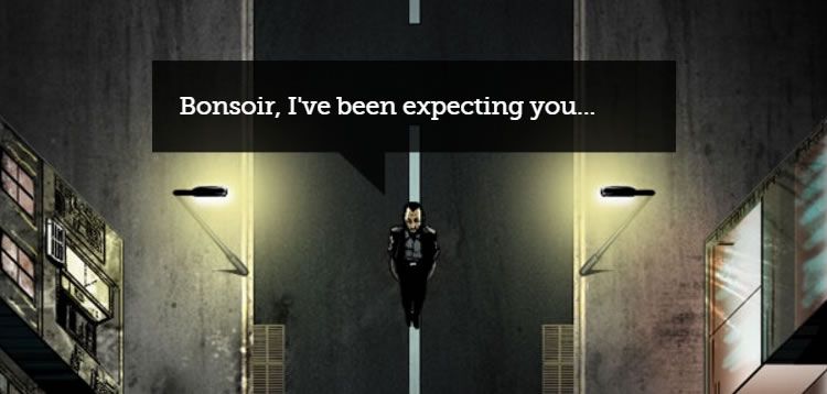
BenTheBodyguard.com – Web Design Storytelling
Automated suggestions. Personalized suggestions based on user actions increase the likelihood that a consumer will take action during any given site visit. This idea is comparable to Amazon’s similar items suggestions.
These elements represent only a portion of possible design features that can save a user time. Use the individual elements that a site’s target demographic will find useful, and consider the thought process of the average user when arranging site components. Every website’s purpose and user base is different and will require a slightly different approach.
Is Time-Saving Design Right for Your Business?
Some businesses cannot feasibly condense a website into a minimalist and Uber-like experience, but all businesses can benefit from exploring time-saving design elements. Consumers want to see relevant information in an intuitive format, from selling B2B software products to offering a convenience-driven delivery service.
Few digital site visitors relish the idea of sifting through blocks of unbroken content and pages of information to find actionable information. Pricing tables, abstracts, infographics, and condensed content, combined with well-placed links to long-form content can deliver time-saving elements to the end user, without sacrificing the breadth or depth of information covered.

Glitter in the Dark – Long-Form Content
As with most interface design, usability, and user experience trends, understanding the core concept informs and enriches future design projects. Take the elements of time-saving design that can help you reach your audience, and leave behind what doesn’t work.
Best Practices for Creating Time-Saving Designs
Explore time-saving design concepts to create and optimize a website or app for better conversions. When the end-user feels satisfied with the user experience, the brand and the user base both benefit. For businesses, time-saving designs can lead to a better online reputation, streamlined sales, and increased conversions. For users, time-saving sites streamline the customer journey and increase brand satisfaction. Use these best practices to incorporate elements of time-saving design into your next online project:
Research your user base to understand the customer journey. Avoid allowing any passing design trend to outweigh user expectations. The target user base should always drive the components used to create an online experience. Invest in both qualitative and quantitative research to understand how average users behave online and what motivates users during an online experience.
With an understanding of the customer journey, designers can begin to identify key touch points along the way that expedite the process. From action driving information to the style of sign-up form used on a given page, customers provide insight into time-saving design elements.
Frequent testing. Every digital experience goes through growing pains before it achieves maximum time-savings. Use A/B testing and other usability tests to understand what works and what doesn’t on a given site, app, or page.
Use competitive intelligence. Explore how other businesses incorporate time-saving design elements into digital assets and what consumers say about the experience online. Learn from others’ mistakes and successes to build a time-saving user experience.
Maintain a level of consistency. A brand could decide to completely redesign an existing application or website with a time-saving user experience in mind. However, brand-new sites that replace existing ones can create a learning curve – even if the new design is technically more intuitive. Make changes end users can easily and naturally adopt to meet time-saving expectations.
Time-saving designs remove frustration from a brand experience, but every brand’s approach to time-saving design will vary. Focus on end users and logical design optimizations to create digital assets that support customer journeys, simplify user experiences, and promote brand satisfaction.
Related Topics
Top