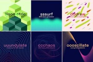
Last week, we released our new WordPress ecommerce theme, and received a lot of questions about the masked blur effect used on the banner images. This is a live effect that can be applied to any image you give it.
I think it’s a nice treatment and more importantly, the general technique opens up lots of possibilities for crafty designers. I’m going to run you through what I’ve learned today.

In short, the above ‘masked blur effect’:
- uses as a single image
- is non-destructive (i.e. it doesn’t permanently alter your original JPEG or PNG)
- can be applied or removed with a line of text
- can be applied via a mask of practically any shape.
- is relatively well-supported in modern browsers – though mask positioning can be tricky.
First up, SVG is the key to this technique. While we all know SVG is a vector format –it says so on the box – the irony is, SVG has a bunch of pixel-based tricks that PNG and JPG can only dream about.
SVG Filters 101
Let’s start with the basics and the simplest of filters. Setting up a basic SVG filter is as easy as creating a set of filter tags and naming the filter with a reference ID – in our case we’ve called ours ‘myblurlayer’.
Adding the following SVG snippet to your page won’t render anything on screen, but it creates a new filter that you can then apply to any page element – images, text, panels, whatever. Increasing the stdDeviation increases the blur.
<svg xmlns="https://www.w3.org/2000/svg" version="1.1" height="0">
  <filter id="myblurfilter" width="110%" height="100%">
  	<feGaussianBlur stdDeviation="2" result="blur" />
  </filter>
</svg>
In this example, we’ve used a simple SVG blur effect (i.e. feGaussianBlur), but there are dozens of other filter effects we could have used. Most commonly, we apply the filter using CSS.
.blurme {
-webkikt-filter: url('#myblurfilter');
filter: url('#myblurfilter'); }<img class='blurme' src='myimage.png' />(Sidenote: Yes, I know there are simpler ways to blur, if that’s all you need)
Now, this CSS class approach works fine in most browsers for simple filter effects. Unfortunately, as your filters become more ambitious, bugs in Safari make this unreliable.
I’ve found you generally get more consistent results by placing your base image (JPG or PNG) inside their own SVG element – rather than a standard HTML IMG tag. So, your image looks something like this:
<svg xmlns="https://www.w3.org/2000/svg" xmlns:xlink="https://www.w3.org/1999/xlink">
<image x="0" width="100%" height="100%" xlink:href="https://www.sitepoint.com/themes/ecommerce/wp-content/uploads/sites/4/ecom-banner-2-1_1020x304_acf_cropped-1.jpg"/>
</svg>
In the browser, this shouldn’t look any different to your garden-variety IMG tag. Later we’ll apply our filter directly to that <image> element.
Adding a Mask to the Filter
SVG offers a handy filter effect called <feImage> that converts images into objects that SVG can then manipulate – in our case, to use as a mask. It looks like this.
<feImage id="feimage" xlink:href="our-mask-will-go-here" x="0" y="0" height="300px" result="mask" preserveAspectRatio="none"/>Technically, our xlink:href can accept a link to an external file (for instance, ‘mask.svg’), but I had trouble getting this to work consistently across browsers. Instead, we’re going to code our SVG mask directly into the filter.
Creating your Mask Shape
Before we write any more SVG, we need to create the mask we want to use. I’m going for a very simple rectangular ‘letterbox’ effect, but there’s nothing stopping you from using any vector shape you like – though I recommend keeping your mask relatively simple.
For this, I’m going to use a nice little online SVG editor called Method-Draw. It’s simple, free and should encourage you to keep your mask simple. If you prefer Illustrator, that should be fine too.
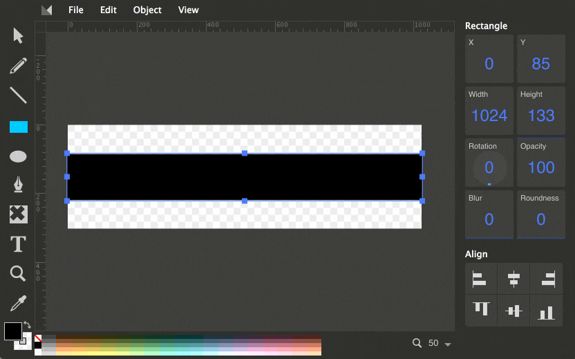
When you’ve created a simple black and white shape, click on ‘View’ -> ‘Source’, and copy the SVG markup to your clipboard.
To bring this mask into our filter, we’ll need to convert it to a ‘data URI’ – basically just an encoded version of our SVG markup that is easy for the browser to use, but looks like complete gobbledygook to us.
Open this Data URI Converter in a new tab, click the ‘Provide text’ option and paste your SVG markup into the text field.
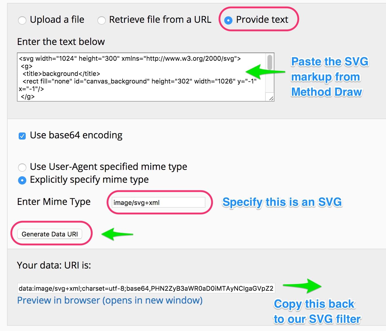
We’ll need to tell the converter we are giving it an SVG, so enter image/svg+xml into the Enter Mime Type field. When you click ‘Generate Data URI’, you get a long string of mostly random-looking characters – that’s our converted mask.
Copy this to your clipboard, switch back to your SVG filter code and paste it into the xlink:href= section of our <feImage> .
So far our filter should look something like this:
<svg xmlns="https://www.w3.org/2000/svg" xmlns:xlink="https://www.w3.org/1999/xlink">
<defs>
          <filter id="blurlayer" width="110%" height="100%">
			<feGaussianBlur  stdDeviation="4" result="blur"/>
				<feImage id="feimage" xlink:href="data:image/svg+xml;charset=utf-8;base64,PHN2ZyB3aWR0aD0iMTAyNCIgaGVpZ2h0PSIzMDAiIHhtbG5zPSJodHRwOi8vd3d3LnczLm9yZy8yMDAwL3N2ZyI+DQogPGc+DQogIDx0aXRsZT5iYWNrZ3JvdW5kPC90aXRsZT4NCiAgPHJlY3QgZmlsbD0ibm9uZSIgaWQ9ImNhbnZhc19iYWNrZ3JvdW5kIiBoZWlnaHQ9IjMwMiIgd2lkdGg9IjEwMjYiIHk9Ii0xIiB4PSItMSIvPg0KIDwvZz4NCg0KIDxnPg0KICA8dGl0bGU+TGF5ZXIgMTwvdGl0bGU+DQogIDxyZWN0IGlkPSJzdmdfMSIgaGVpZ2h0PSIxMzMiIHdpZHRoPSIxMDI0IiB5PSI4NC41IiB4PSIwIiBmaWxsLW9wYWNpdHk9Im51bGwiIHN0cm9rZS1vcGFjaXR5PSJudWxsIiBzdHJva2Utd2lkdGg9IjEuNSIgc3Ryb2tlPSJudWxsIiBmaWxsPSIjMDAwMDAwIi8+DQogPC9nPg0KPC9zdmc+" x="0" y="0"  height="300px" result="mask" />
            ... <!--more to come here -->
          </filter>
        </defs>
</svg>
Ok, are you still with me?
SVG Sandwiches
One of the coolest SVG features is the ability to ‘sandwich together’ multiple effects into a single image treatment. The first thing we need to do is combine our mask and the blur filter into a single entity.It’s a little like plugging different inputs into your TV. We use <feComposite> for this.
<feComposite in2="mask" in="blur" operator="in" result="comp" />As you can see, we’re taking the output from our mask (result="mask") and the output from our blur filter (result="blur") and using (in2="mask") and (in="blur") to combine them. We’re calling the result ‘comp’.
Combining the Filter and the Image Source
Now we just need to tell the filter what to do with this masked blur – which is, of course, to apply it to any image we give it. For this, we can use <feMerge> to merge our masked blur effect with whatever image we give it. Happily, SVG understands the concept of a ‘SourceGraphic’, so we can just tell it merge ‘SourceGraphic’ with ‘comp’.
It looks like this.
<feMerge result="merge">
      <feMergeNode in="SourceGraphic" />
      <feMergeNode in="comp" />
</feMerge>
Our filter is ready. We just have to apply it to an image.
For the demo, I’ve embedded my source graphic – a JPG – in a separate SVG element and applied our filter with filter="url(#blurlayer)"
<image filter="url(#blurlayer)" x="0" y="0" width="100%" height="300px"   xlink:href="https://www.sitepoint.com/themes/ecommerce/wp-content/uploads/sites/4/ecom-banner-2-1_1020x304_acf_cropped-1.jpg"/>
</svg>
Putting the whole thing together, here’s a resulting demo:
See the Pen Masked blur effect SVG – no color change by SitePoint (@SitePoint) on CodePen.
One more thing
As we’ve discovered, SVG filters allow us to layer effects on top of one another. This means we can get even trickier by adjusting the color of the masked area with the <feColormatrix> filter effect.
Adding the following code to the top of our filter code gives us fine-grained red/green/blue channel control over our filter, letting us darken the masked area and increase the text contrast. The default matrix setting places ‘1’ in the places I have ‘0.7’. We’re simply dialling down each of the RGB channels.
<feColorMatrix
    type="matrix"
    values=".7    0   0   0   0
            0    .7   0   0   0
            0    0   .7   0   0
            0    0   0    1   0 " />
I’m not going to explain the full subtleties of feColorMatrix here as Una Kravets has already covered it far more eloquently than I could here.
There’s also a nice push-button tool here shows you how different matrices effect the color of an image. Often playing with a live demo is the fastest way to learn.
And here’s the final demo with the tweaked colors.
See the Pen Masked blur effect that works in Safari by SitePoint (@SitePoint) on CodePen.
Stepping it up
To help keep things easier-to-follow, I deliberately went with the simplest of mask shapes in the demo above – a rectangle. But there’s nothing stopping us from using more interesting mask shapes.
Here’s a more complex geometric mask combined with a more intense color effect.
See the Pen Blur effect with complex mask by SitePoint (@SitePoint) on CodePen.
Final words
This is fun stuff to play with and opens up a lot of visual possibilities in my mind – effects that would have previously been unthinkable outside of image editors like Photoshop. These are design tricks for designers, but you’ll need to get comfortable with code to take advantage of them.
Perhaps the most important concept above is the idea that you can create multiple instances of your ‘SourceGraphic’ and apply different effects and opacities to each one. This could play put as a jitter effect, red-blue 3D hologram effect, shattered glass effects or endless variations. There’s no reason why you couldn’t animate these effects too.
However, it’s also true that browser support is currently wide but – shall we say – a little inconsistent. We’ve obtained usable results in Chrome, Firefox, Safari, and IE10-11, but often, needed to try two or three different approaches to the same problem to get the outcome we wanted. Even now, I can’t explain why Safari lightens the filtered area more than other browsers.
Also be aware that failing filters have a nasty habit of making an image disappear completely, so be thorough with your testing.
Nevertheless, the idea of being able to apply complex yet temporary visual image treatments in the browser – and remove them at a stroke – makes SVG filters a compelling prospect for me.
Frequently Asked Questions (FAQs) about SVG Filters and Masked Blur Effect
What is the purpose of SVG filters in web design?
SVG filters are a powerful tool in web design that allow you to manipulate the appearance of graphics. They can be used to create a variety of effects, such as blurring, lighting, color manipulation, and more. SVG filters are particularly useful because they can be applied to any SVG element, including text and images, and they can be combined to create complex effects. They are also resolution-independent, meaning they maintain their quality regardless of the size of the screen.
How does the feGaussianBlur filter work in SVG?
The feGaussianBlur filter in SVG is used to create a blur effect. It works by averaging the colors of the pixels around a given pixel, which results in a smooth, blurred appearance. The amount of blur can be controlled by adjusting the ‘stdDeviation’ attribute. A higher value will result in a greater blur.
How can I create a masked blur effect using SVG filters?
Creating a masked blur effect using SVG filters involves a few steps. First, you need to define a mask using the ‘mask’ element. This mask will determine which parts of the image will be blurred. Next, you apply the feGaussianBlur filter to the image. Finally, you apply the mask to the image using the ‘mask’ attribute. The result is an image with a selective blur effect.
Can I use SVG filters to create other effects besides blur?
Yes, SVG filters can be used to create a wide range of effects. For example, you can use the feOffset filter to create a drop shadow effect, the feColorMatrix filter to adjust the color of an image, or the feTurbulence and feDisplacementMap filters to create a water ripple effect. The possibilities are virtually endless.
Are SVG filters supported by all browsers?
SVG filters are widely supported by all modern browsers, including Chrome, Firefox, Safari, and Edge. However, older versions of Internet Explorer (IE 9 and below) do not support SVG filters. Therefore, if you need to support these older browsers, you may need to use alternative methods or provide a fallback.
How can I optimize the performance of SVG filters?
SVG filters can be performance-intensive, especially when applied to large images or complex graphics. To optimize performance, try to use the simplest filter that achieves the desired effect, and avoid applying multiple filters to the same element. Also, consider using a lower ‘stdDeviation’ value for the feGaussianBlur filter, as higher values can significantly impact performance.
Can I animate SVG filters?
Yes, SVG filters can be animated using CSS animations or JavaScript. For example, you can animate the ‘stdDeviation’ attribute of the feGaussianBlur filter to create a dynamic blur effect. However, keep in mind that animating SVG filters can be performance-intensive, so use this technique sparingly.
How can I combine multiple SVG filters?
Multiple SVG filters can be combined by listing them in the ‘filter’ attribute of an element. The filters are applied in the order they are listed, so the order can affect the final result. To combine filters, you can use the ‘feComposite’ filter, which allows you to combine two input images using various operations.
Can I use SVG filters on HTML elements?
While SVG filters are primarily designed for use with SVG elements, they can also be applied to HTML elements using CSS. To do this, you need to define the filter in an SVG ‘defs’ element, and then reference it in your CSS using the ‘filter’ property.
How can I learn more about SVG filters?
There are many resources available for learning about SVG filters. The SVG specification provides detailed information about each filter and how they work. Websites like MDN Web Docs, W3Schools, and SitePoint offer tutorials and examples. Additionally, experimenting with SVG filters on your own can be a great way to learn and understand how they work.
 Alex Walker
Alex has been doing cruel and unusual things to CSS since 2001. He is the lead front-end design and dev for SitePoint and one-time SitePoint's Design and UX editor with over 150+ newsletter written. Co-author of The Principles of Beautiful Web Design. Now Alex is involved in the planning, development, production, and marketing of a huge range of printed and online products and references. He has designed over 60+ of SitePoint's book covers.