Twitter Usability Redesign | Version 02 (UX)


Hi Everyone!
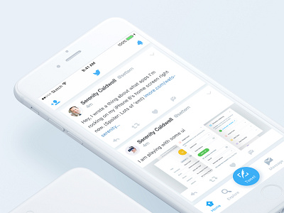
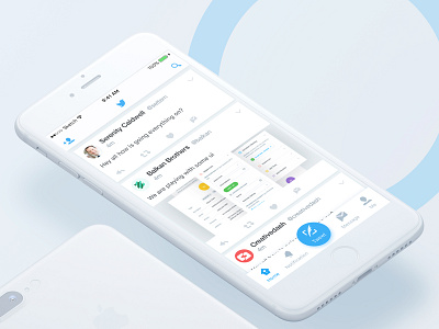
Update - In my Previous shot I worked on tweet button and the goal was to relocate it to an easier location. I decided five buttons on the bottom bar which are Home, Explore, Tweet, Message, and Me. And the notification button was relocated in the top right corner instead of tweet button.
now I think the notification button has to be in an easier location as currently twitter has. Because it is another important thing and users always do tweet and retweet……. so users always check their notification and which is using more than search button. So that I decided to relocate that notification button to bottom bar instead of search button and the search button goes to in the top right corner
Previous shots brief: Currently twitter has the tweet button in the top right corner and I believe it can be improved. Because the Tweet button is out of the thumb’s natural radius zone.... I think it's one of the most core service of twitter, and it has to be in an easier location for users to press due to being in a comfortable location for thumbs.
Please check the previous
VERSION here
Please feel free to share your opinion <3