
Bee There Honey packaging by AIDA PIONEER Branding & Creative
posted by retail design blog on 2017-04-07
Add to collection
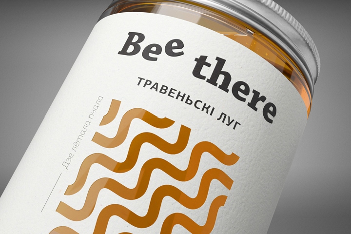

Honeybees are amazing insects. For communication they use a special language – the waggle dance. By dancing a bee shows the direction of the place with the food source to her fellow bees. The movement frequency of the waggle dance contains information about the distance to the nectar.
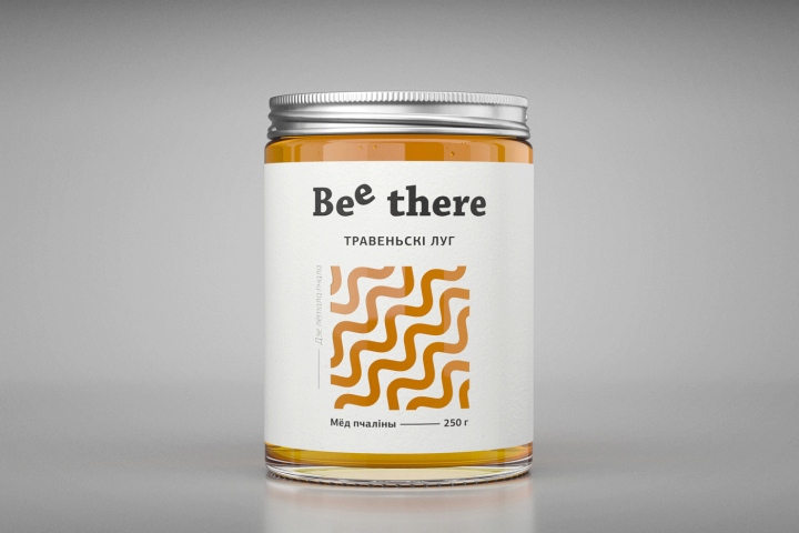
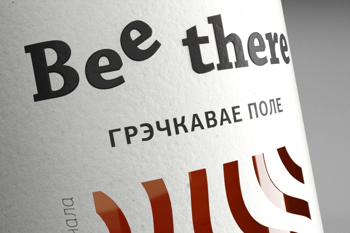
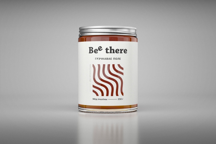
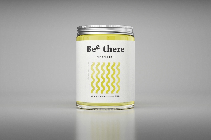
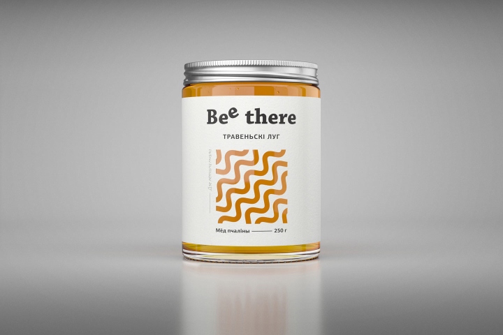
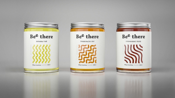
The idea: to convert the honeybee language to the language of design. Inspired by the basic parameters of the waggle dance we used the angle of the lines, their frequency and also the colour of the honey itself to create individual pattern design for the honey “Bee There”.
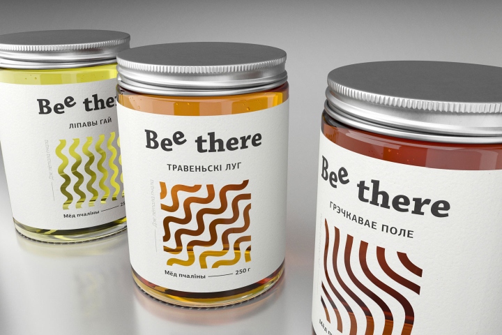
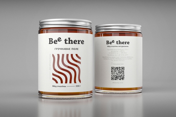
The geometric design of each label reflects the bee’s ways from the beehive to the different places of honey flow — the linden grove, the may meadow and the buckwheat field. As a result we managed to avoid the traditional visual clichés (bees, bee’s cells, drops etc.) and create a nuanced design instrument which we can use to label different kinds of honey.
Particular reference to the specific geographic spot of the honey flow helped to make emphasis on the quality of the honey, which is gathered in the ecologically clean region of the Belarusian national park “Narochansky”. The back of the label contains QR-code with the link. The site of the private beegarden “Medunica” shows the picturesque panorama of the exact place where the honey was collected.
Design: AIDA PIONEER Branding & Creative
http://www.packagingoftheworld.com/2017/03/bee-there-honey.html


Add to collection