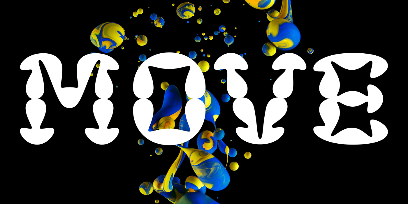
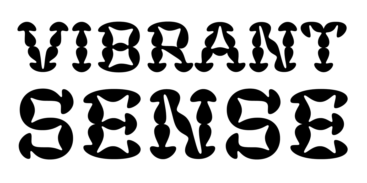
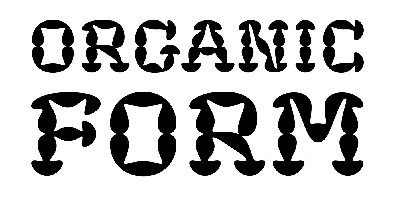
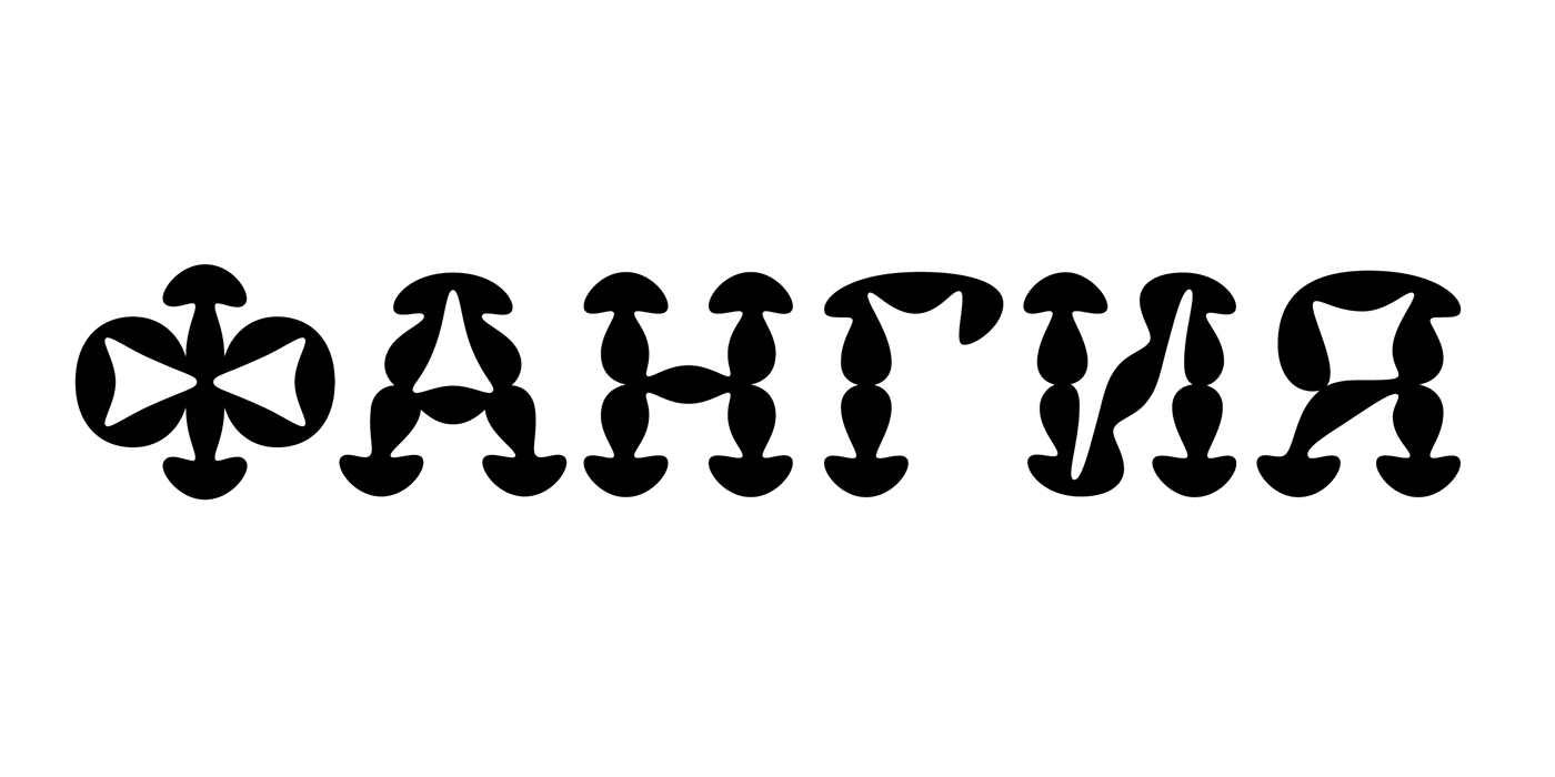
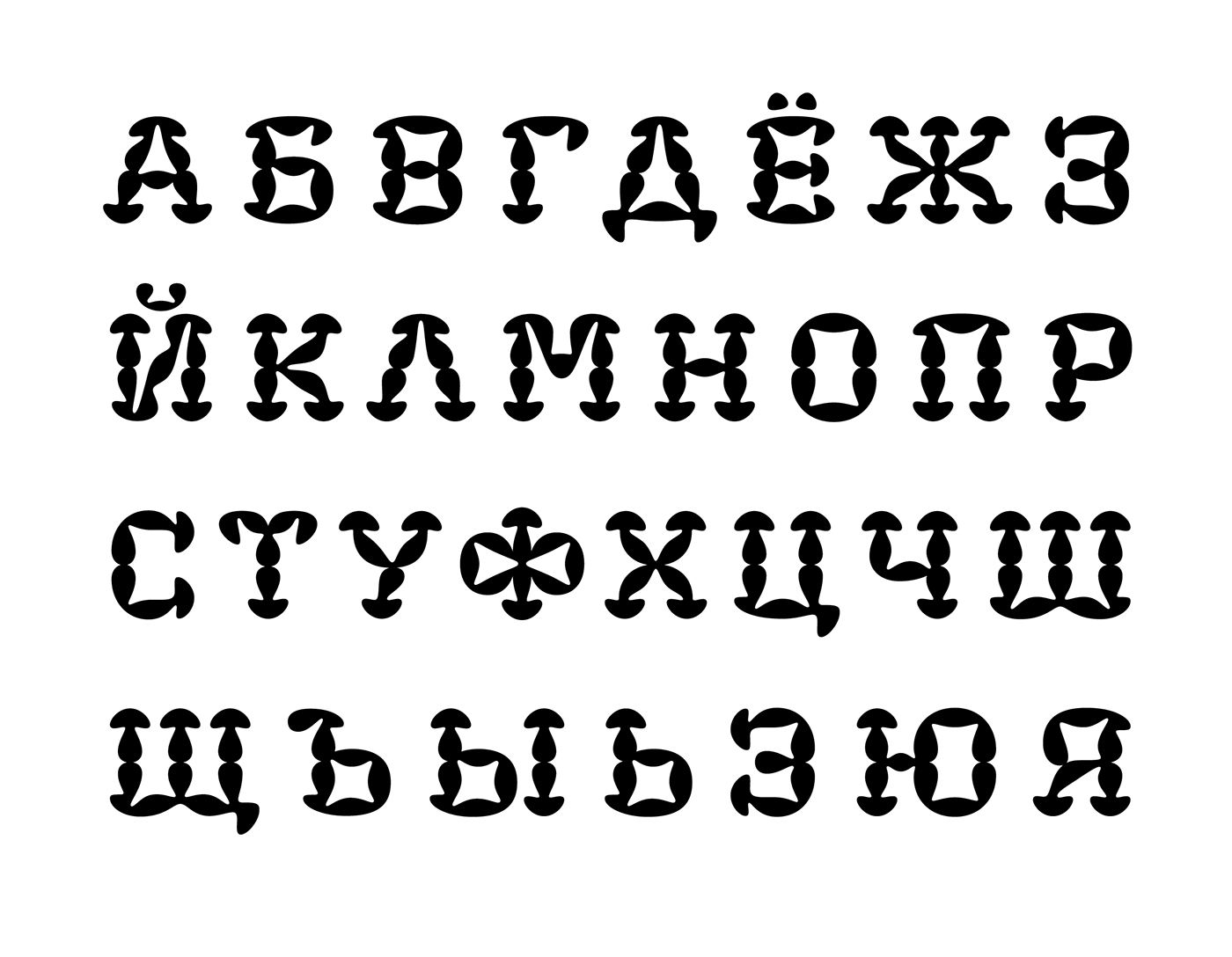
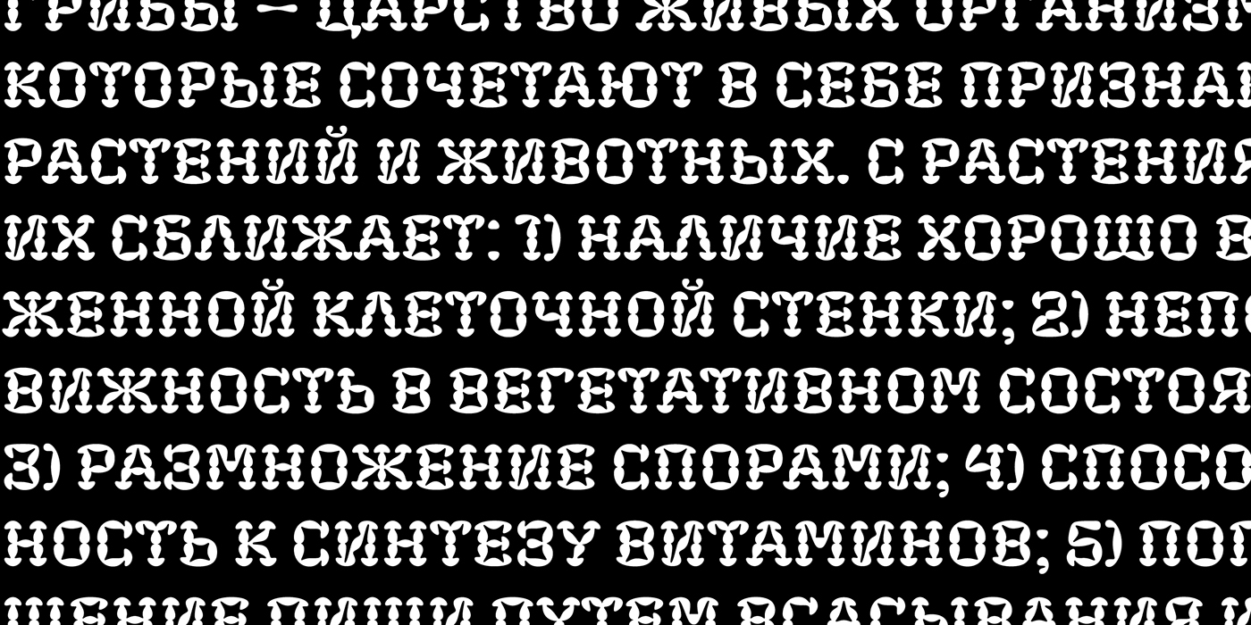
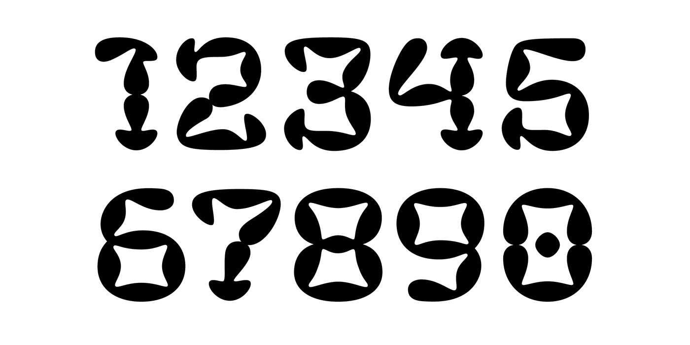
Fungia is the result of an experiment to remelt loose organic forms to a coherent structure of type. The idea arosed as a kind of joke: what letters look like if based on the shape of a mushroom. In a sense the structure of mushroom has some affinity to the structure of a letter: a cap and a stalk remind a serif and a stem respectively. So it was pretty easy to design such straight letters like I, E, L, F. The captivating challenge was to apply the idea on round letters (O, C, D, G), letters with diagonal (N, M, Z) and signs without serifs (digits, @, &). The result exceeded expectations. The typeface turned sophisticated and vibrant but absolutely consistent. It became capital-only font in one weight.
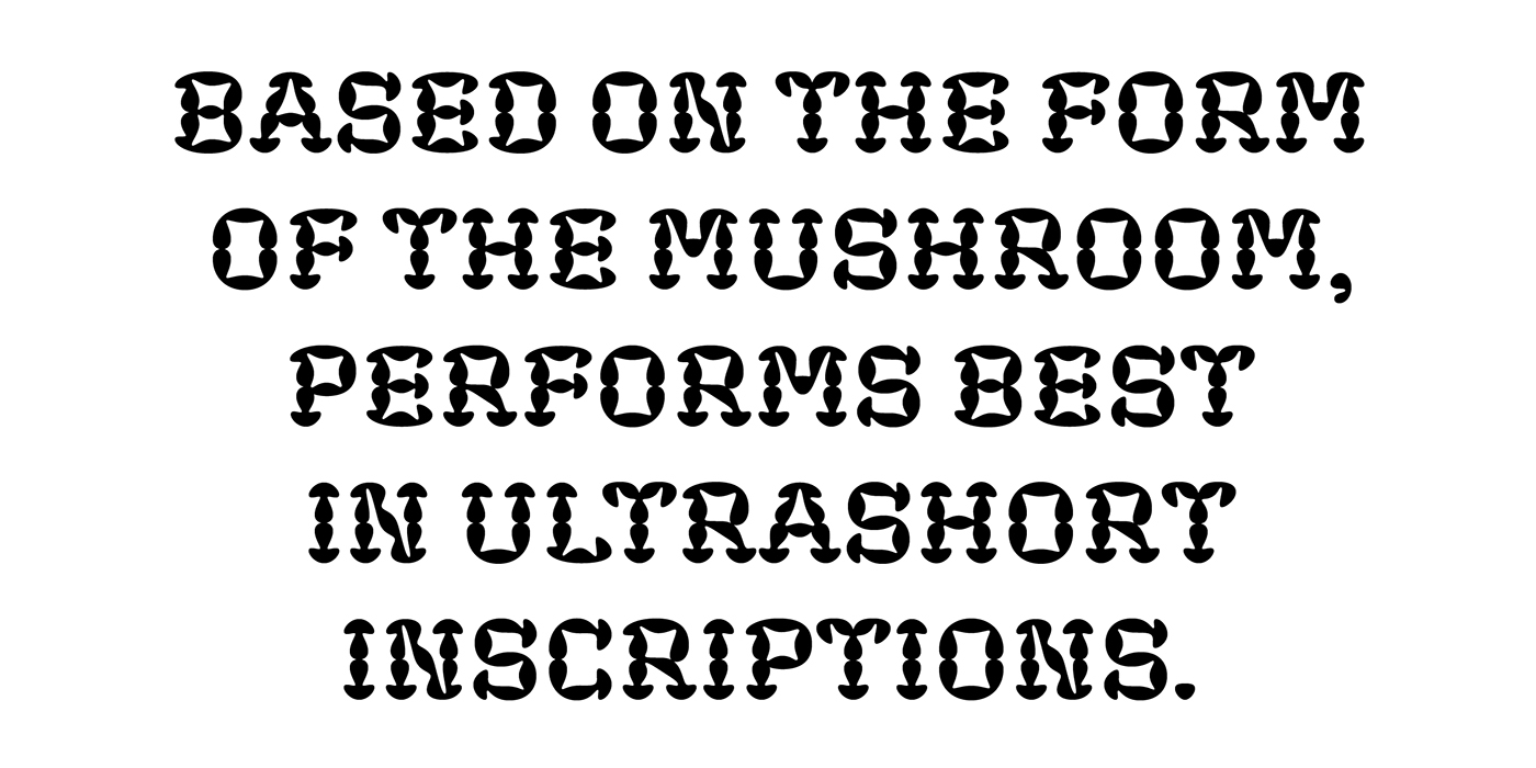
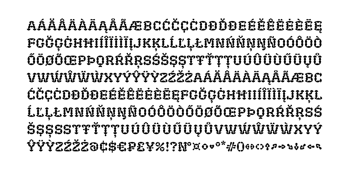
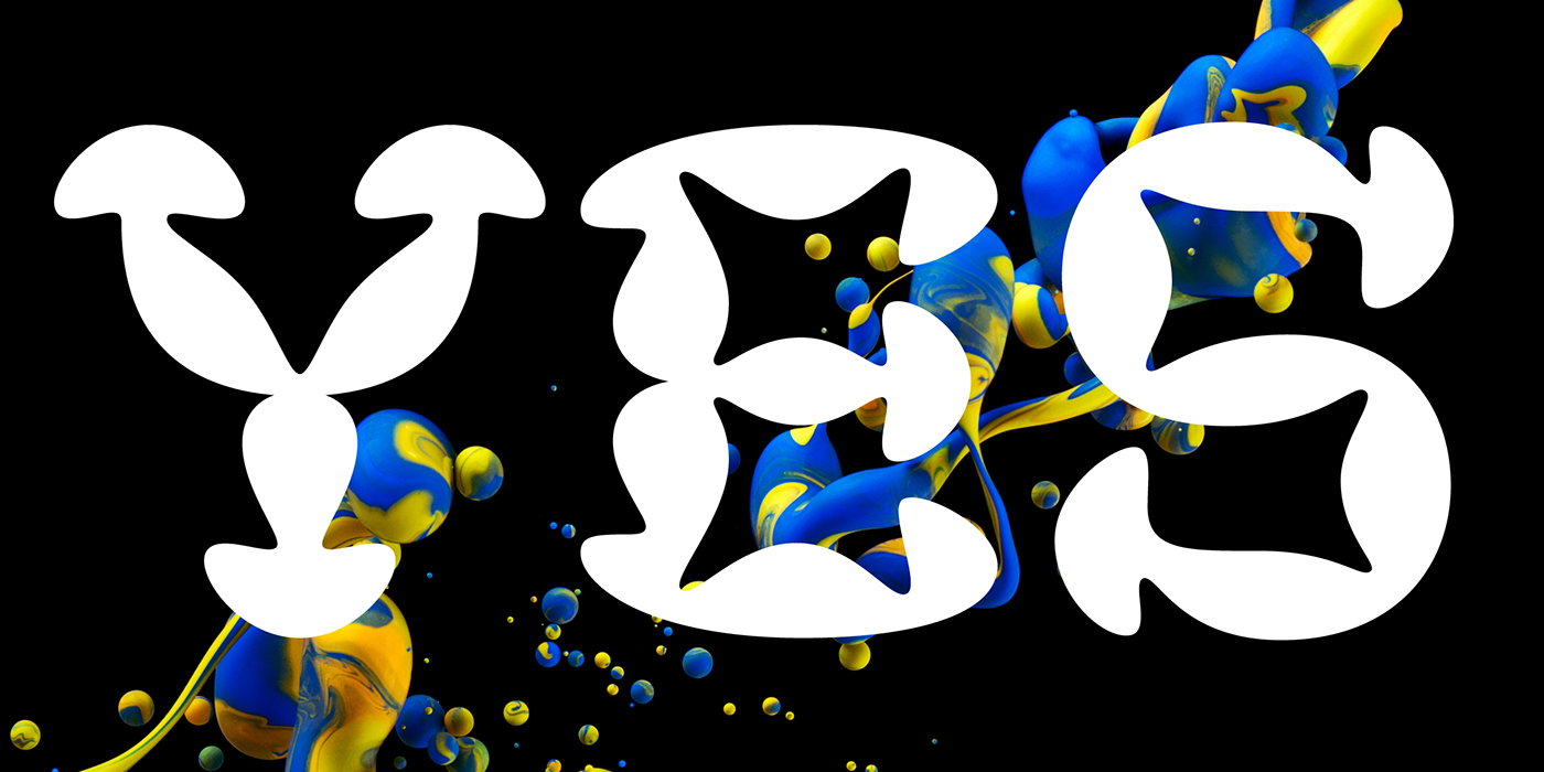
Because of its opulent forms Fungia performs best in large size and short inscriptions. However it provides readability in small size as well. Fungia is more likely thing-in-itself. Initially it wasn't intended to solve specific design challenges. But the alleged scope could include book covers, posters and billboards, street signs, magazin spreads and all situations that demand expressive typography. Fungia supports extended latin and russian cyrillic script systems.