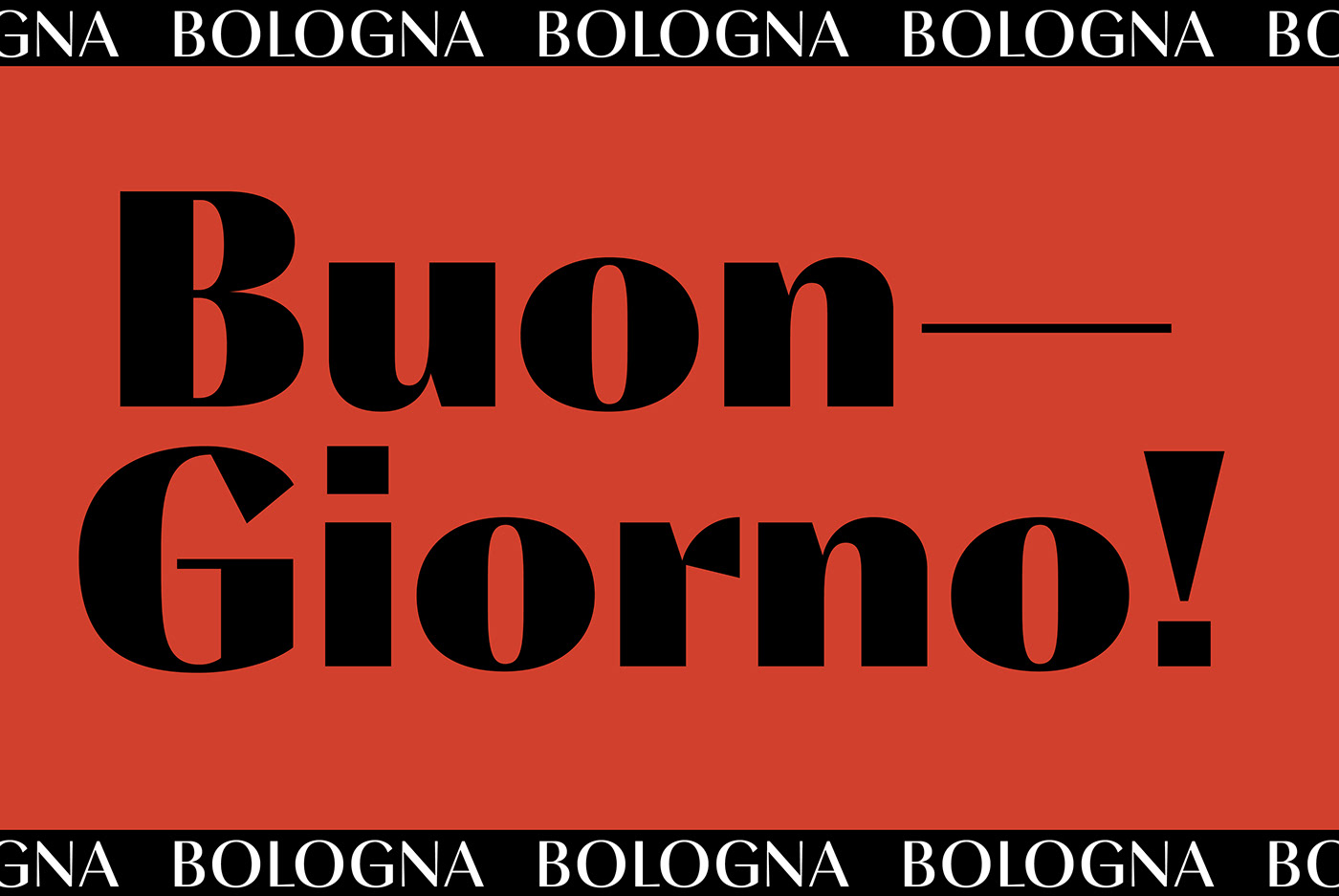


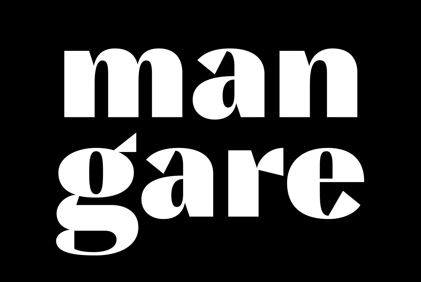

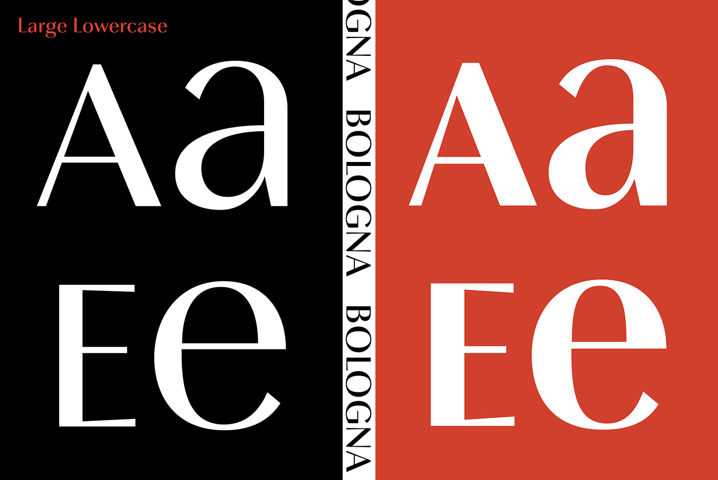

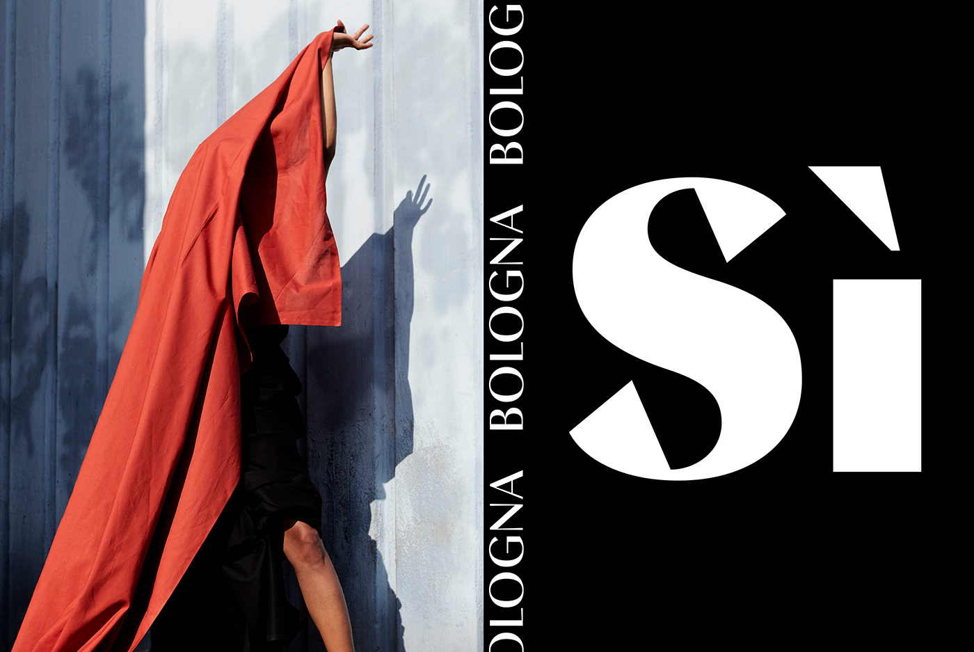

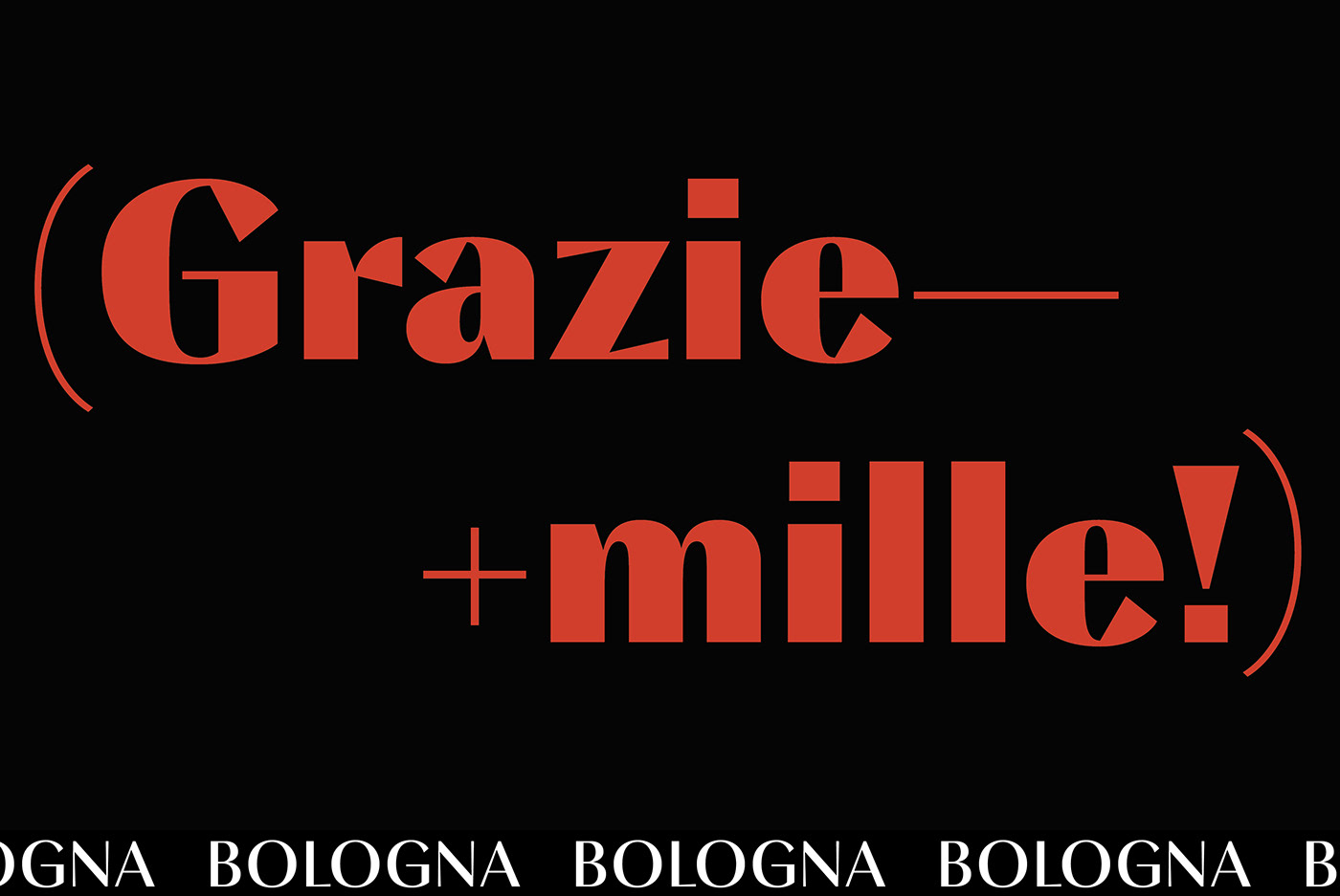
Inspired by pointed pen calligraphy and modulated sans serif typefaces used for advertising in the 1920´s, Bologna is a high contrasted sans serif with a modern and fashionable look.
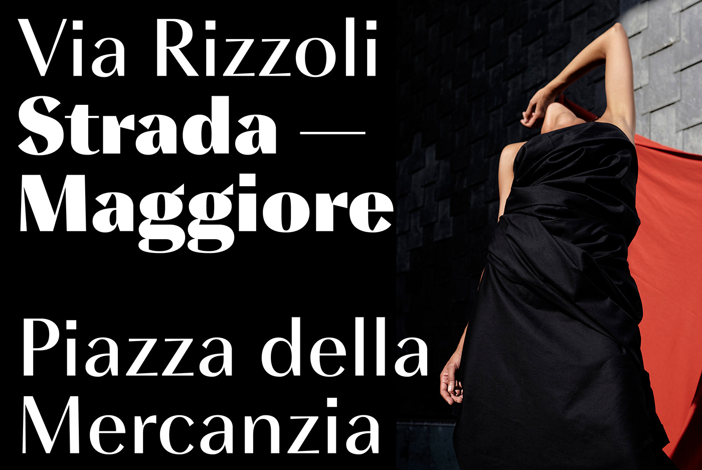
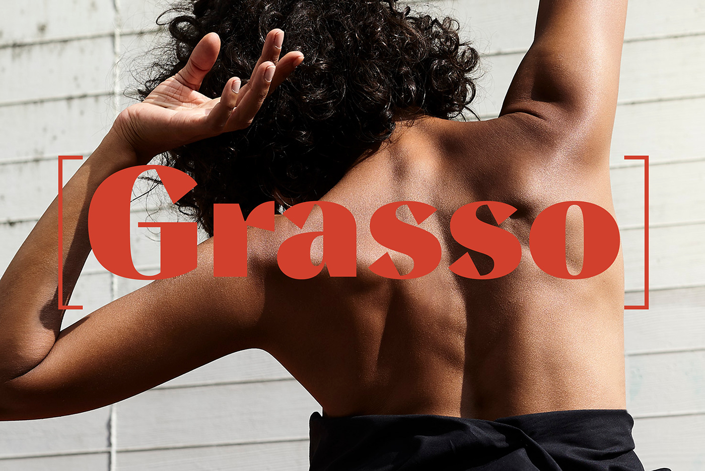
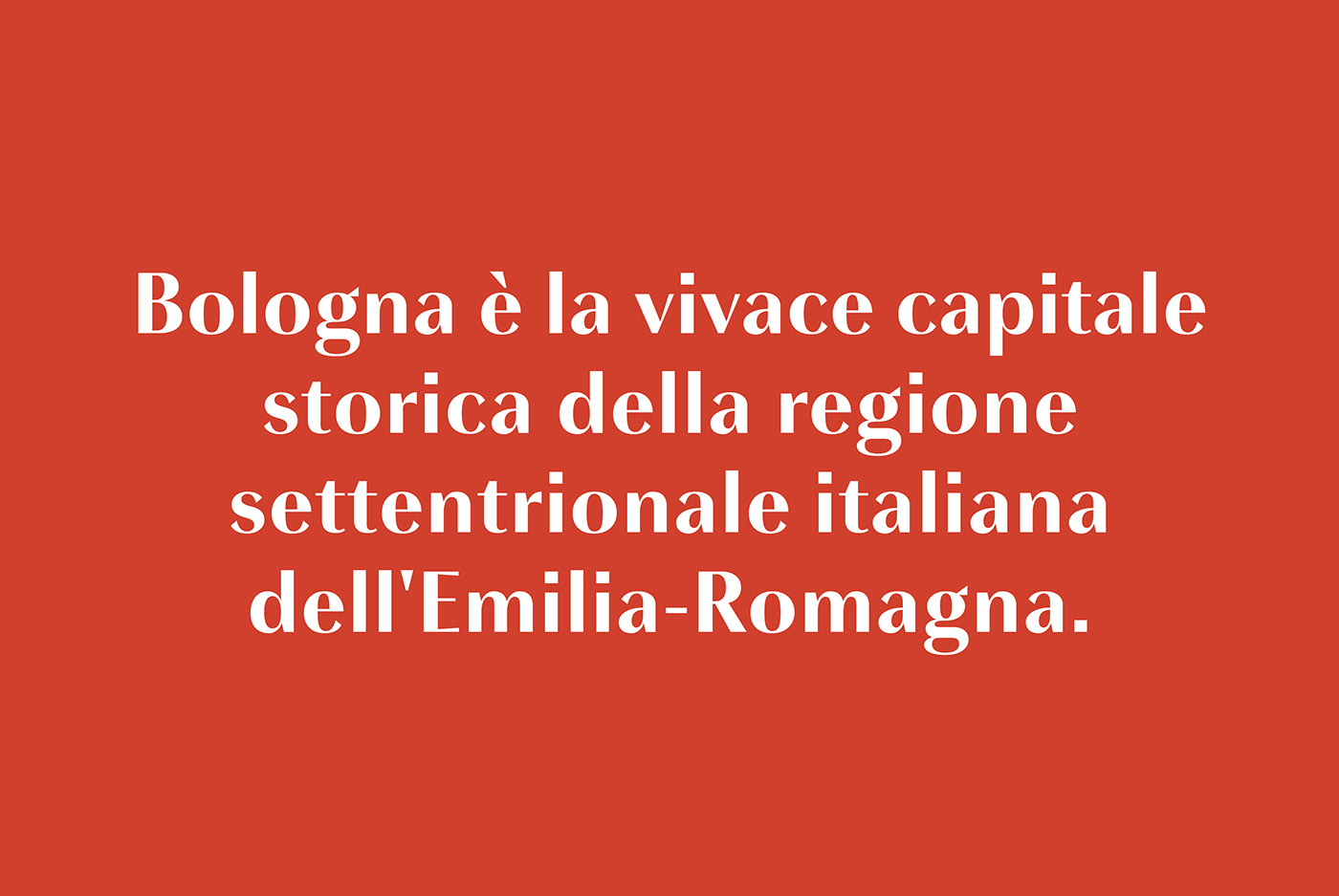
Bologna comes in three weights: Regular, Bold and Black. The Regular and Bold weights are, despite of their high contrast, also build for body texts. Whereas Bologna Black, with a more expressive look and sharp angles, is specially designed for large and striking headlines, packaging or identities.
Available at: https://www.youworkforthem.com/font/T10033/bologna
Overview:
3 weights: Regular, Bold, Black
Regular/Bold: 657 Glyphs
Black: 871 Glyphs
Lining, Tabular and old style figures
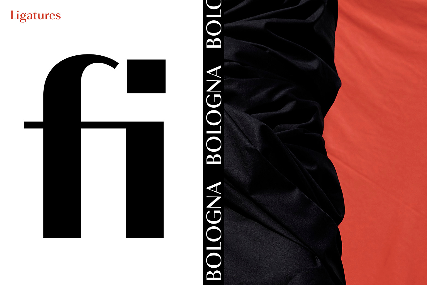
Ligatures: fl, fi, ff, ffi ffl,
Unicase Letters: a, e, m, n, r
alternative Guillemets
case Sensitve
Arrows
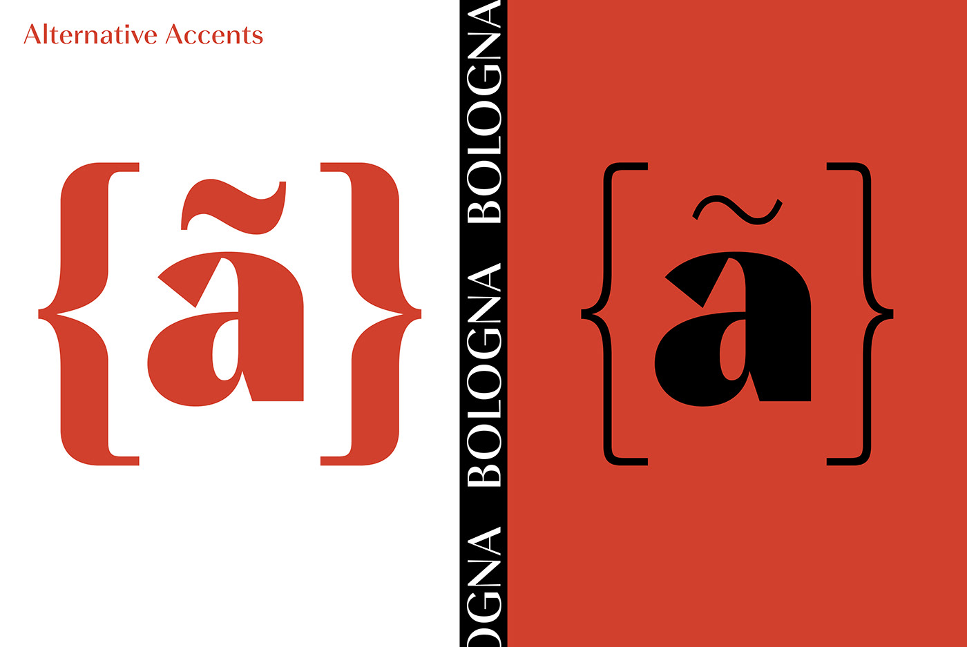
Bologna Black: Hairline Accents and Interpunctations
fractions
Extended language support
Stylistic Sets:
ss01 = Alternative Guillemets / Alternative y
ss02 = Unicase Glyphs
ss03 = Numerals in circle
ss04 = Numerals in black circle
ss05 = Hairline Accents and Interpunctations (Bologna Black)


