

What makes a great logo?
It’s not enough that a logo looks visually pleasing or stands out among the competition; it’s most important that it appeals to potential clients and customers.
But if you’re starting from scratch, it can be difficult to know where to start.
There’s definitely creativity and a basic design knowledge involved in creating a one-of-a-kind logo, but there’s also a system behind it all.

So in my second Ellechat webinar last week, I took attendees behind my screen to walk them through what my logo design process looks like from start to finish.
And I’m sharing the replay with you today!
Whether you’re a business owner who’s building your own brand from the ground up or a brand designers who works with design clients, you’ll greatly benefit from this content.
You can watch the replay by registering through the Crowdcast window below, or keep scrolling and take a look at the webinar slides and transcript.


Lauren Hooker: Hello everyone, and welcome to today’s Ellechat on the ins and outs of creating a one of a kind logo.
We are going to move right into the contents and talk about the ins and outs of creating a one-of-a-kind logo. I've been doing a brand challenge throughout the month of February to try to help you all streamline your brand. We're still towards the beginning of 2017 and I thought it might be helpful to just reevaluate your brand, starting with laying the groundwork of your mission statement, ideal client, brand key words, moving all the way through logo design, choosing colors, and then all the way to icons and patterns as well.
We're on day 14, which is hard to believe, out of 20 days. We just covered logos a couple of days ago, but if you're still struggling with creating a one of a kind logo, a distinct logo, if you're not sure that your logo is 100% there yet, or you just wanna make sure that you're on the right track, this is a good place to be, because I'm gonna talk all about it over these next few minutes. So let's jump right in.
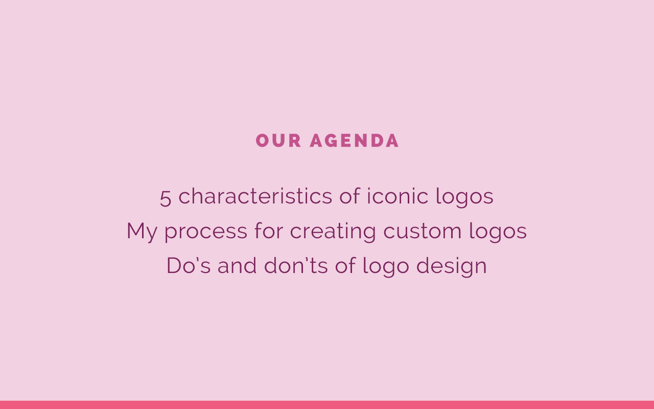
Our agenda, what we're gonna cover first is the five characteristics of iconic logos. What makes a good logo? What should you be aiming for? Second is my own process for creating custom logos. I've worked with 40 plus clients over the last three years, it's been a lot of fun. Logo design is one of my favorite parts of the branding process. So I'm gonna share exactly what I've learned, and any secrets I might have for this process. Then we'll cover some dos and don'ts of logo design as well.
Five Characteristics of an Iconic Logo
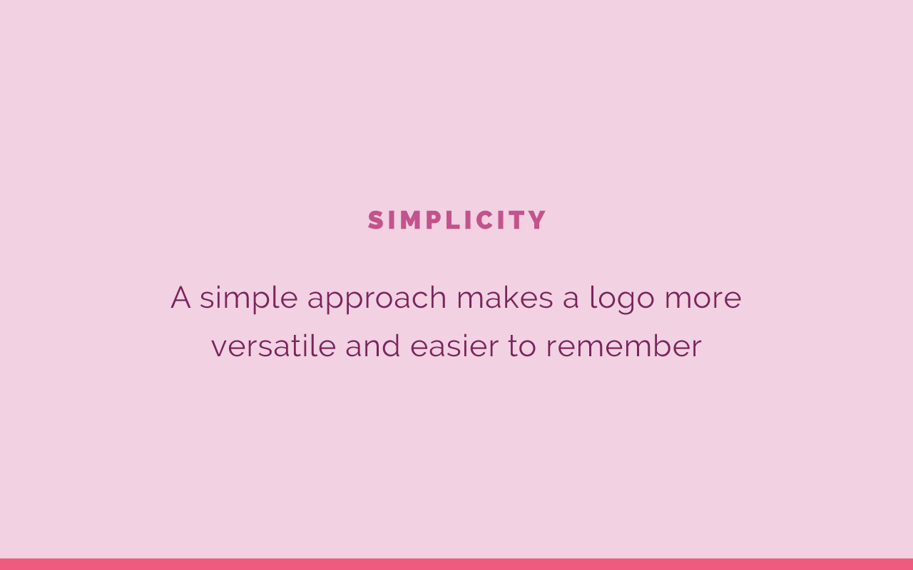
All right. The five characteristics of iconic logos. Number one is simplicity. A simple approach makes a logo more versatile and easier to remember. I remember in college one of my design professors said, "If you are able to draw a logo from memory, it is an iconic logo." So if I asked you to draw the McDonald's logo, you could easily draw those arches. That lends itself to simplicity. If your logo is really detailed and not very simple, it's gonna be hard for someone to draw it, and to remember it actually. The simpler it is, the easier it is to remember. Consider simplicity. Don't go nuts with the details, just choose one detail that will help it stand out, which I'll talk about in a second, and just keep it simple. That "KISS" formula, "Keep it simple stupid." You're not stupid, but keep it simple.
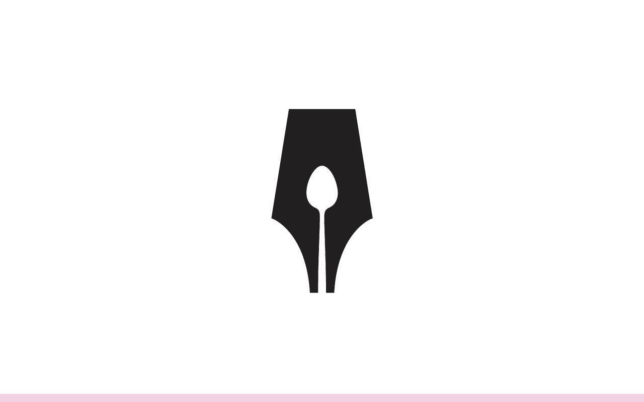
A great example of this that logo for the Food Writer's Guild. If you look at it, it looks like a calligraphy nib, but then you look in the negative space, and it's a little spoon. I just think it is so clever and it's so simple. You think, "Why didn't I think of that already?" That makes a really great logo, this is one of my favorites of all time. I just think it's really clever, and it's a great example of using negative space in a design. Not just thinking about this space right here, the little nib, but also thinking about that negative space. I thought this one was so clever. But keep your logo simple.
Number two is relevance. Your logo should be relevant to your industry and appeal to your ideal audience. For example, these two logos are for two totally different industries. Kate Spade is fashion for women, and ESPN deals with sports and tries to appeal more to men. You can see the styles are two totally different styles. Kate Spade is feminine, classy. ESPN is bold and it's even italicized to show movement as well. Think about that. Does your logo apply to your industry? Would it make sense with what you do? Your logo needs to be relevant.
Number three is to consider tradition. Iconic logos don't just go for a year or two, they last for the duration of the business. They aren't necessarily trendy. This can be hard. It can be hard not to go with the trends when you're creating your logo, but the mark of an iconic logo and a great logo is that it stands the test of time. You think of brands, I think of Pepsi. If you looked at Pepsi's brand 50 years ago, it might look a little different, they've updated it since then, but only small tweaks throughout the years. Same thing with Coca Cola. Nike has been the same for I don't know how long.
So you think of those brands, and the reason that this is important, and the reason it's important not to switch up your logo all the time and rebrand, is because of recognition. You want people to easily recognize your brand, and if you're switching it up all the time, people aren't going to be able to easily recognize your brand. You should only be making small changes if you do choose to update and rebrand. Think about that. Is your logo gonna be applicable for you 10 years from now?
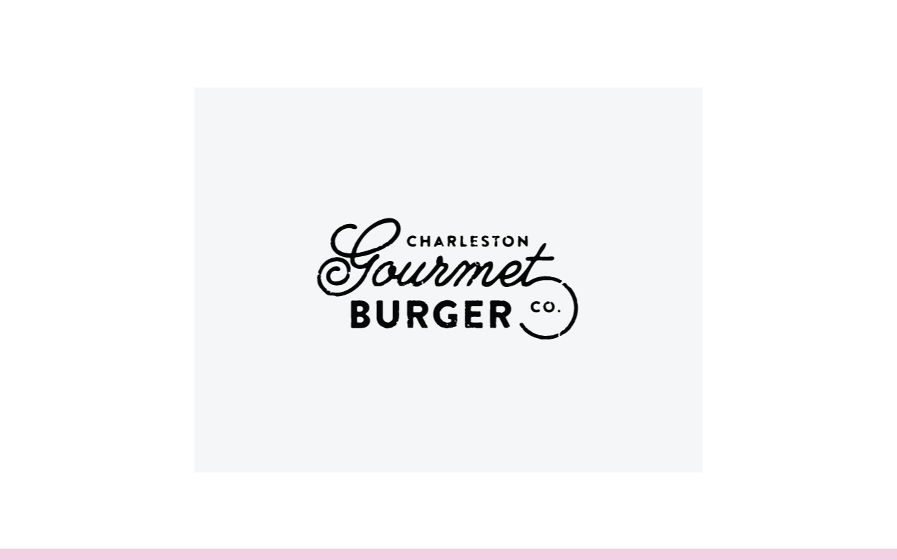
When I was designing the Elle & Company logo, I just tried to choose that simple serif font, with a really pretty ampersand on it. It's just simple, it's classic, I don't see myself switching it up for the next 10 years. This one's good to go. Keep that in mind as you're designing your logo. A great example of this -- I just love this logo so much -- Charleston Gourmet Burger Co. This is a great logo. It's just very classic, it isn't too trendy and it will stick with them for years and years. Keep that in mind.
Number four is distinction. Distinctive logos have one feature that helped them stand out just one. Nike, it's the check. Kate Spade, it was the cute little spade symbol. If you look at the most iconic logos they don't have a ton going on. There's usually one feature that helps them stand out. You do want it to help you stand out. You don't want it to be too plain. One of the great benefits of branding is that it can separate you from others in your industry. Consider that while creating your logo. Just choose one main thing to stick it out, one main feature.
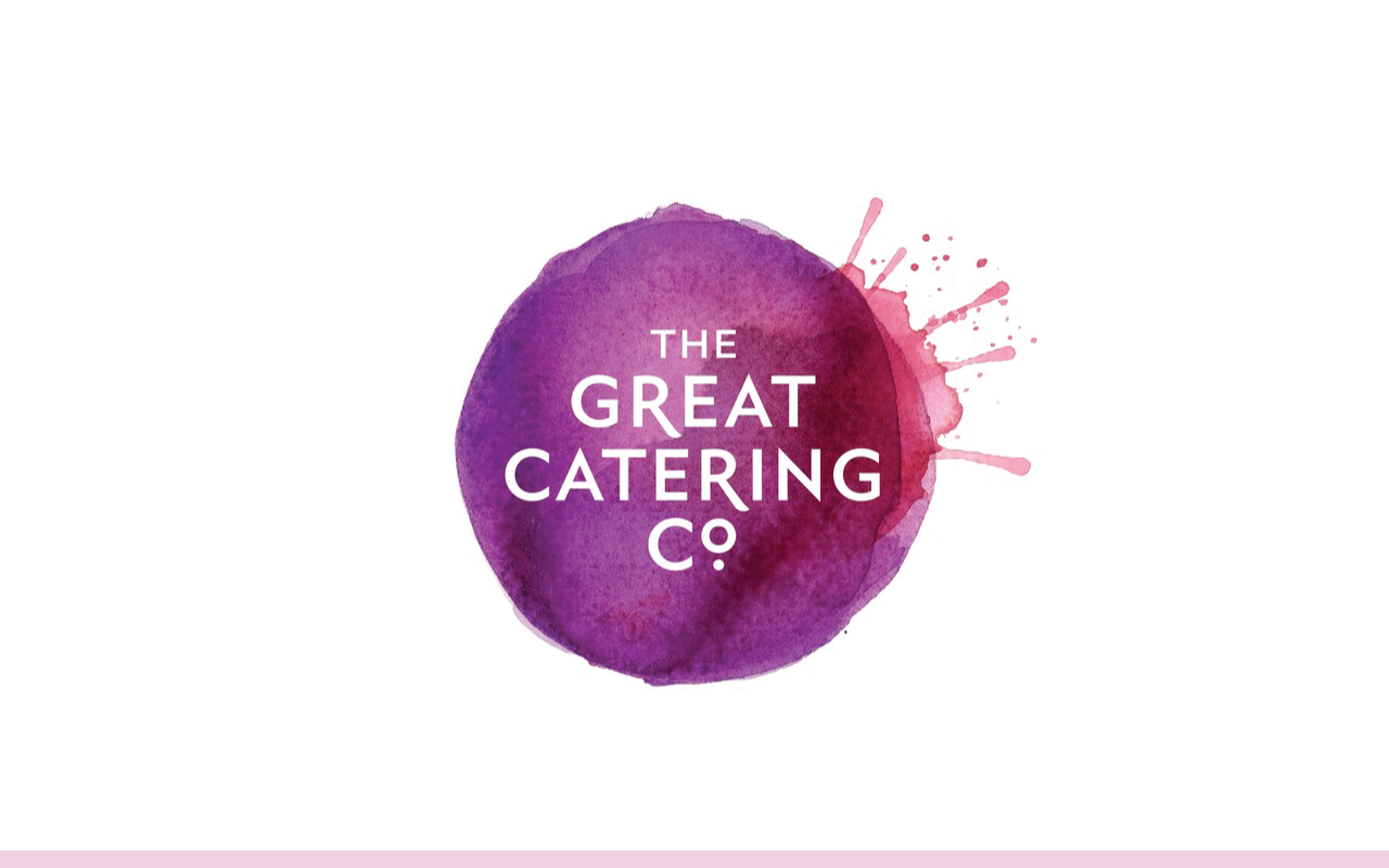
Love this logo, I think it is so fun and so applicable and I wish you could see all the different logo variations because The Great Catering Co. lettering stays the same but they have a different kind of food splatter for each one. But this food splatter, even though the type face is beautiful for the text of their logo, the main feature that they chose to make their logo and their brand distinct are these food splatters. I just think they are so fun. Keep that in mind. What is that one distinct element of your brand that helps it stand out?
You can get really creative, it can be a background image. I did a logo for the Bloom Workshop that uses a B, but instead of filling it in with the color, we filled it in with an image of flowers, which made sense with the Bloom name. Keep that in mind. What's that one distinct feature that's gonna help your logo stand out?
Number five is scalability. We have a rule of thumb as graphic designers, if a logo is sized to an inch or smaller, that's supposed to say, it should maintain all of it's detail. Your logo should look great blown up on a billboard, and it should look great on a pencil. It needs to be scalable. If it's too detailed -- this goes right along with simplicity -- if it's too detailed, it's not gonna scale very well. You're not gonna be able to read it if it's smaller or see all of the logo if it gets smaller.
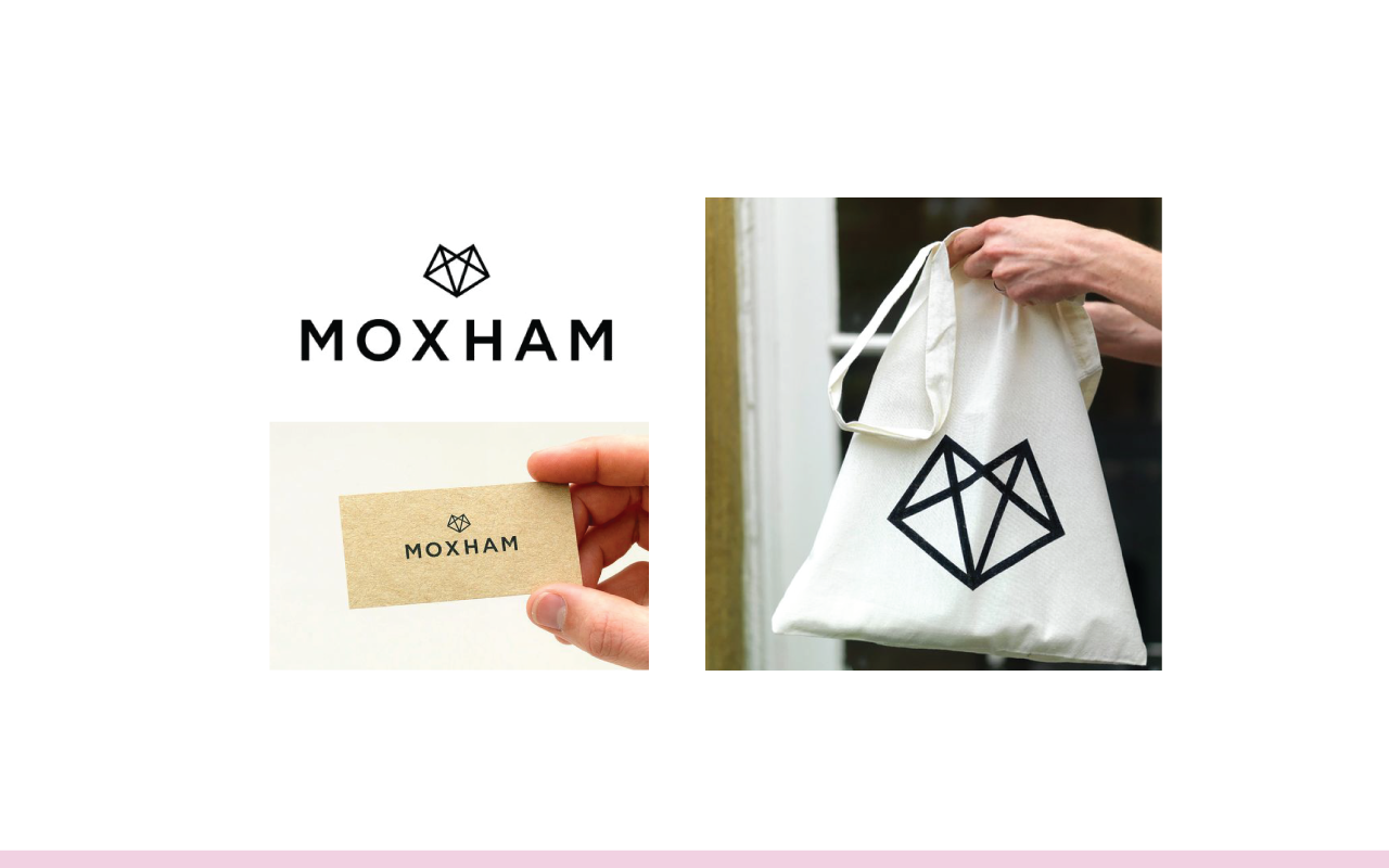
An example of this, I think it's Moxham, is how you say it. It looks like a little fox, but also like a little diamond here. You can see that it looks great blown up on a bag, but it also looks great really small on this business card. Think about that, it needs to be simple enough and scalable enough to be all different sizes.
Those are the five characteristics of an iconic logo to keep in mind as you're designing your logo. But how do you go about designing a logo in the first place? I've got you covered, I'm sharing my process for what it's worth.
My Logo Design Process
Number one is to start with inspiration. This comes in handy. Here's the inspiration board that we started with for my client, Bulos's Photography, and we pulled from the elements of this board to create this logo right here. So start here, start with some visual inspiration. Create a Pinterest board, look for commonalities among the images that you pin to that board, and then you can go for bigger. But have a visual starting point for your brand and for your logo.
Number two is to sketch out ideas for the layout of your logo. Don't skip over sketching. Even if you don't consider yourself to be an artist or a designer, some of the best graphic designers don't have very good motor skills when it comes to drawing on paper. I don't necessarily love sketching, because I'm a perfectionist and I can't get everything just right. But it's helpful just to get your ideas down on paper and to fill up a whole page with ideas. Ideas that you think might be silly or wouldn't work, you might come back to and go, "Oh, that could actually work." Or you could combine it with another idea that you write down. You don't have to be an artist to sketch.
Here's an example of my sketchbook. I just sit there, and I have the inspiration board always at the ready, always by my side. I usually print it out or have it up on my phone or my iPad, and shut down my computer, and I just sit there with my sketchpad and sketch out ideas. I usually work off of the inspiration board to see what shapes are on there.
There was some architecture in Amanda's inspiration board and that's why I pulled this shape right here. We didn't end up using it, but it came in handy when I was just trying to come up with ideas. She had a lot of leaves in her inspiration board, and so you can see I tried to use them at the end of this letter form. Even here in the frame around the A.
This is what the logo ended up looking like. You can see just from these sketches where it came from. I combined the J and the A of this sketch concept. So sketch them out. Use that inspiration board and pull from it. Come up with ideas. This is just a place for you to get your ideas down on paper. Nobody else has to see it. You don't have to snap a photo or share it to Instagram. You can keep it hidden in your sketchbook, but fill up a few pages.
In design school we had to come up with 300 sketches -- it was crazy -- for one logo. Then we would go through and highlight contenders and narrow down to 10 and digitize those concepts in Adobe illustrator, and then we would narrow it down from there. I know other graphic designers who do the same thing on their own. I don't do quite so many now, but I do try to fill up a few pages with concepts instead of going right into Illustrator and trying to design the logo in there. It never works out well.
Number three is to explore and customize fonts. For example, I love to go on myfonts.com, and actually I might show that to you all in a second. Usually on font websites they let you take fonts for a test drive to see what characters will look like in that font.
So I will take the name of the business, or in this case I was branding for an author, and I took her name and I just put it in my fonts and scrolled through the fonts to see what would be some good contenders based on the sketches that I came up with. I landed ... This is actually a font, it isn't hand lettering. I took a screen shot of the font just before purchasing it just to see what it could look in Adobe Illustrator and play around with it.
I took a screenshot, took it into Adobe Illustrator and live traced it to play around with the letters and saw how it could fit. I went in and added these swoops here, and I added these little leaves. But you can go and search for fonts that could work based on the composition of what you've sketched out in your sketchbook. Then play around with it using something like Adobe Illustrator to make it your own, so it's not just a regular font, it's actually distinct and looks more intentional.
"Do I have permission to edit the font?" Sadie asks. Yes. When I just live trace it, that's mainly for my clients to see what it could look like, and if they approve it, then I go and purchase the font if they're gonna use it. A lot of fonts you need to go and check the usage rights, so go in and see can you use this for a brand? How can you use it? A lot of times on font websites they'll have that right there ready to go for you. Even on free websites see the terms of use for your fonts as well. So, yeah. I hope that's helpful. Your welcome, Sadie.
All right. Really, I feel bad even admitting that I take the snapshots, I take a screenshot of the font and do it that way, but I always go back and purchase it. I just want to make I'm not paying hundreds of dollars for a font if I don't need to, if they're not gonna go with it.
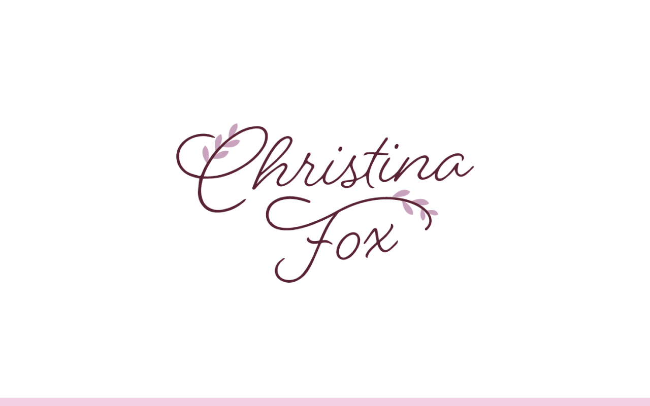
All right. Number four is to add that one-of-a-kind feature. Once you have the fonts in there ... Usually I love, like in Christina's brand, I love off of the fonts in a lot of mine. Even for Amanda Jameson's, adding something to the actual text. But just think about that one-of-a-kind feature that can make it different. So get creative, you may have already sketched out that one-of-a-kind feature.
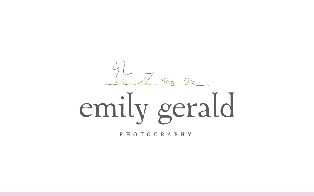
This is one of my client brands. This is actually one of my very first ones when I started my two week design classes. Emily Gerald was my guinea pig. She does babies, bumps, and births photography. So we went off of a storybook theme. She loved Beatrix Potter, and so we choose that storybook text. At first we didn't have the ducks here, it was just the text here. But that was a little bit boring and we wanted it to be more memorable and more distinct.
So I went in, and in Illustrator I drew out these little ducks. She still uses this brand to this day, and I absolutely love it. She's even taken the ducks now and had fabric made for little blankets and she gives it as client gifts and they have the mama duck and the baby ducks on it. It is absolutely precious. But the ducks make her brand distinct. Even if people now, who are familiar with Emily's brand, or just to see the ducks, apart from it saying "Emily Gerald Photography" they would know it was her brand. So that one distinct feature helps set it apart. Think about that as you're designing your logo.
Bridget, you asked if I purchased fonts myself or bill clients? I bill clients. If it's a font that's gonna be extra, usually I try to use free fonts, or fonts that aren't super expensive. But yes, they have to purchase the font, and I'm up front with them about that from the get go. Great question though.
All right. Number five is to experiment with color. I usually recommend, even back here in these drafts before I added the little bit of color in here, I do it all in black and white. The reason for this is because I don't want to color to be a distraction from the overall form and composition of the logo. So I highly recommend to wait until you have designed the logo and gotten the composition right to then go in and add color, because it can be a distraction.
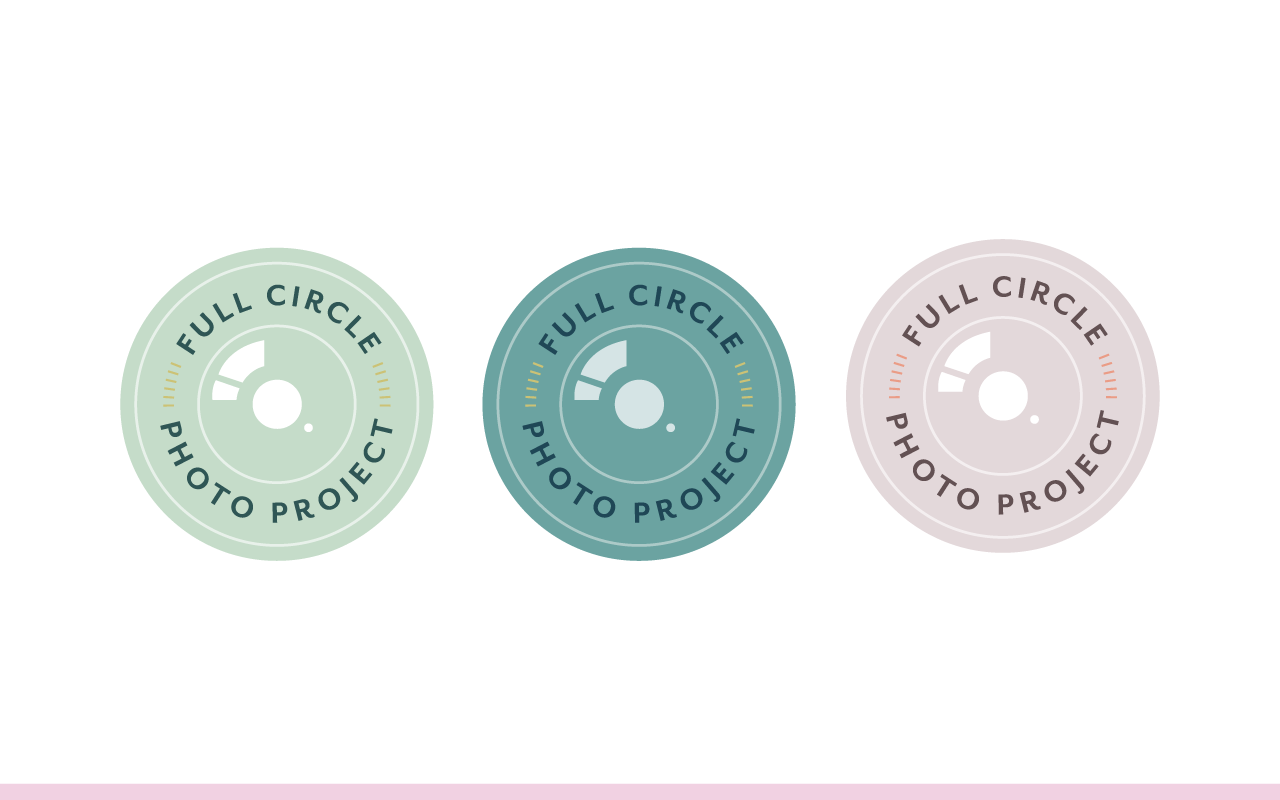
So, you can go in and then come up with some color variations. This was a recent project, it was last fall that I did for a client, Full Circle Photo Project. We came up with it in black and white first. I wish I had put that in these slides. But it was just black and white, all the text, all the little graphics here were white, and then the background was black. Then once she approved it and liked that concept, then I came in with color based on her inspiration board, and came up with different color options. We ended up going with this green option, but opted to use this on other collateral items as well.
Start in black and white first, just focus on the form and the composition and then go in and add color. It's really tempting to just add color straight from the start, but I promise you, you will come up with a better result if you just focus on the composition first.
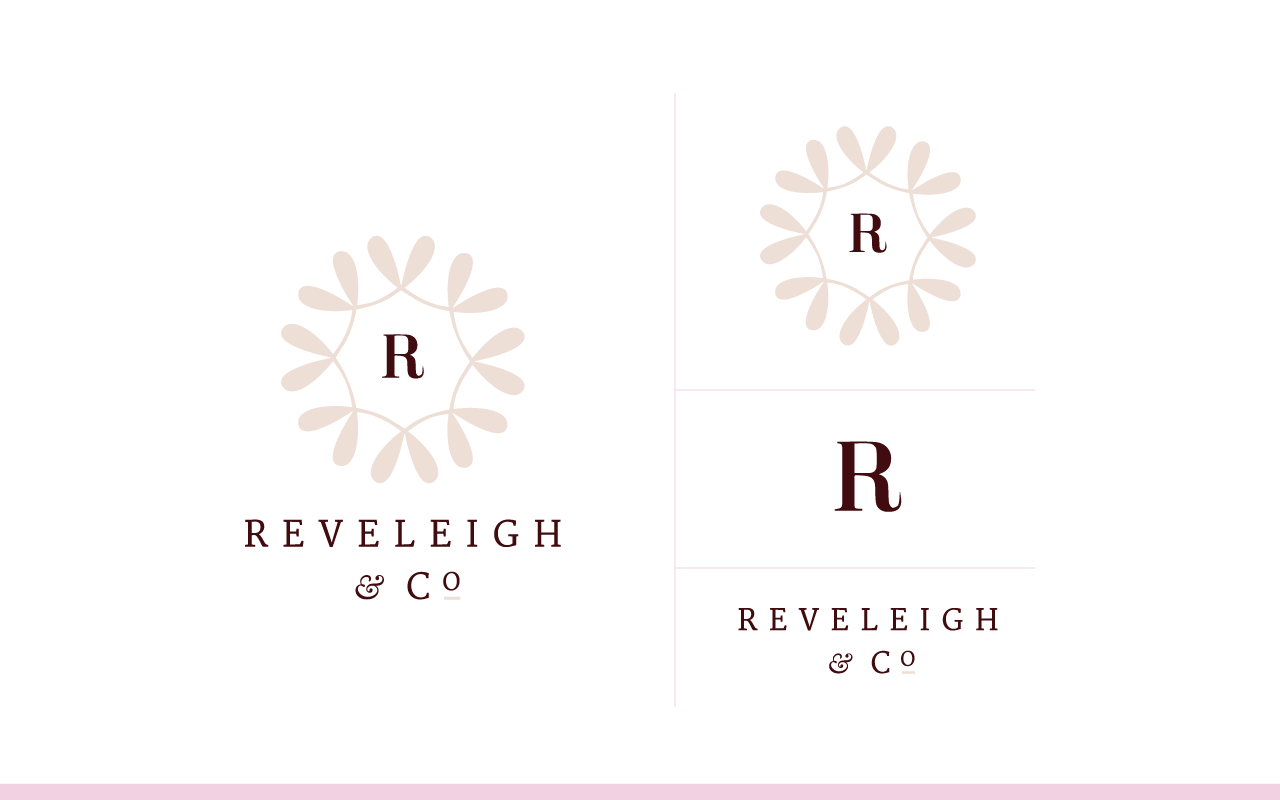
Number six is to consider variations. A lot of times, like with Emily Gerald, this works really well for the top of her website, but when it comes to fitting it into a square and sizing it down like we talked about, scalability. This shape for the logo, the composition doesn't work extremely well, so I usually come up with a secondary logo option. I have an example of this as well. Reveleigh and Co is another one of my clients, and this is her primary logo, but it doesn't ... I mean, it does fit well vertically, and it fits well even within the square, but when it comes to horizontally we needed another option.
So when I'm designing logos a lot of times I'll keep in mind how I can break it apart and reuse to simplify it and create other logo variations. In this one we were able to easily pull it apart and just use this. This fits perfectly in a circle or a square, it works great for a profile image on Instagram or on Facebook, works really well for stickers and packaging items, even for a stamp.
The R works really good for at the top of the screen, if you go to a website and right on the tab is has a logo mark, that's where we put the little R. Then we could break it apart too and just use this text down here instead of using the full logo mark. So that's what I would recommend. Think through logo variations. How can you simplify it so that you have a more versatile brand? You're able to use it in all sorts of ways and all sorts of collateral items, on your website. Consider that.
Natalie, you asked, "How do you present your logo designs to the client?" I do it in stages. First I do the primary logo in black and white. Then I come up with the color versions. Once they approve those, then I do the alternate logo variations. Sometimes I'll do all the logo variations in black and white before adding color. But it's in stages, usually the stages that I've just shared with you.
Number seven is always to revise. Step away from it for a little while, and then come back to it again and see if you can revise it and make it even simpler. Ask other people too, get other opinions on it. I recommend getting it in front of as many people as possible to see what they think, and people who are with your industry, people who have good taste as well. But get it in front of people and get feedback on it, especially people in your ideal client or customer audience, get their feedback on it and see how it resonates with them, because it's really important that your logo appeals to the right people. Going back to that Kate Spade and ESPN example. Always be revising.
Shae, you asked if I present multiple design options or just one logo option. I present three, and I never present a logo option to a client that I don't love. Because I've noticed that if I just put one on there and I'm like, "It's okay, they won't choose it." They choose it every single time. So don't do that. I go with three that I'm really confident with, and I do that because I want their feedback. They know their brand better than I know their brand. They know their ideal client better than I know their ideal client. I always explain my rationale behind the design decisions I made for each logo option and try to educate them, but a lot of times they have some really great feedback during that process.
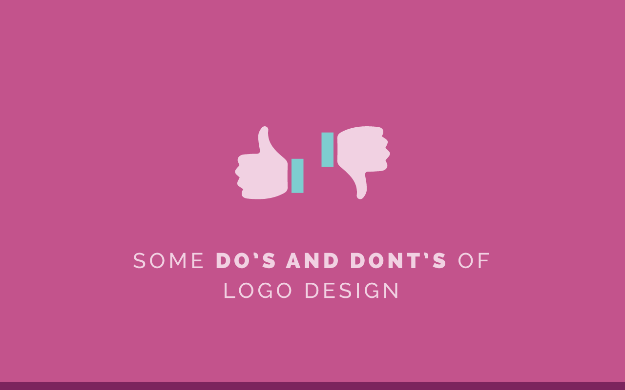
Do's and Don'ts of Logo Design
All right. Some dos and don'ts of logo design before I get to more questions. We'll start with the don'ts, so we can end on a happy note with the dos. Don't switch up your brand every other year or switch up your logo every other year. Again, you want to create consistency, you want to create brand recognition and memorability. If you're always switching it up, you’re not gonna create that recognition with your audience.
It's hard especially as creatives, you want to switch up colors and we get bored with it. But I promise you, you might be bored with it, but other people will not be bored with it. We can also get creative with patterns and icons and that sort of thing, smaller changes, but don't switch up your logo every other year. Make small adjustments to it.
Don't imitate. Don't pin other brands, don't look at other logos when you are trying to create your own logo because even subconsciously it will get in your head and you'll end up copying. I know from experience, it's really hard to shake one of those ideas if I get it in my head. I highly encourage you, don't look around at other logos, hide away with your sketchbook and your inspiration board and just go to town coming up with new concepts. You'll be so thankful you did when you land on a one of a kind result for your logo.
Don't be too literal. I know the Food Writer's Guild, it was writing and food with the spoon, but you don't have to be super, super literal. You can hint at it subtlety with things. Try to get creative. You don't something to be too abstract to where it doesn't make sense, but you also don't have to be super literal.
With Bloom we used the flowers behind the bee for the logo, but I didn't ... That was more from a creative perspective. All I'm saying, I wish I had a better example here and I had some off the top of my head, but you don't have to be super, super literal. Oh, for example, you don't need to have a camera if you're a photographer. You don't have to have a camera in your logo. You can get creative with it.
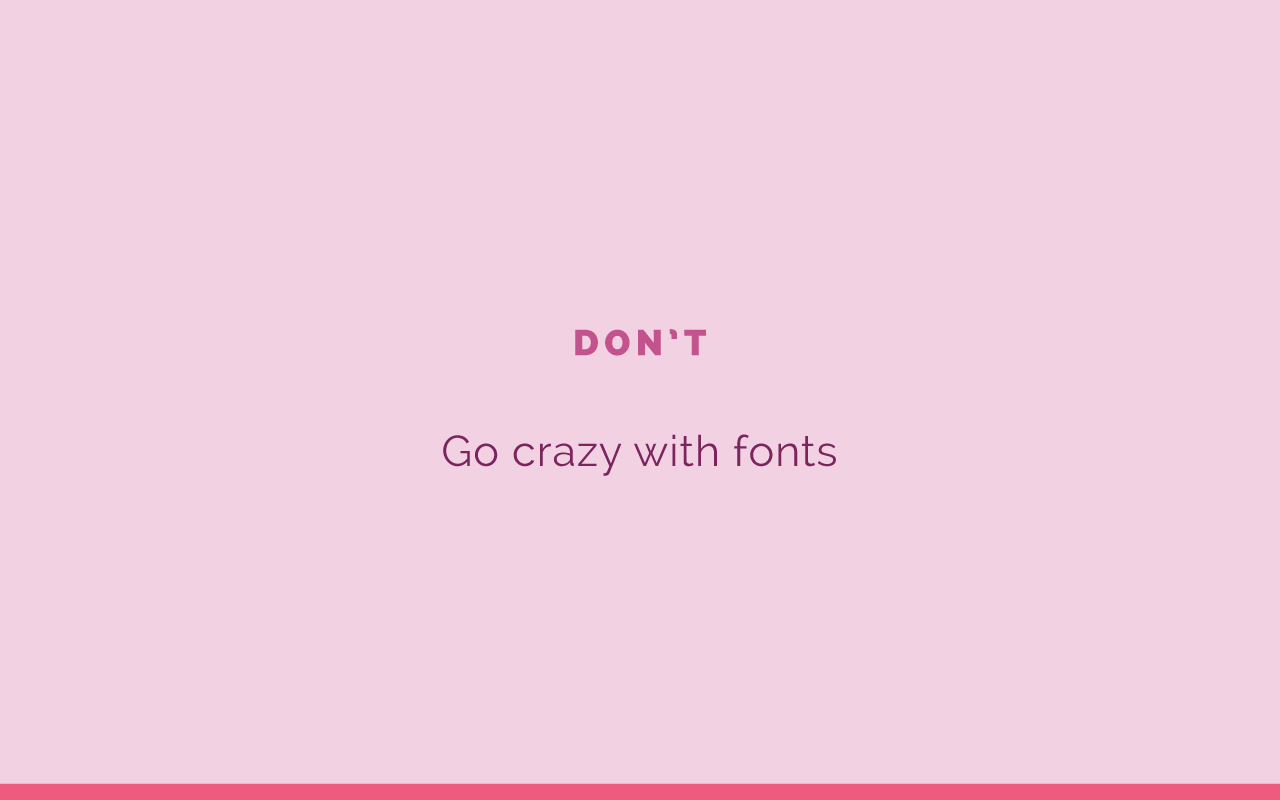
All right. Don't go crazy with fonts. Keep it simple. If you have the hand lettered font or a font that's a little more distinctive, you might want to go with some fonts that aren't so distinctive either in your tag line or across the rest of your brand. But don't go crazy with fonts.
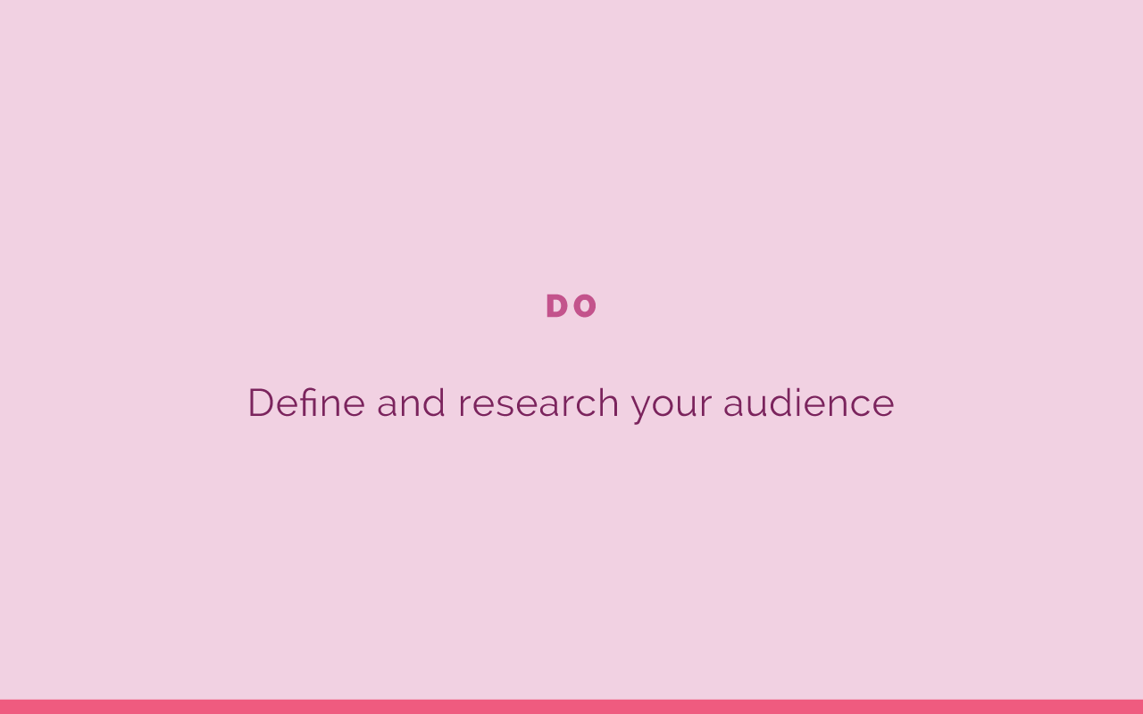
Do define and research your audience. Always keep them in mind as you're designing your logo. You want it to attract the right audience, so you need to know who that audience is. Hopefully if you've been participating in the Brand Challenge you've done that ground work already and that you've had that in line then through every step of the process. But it is an important part of the process. Don't just create a logo based on what you like, create a logo that your ideal audience would like.
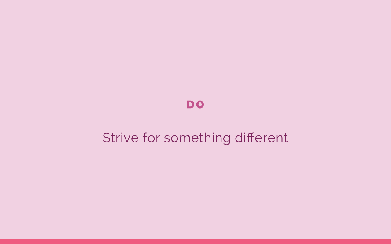
Do strive for something different. Don't just do a hand lettered logo, because everybody else out there is doing a hand lettered logo. Do something a little more clever and creative. Don't be afraid to break the mold. Strive to do something different, maybe that hasn't even been seen before. That would be great too. If you think about the most memorable brands, they're memorable because they're probably different than other people's out there. I encourage you to do something different.
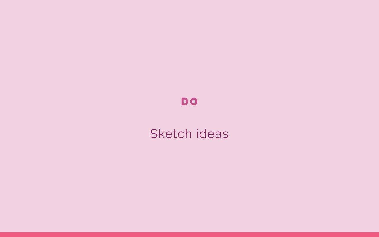
Do sketch out ideas. I can't stress that enough. Don't skip over that part. Again, you don't have to be an artist to do it, but just sit down and just sketch out ideas for your logo.
Do pay attention to spacing, composition, and negative space. I always say that good logos should fit together like a puzzle piece almost. Go back to Christina Fox, let's see, here. You can see it kind of fits together. The F kind of swoops up, it's on a slant. It kind of fits together in that way. That's composition, it should kind of puzzle piece together. This too, even though it's stacked the composition works. The spacing is equal.
You need to think about these things. Spacing between the top of the L and ducks is the same as it is on the bottom of the Y in photography. Consider that. Negative space is just as important as the subject. So consider that. Where was I? Here we are. All right. Do pay attention to spacing, composition, and negative space.
Do get feedback from others. I mentioned this a moment ago. But get others feedback on it, especially those in your ideal audience. The reason for this, is…Has anybody ever seen Jeni's Ice Cream, the logo for that? Let me know if you have in the comments. I'm gonna share my screen with you again so I can share with you this logo. Let me pull up ... Can you all see my screen? Hopefully you can. Jeni's logo.
I'm not gonna say exactly what it looks like because it's a little inappropriate, but had they asked a bunch of people what this looks like, they might realize that it doesn't necessarily look like it says Jeni's, they might use a capital J. I know that's a funny example, but it drives me crazy every time. Every time I think, "Why did they do this? It looks like a terrible word." Just keep that in mind. Maybe if they had asked more people for feedback they would've seen that.
I know for a fact that I am not the only one who has noticed this. Yeah, a little humor there for ya, but make sure that you get feedback. I've also heard stories in design school, there's another hilarious story where the negative space of a logo wasn't very lovely, and so just consider that too. It's always good to get another pair of eyes on your work.
All right. So, I'm gonna answer questions now. If you have any questions feel free to add them to the questions section.
Hannah asks, "Do you have any advice on how to use a hand drawn logo? What are the logistics involved on transferring what's on paper to a usable graphic for your website? I'm an artist and I'd like to show my creative side for my logo." I love that Hannah. I would recommend ... You said that you don't have Photoshop or Illustrator, which does narrow down your options.
If you were a hand letter or creative, Photoshop or Illustrator could really come in handy for you, even if there's a monthly subscription to Adobe Illustrator. Even if you just got for time to do your brand, but I have a feeling you're gonna come across other needs as you create the rest of your brand. It's really, really simple to go into Adobe Illustrator, if you scan in your work, or even take a high-res photo of your logo sketches, you can take it right into Illustrator.
There's tool called Image Trace. Sometimes that's really helpful and you can get a really good result. It'll trace your image in a sense and vectorize it, and you can go in and make tweaks. Or you can go in with the pencil and trace over the lettering and that's really easy to do as well. That's what I would highly recommend doing.
So with logos, like I said, with scalability a logo can be, needs to be really small or it needs to be blown up really large. There are two types of images. If you take a photograph, which is what you would use a lot in Photoshop, you're dealing with what's called a raster image, that's made up of pixels. If you zoom in on that photo or any photo, you're gonna see boxes of color. What can happen is if you try to blow up your logo and it's in a raster image, like a jpeg or png file, it will only blow up so huge before getting really grainy.
If you use Adobe Illustrator to create your logo, and it's a ... Let's start over there. It works with vector images, and vector images are made up of algorithms and mathematical equations. So you can zoom as far as you want into infinity and it's not gonna lose any quality. You can blow it up huge and it's not gonna lose any quality. Which is a big difference between Illustrator and Photoshop.
Long story short, I would highly recommend pulling it into Illustrator and vectorizing it there. Even if it's just for a time you can purchase a monthly subscription to Illustrator and do it there. Or you can hire someone who does know Illustrator and who can vectorize it for you. Great question though.
Jessica asks, "Do you create all of your logo elements, or do you purchase any prints or elements from a place like Creative Market?" I try to create all of my logo elements. A lot of times ... Oh, and you already said a free trial that Adobe offers. That would be super helpful too. Thank you for saying that. Yes, I create all of my logo elements. I try to draw them, and if it's outside of my realm ... I try to also play off of my ... Or utilize my clients creative talents too. So with Bloom, one of the founders of that workshop is also a photographer. So she had a couple of photos of different bouquets and I grabbed those photos and used them actually for the logo.
I don't necessarily recommend pulling from a place like the Creative Market, just because somebody else can purchase those same elements too, and you want to create a distinctive logo. If you find a really great pattern or something like that you want to use on collateral images or collateral files, feel free to do that. But for your logo itself, I would try to create them all from scratch. All right. Great question.
Susannah asks, "What is the best way to go about creating a logo. I tried to make one in Illustrator and gave up when I couldn't figure out how to save it properly, et cetera." I again, am really biased, but I work 99.9, actually 100% of the time with design work, all in Adobe Illustrator. If you know how to use it, it makes it a lot easier to go about saving it and using it for collateral items and all of that stuff. I actually have a class coming up and ... I put the link, a big green button to it. I've taught a course on Adobe Illustrator, it's coming on five times.
Started the course almost, I guess it's been two years ago now. I walk you through how to not only use Adobe Illustrator, but also create a logo and customize a logo, create website buttons, create an inspiration board, create a multi-page PDF document. All of that is covered in the course. I teach you how to save things properly. So is you want to sign up for the waiting list -- any of you tuning in -- I'll be sending out a special offer next week. So be sure to join the waiting list there through that button. But I would highly recommend using Illustrator. There are also a lot of tutorials out there, especially for saving it properly. But that's what I would recommend Susannah.
All right. Jessica said, "How to cover some creative block when trying to create three logo options to present to a client?" Whoo, I know the struggle all too well. It's always the hardest ... The third logo option is always the hardest to create. I would recommend filling up three pages of sketches at the very beginning just to get some good ideas. I also found that my environment plays into how creative I am sometimes. Sometimes I need to hide away in a coffee shop with my favorite drink and just sit there for a little while, turn on my favorite Spotify station or something and just get in the zone.
Sometimes I just have to put a time limit on myself and just push through it. Sometimes if it's down to crunch time I can become a lot more creative too. It might be helpful, Jessica, for you to partner up with some other designers and ask for feedback. I have a couple of friends who I can reach out to and just say, "Hey, look at this. Can you think of any other creative options just to help me?" Or, "Which one is your favorite?" Or just to get some encouragement and support to keep pushing through it is often helpful as well. If you all have any ideas or ways to become more creative too, or beat creative block, feel free to mention it in the comments section.
Cynthia says, "Is it okay to use commercial fonts, or should you hand create your own?" It depends on what kind of look you're going for. Some people want the more hand drawn logos and so you might decide to create your own. My personal style, I tend to use a lot of fonts and so I'm all about that. I just need to check the licensing requirements for the fonts and make sure that I can use them for brands. Some of them won't allow you to do that. I say it's okay to use either. It just depends on what kind of look you're going for and what the style of your brand is.
Teresa asks, "How many different versions of your logo should you have? A vertical and a horizontal option. Should you have type and a logo mark? If you have both a logo mark and a logo type, what are the rules for using them together and separately?" I like to come up with a system. I like to have one option if they're ... Usually I have a horizontal option that works well at the top of websites and saves space at the top of websites too, because everything is so mobile now. Then I like to have one version that fits well in a square. So at least two.
Sometimes you might come up with another logo mark that might be a little bit simpler, just like the Reveleigh and Co example that I shared with you. Then come up with a system for how to use them. If it's in a horizontal space at the top of a workbook, or on the top of your website, then you use that horizontal logo. If you are using it for something really small or your using it for a profile photo or something like that, use that square option. That's how I would go about it, it just depends on what your primary logo looks like and what the format of it is. That's what I would recommend.
Sarah asks, "How long does it take you to design a logo from start to finish?" Whoo, sometimes it depends on the logo I'm trying to create. Including the inspiration board, it can take quite a while. The inspiration board sometimes takes me three hours by the time I find the images, save them, organize them on my art board in Adobe Illustrator. Then sketching can take a few hours as well. Digitizing can take a few hours.
So I would probably say 10 to 15 hours, maybe a little bit more. My whole design process, I have it written out in an Asana board including website design is 52 hours, 55 hours and 20 minutes. But that's not all logo design, it's also collateral design and website design. I'd say 10 to 15 hours. Great question Sarah.
Elizabeth says, "How would you go about designing a logo for your personal website that serves as your portfolio?" I would go about it the exact same way as the steps that I just shared with you. A lot of times when you're starting out a business or a portfolio, just like with me and Elle & Company. I had no idea that it would expand into courses and webinars and any of this. I'm now able to build on my website and it keeps changing and evolving. So you never know what your online portfolio, your personal website can turn into. So I would treat it professionally and go about the same process for designing your logo, Elizabeth.
All right. Last one. Amber says, "I am designing a logo for a brow salon at the moment and I'm struggling with the inspiration part, mainly because I want it to be as original as possible. I don't have any images to work with either. Have you ever had to design a logo with very little inspiration to work with or images to work with, and how did you overcome this?"
Sometimes I also look at imagery. So when you think of brows, I think of the brow shape. Sometimes even apart from the inspiration board, I'll look at icons and things like that to start getting ideas for something along those lines. I would recommend pulling together images, even if you want it to be original, go into Pinterest and pull images. Don't pull other logos or other brands to keep you away from copying, or even subconsciously getting other logos in your head. I would pull those images and start with that inspiration board. I hope that's helpful for you Amber.
One more. I'll do it. Alyssa asks, "What other programs do you utilize most often other than Illustrator?" For design wise, I only use Adobe Illustrator. I could use Adobe Indesign for PDFs and I could use Photoshop for images, but I can honestly say that I don't even have them downloaded on my laptop right now because they were taking up too much space and I didn't use them often enough. Everything that you see, all the graphics you see, everything on my website, literally everything for Elle & Company would be the exception of the photos that I have done, are all through Adobe Illustrator. It goes to show you just how versatile it can be.
If you wanna learn more about it, please feel free to go on that waiting list. Like I said, this course is only offered once a year and registration will open March 7th through March 10th, so feel free to sign up for the waiting list, learn more details. I hope that this Ellechat was really helpful for you today.
Next week I have a dear friend and designer joining me, Melissa Yager, to talk about how to put together a brand style guide. Be sure to go to elleandcompanydesign.com/ellechat to sign up for that, or you can go through my profile on Crowdcast and sign up for it that way as well. It'll be a lot of fun. Thank you all so much for tuning in today and I hope see you in another Ellechat soon. Bye guys.
Does your logo meet all 5 characteristics of an iconic logo? What’s been the most challenging part of the logo design process for you?


