
A First Look At Soofa Data

“Soofa data gives us new insight into how our parks are used which can help us better optimize the services we provide and how we provide them. Over time as we collect more data, we believe that it could also help our organization make better informed decisions about capital improvements and long-term planning and most importantly, help us tell a fuller story of the impact of our parks to our community.”
How Soofa Beta Cities Helped Create Soofa Pro
In May 2016 we launched the Soofa Beta Cities network to deploy Soofa Pro, the sensor-enabled version of the Soofa Bench and the Soofa Core, which measures pedestrian activity in outdoor spaces. The sensor passively listens for WiFi enabled devices within about a 150 foot radius of the bench or core in which it is embedded. With this data we are able to quantify the number of people who walk by, congregate, or come back to the sensor coverage radius.
It was our belief initially that by providing city leaders with a novel data set revealing how places like parks, downtown main streets, public plazas, and trail systems get used by people, city leaders would be able to plan capital improvement projects more effectively and measure their success post implementation, analyze the attendance of events to learn which ones to repeat and which ones to enhance or change, and reduce staffing costs by optimizing maintenance schedules based on how much use different locations actually get.
Now about nine months later our original hypothesis has been validated with the help of a Beta Cities network that includes over a dozen innovative cities and counties across the U.S. Through our collaborative product development process with city agencies like NYC Parks and the Mayor’s Office of Tech+Innovation, Oklahoma City, OK Parks, Sunny Isles Beach Parks and the Mayor’s Office, Doral, FL Parks and IT, county park systems like Prince George’s County, MD Parks, and park districts like the Park District of Oak Park, IL, we have built out a standard data report to analyze pedestrian use of outdoor spaces and have also had an amazing experience watching our clients use our raw data in creative and impactful ways.
Standard Monthly Data Report
Gathering data for the sake of having data doesn’t help solve problems facing cities. In fact, it does quite the opposite as it generally demands more time from staff members to analyze it and figure out what to do with when they are already stretched too thin. Therefore, our goal with the Soofa Monthly Data Report is to provide city leaders with a set of data analysis tools and insights, including the option to export raw data, which are action oriented and outcome driven, and displayed through intuitive, beautiful, and easy to navigate visualizations and graphs.
The report begins with an overview of all the benches and/or cores in a city’s Soofa network, highlighting the pedestrian activity level at each location the units are deployed in and providing a valuable comparison of space use. We call this graph the Activity Overview.

Activity Overview Graph
On the Activity Overview each location (1, 2, and 3) is an individual bench or core with a Soofa Sensor. The number of devices seen per day (the y-axis) is the number of WiFi enabled devices the sensor passively hears over the course of a single day.
This graph reveals many things about the three different locations that one would not be able to see without having an eye on each space all day, every day. For instance, it is clear that although location 2 is the most active location on average, location 3 actually attracts more people en masse through a variety of events both on the weekdays and weekends.
Armed with this easy to understand data visualization, the Parks and Recreation Department in this particular example is now able to correlate the spikes in use at location 3 with events that happened in the park on those days. Additionally, by knowing that location 2 is routinely the most frequented location of all three, the department is able to analyze the maintenance schedules of each space to see if there is an opportunity to alter maintenance hours and number of staff to achieve the desired quality outcome based on actual use. This action will lead to direct cost savings while still providing high quality service to the park goers.
For this example, we will continue to dig deeper into location 3 because of its unique spikes in use. The next way to visualize this location is with our Daily Breakdown Visualization.
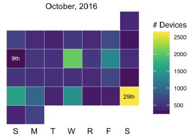
Daily Breakdown Visualization
The Daily Breakdown Visualization illustrates the activity level of each day of the month (October 2016 in this example) for a particular location. Yellow indicates the most activity while dark blue indicates the lowest level of activity seen over the course of the month.

When cross referencing the Daily Breakdown with the Activity Overview one can see each day where there is a spike in use indicated by yellow, green, and light blue on the Daily Breakdown.
For comparison, location 2 is shown to the right. Note that on average there is more activity, however, the total number of people on the busiest day is still far below the total number of people seen on the busiest day at location 3. This data is often used to identify patterns of use between weekends and weekdays and analyze the patterns of activity across many locations. One can also refer to this type of analysis as understanding the “use profile” of a certain park, city street, public plaza, or trail network.
At this point in using the Soofa Monthly Report a city agency now knows how busy different locations are, how each of those locations compare with one another, and how the patterns of use change or remain similar between the weekend and weekdays. The next level of detail available to analyze outdoor space use is the Hourly Activity Level Graph. This visualization lets an agency analyze activity per hour on any given day.
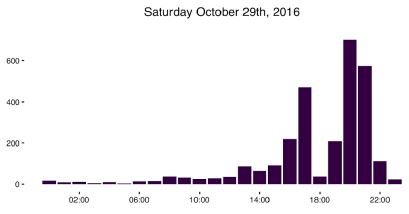
Hourly Activity Level Graph
The Hourly Activity Level Graph above shows the activity per hour in location 3 on October 29th. This day was the busiest day of all of October at not only location 3 but all locations. It is now possible to look at exactly when the park traffic occurred, and for how long people stayed. The graph shows that there were two distinct peaks of activity. When the Parks and Recreation Department went back to look at this day, it noticed that there were community basketball league games taking place. The data shows that the first game happened in the late afternoon while the second happened in the early evening.
With this data the agency not only is able to see the peak traffic times and the number of people in attendance, but also is able to see how fast the event attendance picked up and let out. This data can be used to help plan for things like park cleaning and crowd management in the future.
Having analyzed just a few graphs and space analytics visualizations, the Parks and Recreation department in this example has an unparalleled understanding of how their spaces are getting used. It knows which space is generally the most active, which space sees the most dramatic rise and fall of attendance, when people tend to visit and hang out, and how the overall profiles or space use relate to one another. To be able to look more closely at the average use profile, we have developed the Activity Profile Average Comparison.

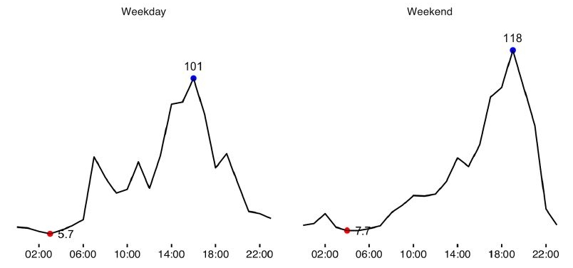
Activity Profile Average Comparison
The graphs to the right are average use profiles for location 3, the basketball court that plays host to many community tournaments. The graphs for the weekday and weekend profile are developed by averaging hourly pedestrian count data for the entire month of October. One can see that this location is much more popular on average in the afternoons and evenings. The context of this park is in a residential neighborhood and close to a school. Many of the events that are organized or take place spontaneously happen after the school day is over or in the late afternoon on the weekend.
For comparison, location 1 is shown below. Location 1 was originally believed to see more walking and biking commuters in the early morning, as shown by the spike on the weekday profile. However, upon further investigation it was found that many people were actually out for early morning exercise routines like walking, jogging, cycling.
By using this data it is now possible for agency leadership to make planning decisions and programming decisions. For example, the agency can ask questions like, “how can we increase use of location 3 during the earlier hours of the day on a weekend as opposed to just the afternoon and evening?” and “can we add an amenity like an outdoor fitness station at or near location 1 because of how many people are already passing by on their morning workout routine?” The data can be used to inform planning and design decisions and then used after the completion of an intervention to see if the outcome that was desired actually happened.
The last component of the Standard Data Report is to analyze pedestrian flow. The Soofa Flow Analysis Map enables city leaders to identify popular routes of travel for pedestrians and see which locations are most popular within a neighborhood or park.
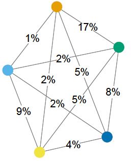
Flow Analysis Map
Each colored location pin depicts a Soofa Bench or Soofa Core with the Soofa Pro sensor embedded. Now, like never before, city leaders, designers, planners, and developers can visualize popular routes of pedestrian travel by foot. The map above is to be read as the percentage of all people who were seen at each different location (as indicated by the colored dot) who were seen at both locations. So, for example, in this location 17% of all people who have passed by the benches at the locations of the orange and green dots were actually seen at both locations. This lets one understand that the connection between these two locations is the strongest of all connections in this particular park.
This type of flow data is incredibly powerful for measuring the success of capital improvement projects in parks or downtown neighborhoods. By gathering reliable baseline data using the Soofa Pro sensor, a city can measure and analyze how a new amenity, park design, public plaza activation, and the like actually impact the pedestrian use of those spaces.
Another way to measure and analyze pedestrian flow is with the Popular Entrances Map.
Popular Entrances Map
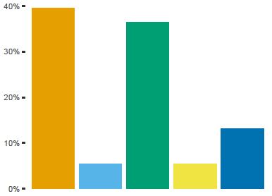
The colored bars represent different benches within a park. The way the Popular Entrances Map is to be read is as follows: for all people who have passed by at least two benches in the park, the graph identifies which bench they passed by first. Applying this logic to the graph it is then clear that the bench identified by the orange bar and the bench identified by the green bar are located at the two most popular entrances of the park.
Raw Data
For cities and agencies who are already very advanced with data collection and analysis, Soofa shares raw data in the form of csv files and an API. Organizations like the Park District of Oak Park currently import Soofa’s raw data into the agency’s dashboard. The data on pedestrian traffic and use patterns in the District’s parks is correlated with weather, marketing activities, and events hosted by the District directly as well as those permitted for the community.
Do you want to be first to deploy Soofa Pro when it officially launches as a product this March? Simply sign up to join our wait list and get in line for exclusive benefits by being first.