
Image 1 - Bites
Initially, I was somewhat stuck for ideas of what to draw to reflect time. After attending the first studio, my eyes were opened… I realized that time is involved in every single moment of our lives, no matter how small or large the task. So starting off small I roughly sketched my apple as I munched away at it in real time.
I used pencil and an art liner in this drawing and explored quick shading techniques.
The image isn’t technically good at all, but the purpose was to capture a moment as quickly as it came and went. In essence, the rough lines are composed to create an easily interpreted image. A more defined technical drawing could be created using different leads pencils or charcoals.
#oneperday
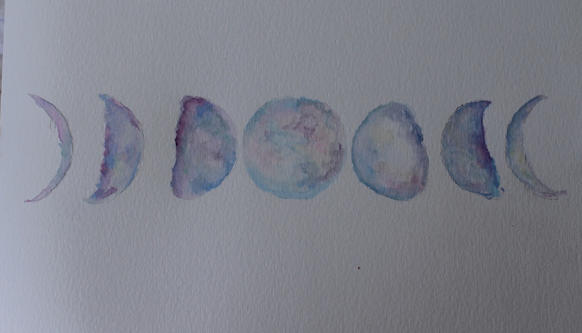
Image 2- Earthshine
This was an alternate take on the homework set for us in week 2. We were suggested to paint/draw/use a traditional art making method to show the life cycle of an object. I used designers gouache to create a psychedelic array of pastel colours to form the crevices and textures of the moon. I think a black background would provide a level of contrast needed to make this art work visually pop.
#oneperday

Image 3 - Clocks on Clocks
This image is an example of my in class work, as a very literal take on the concept of time. Using just a 2b pencil and paper I explored elements of proportions, space and angles to develop an understanding on how to turn everyday items into an object of imagination and perception.
Drawing has always been an issue for me, therefore working on my techniques would be the best way to improve this image. Also exploring further into warping an item to make it almost unrecognizable to its original form would be interesting.
#oneperday
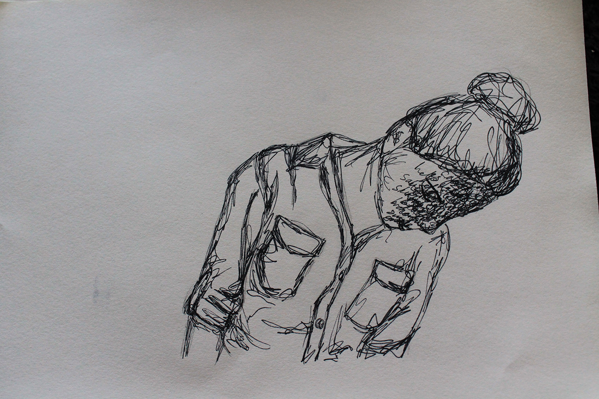
Image 4 - Worded Identity
My last pen and paper drawing is a self-portrait, inspired by the way words can build up over time. Individual words may not always cause hurt, although as time rolls on the words can begin to consume someone.
To show this I wrote un-ordered words over my face, to show the way that they have stolen my identity and in many ways have changed who I am as a personally, emotionally and physically. I used pencil, art liner and a photograph I had taken over myself to draw this picture and let the words flow out of me in a cathartic manner.
In some ways this was a challenging image to create, acknowledging the toll people have taken on me over time. In regards to this personal discovery, I am proud of the image I have created as it is raw and meaning and as blurry as the harsh lines, that have been thrown together to create this. I wouldn’t want to improve or change it.
#oneperday
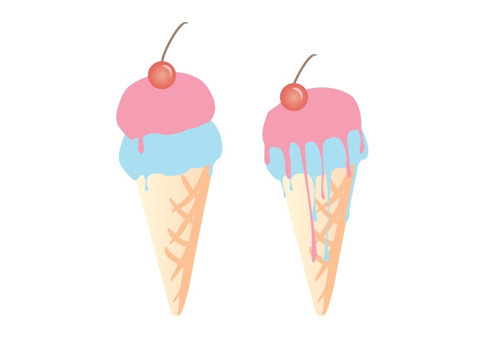
Image 5 - Drips
After watching some of the online Illustrator tutorials and learning about the colour swatch library, I wanted to create an image using the colour groupings to explore how the pre picked colours would improve the aesthetics of my art. After a bit of searching through the colours I came across the file labeled ice-cream and thought, why not. So through free hand on illustrator, I drew out the ice creams and focused primarily on coordinating to colours, making a smooth graphic.
I wasn’t particularly challenged by this image as I have some prior knowledge with illustrator, although I found that the colour libraries were extremely helpful. There is not much I would change about this image, although I would have preferred to find a back ground colour that stood out more, but didn’t clash with any of the colours I had already used in the ice-cream.
#oneperday
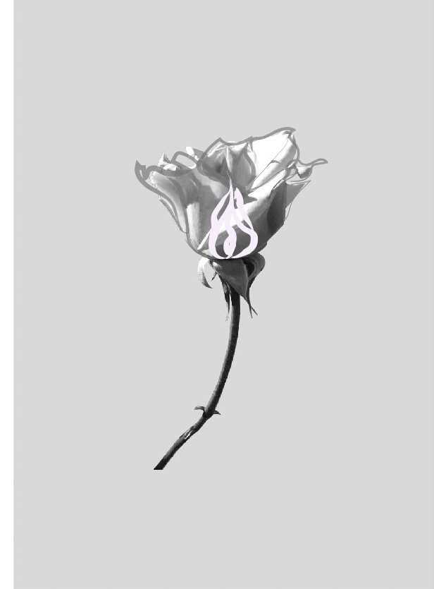
Image 6 - Born and Breathe
This image was inspired by an image I came across of a digitally dissected flower during my research. I found this rose on my walk to uni and snapped it with my iPod camera. After digitally manipulating and layering on the rose in both Illustrator and Lightroom (as my first attempt in this program) I am unsure if this image clearly portrays time, I can see the difference in-between the bud and the rose although after asking around others seemed to miss it, therefore I believe it needs more semiotic value to create a successful image.

Image 7 - Galatic Princess
I took some photographs of one of my model friends and began questioning how to incorporate time into the art work. This lead to layering of clockwork and space and lines over the drawing of the girl. As this was only an initial design sketch not much technique was used although I planned to transfer the image into Illustrator and construct it there, as seen on a later date. I am excited at the result and look forward to creating it into a piece of art although am concerned about having the technical skills to do so in CAD.
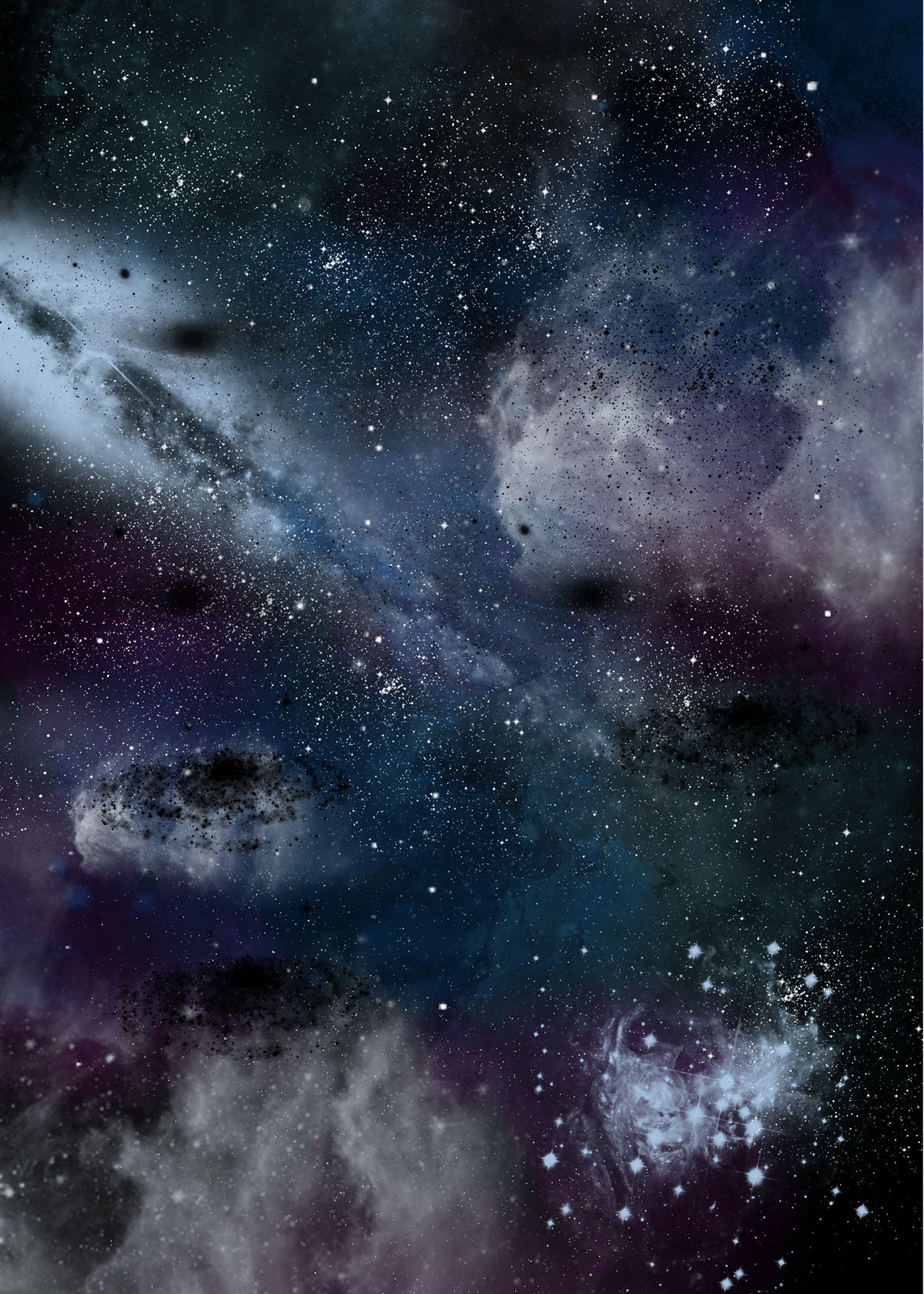
Image 8 - Galatic Princess
This image was created in preparation for the rendering of Image 6. I layered and adjust the opacity, colour and size of a couple downloaded galaxy brush sets in Adobe Photoshop. As my first attempt of Photoshop I know this isn’t a perfectly put together image but it shows what I wanted it to and was a very good learning device.
#oneperday
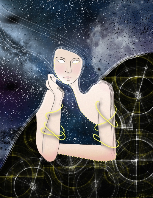
Image 9 - Galatic Princess
The final production day of this image. I took a fair few days to develop this one as it’s a bit more complicated. My inspiration came from a mix of my favourite Sci-Fi television show “Doctor Who” and various images I found during my research period in combination with the need to add element of time which I portrayed as a more physical aspect of the art work rather than a conceptual notion. If anything this work really built on my technical skills in the CAD programs as I strayed from my more regular means of production and discovered more effects.
#oneperday
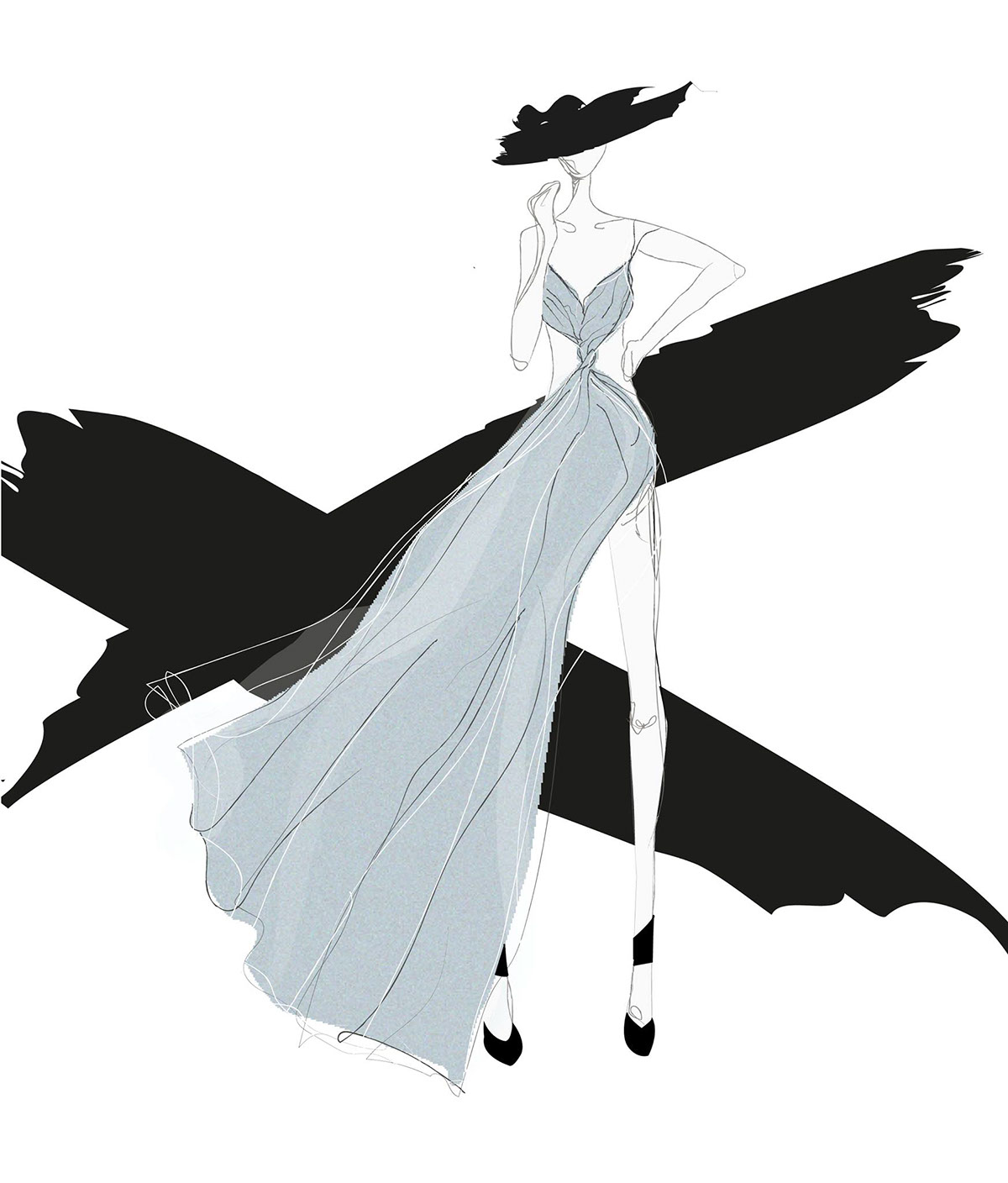
Image 10 - Anti hourglass figure
By this point of the assignment I was feeling very out of touch of my fashion student side and really wanted to create a fashion illustration relating to time. I had an idea to create a dress which drew inspiration from the old fashioned hourglass. I noted the shape of the glass, the stand and the flow of the sand in consideration when designing this garment.
I went through many stages of design on this one. The initial sketch was to place the elements together onto a static model. Once I was happy with the design of the dress I decided on a pose and once again drew by hand the dress and the model, selecting the colours by roughly sketching over with copic markers. This was then scanned and used as a template in illustrator. I used layers to create the flow of the dress. I wanted an overall sketchy, unrealistic and minimal vibe to this artwork which I believe I achieved. An element I have noted is the pixilation in the skirt which occurred when I used the grain technique. I was unsure how to fix this imperfection.
#oneperday
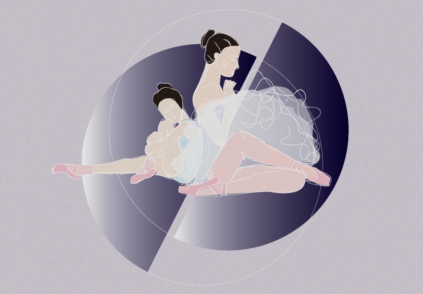
Image 11 - The Dancer
The initial thought I possessed when the theme home and time were announced was ballet. Often throughout my life my studio was closer to my home than my place of residence. I was motivated to set straight to work on this self-portrait. I wanted to create an image containing the young girl who first discovered a passion for dance at the age of five, sitting next to herself fast forward 15 years where she still treats dance cathartic. Therefore in some ways although unintentional the themes crossed over in this work.
I drew a simplified version of the image by hand as I am next to useless at producing images straight in Adobe Illustrator. I later scanned the image in and layered upon it until I was satisfied with the final work. I explored further into textures then I usually would, predominately focusing on the grain tool and how I can contrast this with the smooth/untouched background semi circles.
Overall, I am rather pleased with what I produced, although still unperfected and containing wobbly bits, given the time frame. One problem I did encounter was creating enough contrast within the colours and the white lines.
#oneperday

Image 12 - Cinematic Strings
I was not in search of images for this assignment when I happened to come across this gorgeous texture in an art exhibition at the block. The instalment that this was photographed had film falling slowly into a column over 28 minutes, as the film ran out the tape would rewind and then begin to fall again. I found this process beautiful, the way it created and then re-created brand new patterns every time, conceptualizing the imperfect nature of repetition.
As I was unprepared for this image, I only had my phone camera on me (Xperia Z). This image contains no further digital manipulation. I am rather impressed with the quality of the image my phone took. I later returned to the exhibition with my SLR and could not capture an image which I preferred to this one.
#oneperday

Image 13 - Raceway
I used long exposure to capture time of the flame of my candle. I achieved this through changing the camera settings to manual and the shutter speed to bulb. I then took the photo by holding down the shutter and gliding the camera. Multiple shoots were taken to achieve I photo which I
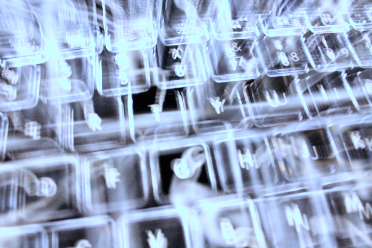
Image 14 - Lettered Lights
I was playing around with my camera trying to grasp the way the settings work, as I am for no means a photographer. The first source I light I could find was right in front of me on my keyboard. I took multiple shoots and observed the way I moved the camera and the speed I did this in dramatically changed the outcome of the photo. I used long exposure which was then edited in Lightroom to shift the white lights to blue.

Image 15 - Burnt Ghost
I was very intrigued by long exposure by this point and felt as if I was beginning to get a better grasp of it. This image is an improvement of image 13. I believe I improved in this image regarding clarity and focus and capturing the flame in beautiful patterns and swirls by moving the camera slower and more fluidly.

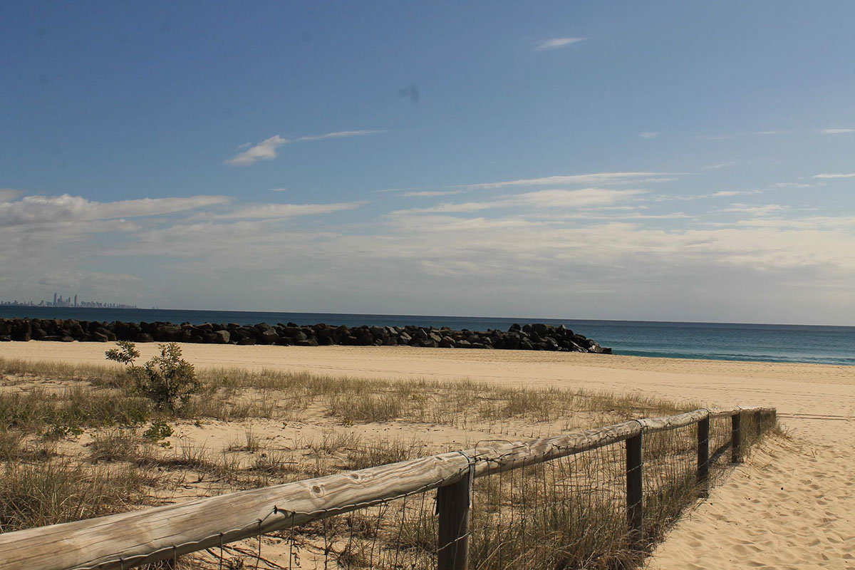
Image 16 & 17 - Coolangatta Kids
This week I used photography to explore the home concept. In response to this theme the first thing I did, was pack my camera, jump on a train and return to the coastal town I grew up in. I, like many other kids in my area, grew up on the beautiful beaches of the far north coast. These were the years I played in the dunes or explored the rocks between nipper sessions. These two images represent my childhood. I used my SLR on automatic setting and only slightly adjusted the images in Lightroom.
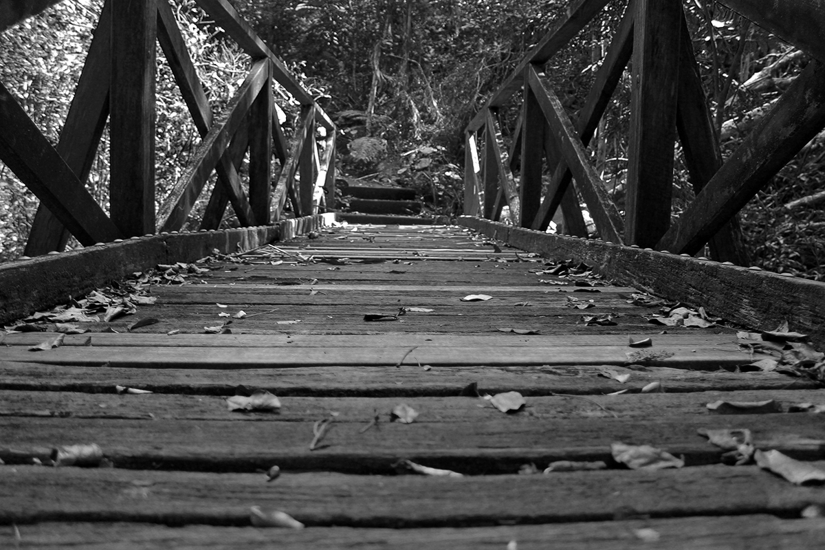
Image 18 - Banora Point Secrets
I explored the effect of angles a lot in this image. Which included getting up close and personal with the bugs and spiders to take a low angled image of the bridge. This is a place I used to go to clear my mind and sort my thoughts out. For this reason I changed the colour scheme to grayscale in Lightroom. To improve on this image, I could have adjusted my cropping whilst taking the picture and explore a little bit more into the camera settings instead of using automatic.

Image 19 - Cosy Ghost
I have 3 bedrooms spread between Brisbane and Northern NSW, sometimes it’s tiring not having one place to belong. Each of my rooms are covered in candles, the glow and fragrance offer me a place of comfort and home no matter where I am. I used long exposure on my SLR and held down the shutter briefly whilst shaking the camera to achieve this photo. Desirably, I would improve on the quality of the image, although that would be difficult considering I shake the image to achieve this affect. However, I do like the ghosty vibe that the blurs ad to this image.
#oneperday

Image 20 - Rocket Blooms
Even though home feels like it’s back where my family is, I have had to accept the city as my new home in the last two years. This image was inspired by the comforts of the botanical gardens after long days of working on business assignments at the Garden’s Point campus. To capture this particular image I had to lay on the ground, angling the camera towards the sky. I want to capture the tall beauty of these flowers. I adjusted the depth of field to clarify the images of the flowers in the foreground and blur the background. I slightly adjusted the levels of this image in photoshop.
#oneperday

Image 21 - Ashley
The next few portraits are of my best friends. Being away from my family I have had to rely on brand new friendships in a new place. They have helped make Brisbane my home. My first of the week’s series of portraits, played around with lighting techniques, I used a harsh frontal flash to accentuate the models features as a whole. This is designed to optimise beauty. The photo then went through photoshop, to manipulate colour and levels and illustrator to add the overlays. Using a tripod would have improved this portrait as I had to stand on my toes, due to the height of my model, therefore it was harder to take the time to properly align my image.
#oneperday

Image 22 - Mykayla
Image 22 is composed of two images I took in the botanical gardens. After observing my camera roll, I knew instantly that I wanted to put these two images together. I had researched a little bit about double exposure photoshop manipulation and after watching several tutorials I decided to give it a go using photoshop. I adjusted the levels and colour of both the images individually and then placed them together by using the portrait as a brush and stamping it onto a layer mask then inverting the image. Theoretically this should have worked differently. Although I was pleased with the results of this image and decided to leave it this way.
#oneperday

Image 23 - Ashley 2.0
After my double exposure fail in the previous image I decided to re-attempt it with the same photograph I used in Image 22. Using a photo from my home town, I re-worked through the techniques outlined in the tutorials. For some reason I managed to successfully create this image. I believe the exposure and contrast affected the success.
#oneperday
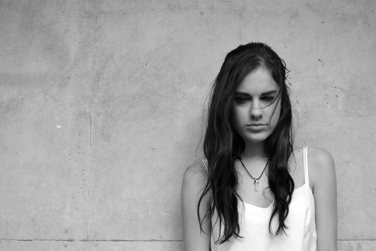
Image 24 - Lauren
I believe identity is an important part in the exploration of this concept. Self-portraiture can in some ways be viewed as vain, but I believe that “selfies” can also capture important emotions and moments of one’s life. Using a tripod and a timer I set my camera up using a friend to stand in place so I could focus and position the camera according to the rule of thirds, I then replaced my friend’s position. In photoshop I adjusted the colours, levels and contrast to create an intense looking aesthetic, and to draw out the emotion evident in a seemingly emotionless face.
#oneperday
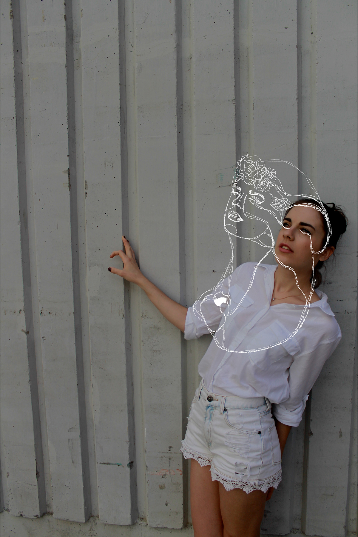
Image 25 - Breathe out
Delving further into self-portraiture I decided to mix mediums- photography and illustrator. Using the previously mentioned techniques to capture and edit the photograph in photoshop, I then transferred the document and traced the features of my face with the pencil tool, adjusting stroke thickness and type. I traced pictures of flowers and the heart on another image and copy pasted them into the document, connecting them with blood lines. To improve on this image I would have retaken the photo on a darker background to highlight the white lines.
#oneperday
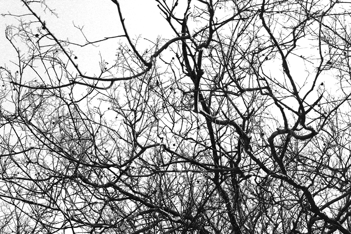
Image 26 - Twiggy
In my exploration of the botanic gardens, I thought more about looking up and exploring a part of the world I am normally too busy to take notice of. After photographing this image I wanted to remove the blue- turned darker grey once black and white filter was added. To achieve this I played around with the scales, removing the cyans and blues out of the image completely. For what I was trying to achieve this photo was a success as it created a highly contrast image.
#oneperday

Image 27 - City Ceiling
Similarly to Image 26, I was exploring the city by looking up and finding textures that I had never seen before, despite walking under this pattern almost every day. I was intrigued by parts of my home that I would never usually see. I slightly adjusted the contrast, in photoshop, to accentuate the pattern.
#oneperday

Image 28 - Florals
In studio today we explored pattern making. Whilst in class I researched some tutorials on how to transform shapes into different, more intricate shapes by adjusting the effects for example the bulge and pucker tool. Instead of creating my pattern in photoshop, I used illustrator by creating my images, copying it and pasting it into the “make pattern” window. I played around with the layouts and size until I was satisfied with the look.
#oneperday
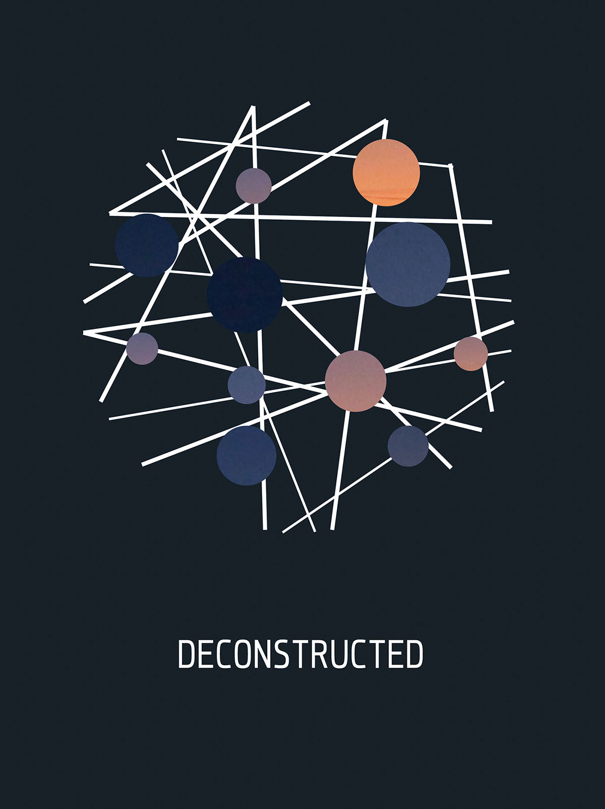
Image 29 - Colours of the reimagined sky
This image happened almost by mistake. I was playing around with my camera and shot a picture of the sunset from my bedroom window. With the other houses in the foreground looking displaced and messy I decided to deconstruct the image by creating several clipping masks on illustrator and complying the lines and colours around and underneath it. This resulted in an image of isolated colours of each phase of the sky as the sun disappeared.
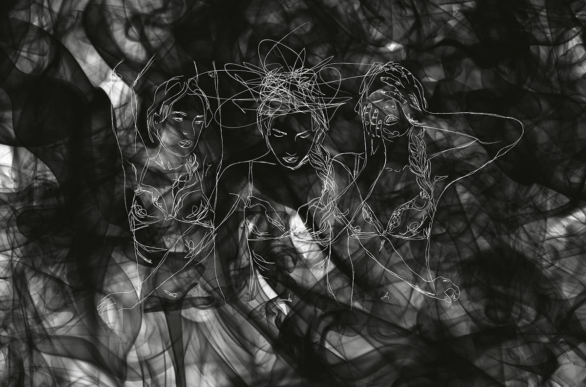
Image 30 - The Laurens
This image explores a little more into self-portraits and how I could express my consistently evolving emotions. I took pictures of myself in different poses on my webcam and traced over them in illustrator. I only used webcam images as I had no other intentions for use of the photographs other than to trace an outline. The messy lines signify the confusion and movement of my emotions. Similarly seen in the swirls of the background (made on photoshop using a downloaded set of smoke brushes). To improve on this image I would have liked to have more time to create and/or explore more effective backgrounds.
#oneperday


