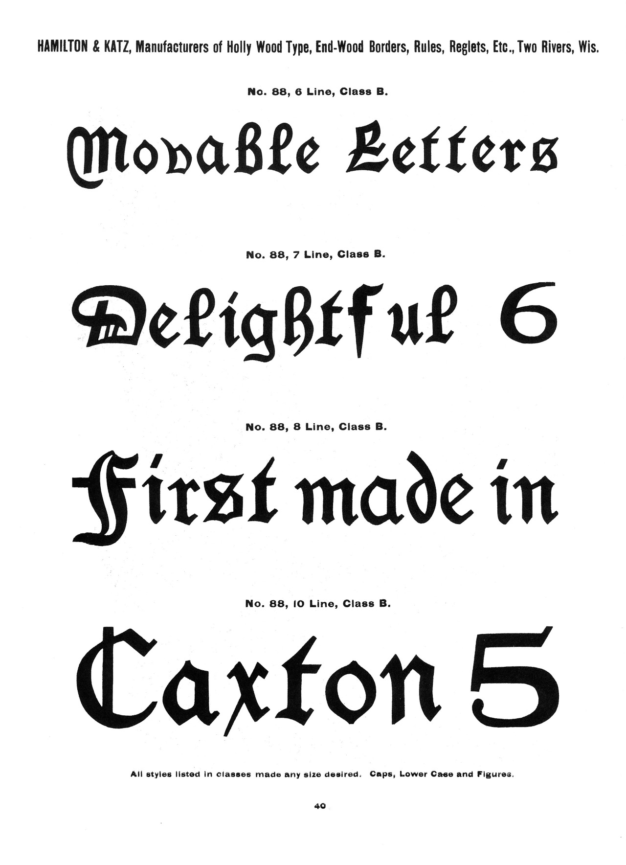
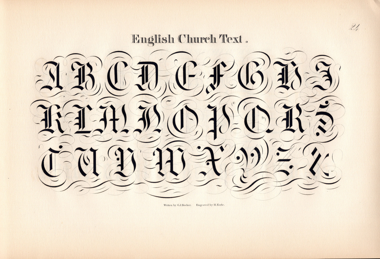
See more posts like this on Tumblr
#graphic design #type #Typography #typeface #Type Specimen #fonts #blackletter #calligraphy #letteringMore you might like
Hamilton Wood Type Blackletter
This is a rather ugly fraktur type specimen from Hamilton. The weights of the letters are inconsistent—just look at “Movable” in the first line. The routing is inconsistent across sizes—just look at how a changes across the three sizes. I’m not sure if that means they used multiple patterns or just didn’t care about the quality in 1884. And that five looks like it was carved by hand!
Announcing free trial fonts from Dunwich Type Founders
Are you tired of buying fonts before a client will approve the purchase? Or do you not have time to sign a trial EULA contracts for rush jobs? Are you a student with no money for fonts? I understand you, so I have made the entire Dunwich Type Founders catalog available as fully-functional free trial fonts. Download it now: http://dunwichtype.com/free-trial-fonts/