

Welcome to post 2 of 5 in our miniseries How to Create a Simple and Effective Portfolio Website with Divi. In this series we’ll cover everything you need to do in order to create your own portfolio website from scratch. We’ll also go over how to use our A/B testing system Divi Leads to make sure your site is effective at attracting new clients.
In today’s post I’m going to show you how to add some alternate styles to the minimal portfolio homepage we built in yesterday’s blog post. My goal is to provide a few simple additions and alternatives that we can test later using Divi’s A/B testing system Divi Leads.
Let’s dive in!
- 1 Today’s Starting Point: A Minimal Portfolio Homepage
- 2 Using Filters, Hero Sections, and CTA’s to Expand a Minimal Portfolio Homepage
- 3 Portfolio Homepage Variant #1: Adding a Minimal Call to Action
- 4 Portfolio Homepage Variant #2: Adding Filters to the Portfolio
- 5 Portfolio Homepage Variant #3: Adding a Hero Section
- 6 Tomorrow: How to Create Beautiful Project Pages with the Divi Builder
Today’s Starting Point: A Minimal Portfolio Homepage
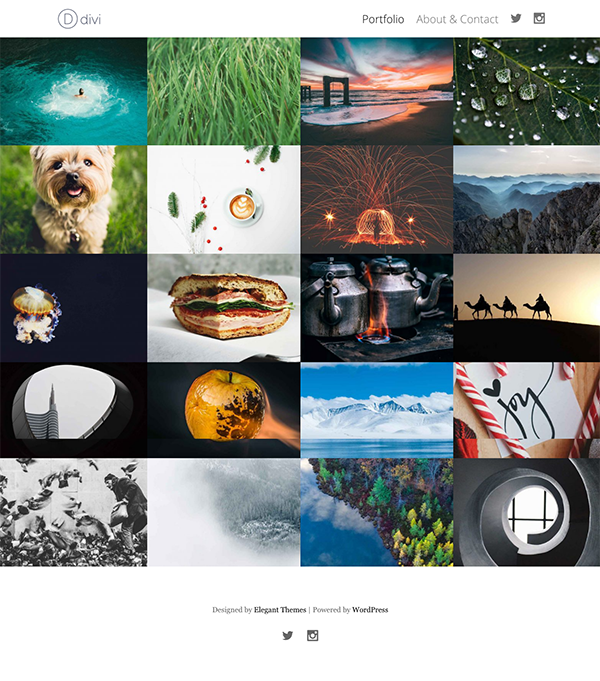
A Minimal Portfolio Homepage
In yesterday’s post I showed you how to create the minimal portfolio homepage above. We’re using that as our jumping off point for today’s design variations below. If you’d like to follow along and haven’t done the first tutorial in this series yet, follow this link and give it a go so you can come back here and try out these fun additions.
Using Filters, Hero Sections, and CTA’s to Expand a Minimal Portfolio Homepage
Subscribe To Our Youtube Channel
Portfolio Homepage Variant #1: Adding a Minimal Call to Action
Adding a Minimal Call to Action above the Footer
In keeping with our minimal aesthetic I thought adding a black and white call to action at the bottom above the footer might be a nice touch. Or, at the very least, something to test and see if it increases the number of people who get in touch via the contact page.
To create it here’s what you do:
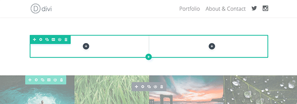
Create a standard section with a single row and two columns (2/3 and 1/3). In the 2/3 column on the left create two text modules, one on top of the other.
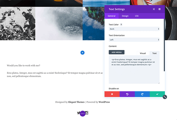
In the top text module I’ve placed the words, “Would you like to work with me?” And in the second text module I’ve put a line of sample text.
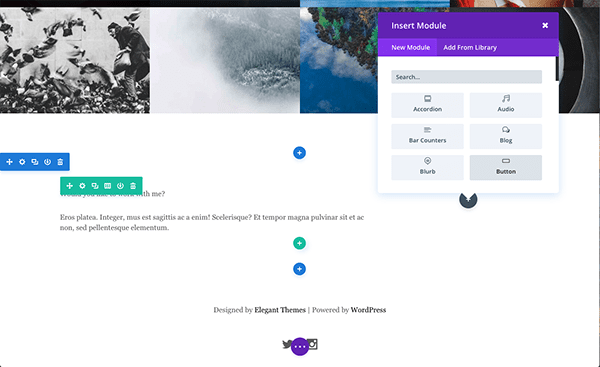
In the 1/3 column on the right place a single button module. For the button text I’ve written, “Let’s Talk!” But you can write whatever feels appropriate for you.
Now that all of our content is in place, let’s style it to fit our design.
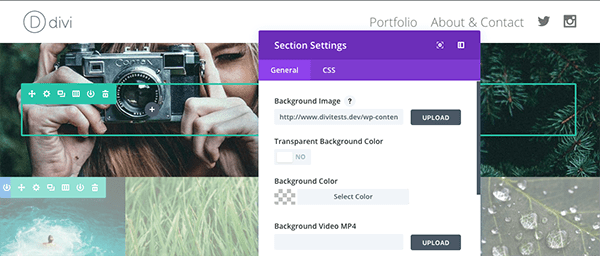
Section Settings
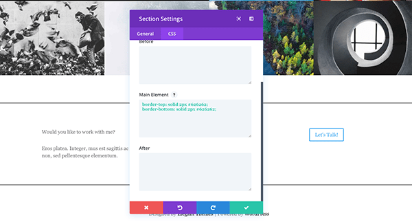
Open up the section settings for the call to action section. Go to the css tab and paste the following under Main Element:
border-top: solid 2px #626262;
border-bottom: solid 2px #626262;
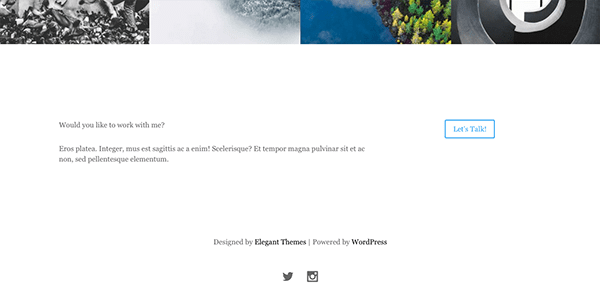
This will result in a top and bottom border like the image above.
Text Module Settings
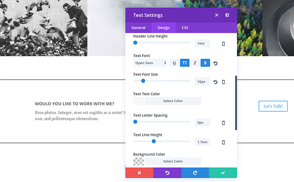
The only text module that needs settings adjusted is the heading, “Would you like to work with me?”
Open up the module settings and do the following under the design tab:
- Text Font: Open Sans; All Caps (TT); Bold (B)
- Text Font Size: 16
- Custom Margin: 0px Bottom
- Custom Padding: 10px Bottom
Save your changes. It should now look like the image above.
Open up the button module settings and do the following under each respective tab.
General Settings:
- Set your button URL to your about/contact page.
Design Settings:
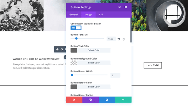
- Flip the switch for “Use Custom Styles for Button”.
- Button Text Size: 16
- Button Text Color: #666666
- Button Border Color: #666666
- Button Border Radius: 0
- Button Font: Open Sans; Bold (B)
- Button Icon: Camera
- Button Icon Color: #666666
- Button Hover Text Color: #666666
- Button Hover Background Color: rgba(255,255,255,0)
- Button Hover Border Color: #666666
- Button Hover Border Radius: 0
Custom CSS:
Paste the following under Main Element.
margin-top: 10%;
Save changes. Your button should now look like the image above.
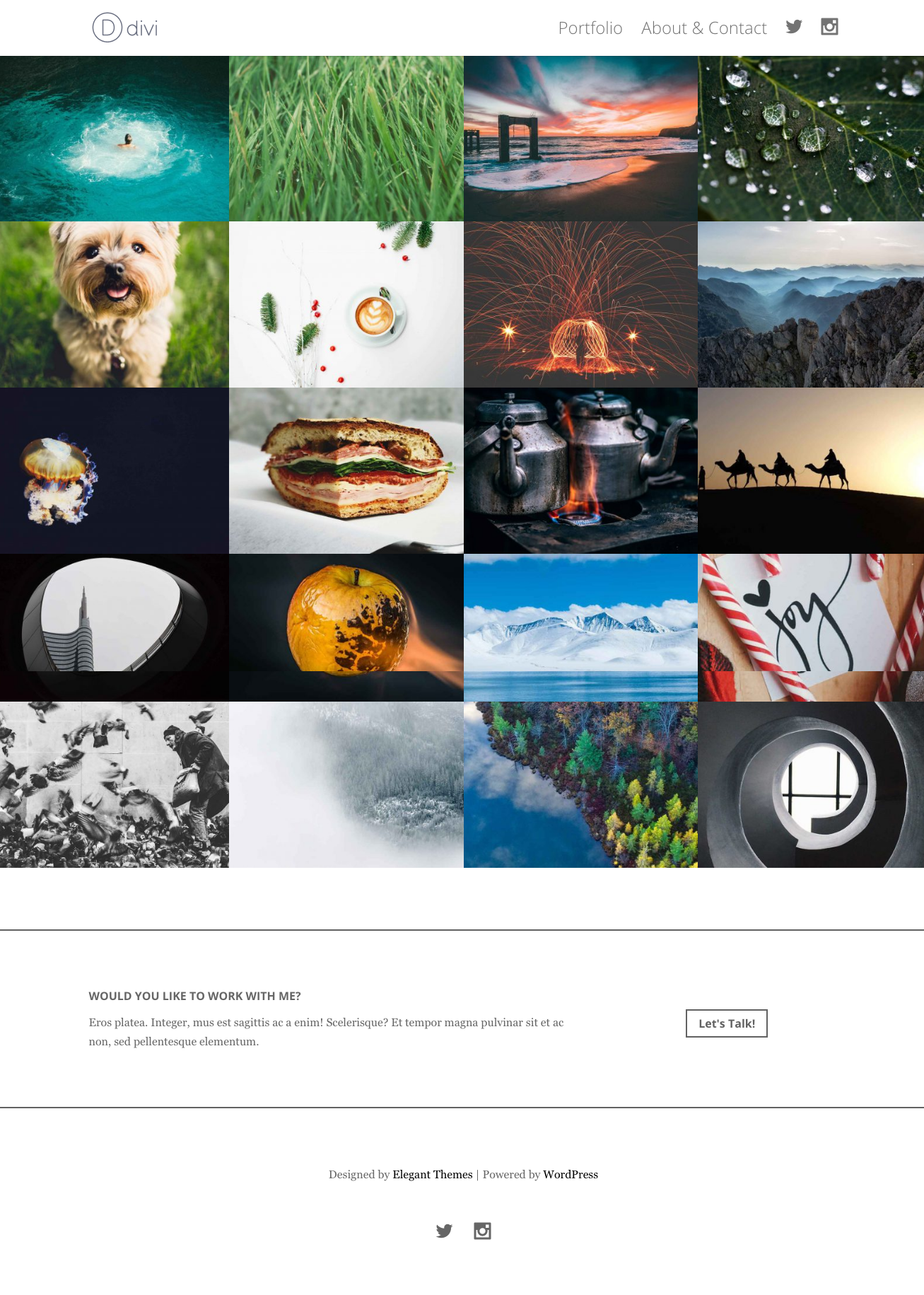
The Final Result: A Minimal Call to Action
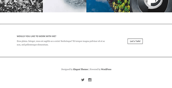
Now that all of your changes are made the new call to action should look like the image above. In the sections below we’ll continue to build off of this initial variant to create a couple more full page designs.
Portfolio Homepage Variant #2: Adding Filters to the Portfolio
Swapping the Standard Portfolio Module for the Filterable Portfolio Module
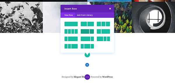
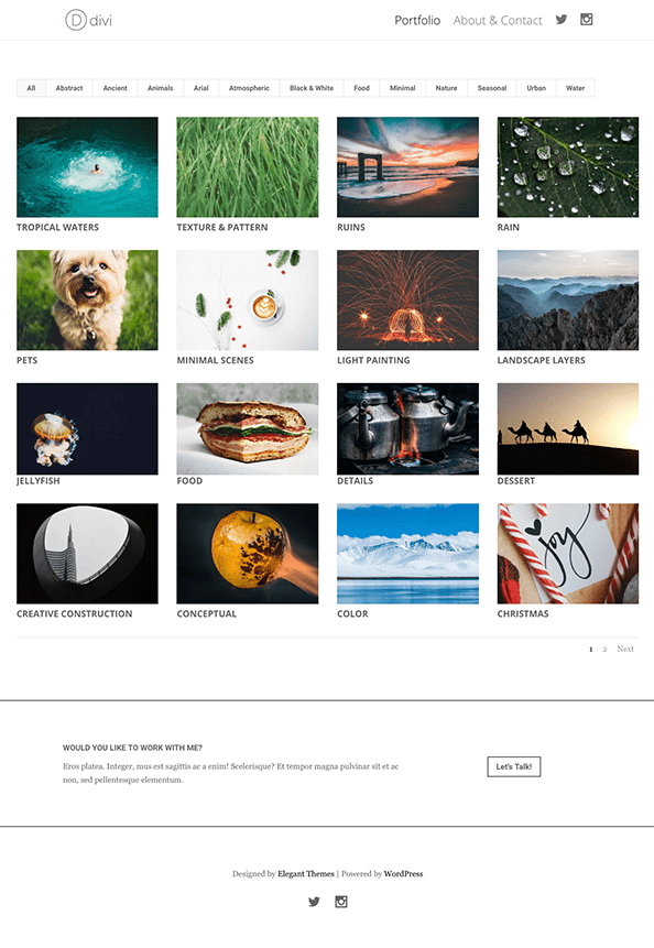
For our second variant we’re going to swap out our standard portfolio module for the filterable portfolio module to make browsing by category easier. But we don’t want to delete or do away with all our hard work so far. So the first step here is going to be disabling the standard portfolio module.
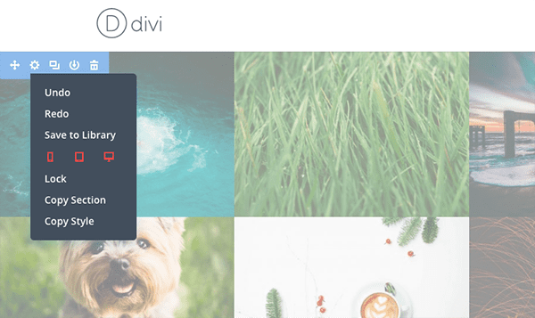
To do that simply enable the visual builder and right click on the blue section controls in the top left-hand corner. Click “disable” and select all devices. You’ll notice that the section becomes slightly transparent/dull. This indicates it is disabled and will disappear from view when you exit the visual builder.
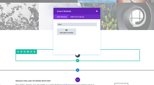
Now scroll down to the bottom of the section and use the blue button to add another section. Select the single column layout and add the Filterable Portfolio Module.
Filterable Portfolio Module Settings
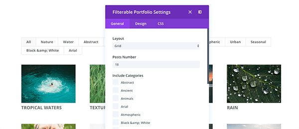
Configure the following settings for each tab of the filterable portfolio module.
General Settings:
- Layout: Grid
- Posts Number: 16
- Show Categories: No
Design Settings:
- Hover Icon: Camera
- Zoom Icon Color: #ffffff
- Hover Overlay Color: rgba(0,0,0,0.76)
- Title Text Color: #666666
- Filter Font: Open Sans; Bold (B)
- Filter Text Color: #666666
Row Settings
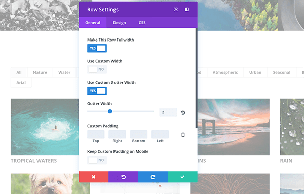
Now we need to adjust the row settings in order to make the filterable portfolio fullwidth. To do this open up the row settings and configure the following settings.
General Settings:
- Make This Row Fullwidth: Yes
- Use Custom Gutter Width: Yes
- Gutter Width: 2
Save changes.
Final Result: A Filterable Portfolio
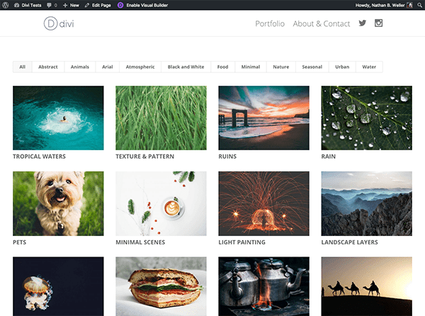
After you save and exit the visual builder your new filterable portfolio should look like the image above. This updated design ads a bit of clean white space to the overall design and makes browsing your work by category much easier.
Portfolio Homepage Variant #3: Adding a Hero Section
Adding a Hero Section to Boost Client Requests
Just as we did with our last variant, this one will build off of the others to create a final full page layout that contains all of the variants in one. To put the final touch on this new full page layout we need to add a hero section. Here’s what you do.
To get started add a new section with two columns and drag it to the top of your page.
Section Settings
Upload a background image that is 1920px wide by 875px high and click the green save button.
Divider Module Settings
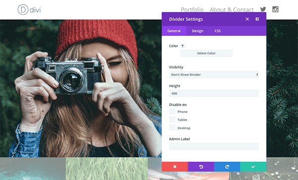
In the left-hand column insert a divider module and set the height to 400. Click the green save button.
Text Module Settings
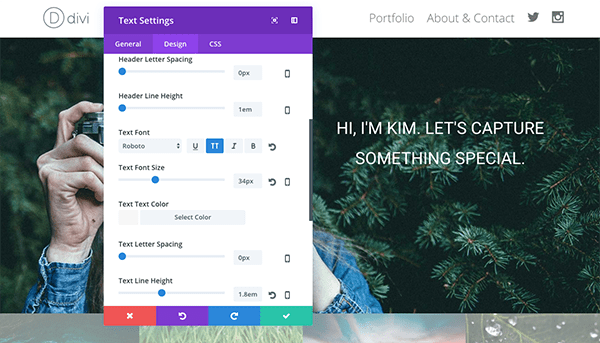
In the right-hand column insert a text module and do the following.
General Settings:
- Text Color: Light
- Text Orientation: Center
- Content: “Hi, I’m Kim. Let’s capture something special.” (Or whatever makes sense for your site)
Design Settings:
- Text Font: Roboto; All Caps (TT)
- Text Font Size: 34
- Text Line Height: 1.8em
- Custom Padding: 15% Top
Custom CSS:
In the custom css tab, under Main Element, paste the following line of code.
font-weight: 400;
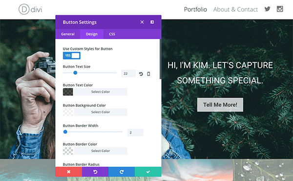
Insert a button module below the text module you just created and configure it according to the settings below.
General Settings:
- Button URL: Set to your about/contact page.
- Button Text: “Tell Me More!” (Or whatever makes sense for your site.)
- Button Alignment: Center
Design Settings:
- Use Custom Styles for Button: Yes
- Button Text Size: 22
- Button Text Color: rgba(0,0,0,0.7)
- Button Background Color: rgba(255,255,255,0.75)
- Button Border Color: rgba(255,255,255,0.24)
- Button Border Radius: 0
- Button Font: Roboto; Bold (B)
- Button Icon: Camera
- Button Icon Color: #ffffff
- Button Hover Text Color: rgba(255,255,255,0.85)
- Button Hover Background Color: rgba(0,0,0,0)
- Button Hover Border Color: rgba(255,255,255,0.85)
- Button Hover Border Radius: 0
Custom CSS:
In the custom css tab, under Main Element, paste the following line of code.
margin-top: 10px;
Save changes.
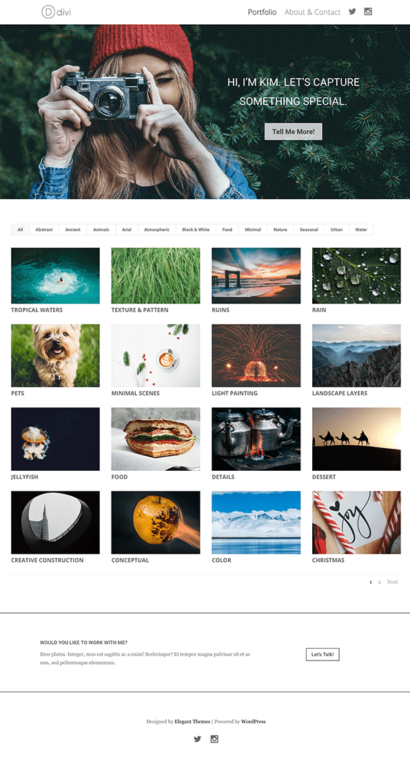
Final Result: A Personalized Hero Section
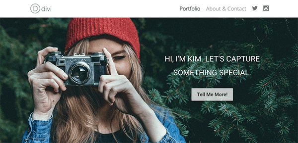
Once you’ve saved all changes and exited the visual builder your new hero section will look like this. And the entire page will now look like the image at the top of this variant section: starting with a hero image, then a filterable portfolio, and finally a minimal call to action.
Later in the series I’ll show you how to test these design elements so you can come to a definitive conclusion on what works best for you and your visitors.
Tomorrow: How to Create Beautiful Project Pages with the Divi Builder
In tomorrow’s post I’ll be sharing design tips and principles to apply to your portfolio project pages–as well as giving away a few free layouts to help you on your way! Don’t miss it!
Be sure to subscribe to our email newsletter and YouTube channel so that you never miss a big announcement, useful tip, or Divi freebie!


Please keep these tutorials coming!
I am really enjoying these daily bits of inspiration!
Looks pretty good, Nathan. It’s simple, but very elegant and functional.
Looking forward to tomorrow’s post.