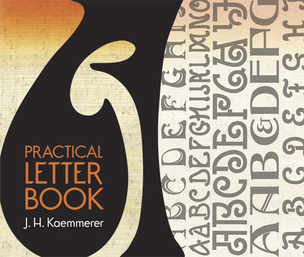
Created during an exciting period in the evolution of graphic design, this volume was initially published in 1911 as Kaemmerer's Practical Letter Containing Several Hundred Alphabets in 140 Plates; Together with Descriptive Text, For the Use of Sign Painters, Show Card Writers, Decorators, Artists and Craftsmen. A century later, this magnificent compendium offers a useful reference for graphic artists and designers in many fields. The 140 plates feature numerous historic and modern styles from throughout Europe, including examples based on Latin, Greek, Hebrew, and Gothic originals. Selections include English and Dutch block letters; Roman, German, and French letters; script and Gothic letters; a variety of contemporary letters; foreign alphabets; numerals; and a sampling of monograms and vignettes. The compilation's original intent as a resource for sign painters ensures the eye-catching quality of its contents, making this volume an enduring source of possibilities and inspiration.
'Practical Letter Book' by J. H. Kaemmerer is a historic collection of 140 different lettering plates first published in 1911. The book was for sign painters and show card writers.
There is a pretty good introduction written and the different plates are introduced. Topics like spacing and centering are brought up. Having done some hand lettering myself, these notes are very useful. Then follows 140 plates showing different styles from English to Gothic to Dutch block letters. There are Hebrew, German, and Roman as well. Many of the plates are full alphabet, and many include sample logos written using the lettering.
I'm a font and hand lettering fan, so getting a chance to look through this collection was fun and a bit inspiring. There are some great looking classic alphabets here, and this would make a good resource for hand letterers today.
I received a review copy of this ebook from Dover Publications and NetGalley in exchange for an honest review. Thank you for allowing me to review this ebook.
This was initially published in 1911 as Kaemmerer's Practical Letter Book: Containing Several Hundred Alphabets in 140 Plates; Together with Descriptive Text, For the Use of Sign Painters, Show Card Writers, Decorators, Artists and Craftsmen. While I am none of those professions, I am fascinated by calligraphy and word art. Kaemmerer's title has stood the test of time and the plates were a delight to look through. This is not a modern how-to guide! The first portion contains specific considerations of the letters and words in different situations while the second contains the beautiful plates. For example, in the case of the English Block Letter: "The M. W. and Y. should be one-third wider than the other letters... These proportions however are by no means arbitrary but must be varied according to the particular word that is being painted. A case where a variation is very necessary is where a sign is to be placed at an elevation and is to be viewed from the ground, for instance, if it is even 10 ft. high it might be necessary to slightly thicken the top and bottom portions of the letter so as to allow for the shortening which comes about from viewing the letters at an angle." There is a considerable amount of useful information for calligraphers, sign painters, and anyone fascinated by lettering. Some modern readers will be disappointed in this book with its lack of tutorials. However I am thankful this title is republished and available today to a new audience.
The ‘Practical Letter Book‘ is a reprint of a in 1911 originally published book, which shows an overview of fonts and typography meant to inspire artists, painters and others. It is a delightful historical source of hand-painted typography. You can recognize fonts which are used in many Art Nouveau posters from the late 1900s.
It discusses how to draw these types; shading, spacing, why some letters need raising and why others do not. Typography has changed a lot since the coming of the computer and has almost turned into a lost art, this book should be a must-read for every younger designer who just knows how to set type with a computer. Not to learn how to draw type (would not be bad though) but more to learn the ideas behind type; why some letters need more spacing, why some letters are raised and so on. It provides a treasure on background info.
The ‘Practical Letter Book‘ is a gem towards the history of typography, a must-have for designers!
If you are an artist, sign maker or in any other business or hobby where lettering comes into play, you really want to get this book. Practical it may be, but it is also a lot of fun. This book explains the fonts in the beginning and then goes on to show you some absolutely stunning examples of them in use later on.
These would be great for anyone who does craft projects, or students who are learning to expand their horizons. I think basically anyone could get use out of this book in some way. The introduction was really interesting too, and the author obviously knows what they are talking about, so it made me feel confident.
This is a really helpful book.
This review is based on a complementary copy from the publisher, provided through Netgalley. All opinions are my own.
This book was first published in 1911 but is being re-released and it is still a good reference for graphic artist or anyone interesting in lettering and calligraphy.This review was originally posted on Books In Brogan
This is a guide book for painters, signwriters or people interested in graphic design, focusing on how to use text in an eyecatching but readable format. The book has some text explaining the history and uses of certain types of text, but is mostly made up of examples. There are 140 plates showing the different types of lettering. The lettering examples are beautiful, and i will probably be copying them for art projects (and addressing birthday cards), but to be honest it's a bit dry. I was epecting something a little bit more interesting.
The Introduction says that this book is mainly aimed at student and sign writers. I found the information very good especially in order to familiarise myself with the characteristics of the different fronts. There is a description and information of each of the fronts at the beginning of the book, with reference to plates further in the book. I use fonts for my artwork so it is nice to actually get some information about the features of each one. A book that will be well used. This book was provided to me in return for an honest and unbiased review
I received a copy of this book from Netgalley and in return for a fair and honest review.
This book was a very informative read. Each font type is explained at the start of the book and has examples of each font type. The book was published in 1911 and it is a fascinating look into how graphic design was carried out. The language of the book is fairly easy to read. The text is short and to the point. The real value is in the examples of the fonts.