Emoji: New glyphs and an all-new design
-
Ron AmadeoRon Amadeo
-
That "moneyface" emoji (column 5) gets a big change.Ron Amadeo
-
Yet another new poop emoji. This is like the fourth one on Android.Ron Amadeo
-
All the people come with variable skin colors and genders.Ron Amadeo
-
Ditto for this slide. Lots and lots of long-pressable options.Ron Amadeo
-
It's crazy that someone took the time to redraw these when they are only a tiny bit different.Ron Amadeo
-
The hearts get a more 3D-shaded look.Ron Amadeo
-
The shoes all face a standard direction now.Ron Amadeo
-
Animals get a big overhaul. The dog now looks like a Pomeranian, while the poodle is now white.Ron Amadeo
-
The koala is no longer on his tree.Ron Amadeo
-
The flowers and plants all get a more shaded revamp.Ron Amadeo
-
The peach still looks like a butt. Whew.Ron Amadeo
-
The food looks even more delicious with the better shading.Ron Amadeo
-
Those globes almost look spherical.Ron Amadeo
-
Lots of changes to the buildings. Like, the bank now gets a granite column look.Ron Amadeo
-
Oh, the train is going down a tunnel. That's a lot clearer when the surrounding circle is black.Ron Amadeo
-
Airplanes get a real runway!Ron Amadeo
-
The sun seems much happier now.Ron Amadeo
-
Pumpkin is looking good with black face holes.Ron Amadeo
-
The basketball loses the net.Ron Amadeo
-
The game controller is less "Google Play" and more "Xbox."Ron Amadeo
-
Do kids even know what half of these are? The floppy disk, the VHS tape?Ron Amadeo
-
The books read much more like a book.Ron Amadeo
-
The gun is still a gun!Ron Amadeo
-
The arrows all get a box.Ron Amadeo
-
The religious symbols all get a box, too.Ron Amadeo
-
More boxes.Ron Amadeo
-
Fonts for things like "Cool" aren't stretched out anymore. Cool.Ron Amadeo
-
Thinner line art makes for much more readable Asian characters.Ron Amadeo
-
We'll stop here, because the flags all look the same.Ron Amadeo
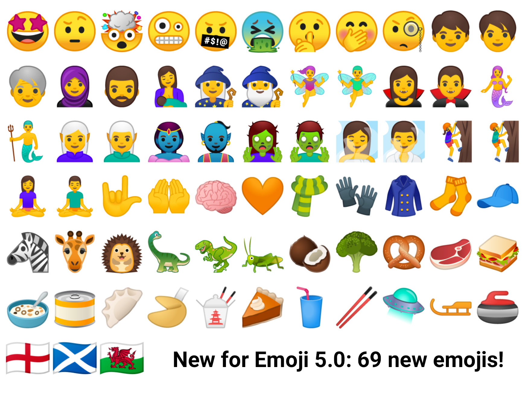
There's major emoji news in Android 8.0: All 2000+ emoji have been redesigned. This is something like the fifth edition of redesigns for Android's emojis. Google's old blob-style emoji are dead, replaced with something a lot more neutral and Apple-y. I think iOS-style emojis are a good thing and will lead to more consistent communication across platforms. Some people are very, very attached to Google's old blob emojis, though, and are unhappy.
Google gave an explanation of the change in a blog post, writing, "With the proliferation of high density screens and new messaging use cases, we decided it was time to give our emoji an overhaul." Google says the old emoji style "wasn’t equipped to to provide standards that unified the look and feel of all the illustrations across the many emoji categories. As a result, our emoji became inconsistent between old and new designs, making it difficult to quickly scan the keyboard to find the right emoji."
To create the new emojis, Google says it created a "design system" that will allow it to pump out consistent emoji now and in the future as new glyphs come out. All the emoji are drawn on a single grid system for consistent sizes and shapes. The eyes, noses, mouths, and other parts are shared across emojis. Poses and angles were standardized for animals, and the colors were standardized with a neutral yellow, sad blue, sick green, and red for angry. The outlines are all in a contrasting brightnesses from the main emoji color, helping with legibility across any background colors.
In its blog post, Google fully admits the iOS influence, saying it "one of our main goals with the redesign was to avoid confusion or miscommunication across platforms" and that it "wanted to assure the user that when they sent an emoji to a friend, the message was clearly communicated regardless of whether they are on iOS, Windows, Samsung, or any other platform."
Besides all the existing emoji redesigns, Google is also rolling out Emoji 5.0 from Unicode 10 in Android 8.0. This means Android is getting 69 new emojis plus all the usual skin tone options. These includes lots of fantasy characters, a few new animals, a few more food options, even more smiley faces, and some inclusiveness emoji like "breast feeding" and "woman with headscarf." Personally, I really like the hedgehog.
EmojiCompat and Downloadable fonts—updating emojis without a system update
-
EmojiCompat takes broken emoji and replaces them with working emoji downloaded from Google Fonts.
-
EmojiCompat will give you real emoji (left) instead of tofu (right).
It's not part of Oreo, but along with the launch, Google is also introducing a new feature in Support Library 26 called "EmojiCompat." This library—compatible with Android 4.4 and up—will allow app developers to ship new emoji to old versions of Android.
EmojiCompat isn't a single, system-wide emoji update system. Instead, it relies on individual apps to include it. The idea is that an app like Google Hangouts could include EmojiCompat, and then instead of older systems seeing tofu—the little squares (☐) that show up when a device doesn't support a character—they'll see the new emoji. Keyboards are just apps in Android, so keyboards can include EmojiCompat, too, allowing users on old systems to type the new emoji. Keyboards are encouraged to check a few flags in the app to see if they're running EmojiCompat, too, so the keyboard doesn't display a glyph the app can't display.
In the past, Android needed a full system update to get a new batch of emojis. Emojis are just a font, though, so—together with a new "downloadable fonts" feature—apps will be able to get fresh emojis shipped to them as they come out. With downloadable fonts, apps will request fonts from a central trusted font provider rather than bundle them with the app. For Google Play devices, this "font provider" is Google Play Services.
In the future, imagine a world where apps and keyboards are all shipping the EmojiCompat library, and a new set of emojis are released with Unicode 11. Google just has to update the emoji font in Play Services, which can be downloaded to your device and used in every EmojiCompat app. Again, this isn't just Android 8.0—this should happen on Android 4.4 and up.
Downloadable emojis adds an interesting wrinkle to the skinned Android situation, since Samsung, LG, HTC, and other OEMs replace Google's emojis with their own designs (For an example, just look at any Emojipedia entry, which shows each style). When new emojis are available, a device will download them from Play Services, so they'll be the Google emojis. By default, EmojiCompat will only replace missing emoji with glyphs from Play Services, so on a skinned device, you'll get OEM-style glyphs for old emoji, but Google-style glyphs for new emoji. You're going to get a mix of emojis styles. App developers can also configure EmojiCompat with a "replace all" option, which will swap out everything for the Google-style emoji. Should app developers opt to banish skinned emoji for the sake of internal consistency? It's a difficult decision—maybe one that can be a user-configured option in an app?
Play Services is handling font duty not just because that's an easy way to get an authoritative font provider on new and old versions of Android, but also because fonts can execute code on Android, so they need to be controlled. Play Services will be providing a "trusted" pool of fonts from Google Fonts—about 800 options in total.
For developers, there are plenty of security procedures to go through, given that fonts are a security risk. Developers have to specify which exact font authority they want to download from, along with a special signed certificate for that font provider. For now, this is only Google Fonts. But in the future, Google wants to allow third parties to provide fonts for Android.
Any required fonts that aren't already on the system will be downloaded at install time. Developers have the option of sticking to a single version or being automatically updated to the latest font release. Apps will share fonts, so only one copy will be updated at a time. This should reduce APK size and storage needs if you have a bunch of custom font apps.
For Developers, fonts are now a resource type in Android, just like images, text strings, colors, layouts, and animations. Along with the Play Services-powered font provider, developers will have 800 fonts to pick from for their apps.
System UI improvements
Adaptive icons—Shape shifting, animated icons
-
The goal of Adaptive Icons is to have all app icons have the same shape. Here's an example of the best and worse-case scenario of icon shapes.
-
Adaptive Icons allow the launcher to automatically change the shape of an icon.
-
The icon masking demonstration in Android Studio.
-
Some icons, like Google Maps, handle adaptive icons better than others. Some of Google's icons use a white background, which seems like a cop-out.
-
It's not active yet, but Google eventually plans to animate these icons.
Today, Android skins—like Samsung's TouchWiz or Xiaomi's MIUI—have trouble blending in with the rest of the Android ecosystem, particularly when it comes to icons. A company like Samsung can change the system theme and reskin all the AOSP apps, but it can't change the Google apps or third-party apps. This is easily seen on the home screen of most skinned devices, where the OEM apps will follow one icon style while Google and third-party apps follow another. If you're an app developer, an icon shape is a tough decision to make. Pixel devices use circular icons, Samsung devices use a squircle, numerous Chinese companies try to emulate Apple's rounded rectangle icons, and apps following the old Google guidelines use uniquely-shaped icons.
To bring a bit more consistency to icons, Google is introducing "Adaptive Icons" in Oreo. Instead of having developers submit a fully-assembled icon with a locked-in shape, the Adaptive Icons system has developers submit a foreground and an oversized background for their icon. The launcher can then assemble these pieces on the fly. The foreground gets centered in the icon, and the launcher crops the background to match whatever icon shape it wants. With this system, developers can match whatever shape the launcher needs with just two pieces of artwork. Samsung can have its squircles, and Google can have circles—whatever shape you need will work.
Like everything new with Android, adopting adaptive icons is an ongoing process that the ecosystem is slowly picking up. For Google in particular, it really seems like the company needs to drastically redesign some of its icons to fit this new icon style. Some apps, like Google Maps, are great: the foreground has a location marker and a white Google "G," while the background is a colorful map that changes shape depending on the icon mask. Other apps, like the Google Play Suite, are awful. They're still using the triangle-shaped "play button" icons, just slapped on top of a white background. It looks lazy and unfinished, and it's in desperate need of a revamp.
Google also plans to animate these icons at some point in the future. At I/O 2017, Android software engineer Hyunyoung Song spoke of using the oversized layers for "parallax effects" and "pulsing," which lets the foreground layer move around inside the icon mask while scrolling or tapping. "We're still vetting how to best place these [animations]," Song said, "but it will come up in future releases."
That's not the only animation feature coming to icons—the clock icon now animates in Oreo. The icon is an analog clock with an hour, minute, and second hand, so they will all move in sync with the time.
A new widget picker
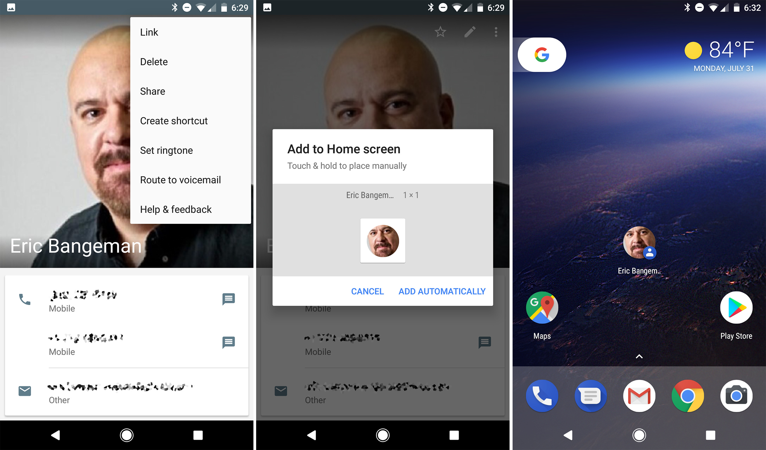
A desktop style, fully-customizable home screen was one of Android's major mobile innovations when it first came out. Finding that customization functionality was always a struggle though. Individual apps never had a way to offer up their widgets to users, which meant, after installing a new widget, the only way to add it was to subject yourself to a clunky process of going to the home screen, log pressing, opening up the widget drawer, and finding the thing you just installed.
In Android 8.0, apps can now offer up an "add to homescreen" dialog box for icons or widgets. From an app, you can now press an "install widget" button, and a popup will appear showing a preview of the new icon or widget. Users are instructed to long press on the item, at which point the home screen pops up and they can place it anywhere by releasing. There's also an "add automatically" button, which will dump the item on your home screen wherever it fits.
The widget picker has the usual "new Android feature" problem: almost nothing supports it at launch. The only thing I've spotted that this is available in is the contacts app, where you can press the overflow menu button and pick "add contact to home screen." Apps like Chrome and Google Hangouts have their own "add to homescreen" button, but it uses a custom-built solution. This will really help third-party apps that are only widgets, which currently show really clunky "dig through the widget drawer and find our widget!" tutorial screens.
Picture-in-Picture for phones and tablets
-
To start picture-in-picture mode: play a video, full screen it, then, while it's playing, press the home button.
-
The video will float anywhere you want it. Also notice the notifications it creates.
It's hard to call picture-in-picture (PiP) a "new" feature in Android 8.0, since Android 7.0 introduced the feature to Android TV. In Android 8.0 though, picture-in-picture gets ripped out of the "TV" niche and is available on any Android device.
Opening PiP is a little complicated. You have find a video, full screen it, and, while it is playing, press the home button. It would be a lot more obvious and discoverable if there was a "PiP" button somewhere in the video UI. Once the video is in PiP mode it works about how you would expect. You can drag it around and leave it anywhere on the screen. If you tap on it, the video will get a bit bigger, and show controls for "rewind," "pause," "forward," "full screen," and "close." The one missing feature is that you can't resize the PiP window, even on a tablet (sign #28576 that Google doesn't care about tablets).
It's up to apps to support PiP mode, and right now Google has support in Chrome and YouTube (if you pay for YouTube Red) but not Google Photos or Google Play Movies. Third-party apps like VLC have started to support the API, too. The YouTube Red requirement for PiP is a real bummer, since it's the video site most people will want to use. Along with limiting background playback, it's another case of YouTube's premium "service" charging users to use a basic, core OS feature. YouTube.com even manages to break Chrome's PiP support—YouTube's mobile site manages to detect-and-kill Chrome's PiP for non-Red users.
Google also seems to experimenting with the idea that picture-in-picture can be used for things other than video. A Google Maps beta has early PIP support—so early that we're not quite sure what the end product will look like. I'm not sure this kind of multitasking works for driving, but it would be great to have a small Maps window on the screen for mass transit or walking directions. Then you could have most of the screen free for watching a video or texting someone while still being able to keep an eye on your next turn or stop.
Correction: I originally blamed Chrome for the lack of PiP support for YouTube, but Paul Kinlan, Chrome's head of developer relations, set me straight.
Smart text selection and TensorFlow Lite

Text selection has been powered-up in Android 8.0 with some machine learning goodness. With a long press or double tap, the system will automatically highlight entire times and dates, addresses, phone numbers, and URLs, instead of just simple "word" selection. The standard cut/copy/paste text popup can also include a shortcut to an appropriate app for a selection: Maps for addresses, Chrome for URLs, etc. Some apps, like Gmail, will already try to detect and link-ify things like phone numbers, but since this is part of the standard text view now, it will work on all sorts of apps.
The brains behind this feature is a mobile version of TensorFlow, Google's open source machine learning library, called TensorFlow Lite. This "lite" version does on-device machine learning, without needing to send any data to the cloud. Recognizing addresses is rather underwhelming task for a neural network, but apparently this is just the tip of the iceberg for Android. During the Google I/O 2017 keynote, Dave Burke said the Android team was working on a hardware accelerated compute framework, and that in the future the team expects dedicated machine learning computer hardware to show up in phones. Burke says machine learning DSPs will power "the next generation of on-device speech processing, visual search, augmented reality, and more." For now though, it finds addresses.
In a future version of 8.0, due out later this year, Android will provide a "neural network API" that lets third-parties plug into TensorFlow.
AutoFill
-
The autofill options.
-
Google's Autofill options, which use all the usual Google cloud stuff.
Also on the text input side of things, Android 8.0 now comes with both an Autofill API and a Google-powered autofill service.
The autofill API works with all the fields you would expect it to: Contact information, credit cards, and username and password combos. Any app that uses the standard text input views is compatible with the autofill framework.
Users can grant and revoke autofill permissions to apps in Settings -> System -> Languages & input -> Advanced -> Input assistance -> Autofill service. By default the only option here is "Autofill with Google" but there's also a handy "Add Service" link that will do a custom Play Store search for other autofill apps. Currently the list is blank, but we've already seen experiments from password management apps like 1Password. For apps storing private data like credit cards or passwords, you can lock the data behind some kind of authentication, like a fingerprint.
Google's autofill service uses all the usual Google cloud services. Names and addresses come from your Google account information, credit card information comes from Google Payments, and passwords come from Google's "saved passwords," which is the same system Chrome uses.
Autofill in Android 8.0 really does seem to work everywhere, and it's really nice given how annoying tiny smartphone keyboards are.
reader comments
254