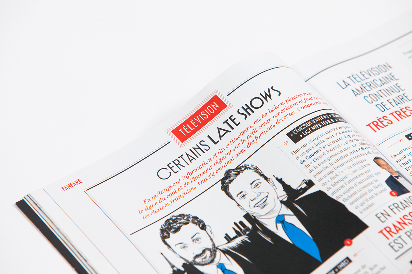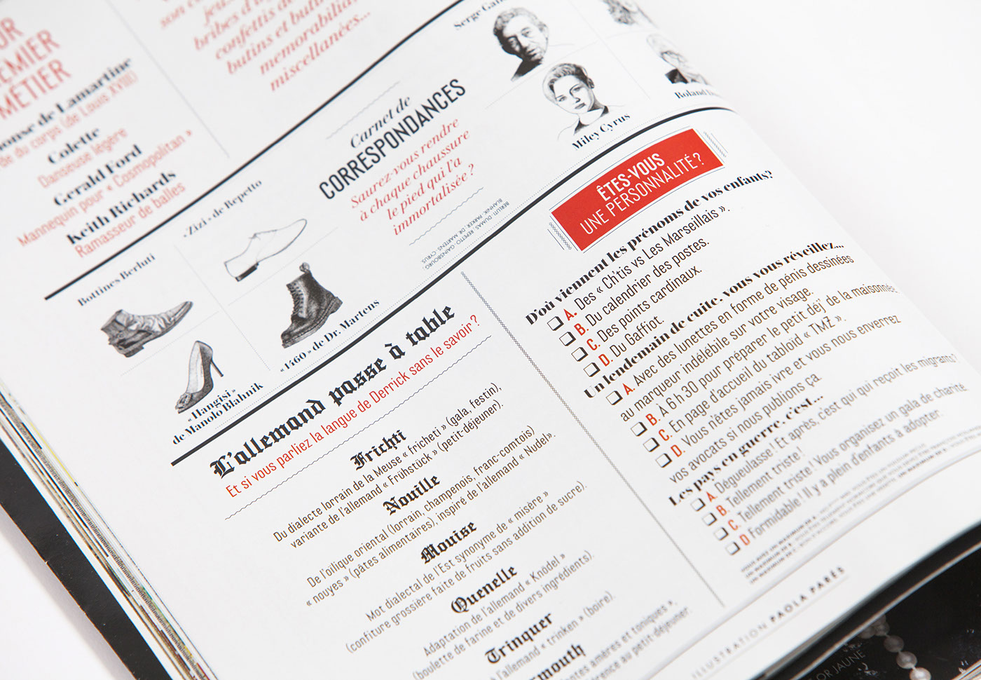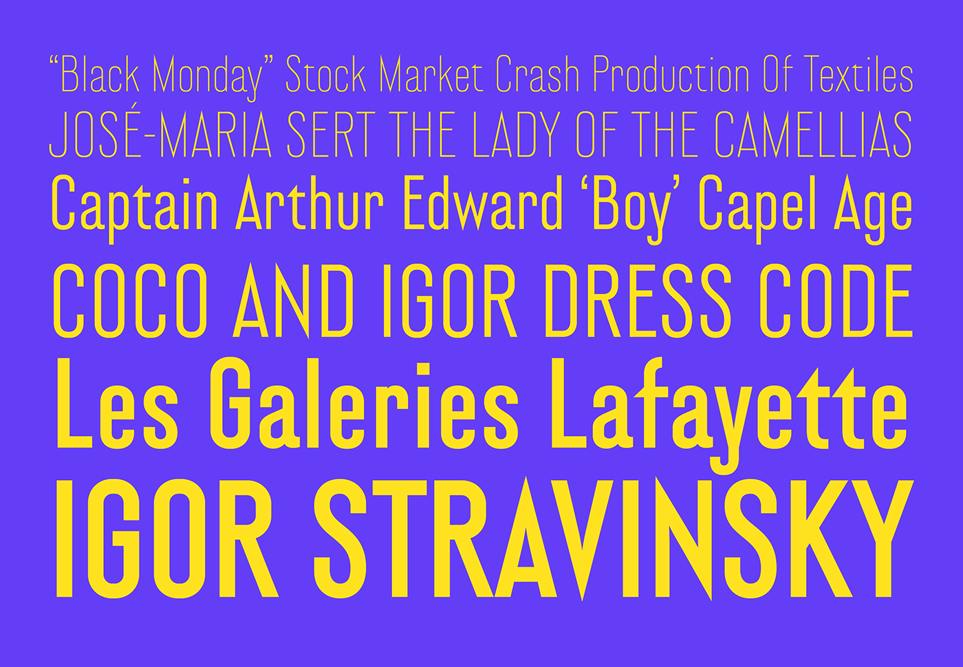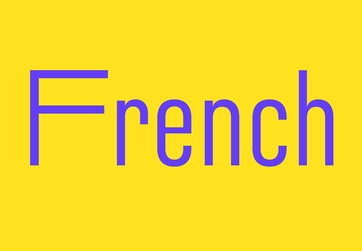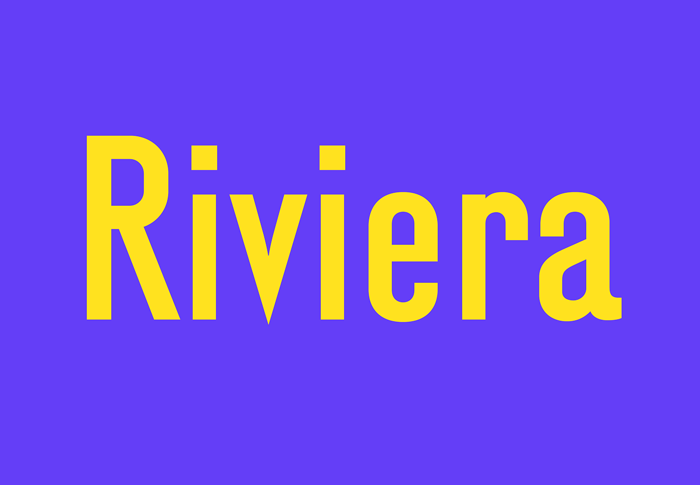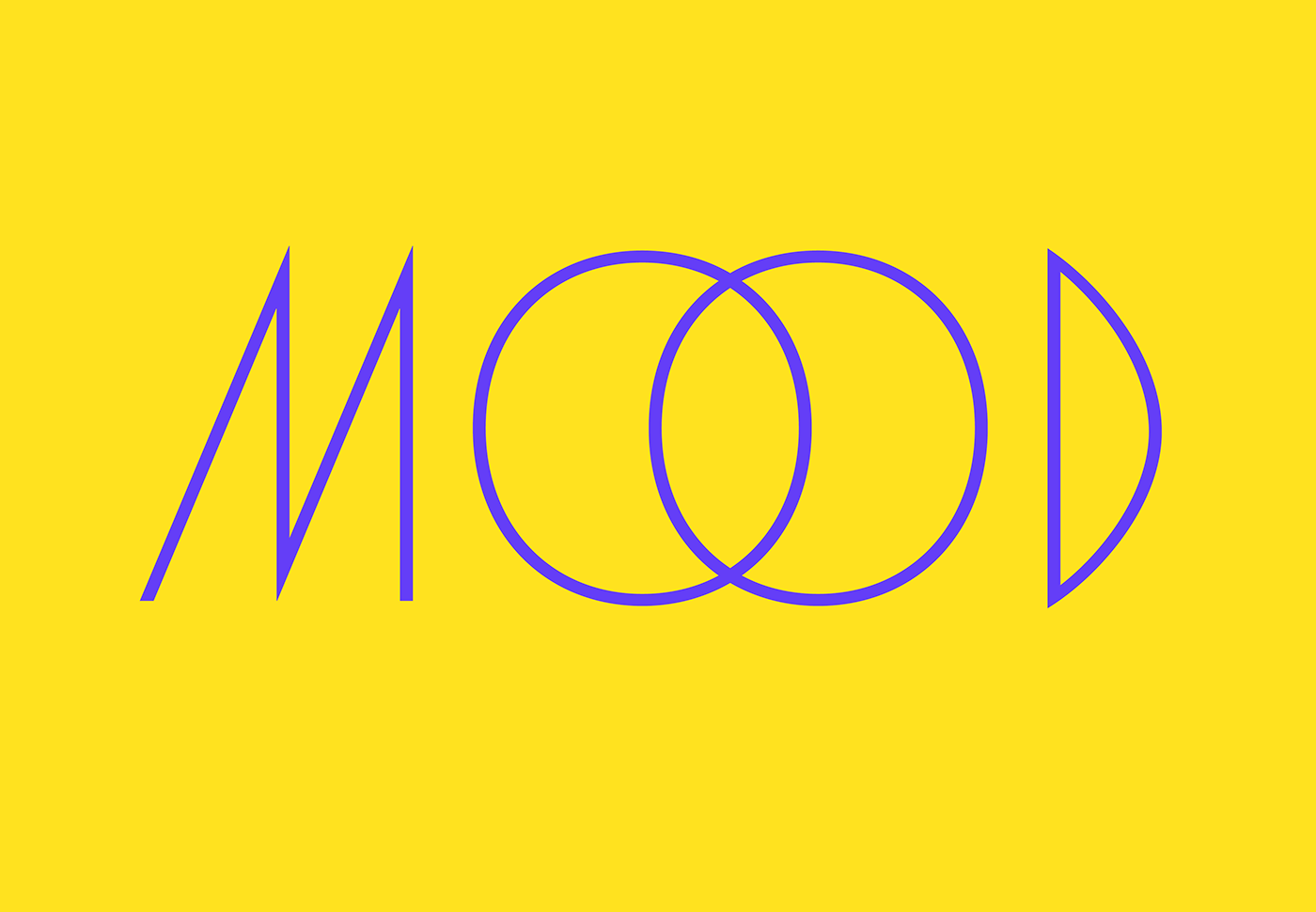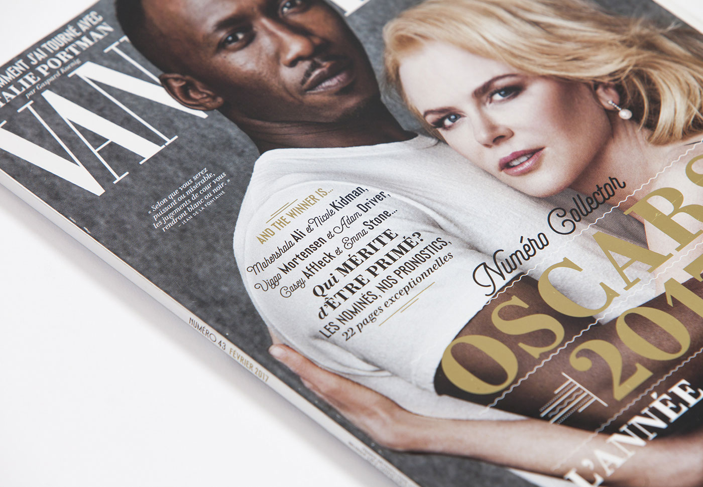
Vanité is a sans-serif commissioned by Vanity Fair France.
Its shapes recall the classic elegance of the twenties and thirties.
Some spiky details are directly taken from the logotype and evoke the journalistic tone of the magazine. Many letters with alternate designs or width allow for a quick typesetting of mini-logotypes.
Its shapes recall the classic elegance of the twenties and thirties.
Some spiky details are directly taken from the logotype and evoke the journalistic tone of the magazine. Many letters with alternate designs or width allow for a quick typesetting of mini-logotypes.
Read more on Production Type website.
Art Direction: Yorgo&Co.