Mikhail Voloshin writes this detailed analysis of NOAA and GISTEMP climate data processing on his Facebook page:
Random Walk analysis of NOAA global temperature anomaly data
Summary
The global temperature record doesn’t demonstrate an upward trend. It doesn’t demonstrate a lack of upward trend either. Temperature readings today are about 0.75°C higher than they were when measurement began in 1880, but you can’t always slap a trendline onto a graph and declare, “See? It’s rising!” Often what you think is a pattern is actually just Brownian motion. When the global temperature record is tested against a hypothesis of random drift, the data fails to rule out the hypothesis. This doesn’t mean that there isn’t an upward trend, but it does mean that the global temperature record can be explained by simply assuming a random walk. The standard graph of temperatures over time, despite showing higher averages in recent decades than in earlier ones, doesn’t constitute a “smoking gun” for global warming, neither natural nor anthropogenic; merely drawing a straight line from beginning to end and declaring it a trend is a grossly naive and unscientific oversimplification, and shouldn’t be used as an argument in serious discussions of environmental policy.
Purpose
I find myself frequently citing and explaining my trend analysis of global mean temperature anomaly data from the National Oceanic and Atmospheric Administration. Sometimes I cite this analysis for people who are genuinely interested in understanding my findings. Usually though, I merely show it to debate opponents just to prove that, unlike them, I’ve actually looked at the numbers directly and have the know-how to understand them (and, of course, I welcome engagement with those who can say likewise). I write this paper to make these subjects accessible to laymen and non-experts.
First and foremost I’ll present a link to my math. I don’t claim that it’s elegant, but I do claim that it addresses a few specific questions about one specific set of data. The rest of this document is an explanation of what those questions are, and what results I found.
The Excel spreadsheet (.xlsx) : NCDC (NOAA) Temperature Anomaly vs. Markovian Null Hypothesis
I ran these numbers several years ago, and then repeated the run a few times since then. My study doesn’t address the quality of the underlying data, nor the “massaging” that the NOAA performs on its raw instrument records in order to produce a single numerical value every year representing the global mean temperature anomaly (more on that later). What my study does address is to ask, even given the NOAA’s own year-over-year numbers: Do those numbers actually represent an upward trend at all? To this end, I test the NOAA’s temperature records against a Random Walk Hypothesis, a principle used in technical analysis of stocks to determine whether or not a trend (either upwards or downwards) exists.
Background
In order to assert that the global temperature anomaly is rising, the raw temperature numbers must demonstrate an upward trend. This is more complicated than it seems. A simple glance at the NOAA mean temperature record since 1880 clearly shows that temperatures are nominally higher today than they were a century ago (I say “nominally” because the seldom-depicted error bars are enormous – again, more on that later). But there’s a difference between saying that something has risen versus saying that it is rising.
Imagine you’re in Vegas and you come to a roulette wheel whose last four spins were 3, 13, 17, and 22. Would you bet that the next spin is going to be around 28 or so? Most people would – and most people would lose their shirt as a result. That’s because there’s no underlying phenomenon driving an increasing output of the roulette wheel. The evident pattern in the numbers is purely illusory. What you’re seeing isn’t a “trend”, merely a coincidence.
Pareidolia
The human mind is exceptional at finding patterns – it is, in fact, our greatest evolutionary adaptation. But we have evolved very few safeguards against false positives. The human capacity for pattern recognition enables us to follow the tracks of fleeing prey, to determine the optimal time of the year in which to plant crops, and to derive the universal law of gravitation by observing celestial bodies. However, that same capacity also compels us to perceive images of the Virgin Mary on slices of burnt toast.
Every one of us, to one extent or another, suffers from pareidolia, the perception of patterns and correlations where none actually exist. It is from this tendency toward pareidolia that arise superstition, occultism, magical thinking, and even social ills such as racism. Of course, it’s also our correct perception of patterns and correlations in the world that enable us to discover natural laws, construct tools, develop technologies, advance medicine, and so forth. Clearly, a correctly perceived pattern is invaluable, but an incorrectly perceived one can be catastrophic.
Unfortunately, humans don’t have any innate way to know when our perceived patterns are right and when they’re wrong – obviously, if such a way existed, we would never be wrong!
It’s only been in the last 300 years or so, with the advent of the Age of Enlightenment, that we’ve developed practices such as the scientific method to help draw the line between true patterns and false ones, and it wasn’t even until the 20th century that Karl Popper’s principle of falsifiability was introduced as an integral component of the search for truth. The question, “Is the pattern I believe I see actually real?” is one that we’ve only begun asking very recently, and the vast majority of us – even scientists – still don’t find it easy. Entertaining the idea that you might be wrong is not something that comes naturally.
Inspiration from the finance industry
There is, in fact, an entire industry of people who literally put their fortunes on the line every day in an effort to differentiate illusory patterns from genuine ones. It’s the finance industry, and I happen to be a part of it, and I have some of their tools and techniques at my disposal. While these tools and techniques offer absolutely no insight whatsoever into the underlying physical properties of Earth’s climate system – thermodynamic feedback or cloud cover or convection or so on – they are exceptional at answering one simple question: Is there even a pattern here in the first place? Even before you get into all the computer models designed to figure out what’s causing the upward trend, you first have to establish that there is indeed an upward trend at all!
At issue is the question of predictive value – the question of whether observations of the past can help predict the future. Quantitative analysts in the finance industry, much more so than academic scientists, require their theories to exhibit predictive value.
Still Available: Climate Change the Facts, 2017
After all, when a scientist writes a paper that fails to correctly extrapolate future data, that scientist can merely write subsequent papers to explore why the previous hypotheses were wrong, ad infinitum. Indeed, as of this current writing, we see exactly this happening in climate science right now, as papers such as Emission budgets and pathways consistent with limiting warming to 1.5◦C and Causes of differences in model and satellite tropospheric warming rates try to explain why past climate models have predicted temperatures much higher than the ones actually measured in subsequent years.
(It’s worth noting that the latter paper, Causes of differences…, is co-authored by the prestigious activist climatologist Michael E. Mann, who developed the “Hockey Stick” historical temperature reconstruction made famous in Al Gore’s An Inconvenient Truth. It’s furthermore worth noting that, if you actually read the Causes paper, you’ll see that the analysis offered there is extremely similar to mine but in reverse. In effect, while I argue that natural fluctuation has caused temperatures to drift upward from a zero baseline (or at least that the data alone doesn’t rule out such a claim), they claim that natural fluctuation has caused temperatures to drift downward to mask at least part of what would otherwise be an already-cataclysmic anthropogenic global warming signal. I contend that we can’t rule out the possibility that our current temperatures are simply the result of natural back-to-back warm spells; they contend that current temperatures should be even higher, but are being held down by natural back-to-back cold spells. Our techniques are largely the same; and, counterintuitively, though the conclusions are mutually exclusive, the data fully supports both interpretations. Such is the nature of basing your argument on the evolution of systems of random variables – they could do the thing you predict, but they could also do a lot of other things, too. Random variability is a fickle mistress; and if you choose to dance with her, so too can your opponents.)
But when a hedge fund manager makes a prediction about the future movement of a stock or an index, and that manager is wrong, then the fund loses millions of dollars. I’ve personally witnessed this happen many times. It’s not a pretty picture.
As such, while both scientific academia and the finance industry are in the practice of drawing conclusions from numerical sequences, finance is much more strongly incentivized to ensure that those conclusions are actually correct. As in, true. As in, correspond to things that ultimately happen in the real world.
Climatology is not an experimental science. It’s slightly outside of our current technological capability to temporarily remove all clouds just to make sure we’re computing albedo correctly, or to keep all air in the atmosphere from moving for a while so that we can isolate convective effects from conductive and radiative ones. As such, in order to still be a scientific discipline at all (as opposed to merely an exercise in modern-day numerology), climatology must depend heavily on data processing techniques in order to provide the falsifiability that would otherwise be supplied by controlled experimental methodology. Climatology is not alone in being a non-experimental discipline; it shares this property with fields such as astrophysics and paleontology, for example. But these fields have succeeded largely on the merit of being extraordinarily good at making accurate specific predictions about subsequently gathered independent data – and you need to use analytic techniques to define exactly what is meant by the terms “accurate”, “specific”, and “independent” (or, for that matter, “data”). And, indeed, climatology has a much harder road to trek than both astrophysics (there are billions upon billions of observable stars, but only one observable Earth) and paleontology (a triceratops skeleton exists in the present day and is readily examinable by any researcher; the temperature of the North Atlantic in 1880, not so much). What’s even worse is that new data in climatology is slow to arrive, and is incredibly noisy and error-riddled when it’s acquired (again, more on “adjustments” below). What all of this means is that climate data needs to be handled with great tentativeness, and claims of the predictive value of resultant hypotheses need to be evaluated very thoroughly before being righteously asserted as “truth”.
Random walks
Now, when it comes to the Earth’s mean temperature, the simplest and most basic assumption, i.e. the null hypothesis, is the same as the null hypothesis for any other time series: that it behaves as a Markov process – specifically, a sub-type called a Martingale. What this means, quite simply, is that it has no “memory” outside of its immediate state – and that the single best predictor of any given year’s temperature is the temperature that came before it. That is, if the mean temperature in, say, 1980 was 14°C, then your best bet for the temperature in 1981 would be, likewise, 14°C. There will be some very small perturbation – sometimes the Earth radiates more energy than before, sometimes it receives more energy from the Sun due to solar activity, etc. – but overall you’d still bet on 14°C. Now, imagine that the perturbation was +0.05°C, so that 1981 turned out to be 14.05°C. What would be your bet for the temperature of 1982? Again, 14.05°C, plus/minus some small perturbation. Basically, whatever the temperature is in any given year, that’s what the temperature is likely to be the following year.
At this point, most people assume that, if the perturbations are unbiased, then this means that value of the Martingale stays near its initial value. If upward perturbations and downward perturbations occur at roughly the same frequency, then they figure that the upward ticks and downward ticks should generally cancel one another out over time, and that the overall value should never deviate far from its starting point.
In this regard, most people are wildly mistaken. While opposite perturbations do indeed cancel one another out, like-sided perturbations accumulate upon one another, causing the Martingale to potentially walk extremely far from its starting point. The long-term expected value of the process is indeed zero, but in practice it can deviate wildly based on pure Brownian motion.
To drive this point home, check out these sample runs of a randomly generated simulation of a temperature sequence, intended to mimic the NOAA’s annual temperature anomaly records since 1880. (In the spreadsheet, the code to generate these can be found under the tab “Random Walk sample run”.) All of these charts were created with the same simple technique: The anomaly starts at 0, and then every year a small random perturbation is added. The function that generates these perturbations is “fair”, i.e. it has no intrinsic positive or negative bias. Nonetheless, as you can see, perturbations can accumulate to cause the final value to be far from 0 indeed. By sheer coincidence, a chain of positive perturbations can arise that drive the value high, and then it tends to remain there; likewise by coincidence, alternating chains of positive and negative perturbations can arise, causing the cumulative value to swing wildly from positive to negative and back again. Mathematically, what this function is doing is taking the integral of a Gaussian random variable, and the results can often be highly unintuitive.

The key takeaway is that one cannot merely look at a graph of historical data, slap a trendline on it, and then assert that there’s some underlying force that’s propelling that trend. Stock traders have a very long history of doing exactly that and winding up penniless. Scientists who have to perform trend analysis, in particular climatologists, would be wise to learn from their mistakes.
Data
The National Oceanic and Atmospheric Administration (NOAA) is a scientific agency within the United States Department of Commerce. Within the NOAA is an organization called the National Centers for Environmental Information (NCEI), which hosts many publicly accessible archives of weather data of many different kinds. (At the time of my original analysis, this was part of a different sub-organization called the National Climatic Data Center (NCDC). The NCDC has been wrapped into the NCEI, but some of the web links still point to the NCDC). You can get extremely high-resolution data sets featuring time series collected from individual weather stations, satellites, ocean buoys, and so on – and I’ve worked with these data sets for analyses outside the scope of the ones I cover here.
But the NOAA summarizes it all into an annual year-over-year chart.

The raw data for the summary chart can be found here: https://www.ncdc.noaa.gov/cag/time-…
NCDC (NOAA) Temperature Anomaly vs. Markovian Null Hypothesis
There are a few things to understand about this chart, and the data that underlies it.
Measuring temperature anomaly, not absolute temperature
The first thing you may note is that the chart’s Y axis measures an “anomaly” rather than an absolute temperature. The chart does not depict a single specific value for the Earth’s temperature in any given year. Instead, it shows the temperature difference. But the difference from what, exactly? What actually was the Earth’s average temperature in any given year?
That’s actually not very easy to answer, nor is a specific number particularly meaningful. The issue is that different measurement techniques – satellites vs. ground stations vs. ocean buoys, etc. – offer such wildly different temperature profiles that globbing them all together is considered extremely poor scientific practice.
As a result, climatologists essentially don’t talk about the global temperature at all, but rather the global temperature anomaly. That is, while different measurement techniques tend to produce wildly different readings, the change in those readings tend to be more homogeneous and universal – at least, in theory.
The analogy most climatologists cite is this: Imagine you’re measuring an infant for a fever. You put thermometers in its mouth, in its armpit, and in its butt. The three thermometers report very different absolute numbers. But if the infant’s temperature does indeed rise, then all three thermometers will show an increase in whatever their numbers may be. Therefore, while the actual values of the thermometers may be meaningless, there is nonetheless a signal evident from each thermometer’s deviation from its own respective baseline.
As such, their annual mean global anomaly number for each year is calculated roughly as follows.
- For each station/buoy/etc., they break up its readings into time segments normalized to a year-over-year window, such as day of the year or month of the year, depending on how often its readings were collected; and then they’ll compute a mean for them. For example, for a station whose data was collected monthly, they will take that station’s readings for all Januaries that the station was in service, readings for all Februaries, etc.; and they’ll compute that station’s mean January temperature, mean February temperature, etc. They keep these “time segments” (in this case, months) separate in order to keep all numbers relatively close to one another for precision – otherwise, you’d be mixing warm summer temperatures with cold winter ones.
- For each station, for each time segment, they’ll rephrase that station’s records in terms of difference from the mean. For example, if a station’s all-time mean for all Januaries was 2°C, and its reading in specifically January of 1980 was 2.5°C, then they’ll rephrase the station’s January 1980 reading as +0.5°C . If some other station, let’s say in the Bahamas, has an all-time January mean of 20°C, and its reading on January 1980 was 20.5°C, then they’ll rephrase that station’s January 1980 reading as, likewise, +0.5°C. This relative difference isn’t the station’s temperature reading; this is the station’s “temperature anomaly”.
- Now that all stations (buoys, etc.) have been rephrased into “temperature anomalies” from their own individual year-normalized average readings, their position on the globe is taken into account and averaged into a year-normalized reading for a “gridbox”. That is, there may be many more stations in, say, Ohio, than in Mozambique. Because of this, if you were to merely average all stations together without taking their placement into account, you would risk over-representing the local conditions of Ohio and under-representing the local conditions of Mozambique. Therefore, they break up the globe into a grid. For each gridbox, for each time window, they average all of the temperature anomalies for all of the stations in that gridbox. Thus they compute an average anomaly for, say, Ohio January 1980, Ohio February 1980, Ohio March 1980, Mozambique January 1980, Mozambique February 1980, and so on. (The astute observer will note that this creates an additional problem: overcertainty in the record of Mozambique! After all, if Ohio is sampled with a hundred of weather stations but Mozambique is sampled with only a couple, then the Mozambique records are much more likely to depict local conditions at those stations rather than a true measurement of the regional climate.)
- For each time window (in this example, for each month), they average all of the globe’s gridboxes together to represent the global anomaly within that time window (i.e. that month).
- They average together the global anomaly of all the time windows (months) in a year to compute that year’s global temperature anomaly.
This homogenization process certainly strips a great deal of detail from the raw data. This loss of detail could be represented by offering error bars, but the NOAA’s error bars only represent a small handful of the sources of uncertainty (or more specifically, the over-representation of certainty) that arise from this process.
There’s a much greater source of uncertainty, too: the fact that, even before all this averaging starts to take place, the raw data from the individual instruments is subjected to “adjustment”.
Measurements are heavily “adjusted”
The NOAA compiles an enormous amount of data from many different sources in order to produce a single final number for every year. There are literally thousands of ground stations, many of which use different measuring technologies – some new ones might use digital thermometers, for example, while older ones might still use mercury. In the over 130 years that these stations have been in use, different protocols have been developed for what time of day to read them, how to select sites for them, and so on.
What’s worse is that many stations are missing months or years of data, due to disrepair or downtime during upgrades. The missing data for these stations is often filled in artificially through a process called “imputation”, which involves replacing the values of unmeasured months with a linear interpolation (or some related model) of the temperature before and after the missing window. This process treats the imputed data with the same level of certainty as data that represents actual measurements, but of course the imputed readings are purely fictitious – a “best guess” of what the station would have reported. Because this “best guess” is made by trying to keep the backfilled data consistent with an overall trendline, imputation risks the creation of a self-fulfilling prophecy: we use the assumption of a regression model to fill missing data with assumed values, and then we use those assumed values to validate the regression model. There are other imputation techniques, but they all amount to the same thing: pretending you’ve collected data that you didn’t actually collect.
By itself, imputation isn’t inherently bad science, but imputed data needs to be supplied with relatively enormous error bars to reflect its fundamentally fictitious nature.
For example, imagine a station measured a high of 20°C on a Monday, failed to get a reading on Tuesday due to a software bug, and then measured 22°C on Wednesday. (Assume that the thermometer itself is very precise, so that these measurements are both exact for all intents and purposes, i.e. +/-0°C). What can we fill in for the temperature on Tuesday? The “best guess” would seem to be 21°C, and indeed that’s a perfectly reasonable imputation value. But we didn’t actually measure this hypothetical 21°C. The station glitched that day. It could have still been 20°C. It could have already jumped to 22°C. It could have even gone down to 19°C or up to 23°C, and then swung relatively back to 22°C on Wednesday. We weren’t there, we don’t know. We can say with a great deal of certainty that the temperature on Tuesday probably wasn’t, say, 5°C, and likewise it probably wasn’t 40°C. But we can’t just put in a value of 21°C alongside the adjacent values of 20°C and 22°C and pretend that it’s just as reliable and factual as them. At best, we have to log the temperature with corresponding error bars, such as 21°C +/- 1°C. The appropriate size of these error bars is open to debate, but what’s certain is that they have to be much bigger than the error bars of actual collected instrument readings, possibly by several orders of magnitude.
So the question is: how do the climatologists that crunch these numbers, in fact, handle the error bars? Well, not to get into a lengthy digression on the topic, but suffice it to say that I’ve examined and experimented with their data processing code. Not from the NOAA/NCDC specifically, but from NASA’s Goddard Institute for Space Studies (GISS), which compiles a surface temperature analysis called GISTEMP that is then used by organizations such as the NOAA. Feel free to download the source code. Or browse it on Github. See for yourself. How do they handle error bars? Simple: they don’t.
And that’s just the land stations. The ocean buoys and satellites each have their own problems, with corresponding mitigation approaches.
All of these variations result in a very “dirty” raw data set. The NOAA stands by this data set on the grounds that it’s the best we have, and that the sheer size of the data set helps ensure that any problems with any individual station will come out in the wash.
Problems arise, however, when these backfilling and massaging techniques themselves introduce systemic bias into the data set, or when the data acquired through such techniques is mixed with original, unadulterated data (of which the official data set contains very little at this point).
For example, one “correction” applied to many older ground stations is to try to normalize their measurements to a common time of day. Before electronic record-keeping, daily station data would be logged by a human being physically trekking to the station every day, looking at the thermometer, and writing down the reading in a journal. However, there was no official standard for what time of day the researcher should do this, and clearly measurements taken in the mornings would be colder than measurements taken in mid-afternoon. As such, the NOAA applies a “correction” by taking early-morning measurements and increasing them by some amount to try to simulate what the station would have measured if it was checked in the afternoon. (An evaluation of the time of observation bias adjustment in the U.S.)
Likewise, ocean temperatures used to be measured by having ships lower a bucket into the ocean, draw that bucket aboard the ship, and stick a thermometer into the sea water. We now use buoys and satellites. According to the NOAA, the bucket process inadvertently introduced inordinately low temperatures – specifically, “…a cold bias of between 0.18 and 0.48C …[due to] the evaporative cooling of canvas and wooden buckets. The modeled bias was affected by variables such as the marine air temperature and both ship and wind speed.” (Bias Corrections for Historical Sea Surface Temperatures Based on Marine Air Temperatures) As such, to “compare apples to apples” – that is, to compare satellite and buoy readings with old ship-based readings – the NOAA “adjusts” the older measurements upward by some amount designed to offset this cooling effect, thereby giving us a number that represents not what the bucket thermometer actually said, but what the bucket thermometer hypothetically should have said if it wasn’t for those pesky “evaporative cooling” and “ship and wind speed” issues.
As a data analyst myself, my biggest problem with these adjustments is that they introduce enormous sources of systemic uncertainty. One cannot, in my opinion, go back into a historical data set and tweak the readings to reflect what you believe the instruments “should have” said at the time. The instruments didn’t say that; they said precisely what they said, and nothing more nor less. The issue is that you can’t perform an experimental validation of your “adjustment” without a time machine. You can concoct all sorts of smart-sounding reasons for why some data point or another should be increased or decreased just so, but how can you know you’re right? After all, what separates science from armchair speculation is the scientific method, and you can’t go back in time and perform the scientific method retroactively. In the case of those bucket-based ocean measurements, for example, how can the NOAA be certain that they increased the historical data enough? How can they be certain that they didn’t increase it too much? There’s no certain way to answer that question. In my opinion, the bucket readings and the buoy readings should be considered completely separate data sets, and not attempted to be merged with one another; that way, whatever systemic biases that affect the buckets remain consistent within the bucket data, and any possible heretofore-unknown systemic biases in the buoy set likewise remain with the buoys. This creates a much more fragmented temperature record that’s much harder to work with and contains enormous error bars – but that’s precisely the point. It’s better to represent your uncertainty truthfully than to pretend to know something you don’t. But I digress.
This adjustment process is not some deep dark secret (though I believe that, if more people knew about it, they’d be as skeptical about it as I am). The NOAA freely discusses these and other adjustments in their temperature monitoring FAQ. Naturally, these adjustments are the source of much criticism and debate. Some, like myself, are frustrated by the lack of error propagation and the failure to account for the inherent uncertainty that arises whenever one performs imputation or mixes heterogeneous data sources. Others are concerned that the adjustments themselves reflect the institutional academic incentives of the researchers – i.e. that climatologists tend to actively brainstorm and publish rationalizations for adjustments that will make older records colder and newer records warmer, while intuitively dismissing the possibility of the reverse (NOAA Adjustments Correlate Exactly To Their Confirmation Bias). And still others flat-out accuse climatologists of implementing these adjustments in bad faith (Doctored Data, Not U.S. Temperatures, Set a Record This Year and Exposed: How world leaders were duped into investing billions over manipulated global warming data).
If you’d like to know more about this adjustment process, check out this somewhat technical but spectacularly detailed write-up on the blog of Dr. Judith Curry. You might also appreciate this essay: Systematic Error in Climate Measurements: The surface air temperature record. A very good and less technical (but still very specific and detailed) writeup can also be found here: Explainer: How data adjustments affect global temperature records.
Finding sources of possible historic systemic bias and adjusting them is an ongoing task at the NOAA, as well as all other climate-monitoring organizations. And that brings me to the next important thing to bear in mind about the source data: the historical record changes over time.
The historical record changes over time
If you were to download the NOAA’s temperature readings in 2012, you would see different numbers than if you were to download them in 2015, or today.
For example, in 2012, the global temperature anomaly in 1880 was -0.16°C (per my spreadsheet). Today (September 2017), the global temperature in 1880 is -0.12°C. Apparently, 1880 was colder in 2012 than it is (was?) today.
On the face of it, it would appear that the NOAA employs The Doctor as a senior climatologist, and he’s bringing back temperature data from Earths from alternate timelines.

What’s actually happening is that the NOAA changes its adjustment practices over time. For example, in 2017 the NOAA updated the techniques that it uses for reconstructing historical sea temperature records (Extended Reconstructed Sea Surface Temperature (ERSST) v5), resulting in slight differences to the final yearly averages.
Again, from a personal perspective, what this tells me is that the certainty in the entire data set is grossly overstated. Put bluntly: if you’re going to tell me that a temperature reading gathered over a century ago needs to be changed by some amount in order to be “more accurate”, and then a few years later you come tell me that that same temperature reading actually needs to be changed by some different amount for the same reason, then I’m going to seriously question whether the word “accurate” means what you think it means. The first thing I’m going to ask is: When are you going to come tell me next what an even “more accurate” adjustment should be? I’m just going to take whatever you’re telling me now, assume your next value will be as different as your previous values have been, and in my own mind I’ll recognize the existence of error bars that are implicit from merely the fact that you can’t get your story straight. In the case of the NOAA’s global temperature anomaly for 1880, at one point they said it was -0.16°C, now they’re saying it’s -0.12°C, at various times they’ve said it’s various other things, and who the hell knows what value they’ll give it next. Maybe they’ll say it was actually -0.08°C; maybe they’ll say no wait, we were right the first time, it actually is -0.16°C after all. The point is, these repeated revisions make their numbers untrustworthy; you can’t take any historical value to the bank because you don’t know what it will be after their next revision.
And it’s not just historical data, either. It includes satellite records, which have recently experienced a spate of revisions based on new calculations that allege that their readings don’t properly account for orbital decay (A Satellite-Derived Lower-Tropospheric Atmospheric Temperature Dataset Using an Optimized Adjustment for Diurnal Effects). The latest such adjustment, as of this writing, has been generating particular attention due to the fact that the post-adjustment data set shows a 140% greater temperature increase since 1998. Climate alarmists consider this latest adjustment to be a powerful vindication of their stance; but, ironically, from a data quality standpoint this dramatically worsens the case for believing the processed instrument data. Again, put bluntly: If you’re going to tell me that the numbers you’ve been reporting have been off by 140% all along because of a glitch you only discovered today, then why should I believe the numbers you tell me now? What other currently unknown glitches exist in your instrumentation that you will only discover tomorrow, and how much will they demonstrate your current numbers are off by, and in what direction? In essence, every time an alarmist screams, “My God, it’s worse than we thought!”, what a data scientist hears is, “You just admitted that you didn’t know what you were doing before, and I’m going to infer that you probably still don’t.”
The point is, no matter what other error bars the NOAA might ascribe to the measurement, in addition to those error bars, each historical measurement also has a substantial extra degree of uncertainty that arises merely from the fact that the NOAA is reporting it. This doesn’t mean, of course, that the data is wrong per se; it just means that the data is much fuzzier/blurrier than it seems, and you have to squint much harder than you think in order to see a pattern in it.
Techniques and Results
The purpose of the kind of analysis I performed in this spreadsheet is to determine the likelihood of seeing the observed numerical sequence from an unbiased Markov process (i.e. a Martingale). More specifically, the question I ask, in various ways, is: Assuming that the temperature system can be represented as a Martingale, what is the probability that, if it’s started at the observed point in 1880, it would evolve to observations at least as extreme as what we observe today? That is, if the anomaly in 1880 was -0.16°C (which is what the NOAA records currently say it was), then what’s the probability that, purely by a random walk with no directional forcing whatsoever, the anomaly might end up at +0.57°C or beyond (which is what the NOAA records say it currently is)?
If the probability is low (traditionally <5%), then that means that the underlying assumptions are implausible — i.e. it would be a strong contradiction of the hypothesis that the system is unbiased. A high probability, on the other hand, does not rule out some bias, but it does indicate that the observations can be adequately explained without the assumption of an upward or downward trend or “forcing” of any kind.
If you’re technically minded and are following along on the spreadsheet, you’ll see that I perform a few analyses of the data, each chosen to be as general and agnostic as possible – that is, making as few assumptions as I possibly can about any properties about the underlying physical system.
For what it’s worth, a very similar analysis was performed in 2012 on behalf of British Parliamentarian Lord Bernard Donoughue. His work and mine were carried out independently of one another; I didn’t know about his question when I wrote my spreadsheet, and if he knew about my spreadsheet at the time of his question then I’d at least like a commemorative fountain pen.
Number of increases vs. number of decreases
In the first analysis, “+/- Bernoulli on NCDC”, I compare the number of year-over-year upward steps against the number of year-over-year downward steps. It’s that simple: Does the temperature of any given year likely to be higher or lower than the year before it?
The NOAA’s historical data, as covered by the spreadsheet, spans 132 years. 70 of those years were hotter than the previous one. 62 of them were colder.
What does that mean? Well, on the one hand, yes, there were more temperature increases than there were decreases. On the other hand, the increases barely outnumber the decreases.
So, what are the chances that we would see this kind of distribution of hotter/colder years if there wasn’t an inherent upward bias? I.e., could we see this kind of fluctuation purely by coincidence?
The question might be confusing to laymen. After all, if there was no upward bias, then we’d see the exact same number of upticking years as downticking ones, right?
Well, no. Imagine you flip ten pennies – fair, unbiased, normal pennies, each with 50/50 odds of heads or tails. Would you always expect to get exactly five heads and exactly five tails? Of course not. Sometimes you might get six heads and four tails. Sometimes you might get seven heads and three tails. Even getting all ten heads and no tails, though highly unlikely, is still possible.
So if you were to flip 132 pennies, what are the odds you’d get at least 70 heads (and the rest tails)? Or, for that matter, vice versa – 70 tails (and the rest heads)? That is, what are the chances that, with no inherent bias whatsoever, you’d get 8 more of one than the other?
The answer is 54%. You are in fact very likely to encounter a pattern like this from unbiased random fluctuation. Sometimes that random fluctuation moves your value higher, sometimes lower – but 54% of the time, a sequence of 132 random fluctuations will move you 8 or more steps away from your starting point.
Let’s phrase it another way: Imagine you play a little game with yourself. You start with a score of 0. Then you flip 132 pennies. For every heads, you add a point. For every tails, you subtract a point. What will your final score be? Well, if you play this game many times, you will see that 54% of the time your score is either >=8 or <= -8.
In the tradition of contemporary science journals, a metric called a “p-value” indicates the strength of an experiment’s results. In layman’s terms, the p-value of a result is the probability that the result could have been produced by the null hypothesis – which typically means unbiased natural random chance. For example, if you’re a biologist who’s feeding rats some experimental new foodstuff to see if it’s carcinogenic, and several of your rats do indeed develop cancer, then the p-value tells you how likely it would have been for at least that many rats in your study to develop cancer anyway with or without your foodstuff. An experiment’s p-values need to be small in order for a null hypothesis to be rejected; traditionally, p-values need to be less than 5% for journals to even consider publishing a paper. The example of the rats makes it clear why; because it’s not impossible for rats to just spontaneously develop cancer anyway, the odds of the observed cancer rates have to be so small (i.e. the cancer rates themselves have to be so high) that it would be functionally impossible (or at least extremely unlikely) for anything other than the foodstuff to have caused the cancer. At that point, the scientist must conclude that the foodstuff caused the cancer.
So in observing 70 upticks out of 132 years, must a scientist conclude that something is causing an unusual rate of upticks? Could those upticks be caused by, for lack of a clearer term, nothing?
Well, it turns out that there’s a 54% chance that those upticks are indeed caused by “nothing” (not literally nothing, of course, but merely by a very large and very noisy combination of forces that buffet the value hither and thither, with no preference of direction). One cannot conclusively state that there is anything driving upticks to be more frequent than downticks. Sometimes the temperature goes up, sometimes it goes down. And yes, it has gone up a little bit more often than it’s gone down. But it would be erroneous to assert that it clearly exhibits an upward trend.
Magnitude of rises vs. magnitude of drops
Given that the temperature seems to rise and to fall with roughly equal frequency, perhaps the rises are bigger than the falls? After all, even if the number of steps were equal or even if it was biased in favor of downward steps, if those steps are much smaller than the upward steps then it would be reasonable to assert that something is pushing the temperature upwards.
Specifically, such a pattern would be seen if there was a natural fluctuation overlaid atop a steadily increasing undercurrent – natural fluctuation would still make there be occasional upsteps and downsteps, but the undercurrent would make the downsteps smaller and the upsteps bigger.
This hypothetical undercurrent is what climatologists seek to clarify when they discuss a “signal”, to separate it from the natural fluctuation that data processing considers as “noise”.
As such, I performed a test to see whether or not downward fluctuations and upward fluctuations were “equivalent”. Technically, what this means is: Do they appear to come from the same distribution? Another way to think about it is: Could whatever process generated the upward movements also have generated the downward movements? If yes, then the upward and downward movements are essentially interchangeable; if not, then something is driving one and/or suppressing the other.
The test I performed is called Kolmogorov-Smirnov (K-S), which I selected specifically because it permits direct testing of two empirical distributions without making any assumptions at all about any underlying generative function or hypothetical source population. It involves taking two data sets, sorting their values from highest to lowest, and comparing the gap between them. A wide gap indicates that the values were probably drawn from different populations; a narrow gap indicates that they could have been drawn from the same population.
Listing the magnitudes of temperature rises against the magnitudes of temperature drops, sorted from highest to lowest, produces the following graph. (The “Decreases” looks dashed because there are fewer decreases than increases, requiring us to introduce gaps to make the spread equivalent. These gaps are strictly visualization artifacts; the K-S calculation is fully capable of handling empirical data series of different sizes.)

Visually, it’s clear that the Increases line and the Decreases line track very closely with one another, strongly suggesting that they were produced by the same process (or equivalent processes). If they weren’t, then this graph would show one curve offset from the other, or one curve flatter than the other, or one curve rising higher than the other, or in some other way introducing a gap between the two lines.
The K-S computation reveals a p-value of 0.591. That is, there’s a 59.1% chance that the null hypothesis is true, i.e. that the two data series were drawn from the same source population. This is nowhere close to the traditional value of 0.05 that’s usually required to reject the null hypothesis.
In short, it doesn’t appear that there’s any difference in the sizes of upward and downward steps in the year-over-year temperature anomaly data. There doesn’t appear to be any kind of “forcing” that drives upward steps to be bigger or downward steps to be smaller. If there is to be any kind of “signal”, it must be purely in the number of upward steps compared to downward ones – except, of course, we already ruled that out.
Wald-Wolfowitz Runs Test
The Wald-Wolfowitz “runs test” is widely considered a “standard” test for sequence randomness. It’s presented as a basic quantitative technique in the NIST Engineering Statistics Handbook.
The runs test is similar in nature to the “# Increases vs. # Decreases” test I performed and described above. Its operating principles depend on measuring the number of “runs” in the data set – that is, the number of times that a sequence changes direction. For example, if several years in a row exhibit upticks followed by a downtick, that series of years is considered a “run”. A random data set in which each element is drawn from a uniform distribution exhibits a very easy-to-predict number of runs of various lengths, and therefore a comparison of your actual observed number of runs against the expected number of runs offers a clue that your data set consists of such uniform random variables.
Running the year-over-year sequence of upticks vs. downticks through a Wald-Wolfowitz runs test produces a p-value of 0.586. I.e. there’s a 58.6% chance that a sequence of unbiased uniform random variable iterations (e.g. flips of a penny) would produce at least as many runs as the ones observed in the NOAA data set. Again, this is far above the traditional p-value threshold of 0.05, so the null hypothesis – that the temperature data is produced by an unbiased random process – cannot be rejected.
Autocorrelation tests (out of scope)
Traditionally, when evaluating a time series for evidence of a random walk, it’s customary to perform one or more tests that compare the data set to time-shifted versions of itself. These include the Box-Pierce Test and the related Ljung-Box Test, a Variance Ratio Test, and others. The primary use of these tests is to try to find cyclic patterns within a data set, such as a low-frequency rise and fall that is much larger than the individual steps.
In the NOAA data set, the Pacific Decadal Oscillation (PDO), which drives El Nino/La Nina events, exhibits such a cyclical pattern; and indeed, most of what we currently know about the PDO is data that we gleaned empirically from performing autocorrelation tests on time-series analysis. Likewise, the roughly 11-year solar cycle is likely to show a sustained pattern of rising and falling temperatures that has been shown to correlate well with year-over-year temperature anomaly data.
However, by definition, these cyclical patterns are ones that reset at the end of every cycle. Identifying such patterns isn’t a useful exercise for the task of determining whether or not there exists an overarching directional trend within a data set. The temperature data may rise and fall in 11-year crests with the solar cycle and in 30-year crests with the PDO; but if each iteration of the PDO were a little bit warmer than the last, then we would use different tests than autocorrelation to reveal that – such as the tests we’ve performed above.
Nor are autocorrelation tests useful in discovering cycles whose duration is longer than the total duration of the data set itself. A cycle needs to repeat at least once during the observation period in order to be identifiable as a cycle at all, so autocorrelation tests on data gathered since 1880 cannot tell us, for example, whether or not we’re in the upswing period of some hypothetical 500-year-long oscillation.
For these reasons, I’ve left autocorrelation tests out of the scope of this analysis.
Overdoing it
We have a joke in the world of quantitative analytics: If you torture the data for long enough, it will eventually confess to anything you require.
I could fill this paper with a dozen more tests for randomness, and eventually I will find one that rejects the null hypothesis at a p-value level of 0.05. However, the reason for that is itself pure chance. Remember, the (informal) definition of “p-value” is the probability that “randomness” (or more technically, factors outside of the controlled parameters) caused your observed results, and it’s traditional to reject the possibility of mere “randomness” when the observed results have less than a 5% chance of being explained by randomness alone. The caveat is that, with every experiment you run or with every analysis you perform, you roll that die again – and eventually that d20 will roll a 1.
XKCD has a great illustration of such an event in action.
This phenomenon is called the Look-Elsewhere Effect. It’s also known as the Multivariate Effect, the Texas Sharpshooter Effect, and others. In data mining operations, we call it “data dredging”, and we try hard to avoid it (those of us with scruples and professional integrity, at least).
I only mention it here because I don’t believe any data science discussion targeted at laymen is complete without it. Bringing awareness of the Look-Elsewhere Effect is a bit of a personal crusade of mine. I’ve seen the Look-Elsewhere Effect wreak havoc in academia and finance alike – whether it’s in the form of technical traders trying to simultaneously buy/sell on 20 different mutually exclusive trading strategies, or epidemiologists claiming that power lines cause childhood leukemia after testing 800 different possible ailments, or a neuroscience researcher observing the effects of photographs of human faces on the brain activity of a dead salmon.
Anyway, my point is: There comes a point at which data mining becomes data dredging, a point at which further tests actually muddy your results and make them less convincing. This seems like a good place to stop before that happens.
Conclusions and Discussion
The simplest assumption one can make about any physical system, no matter how complex, is that its state in the next moment in time will be roughly the same as its state at the present one. While this is obviously not always true, the burden of proof lies with whoever claims that the system shouldn’t remain static, that there exists some force that will compel it to some state other than the one in which it’s currently found. That burden can be met by employing proof by contradiction, by demonstrating that the system evolves in a manner that would be so unlikely in a static scenario that the static scenario simply cannot be true.
The annual global temperature anomaly data provided by the NOAA consists of many layers of complexities, of which the actual global temperature anomaly, i.e. the underlying physical phenomenon being measured, is merely the beginning. The instrumentation itself, the processing of instrument records, the merging of heterogeneous instrument sets, and the collation of those records into a single annual value is fraught with byzantine methodologies that introduce uncertainties (if not outright biases) at multiple systemic levels.
Through all of this complexity, therefore, the safest and most uncontroversial assumption is that of single-timestep autocorrelation: whatever value this whole process produced for any given year, it should produce approximately the same value the following year. When this assumption is extended for many years (over 130 in the NOAA data set), it produces a pattern called a “random walk”, which can amble aimlessly away from its starting point without any force explicitly “pushing” it in one direction or another.
This assumption is qualitatively different from the assumption used by climatologists in the formulation of the very term “temperature anomaly”. Their assumption is that there exists some ideal desired “normal” value that their instruments should be measuring (a “zero anomaly” state). Whatever value they measured one year, they believe that the following year’s value should be closer to this “normal” value. When that isn’t the case, they hold that there must be some external “unnatural” force that’s driving those values away from their desired “normal” state, and this force is anthropogenic global warming.
Essentially, this is the difference between assuming that the underlying physical system behaves like a soccer ball in a valley (where it naturally lies at the center, and if you kick it in any direction, its natural tendency is to roll back to the center) versus like a soccer ball in a flat open field (where it naturally lies wherever it last got kicked, and if you kick it in any direction, it will land at some new spot and remain there as its starting point for whatever next kick might come along).
Few climatologists, indeed few physical scientists of any kind, would deny that the steady-state assumption is always at least tentatively valid; i.e. that a physical system’s state at time t, absent any other knowledge, is best predicted by its state at time t-1 – and, indeed, recent discussions of the Earth storing thermal energy in its oceans is consistent with the idea that the Earth’s temperature in any given year is typically going to be whatever it was the year before plus/minus some small variation. But likewise, few data analysts would deny that there must be some physically enforced boundaries on the terrestrial thermal system – if Earth’s temperature truly was an unrestrained random walk, then at some point in the last few billion years a series of same-direction steps would have coincidentally arisen that would have either incinerated the planet or frozen it to such a chill that it would have snowed oxygen. These two positions aren’t mutually exclusive; essentially, it’s possible for the Earth’s thermal system to function as a random walk within a certain range, but for the boundaries of that range to be rigidly enforced. Conceptually, this could be visualized as a flat soccer field at the bottom of a valley; the ball will generally land where you kick it, but you can’t kick it completely out of the field. However, this transmutes the discussion into hypotheses about just how wide this field is, how steep the walls are, etc.; and, unfortunately, this discussion is almost entirely speculation. Certainly the answers to such conjectures do not lie in the 130-year-old instrument temperature data set; and if it did, then the data needs to unambiguously reflect that.
The point of this discussion, therefore, is to emphasize that, when it comes to temperature anomaly data, Occam’s Razor suggests that the year-over-year time series is a random walk. The burden of proof is on those claiming that there is a trend to the time series, that the “walk” isn’t random. This burden can be met by showing that the data exhibits statistical properties that would be extremely unlikely for a purely random data set.
Verdict: Proof of non-randomness not found
The analysis in this paper shows that the data does not exhibit telltale markers of non-randomness. We’ve applied several techniques that would show non-randomness – techniques borrowed from the finance industry, a world extremely well-versed in the finding of true patterns in time-series data; and each technique failed to rule out the null hypothesis. One does not need to introduce the assumption of an upward forcing function in order to explain the evolution of temperatures in the post-industrial period. The data is consistent with the assertion that the temperature has evolved in the last 130 years due to nothing more than purely random sloshing.
What this means is that it is naive to merely look at the 130-year annual temperature anomaly graph and conclude that it represents a rising trend. Analytically speaking, it doesn’t clearly show anything more prominent than the path of a proverbial drunkard stumbling between the bar and his home.
A logical prerequisite to any discussion about whether or not humans are causing climate change is the establishment of an actual upward signal at all. Despite the impression one might get through visual pareidolia, the data does not exhibit such a signal, rendering all logically dependent discussions ungrounded from reality and suitable only for abstract conjecture.
Random variability is a fickle mistress
But I do need to add this caveat: The data doesn’t disprove a trend either.
The purpose of this analysis is merely to establish that it is well within reason to believe that the 130-year global temperature anomaly record is the result of a random walk, rather than a forced physical phenomenon; i.e. that a random walk can produce the temperature record as we’ve observed it. But some kind of systemic forcing, be it anthropogenic or natural, can produce this record as well.
- The data is consistent with a random walk that has wobbled its way upward through pure coincidence.
- The data is also consistent with natural forcings.
- The data is also consistent with a combination of natural and man-made forcings.
In fact, per the Causes of differences… paper cited above, the data is even consistent with a very large anthropogenic signal that looks smaller than it should because it is being masked by a random walk that has wobbled its way downward!
All of these proposed physical processes and combinations thereof can produce temperature histories that match what we’ve observed from the instrument record. Yes, some of these proposed processes are more plausible than others; some involve making more underlying assumptions than others, some involve more articles of faith than others. The decision of which process best represents reality then moves away from which one could have created this data, and into topics of model plausibilities and Bayesian prior probabilities.
What one cannot do, though, is hold the data aloft as though it is a divine truth etched into tablets by an almighty being (as if it hasn’t been gathered and processed by dirty, filthy humans), and declare that it supports your model. Data doesn’t “support” any model. Data can invalidate a model, but just because you’ve produced a model that’s consistent with the data doesn’t mean that there aren’t an infinite number of competing models that are also consistent with that same data.

So if you’ve ever, in the course of a heated argument, thrown graphs in someone’s face believing that the visuals speak for themselves and that the data is on your side, know this: You’re wrong. The data isn’t on your side. The data is never on your side. At best, the data might simply be not against your side. But data by itself isn’t on anyone’s side. At best, you maybe aren’t the data’s enemy. But never believe that the data is your friend. Data has no friends.
That’s why it and I get along.
“Random” means what exactly? (UPDATE 2017-10-02)
After this essay had begun circulating, I realized that I had spent inordinate pages talking about randomness without really explaining what exactly that term means on a technical level. Most people, I think, see “randomness” as a force unto itself – some fundamental property of Nature that wiggles coins as they flip in flight, or reaches its finger into coffee to guide wisps of freshly mixed cream. The truth is that neither climatologists nor quantitative analysts believe in any such supernatural powers (or at least, if we do, such belief doesn’t factor into our math).
“Random” is simply a term we use to describe a large combination of “unknown unknowns”. “Random” is a summary of all the forces we have not measured, cannot measure, or don’t even know we’re supposed to measure – and all the ways that those things affect the phenomenon we’re measuring. Coin flips are “random” not because they are tweaked by a capricious god, but because we don’t have access to precise readings of a coin’s mass and angular momentum. (Interestingly enough, it is possible to get such readings from a roulette wheel, and a team of physics students at UC Santa Cruz in the 1970s managed to beat Vegas casinos by building a rudimentary portable computer to perform the calculations in real time.) Stock movements are “random” not because any physical force is buffeting them about, but because we cannot collectively model the psychologies of all of an instrument’s traders. (We actually can in certain conditions, which is why folks like me have a job at all.)
In short, “random” just refers to the aggregate effects of all the things we cannot make predictions about.
So when I talk about temperature records exhibiting a “random walk”, I don’t mean that the atmosphere of our planet is being trotted on a leash by Loki and yanked about by his whim-driven hand. What I mean is that the only thing we can take for granted about the temperature is that, wherever it is now, it’s likely to remain there next year; all other assumptions are tentative and must yet be proven. Only by rejecting the premise that we cannot predict the evolution of the temperature system, can we prove that we can predict the evolution of the temperature system. It seems like a braindead tautological statement, but actually doing it is trickier than it seems.
This point is particularly important to bear in mind in the Discussion section below, in which I talk about boundaries on the random walk. In the purest mathematical sense, a random walk is unbounded – and that’s obviously an absurd simplification of the real world. If the Earth’s thermal system was purely “random” in the sense that there was actually some omnipotent force moving it upward or downward every year, then in the last billion years we’d have occasionally grown hotter than Sol while on other occasions fallen far below absolute zero.
Obviously, therefore, comparison of the temperature record to a random walk does not literally mean that some magic supernatural entity has been physically applying Gaussian thermal steps to the planet’s atmosphere. What it means is simply to ask, within the time period that we’ve been collecting data and within the range that we’ve observed results, can we make reliable predictions? That is, predictions more reliable than uncorrelated, unconnected phenomena.
Can we outperform predictions made by tea leaves? Or chicken bones? Or tarot cards? Or coin flips? Or predictions that we would make anyway by simply throwing up our hands and saying, “We don’t really know what the heck is going on!” Well… Can we?
Eye candy for the next month or so. LOVE IT!
Of course, this study ignores the fact that NOAA’s data has been corrupted by adjustments that lower 1938 and warm the present. Our recent warm period only got to about the temperature of 1953 when we were already cooling.
No such study should be done with patently false data. To pretend to prove anything regarding false data, proving it neutral, is meaningless, as it is still altered data and not true.
It doesn’t ignore it at all. It discusses it at great length.
In an attempt to be the first to comment you didn’t read the actual post.
Totally agree.
To the other commenters who are taking higley7 to task. Yes it is mentioned several times BUT it is WRONG in that he notes that earlier temp records were adjusted UPWARD when fact they were adjusted DOWNWARD. I fear that his REASON got the better of him because who IN THEIR RIGHT MIND would consider adjustments DOWNWARD.
The take-away is that IT DOESN’T MATTER. Regardless of the data futzing, real or imagined, you still can’t find statistical significance to unambiguously support an upward trend.
Agreed, Pamela!
Exactly the phrasing I had in mind, “I Love it!”
Though I did encounter an error trying to open his spreadsheet with my version of Excel:
What I did download looked quite interesting, though I am certainly not a believer in NOAA’s anomaly science, or lack of.
Mikhail Voloshin does write an excellent summation regarding many of NOAA’s foibles and fantasies regarding temperatures and dodgy mathematics. Absolutely destroying NOAA’s claims for confidence levels.
Very well done Mikhail!
What is frightening is that Mikhail does not review every NOAA method for data torture and abuse.
No wonder the climate team and miscreants so desperately want to avoid dealing with the null hypothesis!
But, unless I’m mistaken, Alarmists claim a human signal not from 1880, but from perhaps 1950. Should we be adding a test to see if the pre-1950 data as compared to post-1950 data whether randomness still can’t be ruled out?
This article is a superb example of what made America great. An independent web site founded by an individual (thanks Anthony) publishing the even-handed highly skilled analysis of a data expert who seems to be of Russian heritage. Wonderful.
It would be useful if the summary could be a bit more detailed as many people, particulary the young, might not read the full article.
I would be interested to hear more about how balloon and satellite temperature measurements compared with the adjusted surface temperature records and what adjustments are made to satellite and balloon measurements.
According to the NOAA web site the last 9 hottest years have a combined temperature rise of 0.33 degrees or an average of 37/1,000 degrees C rise in temperature for each hottest year. Reports in the MSM almost never mention how little the temperature increased to create these hottest years and there is never a mention of any error range.
Well done, extremely readable for such a long and scholarly document. I look forward to reading more from this author.
Absolutely convincing, and beyond reproach in the math and argument. A landmark.
No smoking gune for sure but a smoking bong or pipe is perhaps close to the mark. A bit of weed, some hash, a bit of ice, crack… man what a brew this CAGW scam is. Everything an off their scientific tits narcissist could dream about…
I gotcher “smokin gun”
Higley7’s words are: “corrupted by adjustments that lower 1938 and warm the present. Our recent warm period only got to about the temperature of 1953 when we were already cooling.”
Dennis Dunton’s claim is a false strawman argument with implied ad hominem.
Higley7 correctly states that NOAA lowered temperatures in 1938 but have been adjusting present temperatures upward.
Can you send a copy of this to Dr. Brian Cox please. I would like to mine some comedy gold from his reply.
Too difficult for him to understand.
” Likewise, the roughly 11-year solar cycle is likely to show a sustained pattern of rising and falling temperatures”
Oceans’ thermal capacity is smoothing the sunspot cycle variability to an extent that is not readily extracted from global temperature data.
Solar activity went a bit up in September. Sunspot cycle 24 numbers in the old money (Wolf SSN) rose from 19 to 26 points while the new Svalgaard’s reconstructed number is at 43.6
Composite graph is here
SC24 is nearing what might be the start of a prolong minimum (possible late start of SC25 too) but a ‘dead cat bounce’ from these levels could not be excluded.
Even with all the cooking that the numbers have been subjected to, they still can’t be differentiated from a random walk.
I’m trying to decide if that’s more funny, or more pathetic.
…I’m going with crooked
Actually it proves that the climate experts are ignorant of proper data handling for if they had been knowledgeable they would have fudged it more convincingly. Ironic that Dr.Mann has now started to do so.
Expect further (entirely plausible “we found an error” ) adjustments now that they have read this article.
By jove the reverend has it.
As Jones the idiot said. He didn’t understand basic Excel
‘The NOAA stands by this data set on the grounds that it’s the best we have’
Climate ‘science ‘ is full of such ‘better than nothing ‘ style of data , proxies are used because there is no measured data to be hand , and often that which is measured is ‘iffy ‘ quality and may have little historic value and vast areas of both land and sea have no coverage. To make up for all these issues you have ‘models ‘ ,the best part of which is you throw enough garbage in , often enough to get any result you ‘need’
On on this quicksand they have managed to build a castle of ‘settled science ‘, which is frankly amazing.
a bit like the researcher “discovering” some of the argo bouys were running cold, yet not discovering a similar amount were running warm.
Actually NOAA see the use of “best available data” (BAD) as a statutory mandate from Congress. Seriously! However, they think nothing of excluding data points and sets, most especially if they didn’t control them from the start. That can mean someone in NOAA’s predecessor agency they didn’t like and certainly anyone outside NOAA.
What conclusions can you draw from a similar examination of the longer monthly anomaly series?
My question about the “allege that their readings don’t properly account for orbital decay” was, how were they calibrating the satellites? They go over known temperatures enough to be able to calibrate the data no?
Thousands of weather balloons are used: (WIKI)
“The balloons are launched from hundreds of locations around the world twice a day every day of the year. The launches occur simultaneously worldwide! This gives meteorologists a snapshot of the earth’s three-dimensional atmospheric conditions.”
But how could it go years without adjustment and then they determine that because it was a degree and half off from the other satellites that the data must be bad? How are they calibrating the satellite temperatures that his might occur? Are the other two to be trusted?
I mean 0.15 degrees different.
As i recall, GSS was last calibrated with a model. Go figure.
There are two ways that “orbital decay” can be “not accounted for properly.” One is that, due to warming of the very thin upper reaches of atmosphere that affect satellites in Low Earth Orbit, the satellites experience increased drag and drop more quickly in altitude than the planners anticipated. Consequently the satellite observes a deeper, warmer chunk of atmosphere sooner than anticipated by the model. If you have a handle on the temperature of outer reaches of the atmosphere, you can predict the rate of orbital decay and code a factor into the reading to adjust for the change. The other possibility is that due to atmospheric cooling, due – for example – to a less active sun, the outer atmosphere shrinks. It reduces orbital decay rates and the satellite may actually remain at an unanticipated altitude beyond expectations. That can result in unexpectedly cool readings as the model over-corrects for altitude loss that didn’t happen. This latter has in fact been an issue with systems like GPS and GLONAS in the last 10 years, requiring attention to satellite almanacs to maintain precision. So, adjusting for overly cool readings might be necessary. This seems to be what NASA and friends are actually dealing with by warming the record, but have they explained the rationale anywhere, other than the vague indication of “orbital decay?” If so, that would mean not just the out atmophere but the the troposhere as well have cooled, not warmed and possibly the adjustment was overdone.
over the top excellent article Mikhail….Anthony thank you for posting it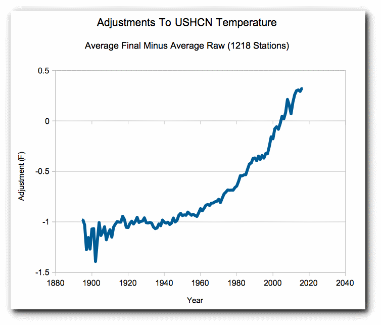
…Mikhail’s graph and this one look strangly familiar….
Even more eye opening:
HI Bart and all,
Here is why I prefer UAH to other temperature data:
.
http://www.woodfortrees.org/plot/gistemp/plot/hadcrut3vgl/plot/uah6
Best, Allan
Hmmm, so if NOAA stopped doing their adjustments, we’d see falling CO2 levels? Whew, that’s a relief! /sarc
I love it how the temperatures are often quoted to the HUNDREDTH of a degree. e.g. The temperature anomaly in 1880 was -0.16 C .
I will therefore tell you my modification to the classic “dick” joke, probably appropriate considering how many dicks there are in Climate Science.
“Mine’s 12.067″ but I don’t use it as a precision linear measuring instrument”
Centimetres or inches?
There is a ” , but if you cannot see it I guess you have made your point anyway.
The problem is that the inches mark resembles the close quote mark in many fonts.
On the internet, unless you specify it in the html, the font that you post in may not be the font that people are reading in.
Until you pointed it out, I was assuming that you had unmatched quotation marks.
Interesting analysis. One thing fairly well established in the very fuzzy field of psychology and research is the need for “blind” procedures in research design. Having people knowing which subject is in which group, or “knowing” how the test is supposed to come out, fairly reliably produces a bias.
How to correct for this effect in this field would be something of a bear. Automated data analysis would probably just move the bias to the programmers, and make it even harder to find.
These changes and the hype that goes with them always remind me of the New Sudso best ever clean washing powder adverts. I often wonder if these adverts and NOAA press releases are written by the same people.
These changes to the temperatures made on a regular basis remind me of virtually every car ad that starts with this phrase: “introducing the all-new”. Can you imagine how much it would cost to create an all new car every year?
You can double your wonderment by subjecting the “new improved” information to Mad Magazine style use of that new information to unravel what the “old unimproved” information was really telling you
Here’s what comes into my mind when I read “new and improved”:
New and Unproved.
Very informative. I shall bookmark this and re-read it many times. Thank you.
Hansen included a test of this in his ’88 paper, see Fig 1, he ran the model for 100 yrs with constant input. Showed a period of growth and a period of decline, max value about +0.2ºC, min value about -0.2ºC, std dev 0.11ºC.
Let’s phrase it another way: Imagine you play a little game with yourself. You start with a score of 0. Then you flip 132 pennies. For every heads, you add a point. For every tails, you subtract a point. What will your final score be? Well, if you play this game many times, you will see that 54% of the time your score is either >=8 or <= -8.
So in observing 70 upticks out of 132 years, must a scientist conclude that something is causing an unusual rate of upticks? Could those upticks be caused by, for lack of a clearer term, nothing?
Well, it turns out that there’s a 54% chance that those upticks are indeed caused by “nothing” (not literally nothing, of course, but merely by a very large and very noisy combination of forces that buffet the value hither and thither, with no preference of direction).
Actually there’s a 27% chance that there will be 8 or more ‘upticks’.
I am guessing that the red team, (and if Judith is not a member, her too) would love to have this in journal-ready form. Bottom line, do whatever it takes to get this published in a peer-reviewed journal. When we went shopping for my research, we added a well-respected researcher to the author list, who substantially improved the write-up and data analysis (though I did the research and most of the CO-ANOVA crunching with Statview). It also led to getting a Master’s degreed Research Audiologist into a national peer-reviewed journal. What you have here is a gold mine.
See if Judith or any of the other ones currently publishing in climate science want to play. Seriously. Publish. Or publish it with just you. You have the credibility and then some.
i will second that pamela. also essential reading for anyone without a science background with even a mild interest in the debate.
Also seconded. A summary in 4 or 5 paragraphs for those less technically minded would be good. something starting like:
“Given a set of temperature data which contains 2 supposed signals, natural and human produced, the natural moving up and down somewhat randomly and the human one supposed to be an increasing trend the task is to “extract” the steadily increasing bit from the overall up/down fluctuations…..”
If the start pont is 1880, then that isn’t very long after the end of the Little Ice Age. In general, with
some notable fits an starts (Little Ice Age), the planet has been warming since the last Ice Age, hasn’t it? The sea level rises per century were truly large for a long period of time – as I recall often over 100 feet per century.
…first they convince you the LIA ended in 1850
When I teach a class on random walks the test we adopt is to plot the (displacement)^2 from the origin, for a random walk this will be linear, for deterministic motion it will be more like quadratic. Applying that test to this dataset shows that it is deterministic, not a random walk.
You are doing it wrong, and so is everybody you teach.
Phoenix44 October 1, 2017 at 11:38 am
You are doing it wrong, and so is everybody you teach.
Really. Care to explain?
Phil. October 1, 2017 at 12:08 pm
Phoenix44 October 1, 2017 at 11:38 am
“You are doing it wrong, and so is everybody you teach”.
Really. Care to explain?
I guess Phoenix isn’t going to back up his assertion.
Einstein in his random walk model for Brownian motion derived the following relationship for the mean square displacement: MSD=2Dt
So as I said random walk gives a linear plot vs time, this NOAA data does not.
Phil, you are indeed doing it wrong. First of all, the expected displacement of a random walk after N steps is not D^2, as shown here:
https://math.stackexchange.com/questions/904520/why-is-the-expected-average-displacement-of-a-random-walk-of-n-steps-not-sqrt
Second, even if it was, you don’t reject a null hypothesis with a p-value of 50%. You reject it at 5%. At the very best, you’re teaching your students to reject the null hypothesis when it reaches a point of “slightly less likely than not”. That’s deeply wrong; you’re literally teaching them to commit Type 1 errors. Not good.
omedalus October 1, 2017 at 7:16 pm
Phil, you are indeed doing it wrong. First of all, the expected displacement of a random walk after N steps is not D^2, as shown here:
https://math.stackexchange.com/questions/904520/why-is-the-expected-average-displacement-of-a-random-walk-of-n-steps-not-sqrt
Indeed the average displacement of a random walk is zero, as I said the average squared displacement is proportional to N, the number of steps.
Second, even if it was, you don’t reject a null hypothesis with a p-value of 50%. You reject it at 5%. At the very best, you’re teaching your students to reject the null hypothesis when it reaches a point of “slightly less likely than not”. That’s deeply wrong; you’re literally teaching them to commit Type 1 errors. Not good.
I didn’t say this so I don’t know where you got it from.
If you plot MSD for a random walk it’s a straight line, if it’s deterministic motion it’s a quadratic, plot the NOAA data and from 1960 onwards ti’s strongly quadratic.
It’s easy to do in Excel, upload the data as linked to above, subtract 1880 from the date, add 0.2 to deltaT and square it.
@Phil;
Since the data set goes back to 1880, why exactly do you think it appropriate to truncate it at 1960? Cherry pick, much?
D. J. Hawkins October 2, 2017 at 4:35 pm
@Phil;
Since the data set goes back to 1880, why exactly do you think it appropriate to truncate it at 1960? Cherry pick, much?
I didn’t ‘truncate’ it, I analyzed the whole set, it doesn’t have the characteristic of random walks and from 1960 onwards it shows a clear quadratic behavior.
IMO the real climate system is not totally random over minimal 30-year intervals or greater. However the bogus, so-called “surface data sets”, despite their deterministic “adjustments”, do qualify as random walks. For instance, they resemble the highest of these eight random walk trends:
https://upload.wikimedia.org/wikipedia/commons/d/da/Random_Walk_example.svg?download
“Example of eight random walks in one dimension starting at 0. The plot shows the current position on the line (vertical axis) versus the time steps (horizontal axis).”
Note that, as would be expected, four trend higher than the start point and four lower, although one not by much at the end of the time run.
Will try again:
William Briggs has a post on random walks using the Arcsine rule here:
http://wmbriggs.com/post/257/
He gives an “R” program you can download and run for yourself.
Most of the in actuality random walks ‘look” significant to my prejudiced eye.
In order for the series to be significant, the number of “up” or “down” anomalies would have to exceed 78 at which point the 95% confidence limit would be exceeded. In other words, merely 7 more up years and 7 less down years out of 132 would have done the trick. Close, but no cigar for the warmistas.
Excellent article –
I’d suggest tagging the all data by date and measurement type and running a k-mean cluster analysis. If it still breaks up into groups that reflect individual sub population defined by measurement type then the assumption must be made that combining them into one is a no no. Alternatively the other conclusion is that there are more data adjustments to come. Perhaps that is the only prediction that can be made on the temperature data sets with any accuracy.
Consider yourself sufficiently cynical. 🙂
Excellent post. Kolomogorov-Smirnov brought back fond memories. I wrote a Fortran program to read the daily S&P 500 prices for a couple of years, apply KS, to show stock price changes are log normal not normal (fat tailed). Prof John Lindner of HBS had done the analytic math, and he wanted an observational validation. Directly relevant to CAPM (capital asset pricing models) using a company’s beta.
Beautifully written, it captures the reader, is simple to understand and does not fudge the conclusions. I enjoyed the whole piece.
No – I did NOT!
Micky “the Master” Mann tried to blackmail me to do that by kidnapping K-9. But he lost against the sonic srewdriver.
I hear K-9 took a particular interest in one tree.
Yes indeed. I think it was a lonely bristle cone.
The fact that K-9 took an interest in that tree might explain why it experienced accelerated growth in recent years.
Besides the cheap attack at my integrity – a real great post – I love it!
It really demonstrates nicely why not data need adjustments but error bars.
Every now and then one of these articles pops up saying that you can use a Brownian motion or random walk as your physical model. That supposes that a great range of things can happen by chance, and so you can’t prove that what actually did happen was not by chance. It’s basically saying that we just can’t make sense of the world.
But we can, and do. This article is explicitly inspired by the analysis that might be applied to financial instruments, like stocks. But there is a very fundamental difference between that and a physical property like temperature. Stocks can, and all too often do, just crash. The time series takes them into oblivion. They can also bubble. But there is one big piece of evidence about temperature that is not taken into account by this analysis. It has been around for many millions of years, and the seas have not boiled, and the atmosphere hasn’t liquefied.
With a random walk, that wouldn’t be true. It can go anywhere, and will. It has no boundaries. That is just not the behaviour that we observe. And it is not the behaviour that physics reasons about. Real temperature is subject to conservation laws. There is a finite energy influx, and a mandatory radiation to space. None of those fit within a random walk.
The post doesn’t claim that Brownian Motion IS a valid or let aone “the true and ony” physical model. It demonstrates that the uncertanty and range of NOAA data even compares with what you get if you’d accept random walk as null hypothesis. Big difference!
Coin flipping was a method of explanation of a random, constrained walk.
That does not mean that the author thinks climate is a random walk.
What this illustration explains is that GISS data cannot be described as other than a random walk, so all theories of ‘climate change’ remain on the table.
So the AGW theory is just one of these.
As is ‘business as usual.’
As is a combination of both.
‘The point of this discussion, therefore, is to emphasize that, when it comes to temperature anomaly data, Occam’s Razor suggests that the year-over-year time series is a random walk. The burden of proof is on those claiming that there is a trend to the time series, that the “walk” isn’t random. This burden can be met by showing that the data exhibits statistical properties that would be extremely unlikely for a purely random data set.’
Funny how, even when arguing against solid mathematical analysis, the Climate Fascist argument STILL boils down to “It’s not a cat, so it must be a dog.” LMAO
NS,
You said, “But there is one big piece of evidence about temperature that is not taken into account by this analysis. It has been around for many millions of years, and the seas have not boiled, and the atmosphere hasn’t liquefied.” Mikhail is not arguing that all temperature changes on Earth have been random. He is, instead, arguing that the changes in the last 132 years, out of 4.5 billion (not “millions”!) years, cannot be distinguished unequivocally from a random walk. That is, the null hypothesis cannot be rejected. The Law of Large Numbers predicts that a sequence will converge on the theoretical value with a very large number of readings, but that doesn’t prevent individual short runs from deviating significantly from the theoretical number.
There is nothing in his analysis that precludes the possibility of negative feedback loops correcting any random walk deviation and bringing it back to regress about the long-term mean. Indeed, he specifically avoided trying to attribute changes to physical processes.
You also said, “It’s basically saying that we just can’t make sense of the world.” Sometimes we can’t! Philosophy and theology may grapple with the question of why there is evil in the world and whether there is such a thing as “karma.” When (good) scientists find that a physical process or system doesn’t behave in a manner that is comprehensible, they try to discover why. Einstein died trying to come up with a grand, unified theory. There are many following in his footsteps. We still don’t have an answer. It is only alarmist climatologists that claim to know everything, and are deaf to criticism.
“He is, instead, arguing that the changes in the last 132 years, out of 4.5 billion (not “millions”!) years, cannot be distinguished unequivocally from a random walk. That is, the null hypothesis cannot be rejected.”
It’s an improper null hypothesis. The requitrement of a null hypothesis is that it is plausible, involves nothing new, and would explain the data. A random walk cannot explain the data, because of its unboundedness. A random walk that operates only over the last 132 years, but not at other times, itself introduces novelty and requires explanation, so isn’t a valid null hypothesis.
Simplicity itself. First order AR model with very long time horizon relative to the interval of interest. Indistinguishable from a random walk over 132 years.
“First order AR model with very long time horizon”
And it’s subject to the same objection. You can dream up statistical processes in which the present rise is to be expected, as a random event. But then, in that model, very much larger changes must also happen at considerable frequency, by the same statistical rules. And that just isn’t observed. You may point to glacial cycles, but no-one seriously thinks they are the expression of a statistical process. And anyway, random walk and related models would wander far beyond glaciation variations.
The proper answer is: “We do not know what is the root cause of the five observed 1000 year long cycles in the earth’s climate, nor do we know the cause of the dozens of shorter 65-70 year cycles superimposed on the 1000 year long cycle. We know these cycles exist, we do not know their cause. ”
Like the cities, sailors and ship captains who knew the tides were associated with the moon long before Newton “discovered” the Law of Gravity, and long after we knew the tides varied by depth of the bays, length of the rivers, and width of the inlets worldwide, we can “use” the results without “knowing” the physics, chemistry, or meteorology. And climatology.
But today’s “catastrophes-in-the-making” astrology-by-CO2 is propaganda. For the governments, by the governments, with the governments, using the governments to control the people.
“But then, in that model, very much larger changes must also happen at considerable frequency, by the same statistical rules.”
Not at all. I can create an ARMA model that will look like a random walk over just about any timeframe you want, but which is ultimately statistically bounded to not much more than your observations indicate.
NS,
You are adding requirements to the definition of a null hypothesis that are not generally accepted.
A null hypothesis is accepted commonly to be “… a general statement or default position that there is no relationship between two measured phenomena, or no association among groups.”
[ https://en.wikipedia.org/wiki/Null_hypothesis ]
While a null hypothesis MIGH be rejected because it can be demonstrated to be impossible, that doesn’t apply in this case. There is no strict requirement that a random walk is always effective. It may well be overpowered by exogenous forces at times. One has to consider the increments in the random walk (noise) compared to the influences of an external signal. It is also possible that a run for short periods of time (I.e. much less than 4.5×10^9 years) may be unchanging. Most importantly, there appear to be feedback loops that prevent “unbounded” behavior, while still allowing random walks within a region of ‘permissible’ ranges.
The claim in the article was that a random walk cannot be rejected as a reasonable and probable explanation for observed temperature changes over the last 132 years based on commonly used statistical tests, therefore, it is as reasonable an explanation of the recent temperature record as the claim that there is some sort of ‘trend’ resulting from forcing. You are characterizing the effect of the random walk as being the totality of effects. You are being disingenuous!
Clyde,
“A null hypothesis is accepted commonly to be “… a general statement or default position that there is no relationship between two measured phenomena, or no association among groups.””
That’s a bit too null. It has to be enough that you can calculate the probability of the outcome under the NH. This article proposes that instead of the normal stationary NH, one should use a martingale. That isn’t just asserting no relation; it’s asserting a particular structure. So the question is, why?
Bartemis,
“I can create an ARMA model that will look like a random walk over just about any timeframe you want, but which is ultimately statistically bounded to not much more than your observations indicate.”
I’ll believe it when I see it.
Bartemis October 1, 2017 at 12:58 pm
Simplicity itself. First order AR model with very long time horizon relative to the interval of interest. Indistinguishable from a random walk over 132 years.
Ok run it 50 times starting at 0,0 then take the mean of all 50 trajectories then plot the mean vs time if it’s a random walk it will have a mean of zero. Then take the mean square of the trajectories, to be indistinguishable from a random walk it will give a straight line. Let us know how that works out.
Guys, this is silly. It’s a trivial problem. You just set the autoregressive time constant to a bit longer than your data record.
“…then take the mean of all 50 trajectories then plot the mean vs time if it’s a random walk it will have a mean of zero. “
One cannot “take the mean”, one can only estimate it. And, that estimate is, itself, a random variable. It is very unlikely to be precisely zero. In fact, the probability is vanishingly small, thought not completely zero when using quantized number representations in a computer.
“Then take the mean square of the trajectories, to be indistinguishable from a random walk it will give a straight line.”
This, again, can only be estimated, and is unlikely to produce a completely straight line, or even a moderately straight line. However, it will produce very nearly as straight a line as you can get from an actual random walk.
I’m beginning to wonder if you guys know anything about stochastic processes at all.
Bartemis October 2, 2017 at 5:00 pm
Apparently you don’t know much about random walks. I don’t see what the difficulty is about calculating the mean of 50 numbers.
The first 3mins of this video shows 4000 random walks.
You cannot calculate the mean. You can calculate the average, which is an estimate of the mean, but you cannot calculate the mean. As you can readily see, you never get precisely zero.
Bart, you bragged that you could “create an ARMA model that will look like a random walk over just about any timeframe you want”. So I said OK so why don’t you do so and perform the appropriate test to demonstrate that. Instead of doing so all we get from you is sophistry about means!
Bartemis October 3, 2017 at 4:47 am
You cannot calculate the mean. You can calculate the average, which is an estimate of the mean, but you cannot calculate the mean. As you can readily see, you never get precisely zero.
I told you how to do it. It’s easy.
I do not deal in sophistry. This is an important point – the parameters of a statistical model cannot be known in truth, they can only be estimated. It is a cornerstone of statistical analysis. We derive confidence intervals based on the statistics of our estimates. If you don’t know it, if e.g. you regularly confuse means and averages, then you immediately betray a lack of sophistication in the arena.
I get charged with sophistry a lot also when I inform people they are mixing up necessary and sufficient conditions for a given conclusion. Untutored people typically jump from the former to the latter, without realizing they have committed an egregious fallacy.
Way too many people think science is all about saying stuff that sounds sciency, and that they are somehow immune to misconceptions such as often encountered in the past because they have iphones and stuff. They really do not understand science at all, but I am regularly lectured by such ingenues that it is I who lack awareness.
My earlier reply appears to have disappeared so I’ll try again.
Bartemis October 3, 2017 at 11:48 am
I told you how to do it. It’s easy.
No, you bragged that you could do it, so I suggested you do so and create 50 trajectories and could test whether they were random walks. All that followed from you was bluster about the difference between means and averages. From which I conclude that you’re unable to back up your claim.
Sorry Nick, that’s not true. The flipping of coins demonstrates random walks quite nicely, but the probability of it being unbounded in any one direction becomes vanishingly small in relatively few flips. Likewise, financial markets are also bounded by zero on the bottom and a diminishing probability of increasing value on the top.
Certainly the Earth’s atmosphere is bounded by the physics of water, the Earth’s rotation and distance from a relatively stable sun, the makeup of the atmosphere and so on, but there is a level field inside those bounds were atmospheric temperatures can and do meander. Certainly they do not meander by chance, but through an extremely complex interaction of forces and variables that are not, by any means, quantified and understood. The ‘Pause’ is more than enough evidence to this fact.
Mikhail Voloshin is not arguing that atmospheric temperature is the product of random chance, only that it cannot be distinguished from something generated by random chance. In other words, it is not statistically possible to identify any one thing as the cause of the observations, because the observations are not distinguishable from what might occur from a random walk. This includes CO2.
Your boundary argument is irrelevant. Anywhere inside given boundaries, a random walk can occur.
“The flipping of coins demonstrates random walks quite nicely”
The flipping of coins is a stationary process. A random walk, as the author explains, is necessarily unbounded. You can add bounding conditions, but then you have to explain them.
“Anywhere inside given boundaries, a random walk can occur.”
But the boundaries are not given. If they existed, that would be a whole other story.
Nick, you either did not read the entire write up, or missed several points. He clearly stated that there could be boundaries but within these boundaries the random walk variation could occur. This is a basic chaotic problem (4th power radiation, non-linear NS, air and ocean transport and storage and release, etc).
Leonard,
“He clearly stated that there could be boundaries”
No, I’ve dealt with that in several comments. Yes, you can assume boundaries. But where are they? and what happens there? That is why it fails as a null hypothesis. It just means that there is a whole lot more to explain. Before you know it, you’re up to your armpits in epicycles.
“Certainly the Earth’s atmosphere is bounded by the physics of water, the Earth’s rotation and distance from a relatively stable sun, the makeup of the atmosphere and so on, but there is a level field inside those bounds were atmospheric temperatures can and do meander. Certainly they do not meander by chance, but through an extremely complex interaction of forces and variables that are not, by any means, quantified and understood.”
The lack of understanding is the problem!
Trends are funny things. Meaningful trends can be extracted from three samples: e.g. ‘Don’t light three cigarettes from the same match,’ or ”Once is happenstance, twice — coincidence, but three times …’
Much longer trends, with an inadequate understanding of the underlying systems, can reasonably be viewed as a meaningless sequence of unrelated facts. (The last quoted sentence spells it out, beautifully.) This is the prime reason why ALL of the ‘spaghettified’ climate models are inherently worthless — even if, by some freak of chance, one of them happens to accurately predict an observed trend. If one doesn’t understand the system, then there is no way to be sure that a hitherto accurate model will continue to be accurate.
Also, given the unknown influences of forces from outside our immediate solar neighbourhood (cosmic rays, etc.), it is appropriate to consider the Earth as an UNbounded system. So, we have a poorly understood, unbounded, significantly chaotic system. Under the circumstances, adaptation would seem to be far more rational than the delusional presumptuousness of anthropogenic climate modification.
No, it is not a random walk, not when the “adjustments” correlate so well to the desired outcome. These are not random.
And NOT when there has been known and INTENTIONAL adjustment to the data, especially the wiping away of the 1940 temperatures. These are not random,
You don’t seem to have read the piece.
If a random walk can simulate the data, then the data can be a random walk.It is that simple.
+1
Nick: “look a squirrel”
Nick,
Here you go again, adding something to the article and no one else brought up,don’t you ever get tired of making Red Herring comments?
When are you going to explain to Tony why you wrote that dishonest comment about the two charts in the other thread?
His latest in exposing your B.S.
Nick Stokes : Busted Part 3
“Nick Stoke’s final idiotic claim takes us right to the heart of this scam.
The first GISS plot is not the usual land/ocean data; it’s a little used Met Stations only
This was the GISS web page in 2005. Top plot was “Global Temperature (meteorological stations.) No ocean temperatures.”
https://realclimatescience.com/2017/09/nick-stokes-busted-part-3/
Why write the way you do,Nicky?
Well, that’s for sure a red herring. What is the connection here?
But if you insist, try finding the GISS Met stations only data in the rather extensive WUWT global temperature page. Or even in the GISS 2005 annual temperature report.
“try finding the GISS Met stations only data”
..you don’t need to “find” it…..it’s all they got
“what James said……”
You are pathetic,Nick since the link I provided answered your questions. The very chart you whine about is right there on the GISS webpage. Tony showed both 2001 and 2005 webpages in his post with links to them.
Here is the 2005 webpage of the charts in it:
Stop being this dumb.
The great Nick, couldn’t find the data for the 2005 chart,which was given to him in Tony’s link I provided:
https://web.archive.org/web/20051019133758/http://data.giss.nasa.gov/gistemp/graphs/Fig_A.txt
“Global Surface Air Temperature Anomaly (C) (Base: 1951-1980)”
ALL the data from 1880-2004, in the link Tony provided that you didn’t bother looking.
Nick writes,
“But if you insist, try finding the GISS Met stations only data in the rather extensive WUWT global temperature page. Or even in the GISS 2005 annual temperature report.”
The answer was in the link you never visited. You appear dumber every time you do this……
Sunset,
You seem to have a lot of trouble following simple arguments. I didn’t say I couldn’t find the GISS met stations only data. In fact, it’s one of the ones I monitor every month , as GISS Ts. And it is one of the ones I show in the interactive comparison of indices with Hansen’s 1988 projections. I argue that it is specially appropriate for that, because it is the index he used in his original comparison, and represents what he was projecting. That tends to get howled down, because it actually follows a bit on the high side of scenario B, currently touching A.
What I am saying here is that the index is little used, not that it is hard to find if you really try. For that I note that since 2005, and somewhat before, GISS has based its annual reports entirely on Land/Ocean (with SST). The Ts (Met stations only) index is not mentioned. And I noted that it isn’t shown in the WUWT collection.
That’s why I think it is dishonest to wave these plots about as evidence of GISS “data torture”, without explanaton of what it is. You obviously and persistently fail to distinguish between that and the well-known GISS Land/Ocean index, and I suspect most of Tony Heller’s audience doesn’t care about the difference either. If you want to complain about GISS adjustments, you should show the effect on the GISS plot that people actually use.
And for this thread, it’s still a red herring.
Nick writes,
“You seem to have a lot of trouble following simple arguments. I didn’t say I couldn’t find the GISS met stations only data.”
You say I have trouble following you,when you can’t even notice i GAVE you the data for THAT chart!
You earlier wrote,
“But if you insist, try finding the GISS Met stations only data in the rather extensive WUWT global temperature page. Or even in the GISS 2005 annual temperature report.”
Here is the data I linked to,for the SECOND time……
https://web.archive.org/web/20051019133758/http://data.giss.nasa.gov/gistemp/graphs/Fig_A.txt
You seem to be ignoring links,I posted because they keep answering your comments.
Try reading better.
“Try reading better.”
You can’t even read what you quote. I said
“But if you insist, try finding the GISS Met stations only data in the rather extensive WUWT global temperature page. Or even in the GISS 2005 annual temperature report.”
and what you link to is not that. You have linked to a file with text data on the internet. I can find that data with no trouble. My point is that you will not find it in the places where temperature information is udsally sought. That includes what GISS includes in its reports, or what WUWT lists for its readers. It is not what readers understand as GISS global temperature. Its use here is a misrepresentation.
Mr Stokes, you clearly didn’t read to the end of the article. The author explained the issue you describe by a series of soccer field analogies. You are describing the analogy of the flat soccer field within which a random walk happens , bounded by steep walls of a valley.
Why do you always automatically try to rubbish good work just because it ‘tests’ your religious beliefs? You are not demonstrating the sort of logical, scientific mind you would have us believe you possess.
obviously Nick didn’t read the link Tommy posted either…..he’s just shooting from the hip
…..he’s just shooting from the hip…
Wouldn’t that be shouting from the hip?
Grandson of Navier-Stokes,
You argue with something the author did not say. He did not say, ” The average temperature of the Earth is a random walk.”
He said, “The 132-year NOAA record of the average temperature of the Earth cannot be STATISTICALLY distinguished from a random walk.”
“Climate Science” howls about Hottest Year Ever in an attempt to prove that we must adopt an austere lifestyle. They actually do this because they hate any and all mining operations, no other reason I can detect.
You have several comments on here, all repeating the same error, contradicting something the author simply did NOT say, why do you bother…
“He did not say, ” The average temperature of the Earth is a random walk.””
I didn’t say that he did. It helps to actually quote what people say. What he did say is:
“Now, when it comes to the Earth’s mean temperature, the simplest and most basic assumption, i.e. the null hypothesis, is the same as the null hypothesis for any other time series: that it behaves as a Markov process – specifically, a sub-type called a Martingale. “
And what I say is, no, you can’t make that assumption. It is inconsistent with Earth’s history, as he acknowledges. Temperature hasn’t wandered without bounds. It just fails as a null hypothesis at a basic level. So he has to adorn it with fancies that it sometimes is and sometimes isn’t (so why does it change, and what is it when it isn’t?). Or that there are some barriers where it stops being a random walk (So where are they, and how does it behave there?). The hypothesis either doesn’t explain, or it isn’t null, which means it leaves a whole lot else to explain.
Besides inventing brand new red herrings Nick, you just busted your own strawman.
You just verified that the null hypothesis stands and has not been accounted for or disproven.
Your ineffectual hand waving does not cause null hypothesis or hypotheses, if you prefer, to evaporate just because you don’t like the method or message.
• Disprove the mathematics involved! Which means you have to prove decades of financial testing of those methods are wrong.
• Disprove all of the error bounds NOAA, MetO and BOM overlook!
• Disprove all of the data mishandlings NOAA, MetO and BOM forcibly use to abuse their data.
Stokes-as-he-ever-was,
You make an analogy between 132 years of thermometer records with 4.5 billion years of no thermometer records, FAIL
“It’s basically saying that we just can’t make sense of the world.”
No it’s not. It’s saying that the NOAA data set in question is probably telling us nothing about the real global temperature trend. You are trying to make the same argument as Niel Degrasse Tyson when he said people trust science to predict solar eclipses, so they should trust science to predict the future climate. Earth-moon orbital mechanics is a much better defined problem, where the moon’s orbit around the earth is known with great precision. There is little randomness involved, so we can easily make sense of it. Global temperatures have a lot of apparent randomness, and the available data record is short and corrupt. Therefore we can make no sense of it!
Another “Nick Stokes” bogus strawman logical fallacy. Fake through and through.
Try reading the article, Nick; not inventing fake sentences and then pretending the author of the article wrote them.
Nick, I think the author just said what you said when he said “The decision of which process best represents reality then moves away from which one could have created this data, and into topics of model plausibilities and Bayesian prior probabilities”
HAS,
Well, yes. But my point is that a random walk fails on model plausibility. Temperatures clearly haven’t varied without bound. And the notion that we are just going through a period of random walk when normally it isn’t is also not plausible.
What is quite plausible is that the instrumental period is, if that’s all you’ve got. You only can claim its bounded by peaking outside the dataset.
Now you might argue the utility of that pov, but it might be a very good approximation when working at that scale and resolution. We regularly use different models to describe phenomena that differ in this way (think quantum and Newtonian mechanics). If any period of a couple of centuries at a daily resolution behaves this way then that is pretty useful for thinking about what might happen over the next 50 years.
HAS
“What is quite plausible is that the instrumental period is, if that’s all you’ve got. “
It isn’t all we’ve got. We’re sure that the seas haven’t boiled in the last billion years, and that is inconsistent with a random walk.
“We regularly use different models to describe phenomena that differ in this way (think quantum and Newtonian mechanics).”
We use them on different scales. But we don’t assume that Newtonian mechanics was true up until 1900 and then the universe changed to quantum mechanics. That’s the analogy here.
Nick, it may be academic but it is informative to consider what the data – at the resolution in question – tells us if this is all you have. It is useful precisely because there is this unique period in time when we have it at this resolution.
However I think you are missing the point, for short periods at high resolution the assumption of unboundedness may be good enough. We don’t put aside Newtonian mechanics because strange things are going on at the edge of the universe. If we had instrumental data for the first couple of centuries of the last millennium and were interested in studying things on that time scale we may well apply avsimpler unbounded model to the problem.
Models in the end are judged on their utility, and for the purposes of short run high resolution study boundedness may not matter (and I think this post is suggesting just that).
Whether there is a better model for this particular application therefore may well come down to Occam’s razor.
PS Perhaps to make it crystal clear with a direct analogy, we don’t not use Newtonian mechanics because the speed of light seems be a limiting factor.
HAS
“However I think you are missing the point, for short periods at high resolution the assumption of unboundedness may be good enough. “
Or bad enough, which seems to be the aim here. We have data which makes good sense with a conventional stationary model with imposed secular variations, but then someone dreams up a model with more uncertainty, so that the observed features could be “explained” as random.
But as I said elsewhere, the problem is that if you assume a model where the current marked rise is merely a random occurrence likely to occur frequently, then even larger, and very much larger, changes are also likely to occur over a few million years. And that just hasn’t happened. So then you have to add an assumption that there is something special about the period for which we have observations, so that the model you want tio apply now would not have applied in the past.
But why would you assume that?
You can have convergence, without having infinite impulses?
Nick, so you now agree that there can be utility in modelling the global temperature for short periods of time at high resolutions that don’t take account of aspects of the wider domain that are not discernible within the domain being modeled.
With the speed of light and Newtownian mechanics, if you start going very fast or operating on large scales it might be useful to included it, but we generally agree we don’t need to bother. In the same way it might just not be useful to accommodate bounds in a temperature model for this narrow purpose.
The question for you is when does the assumptions of a stationary model with imposed secular variations become more useful, noting that this isn’t able to be discerned from the domain in question?
Note this is a contingent question, not handed down from the gods as you are suggesting.
HAS,
“The question for you is when does the assumptions of a stationary model with imposed secular variations become more useful”
But you are not looking for useful. You are looking for useless. A null hypothesis sufficiently general that it can’t be rejected. You could adopt the null hypothesis “Could be anything”. That’s very hard to reject. But it’s inconsistent with what we know of the world.
This really relates to statistical power. Adopting random walk is minimising the power. That is not useful, and is the opposite of what true scientists try to do.
The author covered this:
“The decision of which process best represents reality then moves away from which one could have created this data, and into topics of model plausibilities and Bayesian prior probabilities.”
Plausibility has to be evaluated in terms of everything we know about temperature. The basic structure of a stat inferential test is: OK, our bright idea will explain the results, but there is an alternative, plausible explanation (NH) which could also possibly (5% say) explain them. Or not. Plausibility is the key.
To be clear: ‘Random walk’ in itself is not enough. One would specify the kind of randomness.
So if someone just says ‘random walk’ he may mean Brownian motion (random walk with red noise) or a Gaussian random walk (white noise) or it may mean a random walk using a kind of randomness coming from some unspecified/unknown distribution. The latter may very well be the case here.
Because he (Mikhail Voloshin) uses non-parametric statistics it doesn’t matter whether we know the distribution of the ‘randomness’ or not.
Random walks commonly are constrained (bounded) in which case the number of steps is bounded to a certain maximum, there is a ‘random walk length’. And there is a maximum to the expected excursion from the starting point.
In many processes the random walk is actually bounded, sometimes just one sided. For example stock prices are bounded on the downside to 0.
Many processes can’t be pure random walks because that could indeed imply unbounded growth.
See e.g.:
Stationary Processes That Look like Random Walks: The Bounded Random Walk Process in Discrete and Continuous Time [2002, João Nicolau]
And see also:
Random walk lengths of about 30 years in global climate [2011, Bye et al.]
Sure, but the post was based on an analysis of a brief finite range of years. Your critique is misdirected.
I found this to be a very informative and very well-written article. I have to admit, at first I could only marvel at how well Gates McFadden could simulate being knocked out by a faux slap. Then I started thinking: “What does this have to do with anything?”
Since the temperature record was never a legitimate argument for a man-made global warming crisis, due to the natural warming of the early 20th Century equalling the warming of the late 20th Century, this article doesn’t really add anything to the skeptical argument.
The following section from the article probably stokes the the crisis paradigm in the minds of any doom-and-gloomers who read that far:
“In fact, per the Causes of differences… paper cited above, the data is even consistent with a very large anthropogenic signal that looks smaller than it should because it is being masked by a random walk that has wobbled its way downward!”
The climate crisis paradigm has not been foisted on politicians and the public based on robust science and statistical analysis. Those things simply don’t exist for the warmests. They never have. The crisis has always been sold with emotional arguments and the irrational Precautionary Principle. If a crisis could happen (no matter how little the evidence supports it), shouldn’t we put an end to our CO2 emissions immediately? Of course, the answer is and very emphatic ‘NO!’, for very rational and sound reasons, but the warmests can’t hear those reasons. They are in an emotional state of fear!
http://www.michaelcrichton.com/state-of-fear/
“The whole aim of practical politics is to keep the populace alarmed (and hence clamorous to be led to safety) by an endless series of hobgoblins, most of them imaginary.” H. L Mencken
However, the take-away from the article – and one thing that an otherwise excellent article missed stating EXPLICITLY – is that the wise analyst, whether they are a stockbroker or a politician, does NOT</b lay any money down when there is no way to tell whether there is a trend there, or not.
What this analysis shows is that, even making the thoroughly invalid assumption that the currently accepted “data” for the last 132 years is accurate and unbiased in any way, it tells us nothing about the trend. The world temperature could be warming. The world temperature could be cooling. The world temperature could be static. No way to tell. Don’t mortgage the house to lay a bet; you are all too likely to end up huddled over a vent on the cold, cold street. The call by “warmists” to invest just about all of the GGDP – Gross Global Domestic Product – on the bet that the world is warming is the same as mortgaging everybody’s entire belongings, as well as their lives. Which is completely unacceptable.
Now, with a longer data set, we can show fully justified and mathematically defensible trends (as semi-regular cycles). That data set tells us that we will be drastically cooling in the relatively near future, as in a return of the massive glaciations. However, the error bars on that data set are such that we cannot say just when. “Coolists” are largely honest with their predictions; e.g., “Sometime in the next 10,000 years, Manhattan will once again be under a mile of ice.” So, of course, they don’t get much attention from the press (quite rightly, by the way…) Then again, “coolists” are not calling for a massive, economy distorting investment in fusion power plants and solar mirror arrays in space to hold off the glaciers. Many of us do call for reasonable investment in those things – but for near-term benefits, not the anticipated glaciation. We also have no problems with reasonable investments in improving solar cell efficiency, better batteries, and so on. Also for the near-term benefits, not to prevent the anticipated melting of the ice caps. (“Reasonable,” to me = “somewhere north of $100 million, but well south of $10 billion, per year.)
By the way an honest reading of the cycles says that the ice caps will melt away in the future – sometime in the range of 100,000 to 250,000 years from now.
Should be “by menacing it with” and endless series of hobgoblins. A favorite quote of mine since it describes AGW precisley.
AN endless series (typo)
Mikhail,
I think that this is a very-well written post, and it raises some extremely important points!
You said, “A logical prerequisite to any discussion about whether or not humans are causing climate change is the establishment of an actual upward signal at all.” Should the Red/Blue Team exercise come to pass, I think that this should be the first topic of discussion: “Are we seeing a rise in temperature that can be attributed unequivocally to anthropogenic forcings, or is it just an illusion?” I think that you have just raised the bar significantly for those who are alarmed by recent temperature changes.
First bullet point on the agenda should be “Are we seeing a real trend in temperature.” Period, dot. As shown by Mikhail – we cannot say that we are seeing a real trend in temperature. Meeting adjourned, where should we go for lunch?
Don’t mind where, as long as its filling and warming.
Exactly. Who gets to decide “normal”? Would we be happy with the temperatures of the LIA and were they “normal”, if a recovery from then is considered “abnormal”, or even “unprecedented”. Anomaly base years can be changed to produce very different results and Phil Jones didn’t want the 1960-91 base changed until he had retired, because so many stations disappeared. I believe the public at large know nothing of “anomalies” and think they are being being presented with real temperatures running out of control.
Temperature readings today are about 0.75°C higher than they were when measurement began in 1880,
That would put them where they were in about the mid 1920’s.
No, it is not a random walk. For several reasons, but since this post is purely and extraordinarily naively mathematical, here is a competent mathematical analysis: https://tamino.wordpress.com/2010/03/11/not-a-random-walk/
And then: http://moregrumbinescience.blogspot.com/2011/08/is-climate-random-walk.html?m=1
The Tamino analysis is not relevant to the question posed and answered here. And, it is also partly wrong.
What is “partially wrong” with Tamino’s analysis?
Right, he’s a quant payed millions and his maths is wrong.
Whereas you are…somebody who thinks Tamino knows what he is talking about and is unbiased.
Er…Tom…what do you think produces future climate model scenarios? Maybe the huge climate model servers have become artificially intelligent and no longer need no stinkin math.
Mikhail did not say the temperature series was a random walk. he said it was statistically indistinguishable from a random walk. So who is naive?
…and even more competent math analysis showing these data really (really!) cannot be reasonably attributed to a random walk: https://tamino.wordpress.com/2010/03/16/still-not/
The issue is not if the last 132 years of data are a random walk, but instead, as the OP points out, if the data can be statistically differentiated from one. It cannot be shown to differ significantly from a random walk time series. Every silly doomsday claim made by the fear-of-CO2 group could be true, but they do not have any data, not even massaged data, that supports them in a statisically believable way. That alone calls into question their physical assumptions. The null hypothesis is not falsified. This has been the problem with “global warming” advocates since the 1990s. It was one of the big problems with Mann’s original work and has never gone away. Even the stupid “97% consensus” issue has the same problem, and it is not founded in weather data.
Anybody who takes the time to read about the collection of and the methods employed in the compilation of the historic temperature record realizes that the data are completely unreliable.
It’s a joke.
The truth is that climatology hasn’t got the foggiest idea in hell whether the earth is now warmer (or not) than it was prior to the advent of satellite recordation.
IMO real climatology does have an idea, from paleoproxy data. But we can’t know to tenths of a degree globally, let alone Hadley CRU and NOAA’s imaginary hundredths of a degree.
Willy,
NASA has published tables with temperatures to the thousandth of a degree!
What I said goes triple for thousandths!
+1,000 All data graphs should be shown in full degrees, then the truth becomes apparent.
IMO, proxy observations and limited instrumental data show that earth globally is warmer now than in AD 1880, but not by much, and further that it’s no warmer now than in the 1930s. Locally, there are places hotter than then, but they don’t add up to any significant global warming.
The trouble here with ‘randomness’ is the idea violates the basic necessary thermodynamic principle that no additional warming can occur in a dissipative system without an additional input of outside energy.
Vuk says “Oceans’ thermal capacity is smoothing the sunspot cycle variability to an extent that is not readily extracted from global temperature data.” – incorrect. The solar signal is easily extracted from SSTs.
The AMO, PDO are indices that spatiotemporally integrate irregular solar TSI warming and cooling.
From the post, “In the NOAA data set, the Pacific Decadal Oscillation (PDO), [1] which drives El Nino/La Nina events, exhibits such a cyclical pattern; and indeed, most of what we currently know about the PDO is data that we gleaned empirically from performing autocorrelation tests on time-series analysis. Likewise, the roughly [2] 11-year solar cycle is likely to show a sustained pattern of rising and falling temperatures that has been shown to correlate well with year-over-year temperature anomaly data.”
[1] the PDO does not drive ENSO. PDO & AMO are about solar energy accumulation/deficit over time.
[2] the solar cycle influence is clearly seen in year-over-year temp anomaly data, and whole cycle.
As for [2]: this was the concept that I investigated and successfully used to determine a solar sensitivity factor of ~0.5C/W/yr, which I used in late 2015 to predict the year end SST in 2016 to within 3%.
There is no randomness nor chaos. Climate is very deterministic – it rises and falls on TSI & insolation.
If the red team cannot or will not understand and use the solar influence then they’re truly blue team.
There is no escaping this conundrum nor the consequences to those who ignore or dismiss it.
No, “randomess” simply simulates our lack of knowledge of all the myriad of forces and how they interact. as the paper says, it is not truly random (nothing is) but if you can simulate the data using a random walk, then you cannot claim there is a trend. There might be, but there doesn’t have to be.
The beauty of this analysis is that you don’t need to know anything about what is actually happening. You can however show that what is happening can be explained by what had happened before.
“Random” outside the QM Domain is simply a polite way to say “I have no fucking idea”.
OOps – I use a bad word
ALT-Text:
“Random” outside the QM Domain is simply a polite way to say “duh”.
“You can however show that what is happening can be explained by what had happened before.”
agree !
and that is what I have attempted to show here
https://wattsupwiththat.com/2017/09/30/climate-models-overheat/#comment-2624836
All the so-called “surface data sets” are worse than worthless kludge, totally unfit for the purpose of guiding public policy. They are not science but political artifacts, showing literally man-made warming, where “man” means lying bureaucratic “climate scientists”, who aren’t climatologists or even scientists. Their adjustment AlGorethms are GIGO.
The mendacious “surface data” gatekeepers are the real climate criminals. Their felonies have cost millions of lives and trillions in treasure.
Couldn’t agree more, and their representation being to the tenths, hundredths, or even thousandths of a degree renders them all pure fantasy.
All this article is very wonderful and though out science but it won’t convince a single soul that global warming isn’t a dire threat that has to be dealt with right now or we will destroy the planet. I much prefer Alex Epstein’s method of convincing people: state the benefits over the negatives, put it in moral terms so even a lefty will understand, and you can more easily show them they are wrong. Thanks for the info…
Beautiful analysis and explanation. WUWT has slogged through the quagmire of marginal statistics many times before. For example, see
https://wattsupwiththat.com/2015/07/12/robust-analysis-isnt-what-it-is-cracked-up-to-be-top-10-ways-to-save-science-from-its-statistical-self/
The following are my comments that are applicable to the present article:
Neil Jordan July 12, 2015 at 3:19 pm
My 2013 comment to WUWT is germane to this argument. I will add another quote from the article which should be mandatory reading for anyone delving into statistics:
“William Feller, Higgins professor of mathematics at Princeton, is in a fighting mood over the abuse of statistics in experimental work.”
http://wattsupwiththat.com/2013/05/14/the-beginning-of-the-end-warmists-in-retreat-on-sea-level-rise-climate-sensitivity/
Neil Jordan May 16, 2013 at 1:32 pm
Re rgbatduke says: May 14, 2013 at 10:20 pm
Abuse of statistics is also covered in this old article which is unfortunately not on line:
“A Matter of Opinion – Are life scientists overawed by statistics?”, William Feller, Scientific Research, February 3, 1969.
[Begin quote (upper case added for emphasis)]
To illustrate. A biologist friend of mine was planning a series of difficult and laborious observations which would extend over a long time and many generations of flies. He was advised, in order to get “significant” results, that he should not even look at the intervening generations. He was told to adopt a rigid scheme, fixed in advance, not to be altered under any circumstances. This scheme would have discarded much relevant material that was likely to crop up in the course of the experiment, not to speak of possible unexpected side results or new developments. In other words, the scheme would have forced him to throw away valuable information – AN ENORMOUS PRICE TO PAY FOR THE FANCIED ADVANTAGE THAT HIS FINAL CONCLUSIONS MIGHT BE SUSTAINED BY SOME MYSTICAL STATISTICAL COURT OF APPEALS.
[End quote]
Correction: I was able to locate the article on line at:
http://www.croatianhistory.net/etf/feller.html
The PDF can be downloaded here:
http://www.croatianhistory.net/etf/feller_too_much_faith_in_statistics.pdf
Bob and Tom (sounds like a morning radio show),
You are missing the point. Mikhail specifically agrees that temperature changes happen for very physical reasons, but the observed temperature is not distinguishable from a random walk. This means , statistically speaking, one cannot attribute a specific cause for the observed conditions. This is just the scientific method in action.
“but the observed temperature is not distinguishable from a random walk”
But it is distinguishable. He exxplains how:
“if Earth’s temperature truly was an unrestrained random walk, then at some point in the last few billion years a series of same-direction steps would have coincidentally arisen that would have either incinerated the planet or frozen it to such a chill that it would have snowed oxygen.”
I think billion could be replaced by thousand.
Mr Stokes, you repeat the same lack of reading ability. The author deals with this laboured point in his analogies of soccer fields.
He is not saying that the earth’s climate is random, nor is he saying that the temperature record is random.
He is merely testing the null hypotheses as all good scientific method should.
The result is clear. Its not for debate. Increases in temperatures by forcing, CO2, polar bears, red balloons or any other agency is UNPROVEN.
Now you might believe in the the magic molecule, but its just that, a belief. Not scientifically or statistically proven.
NS,
You are misrepresenting the author’s claim. He is NOT claiming that all temperature changes are the result of a random walk. Indeed, you are quoting him acknowledging that they are not! He is claiming that the recent warming, for a miniscule fraction of the Earth’s history, cannot be distinguished statistically from a random walk. This is your sophistry being demonstrated.
Using non-parametric statistics to muddy a problem that has quantitative measurements is a dodge, and using a 100+ year record to obviate a rise that happened mainly in the last 40 or 50 years is suspect.
If we look at the last 40 years, there are 24 increases and 14 decreases, and 2 ties. For Prob = 0.5, the chance of getting 14 or less is about 7%. A far different result than the picture you paint.
That’s a really dumb reply. You are simply making the basic error the paper describes – seeing a trend. So you pick where to start based on where you think the trend starts. But we can get to that “trend” from earlier simply by using a random walk.So there is no trend-less period and then a trend to explain.And just cutting off the amount of data you use and saying there, look, is nothing more than using the data that works for your claim.
Really,
Here is reality:
Temperature rose much more dramatically and for longer in the early 19th century, coming out of the Maunder Minimum depths of the LIA. Then it generally cooled, with some ups and downs, until the end of the LIA in the mid-19th century.
Since then there have been three warming cycles and two or three cooling cycles, each of 20-40 years. There is no evidence of any human signature in any of those cycles.
The late 20th century warming was virtually identical to the early 20th century warming. Earth cooled from the 1940s until the PDO flip of 1977, despite rising CO2. Then for 20 or 30 years, it warmed slightly. Whether temperature since than has been flat or cooling will take a bit longer to see. But during all these ups and downs, CO2 was climbing, so no effect is visible.
Thus far, more CO2 has been a great boon to the planet, its plants, and the animals and fungi reliant upon them.
There you go with those “Inconvenient Truths” again. The Climate Fascists clearly have more revisions to do to make the record match the propaganda.
ah…reallyskeptical points out weather to us. However I think he was attempting to use a 40 year climate regime shift as proof that humans caused it. Score one point for the non-AGW side. There have been MANY such shifts in climate regimes. What caused it then? Too many Neanderthals around the campfire? Nature is still in charge of weather and climate. The vanishingly small amount of additional CO2 gassed into the environment by human activity could not have caused that increase. Not enough energy. And the additional natural CO2 is likely sourced from the greening of the Earth just like the rise in temperature came first followed by the rise in CO2 in the ice cores. All pointing to: weather, on a small to writ large scale. Thanks reallyskeptical.
Weather. Right. I will write that in my notebook as wise advice.
Not.
If we look at the last 40 years…do they let you cross the street by yourself?
Sorry, realygullible, the only real warming in the 40 years has come from two major El Nino events.

Basically zero trend apart from those two events.
No warming from 1980 – 1997
No warming from 2001 – 2015.
And, while it has only been about a year since the end of the 2016 El Nino, it looks as if we’re back in another no warming phase. Time will tell.
Once the noise of the 2015/16 El Nino has died down, I suspect it will level of to pre El Nino levels for a couple of years, then start to decline.
( I am talking about actual temperature, not any fabrication from GISS et al. )
When / if the “Pause” returns – so will the claim by warmists that the data is cherry-picked.
That prediction, by the way, you can take to the bank.
If we look at just the last year, there is 1 decline, 0 increases and 0 ties. So obviously CO2 causes cooling.
1) most of the increase did not occur over the last 40 to 50 years.
If you cherry pick the starting and end points, you can prove anything you want.
Pick your period, pick your trend. Been saying that for years. Doesn’t mean a damn thing when there’s no empirical evidence that CO2 causes warming.
For 40 runs on a 50-50 shot, and a mean of 20, the average deviation from 20 will be about 3.14. The probabilty that your 40 runs will deviate from 20 by 4 or more is about 20%- not very significant.
See
http://onlinestatbook.com/2/calculators/normal_dist.html
Or a similar site, and plug in mean of 20, standard deviation of 3.14 and see what you get.
Nope.
And what heck is “average deviation”?
Run that 40 coin flip test many times. You’ll get damn few 20-20 splits. Sometimes the totals will be 25-15, sometimes 23-17 , etc. Total up ABSOLUTE difference from 20-20, take the average, and the average deviation will gradually approach the square root of (40*1/2*12) which is approximately 3.162…
A continual misinformation campaign from Mr. Watts.
[unfortunately, this person isn’t either 1) reading the article or 2) if it was read, unable to comprehend it -mod]
“The point of this discussion, therefore, is to emphasize that, when it comes to temperature anomaly data, Occam’s Razor suggests that the year-over-year time series is a random walk”
No, it doesn’t. There is nothing particularly complex about a stationary series with randomness. It makes sense of data, it aligns with physical understanding. A random walk, on the other hand, as the author says, would lead to temperature extremes that arte just not observed (and not even physical, like negative K). The answer, he says, is that there could be boundaries where something stops the random walk. Or perhaps there are time periods when it is random and sometimes not. Now OK, you can postulate these things, withg no physical basis, but you can’t claim the blessing of Occam.
Nick … go back and read the part he wrote that a random walk can occur within a defined limit. …i.e., the earths temp is bound by limits that the earths temp just simply can’t rise above …. and can’t go below. We r nowhere near those limits. …. thus, it IS a random walk within those limits.
I for one don’t believe we can even measure the “global” temp, and even if we could, it is a meaningless metric. So fricken what if the average temp goes up by 3C …. if the increase is restricted to the North Pole, which it is, that just means a little warmer up there, the rest of the globe is where it is always at.
Damn leftist are dense.
“If you were to download the NOAA’s temperature readings in 2012, you would see different numbers than if you were to download them in 2015, or today.
For example, in 2012, the global temperature anomaly in 1880 was -0.16°C (per my spreadsheet). Today (September 2017), the global temperature in 1880 is -0.12°C. Apparently, 1880 was colder in 2012 than it is (was?) today.”
1. Every global average is a PREDICTION or estimation of what a perfect measurment system
would have recorded.
2. That prediction is based on:
A) Data available at the time
B) The method used for doing a spatial prediction– otherwise known as an interpolation.
3. IF you change the method, or add new data, then your prediction will change
For example, every month at Berkeley earth we get new data about the past.
Stations are added, stations are dropped.
This means
1. Today we will estinmate the temperature in 1900 using data x,x1,x2,x3 etc
2. Next month we will estimate the temperature in 1900 using different data.
Most months the difference is minor. But one thing we have noticed. As we collect more historical
data….. The past gets cooler and the present gets warmer, sometimes it goes the other way
but in all cases it is within the error bounds of the prediction.
never forget this.
a Spatial Average is a PREDICTION.. as you get more data your answer will change, it should change
and it will generally improve.
Second point: temperature isnt a random walk. physically impossible.
Mr Mosher, ‘For example, every month at Berkeley earth we get new data about the past’ , so you do employ The Doctor! I will be sure ‘to never forget this’.
Your second point shows your complete lack of understanding of the basis of the article. The author is at pains to make clear he is not saying temperatures or climate is ‘random’. He is merely subjecting the time series of data to null hypothesis tests which clearly demonstrate that there is no proof whatsoever that the time series exhibits any forcing in any direction by a forcing agent of any kind.
I assume you are intelligent, so I infer from your automatic negative reaction ( just like Mr Stokes) is due to your ‘beliefs’ being threatened.
By the way I still await your explanation of the link between CO2 and Hurricane Bawbag.
Perhaps had the Mosher ever studied statistics or science, he might have been able to buy a clue as to what the article means.
I see….
So no matter what the computer games say today, yesterday…of last year……
…they are wrong
Yes, of course. But they are less wrong than knowing nothing, so we must blindly make up, er follow the facts that represents the consensus of the smartest people on the planet , neener, neener! Even when wrong!
Mosher doesn’t know enough to even start to be wrong !!
I honestly can’t believe Mosh just said that….
Models are tuned to past temp history….Mosh just said that history constantly changes
…of course, that means the models will never be right
( I absolutely have to save that post)
“Temperature isn’t a random walk”
Especially when in the hands of rabid AGW proponents like GISS and BEST?
They have certain “expectations”
“1. Every global average is a PREDICTION or estimation of what a perfect measurment system would have recorded.”
You have got to be kidding!! If we do not know the precise attributes of the original instrument used to take a measurement years ago then you have no right to change that measurement at some point in the future. AND who defines what a “perfect measurement system” might look like?
Once upon a time when I first heard about AGW I was willing to buy in. Yet the more I have read from those in the AGW advocacy community the more skeptical I become. One thing for certain few in AGW “research” can claim to be real scientists.
Mosher ==> No one, not even you and the BESTies, can predict the past — it was what it was….if that reality was not recorded, then we will not know to anything but a vague approximation, what the temperature at any given location, any given time, or any given region, was.
There are physical elements of the past discernible from the present — biological signals, etc — that could tell us if 1894 was a good growing year for pine trees in the Sierra Nevada — but not temperature. Certainly, a few dozen iffy thermometer readings spread out over a continent tells us almost nothing about the “average temperature” (if such a thing physically exists).
The idea that this months temperature in Chico, California make necessary (or possible) a change to the “prediction” of the temperature there in September 1894 is ludicrous. This year’s temperatures tell us nothing about last decade’s temperatures, nothing about last century’s temperatures.
Your whole “Every global average is a PREDICTION or estimation of what a perfect measurement system would have recorded.” is a mathematical, statistical fantasy-land concept — totally divorced from physical reality.
The present does not predict the distant past — and the past does not predict the distant future.
“This year’s temperatures tell us nothing about last decade’s temperatures, nothing about last century’s temperatures.”
I would go further and say that ‘this year’s temperatures tell us next to nothing about last or next year temperatures’
Decade of annual CET data (degrees C)
2006 … 10.87
2007 … 10.5
2008 … 9.97
2009 … 10.14
2010 … 8.86
2011 … 10.72
2012 … 9.72
2013 … 9.61
2014 … 10.95
2015 … 10.31
vukcevic ==> The more Mosher writes about the BEST methodology, the worse it gets — the absurdity of the argument that past temperatures must be adjusted because of newly emerging present temperatures is so nutty I can hardly believe he can type it without a cognitive short-circuit.
It must be something in the water at Berkeley….the EPA needs to investigate to see if some new Tim Leary has been spiking the water supply.
“For example, every month at Berkeley earth we get new data about the past.
Stations are added, stations are dropped.”
I can understand previously unknown/overlooked station data being added, but under what circumstances are previously known, and presumably acceptable data dropped?
That’s easy:
if they’re high they’re dropped;
if they’re low they’re added.
Blind Freddie knows that.
But there’s more:
if they’re high they’re dropped. adjusted and then, after an appropriate hiatus, they’re added back in.
Guess which way the adjustment goes.
The idea that reported past temperatures are to some extent a function of subsequent reported temperatures creates some interesting conundrums for the subsequent use of them as a time series in any kind analysis.
“Second point: temperature isn’t a random walk. physically impossible.”
You just proved you have absolutely ZERO comprehension of the article.
Stick to used cars, mosh, its the best you can hope for.
“Stick to used cars, mosh, its the best you can hope for.”
If he has to live off what he can make selling second hand cars, he’ll starve to death in a month!
The data you have for 1900 is the data which was measured in 1900. It’s fixed.
There might reasonably be a change in adjusted past temperatures when you introduce a new adjustment (such as for a newly discovered inaccuracy in the equipment that was being used in 1900). But such major changes ought to be rare, and accompanied by a clear description of the rationale for the change. If adjusted past temperatures are changing every month, or even every year, and there are no papers being published to say why, then there’s got to be something wrong with the way the data is being processed.
I wish people wouldn’t resort to attacks so much here.
Mosher, I’m genuinely interested. How often are new data points added and how often are they removed? What’s the ratio of that combined to “updates”. I think the author didn’t mention new data points or data points removed, so I’m curious if it is actually a big thing, or if it is mostly reinterpretations of past data.
I personally wouldn’t have too much issue with a temperature in 1880 officially changing if it was based on raw data added. I’d personally be a little skeptical that after 140 or so years that we keep finding new ways to play with that initial reading every few years.
“I wish people wouldn’t resort to attacks so much here.
It’s all they have. Real scientists would attack the problem and provide a refined solution
Mosher, I’m genuinely interested. How often are new data points added and how often are they removed? What’s the ratio of that combined to “updates”. I think the author didn’t mention new data points or data points removed, so I’m curious if it is actually a big thing, or if it is mostly reinterpretations of past data.
1. It varies month to month. With 43000 stations a change of 1% is 430 stations. The reasons for adding are simple. Its called data recovery. As I and others here noted years ago there are MILLIONS of old
paper records that have not been digitized. That work continues. It’s even being crowd sourced.
https://www.oldweather.org/
https://www.forbes.com/sites/marshallshepherd/2017/09/16/operation-weather-rescue-how-you-can-help-rescue-a-historic-scientific-dataset/#7e29084a42ee
NO SKEPTICS would ever pitch in and help on this or ever even know it was going on.
What is the value of these old observations? Well a spatial model PREDICTS what would have
recorded there. Now we can go check and see.
2. Stations are sometimes dropped ( upstream of us) because the country collecting the data has
resolved issues in metadata. Where you once had two stations with similiar locations, they
determine that there is only one.
3. when we started our first dataset had 39000 stations, now its up over 43000. Thats over
a period of 5-6 years.
4. we dont focus on tracking it month to month. At the begining of the Month when we run the code
about 90% of all 20K ACTIVE sites report, So when we run its around 90% of the data.
the other 10% will trickle in over the course of the month. Take Sept, the report of Sept in
November will differ from the report of Sept in Oct. The Globe is oversampled so the difference
will be small. A couple years back we used to compare these differences. Not much to see,
But if your goal is obsfucation you could follow it and create misunderstanding
5. It’s not Re Interpretations of past data. Every month we has the same question.
GIVEN the current reports of historical data, what is our best prediction of what the
past looked like? Again the situation today is a good example. When we run September
our first run will use only the data that is reported. Of about 20K ACTIVE sites, maybe
18-19K will report in the first week of October. We use that to estimate.
In November close to 100% of these active sites will report their sept figures and our
estimate will be revised because MORE DATA IS A GOOD THING, in general.
I personally wouldn’t have too much issue with a temperature in 1880 officially changing if it was based on raw data added. I’d personally be a little skeptical that after 140 or so years that we keep finding new ways to play with that initial reading every few years.
Whereever possible we use daily data. Why? because daily data is not adjusted. We have no “new”
ways of adjusting this daily data. There is no adjusting. The daily data is then QC’d. See that reading
of 15000C? ya, we dump that. See that value of 57C repeated a hundred times? Ya we remove
that. I once ran a test on non QCed data. It wasnt that different. law of large numbers.
The daily is combined into Monthly. Then the Monthly is processed.
Then the entire raw average is constructed for the globe. Region by region, time slice by time slice
an algorithm then looks for stations that are odd balls. Stations that warm (like cities) while the
rural neighbors cool. These oddball stations are not adjusted!!! Instead, they are given a quality
rating, 0-1. The quality rating is determined empirically. The weighting is changed dynamically until
the prediction error is optimized. So there is no human deciding ‘This is a good station” and “that is a bad
station” There is no subjective decision. Instead, there is just data and an optimizer.
If you add stations or subtract stations, the optimization will change. 1/1000th, 1/100th, typically small
changes.
When we are done the average is estimated using the raw data with a station quality weight.
After the global average is done. we create an ADDITIONAL FILE.
The file contains the following
Station readings, PRESUMING, that the weight was equal to 1. We call this “homogenized”
but this data is never actually used in any construction of the global average.
Mosh,
How do you know that no skeptic would ever pitch in to rescue station data?
The host of this site is renowned for doing real scientific work in which book-cooking “climate scientists” weren’t interested. Steve McIntyre collected gratis tree ring data in which Mann was interested, even if paid to gather it.
Seems that yet again, your prejudices leave to backa$$ward.
“How do you know that no skeptic would ever pitch in to rescue station data?”
Simple I recommended to some skeptics with huge megaphones ( read popular sites) that they
promote this recovery…. and
crickets!!!
In the begining I supported this site because it promoted citizen science, and open data, and
posting code, and actually doing science yourself.
hence surface stations.
In the end, snark and sarcasm and secrecy ( not sharing data) has won out… even HERE at the place where citizen science has had some of its best moments
Sad
SM,
You said, “Real scientists would attack the problem and provide a refined solution.” This is a thinly veiled attack. And, it isn’t the first time!
“Who controls the past controls the future. Who controls the present controls the past.”
― George Orwell, 1984
HADCRUT gets new data
//platform.twitter.com/widgets.js
If you rely on “data” changes from HadCRU and NOAA, what’s the point of BEST?
“If you rely on “data” changes from HadCRU and NOAA, what’s the point of BEST?”
1. We dont rely on HADCRU. HADCRU takes ADJUSTED data from NWS. take canada. They use
the 200 station adjusted canadian series. they believe in local experts. Local experts correct the
data. hadcrut use that.
2. NOAA. We don’t rely on data changes from NOAA. NOAA runs several archives of raw data
these are collected from countries that contribute that data. NOAA does adjustments of these
we dont use those adjustments.
For example. HADCRUT has a few thousand stations ( something around 5K) Their method REQUIRES
that they use long series. Long series tend to be more unreliable, unless adjusted. A Long series is subject to many changes. the hadcrut philosophy is TRUST the NWS (national weather service) to provide the
best version of history. the Local expert knows the area, they know the history etc etc etc.
For berkeley instead of a relying on only a few long stations, we look at all the data. We dont need anomalies because of some breakthrough thinking that actually skeptics came up with! we dont need long series because of some cool ideas that skeptics suggested. That allows us to use all the data.
Lets take a simple example. Suppose your local post office had records going back 100 years.
For the first 90 years it was the only thermometer within 50km. Then suppose in the past 10 years
1000 new statiosn were added around the post office. The HADCRUT method would dump those
1000 stations. BECAUSE they need anomalies. We dont use anomalies. Our method would use
the one station for the first 90 years and the 1000 stations for the last 10 years. we are estimating
the temperature of that 50KM region, and in the first 90 years we had one station, in the last 10
we had 1000 stations.
NOAA serves two functions: aggregator and adjustor. As an agregator they just collect data as produced
by various agencies ( FAA, NWS, Ect) we use all the data they aggregate
There is ANOTHER aggregator ISTI. so they have about 35K stations. raw data only.
You can go try that data. same answer.
It IS getting warmer.
yes the temperature IS getting warmer.
Do we have any other evidence that Supports this conclusion?
A) we have paleo data that suggests a cooler LIA
B) we other documentary evidence that suggests a cooler LIA
C) we have some evidence that Sea level has increased, yes warm water expands
D) we have some evidence that a good number of glaciers are shrinking
E) some plants seem to be migrating.
So we have an imperfect temperature record that indicates warming over the historical record.
This is our best evidence of warming.
That best evidence is also supported by other evidence.. documentary evidence, proxy evidence,
sea level evidence, glacier evidence, evidence from plants and animals who dont understand politics.
The only people who deny that it is warming since the LIA… are Skeptics who also
believe that the LIA was global.
In short they believe it was global colder THEN, but not globally warmer NOW.
Mosh,
Who are these imaginary skeptics who doubt that earth has not warmed since the LIA? Few and far between, maybe about as common as the two out of 79 “actively publishing climate scientists” who didn’t think that earth had warmed since the mid-19th century in the Zimmermann survey from which the bogus 97% figure comes.
Sea level has risen, but at the same rate in the 18th, 19th and 20th centuries as in the 21st, ie no change in acceleration thereof since the depths of the LIA during the Maunder Minimum. Similarly, some glaciers have retreated since that time, having previously grown during prior centuries of the LIA.
That the LIA was global is not in doubt. Evidence from every continent and ocean shows that to be the case. Only alarmists who can’t handle the truth, have no interest in reality and d@ny it imagine that the LIA wasn’t global. All available evidence shows that the LIA was global, as were the Medieval Warm Period, the Dark Ages Cool Period, the Roman WP, the Greek Dark Ages CP, the Minoan WP and the Holocene Climatic Optimum, as were similar cycles in previous interglacials.
The issues are not whether earth has warmed slightly since the LIA, but whether there is any evidence of a human component to whatever warming has actually occurred and, if so, whether that contribution is significant or not. Might add, whether warming and more CO2 in general are good or bad. So far, more CO2 has been beneficial, and more would be better yet.
Having parsed and re-parsed it a few times, I think I now understand what Steven Mosher was trying to say in his comment.
He seems to be telling us that, when stations drop out or are added, BEST simply drops their data or adds it in. And that only currently active stations are considered; period. That would mean that the 1900 data for a station which has closed since then would be ignored, and instead “extrapolated” from the data of other surrounding stations that were giving readings at the time.
I do hope that Mr. Mosher has misunderstood the way in which his colleagues at BEST make these adjustments. But it’s possible that he’s telling the whole truth, and that’s the way they do it. Perhaps, instead of their main processing loop starting “For each year, for each station including non-current ones” as it should, it starts “For each current station, for each year.” Having spent many years in software QA, I say that’s about as fundamental a flaw as you can get. But it would certainly explain why the processing adjusts the past. (And, so I hear, GISS does the same thing too).
“He seems to be telling us that, when stations drop out or are added, BEST simply drops their data or adds it in. And that only currently active stations are considered; period. That would mean that the 1900 data for a station which has closed since then would be ignored, and instead “extrapolated” from the data of other surrounding stations that were giving readings at the time.”
Wrong.
There are about 14 different archives that we download.
Lets take one; Historical Forts. This is data from Forts in the united states. Its all old data. 1800s stuff
it never changes. Its Not active. We import it every month. IF that project were to re open
and IF they added new data to the collection. then we would pick up that new data.
Lets take another one: GHCN DAILY. this is a huge source for us. lets say it has 38,000 historical
records. 15K of these might be ACTIVE.. reporting today. the rest would be historical.
Every month we read in the current version. Current version includes ACTIVE sites and non active
What can change.
1. An ACTIVE site stops reporting. We still read it in.
2. A new Historical site is added. Some country added to their archive and get added to NOAA
we read it in.
3. An Old site gets Dropped. We dont read it in because it is not there.
As for your stupid speculation on how the IMPORT goes.
There is no loop. Check our code. its been posted for 6 years, clown.
Every file has a url.
We get the file.
we read in ALL THE DATA from all the files.
Then we process ALL THE DATA.
SM,
You quoted, ““I wish people wouldn’t resort to attacks so much here.” Then you hypocritically say, “its been posted for 6 years, CLOWN.”
“If you’re going to tell me that the numbers you’ve been reporting have been off by 140% all along because of a glitch you only discovered today, then why should I believe the numbers you tell me now? What other currently unknown glitches exist in your instrumentation that you will only discover tomorrow, and how much will they demonstrate your current numbers are off by, and in what direction?”
Why should I believe anything, in fact? This is turning into an argument about the differences between cloud songs and pixie dust, especially with Mr. Mann’s sticking his oar into it again. I’d like to remind one and all that he routinely gets huge grants for research. The last one I read about was $3 million or close to it, and he gets half of that, in addition to his university paycheck. Always follow the money.
Here’s what I have, using information provided in the article:
1 – The average temperature has risen 0.75C since 1880.
2 – 2017 is 137 years after 1880,
3 – 1880 was slacking off the end of a prolonged period of cold weather, i.e., LIA, which was affected by the eruptions of a couple of very noisome volcanoes, one of which was responsible for the year without a summer. It has since then become slightly warmer.
4 – The average or mean temperature over that 137 year period rose 0.0054744C per year.
So what is the real issue here? We’re in a warming period. We should be grateful for abundant sunshine, abundant rain, increased green spaces, and abundant food crops. Instead, it becomes an exercise in pseudo-religious hysteria.
If Mr. Mann pops a gasket, it’s his problem and his ego. In my view, it has become something close to “Tempest, meet Teapot”, an argument that ends with him saying “It it if I say it is!!!” And I believe I’ve brought up that response before.
Otherwise, good article. Thorough and well=thought out. I enjoyed it.
EXCELLENT
If history changes enough over time maybe the Confederacy won the civil war
,blockquote>Temperature readings today are about 0.75°C higher than they were when measurement began in 1880…
Not sure when this article was first published, but the spreadsheet data, presumably the data used to arrive at that 0.75°C figure, stops in 2012. According to NOAA’s latest data total temperature rise since 1880 is now 0.94C; according to GISS it’s now 1.00C.
It looks like that ‘random walk’ is still taking us in the same direction since 2012. At what point do we use start to suspect that it may not be so random after all?
Try again, sorry:
Not sure when this article was first published, but the spreadsheet data, presumably the data used to arrive at that 0.75°C figure, stops in 2012. According to NOAA’s latest data total temperature rise since 1880 is now 0.94C; according to GISS it’s now 1.00C.
It looks like that since 2012 this ‘random walk’ has continued to lead us in the same direction. At what point do we start to suspect that it may not be so random after all?
“At what point do we start to suspect that it may not be so random after all?”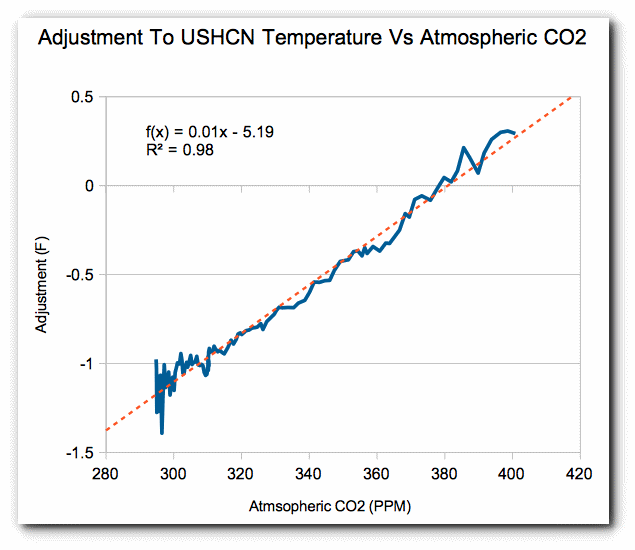
…right about here
Latitude,
If you’re saying that the continued temperature increase (since 2012, when the data quoted in the above article stops) is purely down to adjustments, then you have to say that *all* the surface and LT satellite temperature data sets have been busy ‘adjusting’ since 2012 – and all in the one direction too: continued warming of the surface and lower atmosphere.
To call this and the previous data, since 1880, the result of a ‘random walk’ seems a stretch, to say the least. If you have a fair dice and it rolls 49 straight even numbers in a row, what are the odds that the next throw will also produce an even number? The statistically ‘correct’ answer is 50/50. The ‘real’ answer is… it’s *not* a fair dice. It’s loaded.
No DWR, of the satellite data, only RSS had had a recent warming “adjustment™”
UAH shows NO WARMING apart from El Nino (non anthropogenic)
Just like RSS didn’t show any anthropogenic warming before its “adjustment™”
GISS and it stablemates, show MASSIVE anthropogenic effects, but that is to do with the AGW agenda, not any actual global warming.
RSS doesn’t really, either. It basically just gets a nearly constant offset after the ’98 El Nino.
http://www.drroyspencer.com/wp-content/uploads/RSSv4-vs-UAH-MT-original-series.jpg
Compare 2001 and 2015 from both. A definite trend “fabrication”

Here is a graph of RSSv4.0 – RSSv3.3….. note the step at 2012/13
But even after that there is still a zero trend section
I have just suffered one of the coldest longest winters of my long life, where is all this warming, it must be at Santas house.
Any purported gain since 2012 is due to the 2016 El Nino, not to human activities.
The NOAA “surface series” is a pack of lies.
It isn’t random. It is intentional.
The chart starts when CO2 was ~290 …when was that?
“and all in the one direction too: continued warming”….did you notice where 0 is…and how long before satellites was that?
DW 54 … of course it is not all random walk. The interglacial sand glacial are definitely NOT random walk …. but small fluctuations within them on the order of a degree C …. yeah …. randomness can’t be ruled out …. thus, CO2 can’t be ruled in.
“CO2 can’t be ruled in.”
Nothing but sheer FANTASY can rule CO2 in. !!
The ONLY warming has been from El Nino events, which are essentially delayed/stored solar warming.
They are a release of energy from the oceans.. ie an ocean cooling event.
I have also pointed out zero signs of a positive forcing trend for a decade now.

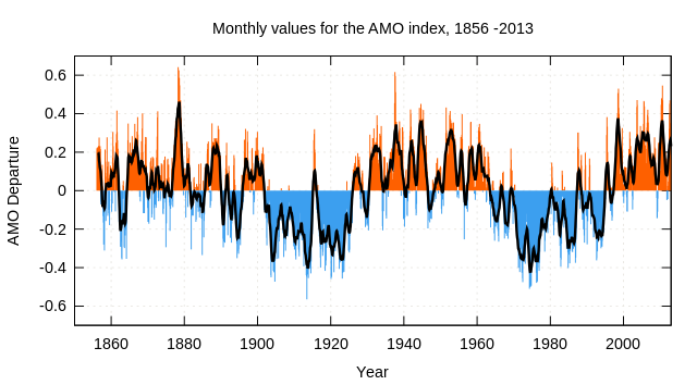

No sign in trend of day to day change
Nor is there one in the seasonal rate change, although it wiggled a bit
But all it’s actually doing is following ocean cycles
The Earth’s climate system is notoriously dynamic. Inference from data sampled below the Nyquist Rate, and proxy data from well outside an established frame of reference, as well as inadequate models (i.e. hypotheses), should not be considered sufficient justification to establish extreme risk management protocols.
Extreme risk management protocols are all the rage nowadays, aren’t they?
Seems lawyers and pessimists are driving the world mad.
An informative and easy to read article. Thanks.
I always like to plot and visualize data. If you do box-whisker plot comparisons of the magnitudes of the rises and drops you can see they surely look like they came from the same data sets, as you have shown in your K-S plot.
Wow. Brainwashed deniers still trying to hold out hu? You know even the major oil companies knew about man made global warming decades ago. Exons own scientists even described the potential consequences as “catastrophic,” correctly describing the catastrophic hurricanes currently afflicting the east coast.
If you really think that us just about doubling the co2 concentration of our atmosphere will have zero affect on the planet, then you’re just fucking stupid.
Would you haphazardly double the concentration of co2, iron, hemoglobin, or plasma in your own body with out knowing it’s affects? No, you wouldn’t, because fucking with delicate systems that you dont understand is stupid.
The more time goes on, the more obvious it is that right wingers are nothing more than angry, stupid little men that refuse to take responsibility for the oil and gas companies that their party has not only allowed to destroy the planet, but has actually given subsidies to some of the already most profitable oil and gas companies in the world. It is absolutely disgusting. Republicans ignore every piece of economic and scientific knowledge to give their donors and multinational companies an unfair advantage. They use the useful idiots of the right to rob the American people of their money, their natural resources, and in many cases, their lives. It’s sick. If you are a Republican you are nothing more than tool for snakes.
[typical Colorado liberal, resorts to name calling and smears rather than arguing the data. Already lost the argument. -mod]
Amusing.
I needed a good laugh this Sunday afternoon. You neglected to accuse realists of pederasty. Also, you really ought to learn how to spell “Exxon.” Your current non-existent credibility and legitimacy will be superficially enhanced.
You really might want to think about trying evidence-based science and scientific method. You’d be amazed what you can learn.
Nonya,
You are making contested, unsupported assertions. Those reading them here will give them all they consideration they deserve. You strangely are behaving as though you think that if you indulge in name calling it somehow makes your argument stronger. You come from an alternate reality.
Kewl!
A liberal screeching hysterically, spitting venom, and tossing out leftist soundbites.
I guess the mathematics in the post must have triggered the poor little snowflake. Snowflakes hate math. They do not understand it and cannot do even the simplest computation.
The reason snowflakes are so concerned about Global Warming is they know how susceptible they are to melting, or in this case having a complete meltdown. But I digress.
Nonya, there is an awful lot of political references in your comment. Right Wing,Republican ,etc and clear American only emphasis. It looks like your own data collection is skewed. Climate is something that happens over the whole planet, America is just a small part of it. “Science” is a profession practiced by people with all kinds of political views. About half the voters in the USA are right wing and about half left wing at any one time. Your personal experience seems to be, shall we say, unrepresentative of the real world.
In any case we trust you would agree that in determining the true scientific basis of any phenomena we should be interested in the actual data, interpretations, experiments, etc. We should not be interested in the politics of the scientists unless of course you are suggesting that the politics is influencing them? Do you think people behave like that? Cheat the truth because of their personal politics?
It is futile to try and come up with any valid scientific conclusions using cooked climate data .
Same for government economic time series.
Yup. Before GISS, there was the BLS and other original USG book-cookers.
Cue Shadow Stats: http://www.shadowstats.com/
“(It’s worth noting that the latter paper, Causes of differences…, is co-authored by the prestigious activist climatologist Michael E. Mann… It’s furthermore worth noting that, if you actually read the Causes paper, you’ll see that the analysis offered there is extremely similar to mine but in reverse.”
That would be because Dr Mann has his cart before his horse in his interpretation of things.
Mr. Voloshin’s progression of thought as expressed in writing is forward and logical. Mann’s is the reverse of that, always caught up in revalidating himself and invalidating any other perspectives by whatever means necessary, even resorting to personal (and sometimes, legal) attacks.
It wasn’t Doctor Who. It was Dr. Brown.
https://youtu.be/HJd04Trvm_I
Why do we need to be able to take clouds away before we can measure the Earths albedo in fact why can we not determine anything that happens on the Earth without being able to perform a laboratory experiment because that sort of experiment is only one particular type of experiment there are other types. We cannot put the core of the Earth in a laboratory and yet we have still worked out a great deal about its composition and behaviour using experiments. The “there is only one Earth” proposition gives a very simplified view of science all the statistics and forecast used in climate science are not the only way experiment is possible even on the Earth.
Voloshin and Watts write: “When the global temperature record is tested against a hypothesis of random drift, the data fails to rule out the hypothesis. This doesn’t mean that there isn’t an upward trend, but it does mean that the global temperature record can be explained by simply assuming a random walk.”
This is a totally bogus argument. Totally! A random walk model ends up infinitely far from a starting point given a long enough period of time. Such a model is totally inappropriate for the Earth.
Let’s call a drift of 1 degC in one century one step in “climate change time”. The amount of change in N steps of a random walk process is proportional to the square root of N. After 4 centuries, we expect climate would expect climate change to average 2 degC in either direction. After 100 centuries, we expect climate would expect climate change to average 10 degC in either direction. After 10,000 centuries (1 million years), we expect climate would expect climate change to average 100 degC in either direction. After 1,000,000 centuries (roughly back to the age of the dinosaurs), we expect climate would expect climate change to average 1000 degC in either direction. The Earth is 4.5 billion years old, 45,000,000 century-sized steps in a random walk process that will lead us an average of 6700 “steps” from when we began. CLEARLY THE RANDOM WALK COMPONENT IN CLIMATE CHANGE MUST BE AT MOST 0.001 degC PER CENTURY!
There is a large difference between the scientific method and time-series analysis. Time series analysis is extremely challenging; a large number of statistical models are possible and it is difficult to select one based on a limited amount of data. Voloshin is certainly correct is saying that we can’t rule out a random walk model with 100-150 years of historical data. However, we some limited information about climate millions of years ago that makes a random walk model impossible.
Furthermore, scientific progress is rarely if ever made by purely statistical time series analysis of complicated phenomena. For example, consider analyzing the fall of an object through our atmosphere, which begins with a constant acceleration and is opposed by a force proportional to velocity squared. Eventually a constant terminal velocity is reached. Now add some wind and an irregular shape to introduce some chaotic tumbling. If you give the data to a statistician to analyze (and don’t tell him where it comes from), he won’t be able to tell you anything about the physics of objects falling in out atmosphere.
Science makes progress by studying critical phenomena under carefully controlled conditions in the laboratory and then applies that knowledge to more complicated phenomena. We have learned that blackbodies radiate proportionally to T^4, so any blackbody circling a star MUST reach an equilibrium temperature. A random walk process will NEVER be viable hypothesis for temperature change in such a system with negative feedback.
The Earth isn’t a simple blackbody, but a billion years of relatively stable temperature tells us there is no need to consider random walk processes.
You miss the point.
What the author shows is that despite the books having been cooked, NOAA’s alleged temperature series since 1880 is indistinguishable from a random walk. He doesn’t say that it is a random walk capable of being extended indefinitely.
Yes.
Imagine a line of footprints on the beach.
walking the same path without matching the exact footprints in the sand is what he considered a “random walk”. Perspicacity might be required.
Besides which, a degree one way or the other is normal, natural centennial-scale average fluctuation. Perhaps during warm periods, the fluctuation is a bit less, except when transitioning from warm period to cold period, and the reverse.
For instance, the 18th century was at least one degree C warmer than the 17th century, the LIA low century. The 14th century might have been about a degree cooler than the 13th, at or near the Medieval WP peak (possibly the 12th century on average). It should come as no surprise, indeed be expected, that the 20th century should be warmer than the 19th, the first half or more of which was still in the LIA.
Indeed, why are so many comments coming from people not reading the full article. The author deals with this issue clearly with his soccer pitch analogies. He demonstrates that for 130 years the temperature time series does not exclude the null hypothesis. So over the period that ‘man’ is supposed to have ‘forced’ increased temperatures, no forcing agent of any kind can be proven to exist through the points on the data series. That is it, plain and simple.
Precisely. The null hypothesis is that nothing out of the ordinary has happened to “climate” since at least 1880, so there is no justification for assuming that anything unnatural has happened to force “climate” one way or the other.
The null hypothesis can’t be rejected, so no human signature can be detected, or any other unnatural or new “forcing”.
Frank,
You said, “A random walk model ends up infinitely far from a starting point given a long enough period of time.” If increments and decrements of equal probability are allowed, I don’t understand why the series should approach a limit of infinity. Perhaps you could explain that to me.
Clyde: If I shake 4 coins and count the number of coins with heads thousands of times, the data will follow a binomial distribution (1:4:6:4:1) that can be calculated using the principles of probability. The same thing is true if I shake 100 coins, but with a large number of coins, the binomial distribution is essentially the same as a normal distribution. The mean number of heads will be 50 and the standard deviation will be 5 (SQRT(N*p*(1-p)). If I use more coins or repeat the experiment more times (up to infinity), the average result will still be that 50% of the coin flips will be heads and the standard deviation will be the 0.5*SQRT(N).
If I flip a coin and step right if it comes up heads and step left if tails, I am taking a “random walk”. If I repeat that process N times, mathematicians have determined that one the average, I will end up a distance of SQRT(N) steps left or right of my starting spot. (Half the time it will be left of the starting spot and half to the right.) The more coin flips I perform, the further from the starting place I end up on the average. As N approaches infinity, so does SQRT(N).
The authors of this post are claiming that 20th-century warming is consistent with a model of random variation similar to the variation of a random walk. That is true for the 20th century. However, this statistical model is not consistent with what we know about a billion years of planetary temperature.
Hope this helps. Simple advice: When someone start talking about temperate and a random walk model (or parametric statistics), you are hearing someone who understands sophisticate statistic, but little about the physics that controls the Earth’s temperature or little about the history of the Earth.
Frank,
Let’s get something near the bottom of your reply out of the way first. You said, “The authors of this post are claiming that 20th-century warming is consistent with a model of random variation similar to the variation of a random walk. That is true for the 20th century.” And, that is ALL the author is claiming! He is NOT claiming that all historical temperature changes are a ‘Random Walk’ (RW) or that they even look like an RW. Perhaps you have missed the point that the recent changes in temperature have been attributed to Man. If the 20th C changes are indistinguishable from an RW, then it diminishes the probability of the validity of the anthropogenic cause claim.
Now, let me return to your initial remarks. You said, “… I will end up a distance of SQRT(N) steps left or right of my starting spot. (Half the time it will be left of the starting spot and half to the right.)” If I understand you correctly, you are claiming that it is impossible that after a large number of coin tosses that the ending position might be midway between the left and right extremes, that it always has to be left or right of ‘center.’
I’m reminded of the old joke about the not-so-bright person who claims that a thermos bottle is the smartest invention made by Man because it always knows whether what is placed in it is hot or cold and acts appropriately to maintain its initial state. Your claim is a bit like the thermos bottle. That is, once a left or right bias is established, it maintains said bias until a deviation “… of SQRT(N) steps left or right” is attained. This is not only counter-intuitive, but doesn’t agree with the many illustrations one sees of random walks.
Take a look at the Wikipedia article at: https://en.wikipedia.org/wiki/Random_walk
I don’t see any support for your claimed mathematics in the article. Indeed, the illustration on coin flipping states clearly, “The ‘expectation’ E(S n) of S n is zero. That is, the mean of all coin flips approaches zero as the number of flips increases.” This would appear to be a consequence of the Law of Large Numbers. If we add the time element and plot the left and right deviations on the y-axis, and the uniform incrementing time on the x-axis, what we should expect to see is shown in the very first illustration at the top of the article. Note especially that the magenta line ends up pretty much where it started after 100 tosses, while other lines seem to wander off in the direction they generally ‘trend.’ However, because the ‘expectation’ is zero, I would anticipate that they would eventually reverse course after a sufficient number of tosses. So, for short periods of time (like 132 years) one might see an apparent ‘trend’ such as those in the Wikipedia illustration. However, the author of this article makes the case that these are false trends that are the result of random processes.
Color me “unconvinced” by your claims. I think that Mikhail has made a good case that at least the last 132 years of temperature changes can be explained by a random walk equally well as the claim that they are the result of anthropogenic forcing.
Clyde wrote: “Take a look at the Wikipedia article at: https://en.wikipedia.org/wiki/Random_walk
I don’t see any support for your claimed mathematics in the article. Indeed, the illustration on coin flipping states clearly, “The ‘expectation’ E(S n) of S n is zero.”
Excellent points. I wasn’t clear enough. If a step to the left is -1 unit of distance traveled and a step to the right +1 unit of distance traveled, then the expected value for the distance traveled after N steps is zero. If we ignore direction and only concern ourselves with the MAGNITUDE of the NET distance traveled, then the most likely net distance traveled is SQRT(N). In Wikipedia, just below your quote you will find:
“the expected translation distance after n steps, should be of the order of SQRT(N).
With a random walk, on the average you do not travel left or right, but on the average you expect to be about SQRT(N) net steps from where you started.
So, as I wrote above, if 1 degC is a typical random “step size” for climate change over a century, then we would expect temperature to have randomly walked from the starting temperature an average of about 10 degC warmer or colder over the 100 centuries of the Holocene. However, if we repeated that random walk process through the Holocene a thousand times, the AVERAGE changes would be zero.
Contrast this with shaking 100 coins and counting heads many times. The mean (50 heads) and standard deviation (5 heads) remain the same no matter how many times you repeated the experiment. 68% of the time you will get 45-55 heads. 96% of the time 40-60 head. The spread in the data from the mean remains the same with time. In a random walk, on the average you end up further (in terms of net distance ignoring direction) from the mean the more times you flip the coin(s).
Suppose we averaged the 240 monthly temperature anomalies for the 10 years on either side of 1900 and 2000. With these means and standard deviations, we can calculate the standard deviation for the difference in these means. That allows us to determine the likelihood that the difference could be zero (or less) BY CHANCE. By tradition, if this likelihood is less than 5%, then we say the difference (warming) is statistically significant.
http://www.stat.yale.edu/Courses/1997-98/101/meancomp.htm
However, if climate doesn’t revert to a mean temperature over long periods of time and can drift from the starting temperature in a manner analogous to a random walk, then we are not allowed to assume normally distributed variation around a constant mean. In that case, we can’t draw statistical inferences about whether the observed warming is consistence with typical fluctuations in temperature or whether it likely was caused by something else When variation depends processes that produce random walks (a drifting mean), then one must rely upon non-parametric statistics (which doesn’t postulate any particular distribution for your data and a fixed mean). All the tests in this post come from non-parametric statistics.
We can’t tell from the historical temperature record alone whether that data should be analyzed in terms of means and standard deviations or allow for a drift in mean as in a random walk. However, IMO we can use our common sense to rule out the need to consider the possibility that temperature could behave like a random walk: 1) The history of the planet. 2) Radiative cooling increases with T^4, producing negative feedback (a “restoring force” when climate drifts from the mean). If you read further in the post, you see that the author realizes random walk statistics can’t apply to the Earth for the reasons I suggested. He says that temperature might drift 10 degC from a mean by a random walk mechanism, but that further variation is limited by a normal distribution. However, nothing has changed in the physics that causes variation.
Time series analysis in economics is extremely challenging because market data is determined by irrational human being motivated by greed and fear. As investors study what has happened in the past, they change their behavior. Fluctuations in markets around the world have become more correlated after advisors began teaching clients to diversify globally. Things drift over time. Volatility didn’t have a normal distribution, but “fat-tails”. The author of this post doesn’t recognize that the chaotic behavior of our climate is controlled by unchanging physics.
I hope this is helpful and that you realize that I am not trying to feed you BS. There are weaknesses to both approaches. What happens to my 20-year averages around 1900 and 2000 if a 65-year AMO has a major effect on the planet’s temperature? A 20-year period doesn’t properly sample the deviations from mean behavior caused by the AMO, (but it will sample the effects of a few El Ninos). The IPCC avoids this problem by doing a least squares fit to the data to prove warming (and the confidence interval for the slope doesn’t include zero), but forcing didn’t rise linearly. I think the best we can do is look at the variation seen in ice cores over the Holocene and assume that random variations in climate during the 20th century are likely to be similar to those seen in the past. (Remember that Arctic amplification makes temperature change in Greenland about twice the change in GMST.) Random walk statistics imply the the drift over the 20th century will be about 1/10 the drift over 100 centuries of the Holocene.
paqyfelyc wrote: “And, then again, the purpose of this post isn’t to advocate that climate is random. I don’t think it is, and i am pretty sure the author don’t think that either. The purpose is to check the compatibility of a null hypothesis: “climate is just random” with current data. Answer: the data cannot allow us to rule this out. ”
All statistical tests of the null hypothesis start with ASSUMPTIONS about random variation (noise) in the data. The author of this post is applying models from non-parametric statistics that allow the mean of a sample to drift in a manner analogous to a random walk. That choice is an ASSUMPTION. I don’t believe this is an appropriate statistical model for GW.
Let’s think more simply. DId it get warmer over the 20th century? Subtract the temperature in 2000 from the temperature in 1900. It is about 1 degC warmer. (On land, adjustments contribute about 0.2 degC to that warming, so warming didn’t come from adjustments.)
Now, temperature varies from year to year, so why pick those two years? Let’s average the temperature for 10 years on each side of 1900 and 2000 and apply the formula for the standard deviation of the difference between two means. That difference is statistically significant.
Yes, but the statistical test for the significance of a difference between two means assumes that annual fluctuations from the mean are random (not auto-correlated) and normally distributed. Where those 20-year periods typical of the temperature variation the planet typically experiences? Good question, Frank! Those periods probably included a reasonable sample of El Ninos and typical annual fluctuation, but not phenomena that change slower like the AMO and PDO. And we also know about phenomena like the MWP and the LIA. They may have been caused by naturally-forced variability we didn’t experience in the 20th-century (like the Maunder minimum in solar activity or a cluster of large volcanos). Or they may represent “unforced” internal fluctuations in climate due to chaotic change in ocean currents (like El Nino). Clearly a 20-year period isn’t good enough.
The IPCC deals with this problems by doing a least-squares fit to data for the whole century. The slope is significantly different from zero even when we allow for auto-correlation in the noise. Nevertheless, that analysis is equally problematic. The LIA and MWP lasted centuries, and the AMO is poorly sampled by a single century. Worse, GHG forcing hasn’t risen linearly over the century.
I look at the temperature record for the whole Holocene (100 centuries) to tell me how big naturally occurring fluctuations in climate might be in one century in the absence of changes in GHGs. 1 degC of warming in a century is unusual, but not unprecedented. It is suggestive, but not proof, that warming isn’t a natural fluctuation. (Nevertheless, there is compelling evidence that rising GHGs should reduce radiative cooling to space and thereby cause warming.)
Then I look at the Holocene and consider the possibility that climate might be following random walk statistics – where fluctuations don’t eventually return to the original mean temperature. In random walk statistics, 100 centuries on the average will produce about 10-fold more “drift” that a single century. That implies that random walk drift can’t explain 20th-century warming.
The author of this post wants us to look ONLY at the 20th century. Non-parametric statistical tests on that data alone are compatible with a random walk model and the absence of a forced warming. However, I’m not stupid enough to look only at a least squares fit to 20th-century data when the IPCC tells me warming is significant. Nor am I stupid enough to look only at 20th-century data when some financial analyst tells me a random-walk model proves that warming doesn’t need to be forced. Both positions are absurdly over-simplified. The assumptions underlying BOTH methods are invalidated by looking at temperature change throughout the Holocene.
If you had read the text (quite long, i confess), you would had noticed that your objection is already taken into consideration. Try again.
paqyfelyc: It would be nice if you had quoted the section of this absurdly long post showing where it had anticipated my objection. (I must admit to writing my comment immediately after seeing the phrase “random walk”. Let’s try this passage:
“Few climatologists, indeed few physical scientists of any kind, would deny that the steady-state assumption is always at least tentatively valid; i.e. that a physical system’s state at time t, absent any other knowledge, is best predicted by its state at time t-1 – and, indeed, recent discussions of the Earth storing thermal energy in its oceans is consistent with the idea that the Earth’s temperature in any given year is typically going to be whatever it was the year before plus/minus some small variation. But likewise, few data analysts would deny that there must be some physically enforced boundaries on the terrestrial thermal system – if Earth’s temperature truly was an unrestrained random walk, then at some point in the last few billion years a series of same-direction steps would have coincidentally arisen that would have either incinerated the planet or frozen it to such a chill that it would have snowed oxygen. These two positions aren’t mutually exclusive; essentially, it’s possible for the Earth’s thermal system to function as a random walk within a certain range, but for the boundaries of that range to be rigidly enforced. Conceptually, this could be visualized as a flat soccer field at the bottom of a valley; the ball will generally land where you kick it, but you can’t kick it completely out of the field. However, this transmutes the discussion into hypotheses about just how wide this field is, how steep the walls are, etc.; and, unfortunately, this discussion is almost entirely speculation. Certainly the answers to such conjectures do not lie in the 130-year-old instrument temperature data set; and if it did, then the data needs to unambiguously reflect that.
The point of this discussion, therefore, is to emphasize that, when it comes to temperature anomaly data, Occam’s Razor suggests that the year-over-year time series is a random walk. The burden of proof is on those claiming that there is a trend to the time series, that the “walk” isn’t random.”
————————–
The changing temperature of the planet isn’t determined by a random process. It is determined by the difference between incoming and outgoing radiation – by the law of conservation of energy. In the long run, that will produce a single average temperature for the planet as long as the incoming and outgoing radiation remain the same. There will be chaotic fluctuations in that long term average; because heat is partially carried by air and water currents, and fluid flow is chaotic. However, chaotic processes don’t produce random-walk statistics.
When one looks in great detail into the factors that determine incoming and outgoing radiation, one does find many complications. The absorption and emission of thermal IR by GHGs is the simple part that predicts that rising GHGs will warm the planet. Feedbacks from cloud and water vapor (another GHG) and the lapse rate and surface albedo are incredibly complicated. Over longer periods of time, the motions of the continents become critical. (Note how different the Arctic and Antarctic are.) The complications from feedbacks even admit the possibility of a runaway GHE, but – since the planet doesn’t seem to have experience one – total feedbacks are unlikely to be near zero. (The past two billion years of ice-ages suggest that our soccer field may have two valleys in it, one for interglacial conditions and one for glacial conditions. It seems we tip from one to the other simply by changes in how sunlight is distributed, not the total amount received.) All of these phenomena (including ice ages) should be analyzed in terms of normal distributions, not random walk statistics.
For the recent 100 centuries of the Holocene, our planet certainly hasn’t behaved as if it were governed by a random walk process. As I noted above, if 1 degC in a century is the size of a typical “step” in a random walk process, then 100 centuries would produce and average “walk” of 10 degC.
When we look at feedbacks that influence the radiative balance of our planet, they mostly occur on a fast time scale: Clouds last for perhaps a day. The average water molecule remains in the atmosphere for 9 days after it evaporates. Weather fronts and storms last for a week or two. Trade winds circle the Earth in about a month near the surface and ten times faster in jet streams at the tropopause. Suggesting that these processes create random-walk statistics is crazy.
Chaotic fluctuation in ocean currents are less well understood and certainly occur over longer time periods. ENSO is mostly a fluctuation in upwell and downwelling of water in the Pacific that occurs several times a decade. We don’t know much about the AMO, PDO and related processes. We aren’t sure whether periods like the LIA or MWP were caused by chaotic fluctuations in ocean currents or natural forcing from the sun or volcanos (but we are fairly sure natural forcing isn’t responsible for 20th century warming). However, we do have a 100-century record of the climate variation these phenomena have produced and it doesn’t fit a random walk that explains 20th-century warming.
You are fooling yourself by being too smart.
A standard dice movement, too, is ruled by law of conservation of energy, and is bound to give a result in a limited set of 6 options, no more. It is random nonetheless, isn’t it?
And, then again, the purpose of this post isn’t to advocate that climate is random. I don’t think it is, and i am pretty sure the author don’t think that either.
The purpose is to check the compatibility of a null hypothesis: “climate is just random” with current data. Answer: the data cannot allow us to rule this out. Which tells us nothing about the climate process (which, again, is surely NOT totally random), but tells us much about the data: data should be able to disprove the unlikely hypothesis of total randomness, but just cannot do that; meaning, it is unsufficient.
Willy Pete: “What the author shows is that despite the books having been cooked, NOAA’s alleged temperature series since 1880 is indistinguishable from a random walk. He doesn’t say that it is a random walk capable of being extended indefinitely.”
For billions of years, the Earth’s climate has behaved as if it were constrained by negative overall feedback (oT^4) to about the same average value as today (about +/-10 degC). During most of that period CO2 much higher and sometimes a little lower. At the beginning of the instrumental record, you and the author are suggesting that the Earth suddenly started behaving as if temperature were controlled by a random walk. That is absurd. Nothing important has changed that could possibly explain why temperature should suddenly be determined by a random walk process.
Willy Pete: “Besides which, a degree one way or the other is normal, natural centennial-scale average fluctuation.”
This comment is perfectly reasonable, but has nothing to do with the subject of this post. 1 degC one way or the other returning to a long-term mean for the Holocene has nothing to do with a random-walk process that almost certainly would have taken the Earth hundreds of degC from its starting temperature (if a random walk process caused 20th century warming).
Willy Pete: “The null hypothesis is that nothing out of the ordinary has happened to “climate” since at least 1880, so there is no justification for assuming that anything unnatural has happened to force “climate” one way or the other.”
The author of this post is using non-parametric statistics to test his null hypothesis. Non-parametric statistics doesn’t assume the temperature during the Holocene can be described by a normal distribution: a long-term mean with (auto-correlated) deviations from that mean that get increasing less likely as they get bigger. The author is using a test that includes the possibility that our planet’s temperature WILL eventually move infinitely far from its starting position. He hasn’t performed the more stringent test that are possible for data that is normally distributed.
The stock market – the author’s area of expertise – apparently is best described by as a random walk. The Earth’s temperature is not.
The statistical methods used in economics and finance are not always appropriated in physics – where we know why things change. The S-B law and conservation of energy guarantee that the Earth’s temperature will not behave like a random walk. The only except would be a runaway GHE occurred, and that hasn’t happened in 4.5 billion years!
Frank,
You seem not to grasp the fact that Mikhail has emphasized, ie that he does not claim that the temperature of the past 132 years as bogusly reconstructed by HadCRU IS a random walk. The key result is that it is indistinguishable statistically from a random walk.
Please see his comments on boundaries. I’d have thought that this distinction was obvious.
Willy Pete writes: “You seem not to grasp the fact that Mikhail has emphasized, ie that he does not claim that the temperature of the past 132 years as bogusly reconstructed by HadCRU IS a random walk. The key result is that it is indistinguishable statistically from a random walk. Please see his comments on boundaries. I’d have thought that this distinction was obvious.
You and Mikhail seem to not grasp the fact that climate change during the Holocene (and before) is not compatible with the ASSUMPTION that the null hypothesis should be tested by non-parametric statistics. The physical mechanisms that produce noise in our climate (mostly fluctuations in currents and natural forcing) didn’t change a century or two ago. They have been operating throughout the Holocene. The Holocene climate record tells us that a random walk model for that noise isn’t appropriate.
I’ll be glad to listen to the recommendations of experts in the statistical analysis of systems governed by deterministic chaos. The author of this post doesn’t appear to have such credentials.
I’m not what you mean by repeat itself, the English is ambiguous. If you mean there must be at least 2 cycles, then you are correct. If you mean there needs to be only one cycle, you are not correct. Nyquist is symmetrical, it applies to both the sample window length (the lowest frequencies you can distinguish) as well as the distance between samples (the highest frequency you can distinguish).
In numerical experiments with multiple signals close in frequency (e.g. all the various MDOs), I find you need at least 5 cycles to start distinguishing them. Since these cycles are on the order of 70 years, the meager window length we have now means we don’t know jack. The ‘trend’ we are seeing could just be natural cycles lining up.
Peter
It is a pity that person writing this article is not available here for comments?
The actual problem with the NOAA graph is that the weather stations are not balanced to zero latitude which gives a complete imbalance of measurement. Confirmed by my own data [of the past 40 years] , for various reasons, it appears that there has been more warming in the NH compared to no warming in SH.
By looking at an average annual yearly result and comparing the rate of change in K/year at each weather station you could eliminate the need for balance on longitude, but that was also not done.
Never mind the changes in measurement, calibration and type of recording over the past century. That could easily account for a lot of the change seen in the NOAA graph. Indeed, my results of the past 40 years [on minimum temperature] show a decline in T , although it is not much.
My conclusion: there is no man made global warming.
I did it. All the process runs are in SourceForge and what I have written at wordpress.
There is no trend in min T forcing due to an increase in GHG forcing.
No warming in SH, warming in NH following dew points, driven by ocean water vapor cycles.
Would be delighted to examine your work! I was just about to perform a similar run myself.
The code and report data is at the SourceForge url, and I go through some charts at wordpress(follow my name). You will likely want some docs once you down load the data, message me and I’ll send it to you.
Micro6500
Are you Mikhail?
No. Not me.
“Never mind the changes in measurement, calibration and type of recording over the past century”
Don’t worry BEST is getting new information all the time, and they can predict what the measurement should have been.
/s
henryp October 1, 2017 at 1:28 pm
It is a pity that person writing this article is not available here for comments?
He’s here under a pseudonym.
When all else fails always bring in the the seemingly smart Wall st. Math geniuses to destroy whatever unwelcome set of facts gets in the way of doing what whosever paying his salary is doing. In this case, you can almost bet that if you dig deep enough into this klown ‘s past you’ll strike oil, coal or natural gas $$$ funding his work.
When all else fails always resort to vacuous ad homs.
Do you really believe that all skeptics of the “climate change” ho@x are in the pay of Big Oil? It is to laugh.
The author is a quant for a hedge fund. Please support your baseless allegation of fossil fuel funding, or be known as a vile libeler. I take your calumnious “almost bet”.
Random walk analysis has been productively applied to many phenomena besides Wall Street. But even if it were restricted to the math of that realm, that wouldn’t somehow nullify its applicability to other numerical series.
For instance, random walk analysis in physics, from 1985:
Random walk analysis of quantum chaos
http://www.sciencedirect.com/science/article/pii/0375960185908291
PS:
NOAA’s cooked books are not “facts”, ie observations of nature. They are artifacts manufactured by activists, not scientific observations.
Option A: it is random and we cannot do nothing but adapt
Option B: it is witches/ jews/ rich oil companies fault, and all we have to do to fix it, is to burn them
All along history, human choose B. Afer all, we have to TRY to do something, don’t we? And anyway we already hate witches/ jews/ rich oil companies, so even if it doesn’t work, well, we are still get rid of these nuisances, so, we are happy.
Hence the CAGW religious-like zeal. You cannot fight this with scientific facts.
Religious-like, or just plain religious zeal?
“Scientific facts” batter “religious belief” constantly, yet the latter still exists. It’s a “Human thing”.
+1. Unfortunately.
paqy,
First, kill all the lawyers.
Wow, fantastic detail! Thank you.
” if the anomaly in 1880 was -0.16°C” this is blatant nonsense. Until recently, RECORDING accuracy was +/-0.5 deg C !
“To drive this point home, check out these sample runs of a randomly generated simulation of a temperature sequence, intended to mimic the NOAA’s annual temperature anomaly records since 1880. ”
So he shows a few Monty Carlo runs that look similar to reality. You can do this on your computer with excel and rather big spreadsheet, going from 1880 to 2016. and you can rank the results. Then you can ask, for example, what percentage of runs give you the last three years being the top three temps? You will get a number near 5%.
So there is about a 1 in 20 chance that randomness can explain our temperature history.
Seems like a bad bet.
NOAA’s series look nothing like reality.
That’s because they are not “random”.
So you would use an El Nino to infer a trend?
Somewhat retro-myopic, assuming paleoclimate only extends back to 1880. Also, your top three temperature years are only valid in comparison to those in the satellite era. There is not sufficient global data resolution from previous observation.
Crooked casino
You ask many other questions, as well. What is the chance that most the years since 2000 are the highest?What is the chance that the years since 2010 are the highest? etc etc etc.
In all cases, they are unlikely.
But I agree with Stokes, there is no theoretical unpinning to imagining that temp change should be random.
It’s only to be expected that some years after 1979 would be the highest in the satellite record, since 1979 came after over 30 years of dramatic cooling.
The issue is whether years like 1999 and 2016 were hotter than years in the 1920s, ’30s and ’40s, during a warming cycle virtually identical to that following the PDO flip of 1977.
The cooked book “data sets” since 1880 are packs of lies, so we can’t know how the recent warming cycle compares to the previous one.
But paleoproxy data show that the Current Warming Period has not yet achieved the sustained warming of the Medieval, Roman and Minoan WPs, or the Holocene Climatic Optimum, nor indeed of the Eemian Interglacial, which was a lot hotter, without benefit of a Neanderthal-Denisovan industrial age.
Nor is there any underpinning to say it is affected by anything but natural cycles
The years since 2000 haven’t been the highest except in a very short insignificant time period.
They are below what they have been for most of the last 10,000 years.
You really have to stop being reallygullible.
“What is the chance that most the years since 2000 are the highest?What is the chance that the years since 2010 are the highest? etc etc etc.”
AFTER the event, the chances that reality happened are: 100%
BEFORE the event, the chances that the reality (as we know it afterward) would happen were: 100% in a perfectly determinist world; reduced in the proportion of randomness/unknown involved
So, supposing the years since 2000/2010 are the highest (just a supposition), if it happened, the chance were 100%, minus the randomness/unknown involved.
The random walk model is surely bad. No question here. He just proves that the null hypothesis “there is no significant warming trend, all happened out of randomness/artifact of bad data manipulation” cannot be ruled out. no less, no more. period.
Mr/Ms ‘reallyskeptical’ , clearly neither you nor Mr Stokes know enough about statistics. Which as ‘climatology’ is not experimental science, but ‘statistical numerology’ calls into question your ability to comment at all. The author makes it very clear he is NOT saying temperature change is random. He is merely using statistical tests on a 130 data series to test if there is any significant ‘forcing’ agent necessary to produce the series. There isn’t, its very clear and simple. Your CO2 religion is unproven by the very data series your zealots have striven so hard to produce. Tough!
If you perform a large number of Monte Carlo runs using the same variable step size as the actual climate data, then you will find that 54% of your runs will produce results that are at least as extreme as the NOAA graph. That’s literally the point of the analysis. You throw out this “5%” number because you didn’t actually do the math. I did.
Mikhail Voloshin ==> Thank you for this clear and extremely interesting essay.
This point is perhaps the most important:
Andy Revkin once featured a propaganda piece about climate, stating that “the trend tells us where the climate is going”. He was kind enough to allow me to respond with an essay of my own, which he printed in his NY Times Column, Dot Earth, titled “On Walking Dogs and Warming Trends”.
It is the “system” (whatever physical, mathematical, financial or social mechanism) producing the data that produces the trend that produces future values. Unknown systems, like Earth’s climate, which we barely understand, can not be said to produce predictive trends. It is not the TREND that predicts, but the understanding of the underlying system that allows us to predict future values from current data.
Whether the non-physical value being called “Global Temperature Anomaly” is produced by a random walk, a complex chaotic interaction between dynamical systems or by some single over-riding climate forcing — if in fact it is being produced by any discernible system at all — is still, and will remain, a mystery — at least for our lifetimes, I suspect.
Old Wall Street wisdom says that the trend is your friend, until it isn’t.
GIGO, book-cooking “climate scientists” will try to extend the trend for as long as they can by various tricks, but eventually they’ll learn that it’s not nice to fool with Mother Nature.
Que sera, sera seems to ‘sum it up’ simply. That’s the biggest pill for them to swallow as ‘planet-savers’.
Of course, once it’s already happened it’s eligible for adjustment by the science elite.
“Que sera, sera”, “What will be, will be.”
What’s the Spanish for “What we want, has been.”? 😎
Lo que deseamos, ha sido.
You’re exactly right that the “trend” is merely the name we apply to an emergent property of measurements, and is not itself the underlying physical causative force behind those measurements. The distinction is clear to us data folks but important to call out for laymen.
If there was one key point I feel negligent in leaving out of this essay, it’s a clarification of what data people mean when we say that something is “random”. We are NOT saying that it is subject to the arbitrary whims of some fickle god. What we mean by “random” is that it is affected by myriad forces that we cannot identify or predict. A coin flip is “random” not because it is touched by Loki, but because we can neither measure nor calculate the physical forces acting on the coin during the flip. Likewise, to say that the climate exhibits a “random walk” is not saying that it’s moved by magic, but rather that we lack predictive power over the forces that affect it (at least, within a range whose boundaries we have yet to define).
omedalus ==> Yours is a refreshingly intelligent and instructive voice — hope we see more of it here.
Mikhail,
I second Kip’s motion.
Excellent point.
Could this randomness be a major factor in explaining the stepped character so often seen in the temp record- a sudden, more marked change of obscure “cause” followed by several yrs of little or no change?
omedalus October 1, 2017 at 8:06 pm
What we mean by “random” is that it is affected by myriad forces that we cannot identify or predict. A coin flip is “random” not because it is touched by Loki, but because we can neither measure nor calculate the physical forces acting on the coin during the flip. Likewise, to say that the climate exhibits a “random walk” is not saying that it’s moved by magic, but rather that we lack predictive power over the forces that affect it (at least, within a range whose boundaries we have yet to define).
And a random walk has specific properties which you appear to ignore as I pointed out before the mean squared displacement of random walks gives a linear plot, this data does not instead it behaves as if there is a deterministic behavior.
I wasn’t too impressed with your attempted rebuttal of my post up-thread which referred to a very confused thread on a Math Q&A site (which was wrong anyway), couldn’t you do better than that? I’ll stick with Einstein thanks.
One of the most useful analyses of the whole data manipulation process I’ve yet read. Notwithstanding other shortcomings in the AGW platform the adequate treatment of data is crucial to developing any meaningful interpretation of any supposed changes that may or may not be occurring. A very informative read for someone who does not particularly like statistics.
As appealingly instructive as this lengthy essay may appear to novices in time-series analysis, it is deeply flawed as an explanatory model for geophysical temperature data, real or manufactured. While the “random walk” of Brownian motion, known also as the Einstein-Wiener process, indeed provides a sound model for diffusion-like phenomena in the physical world, its constantly growing–ultimately unbounded– variance (signal power) renders it wholly unrealistic for representing temperature. This lack of “stationarity” distinguishes it categorically from zero-mean “noise,” white or red, integrated or not.
Unfortunately, the entire question of “trend” in climate data has been hijacked by simplistic notions of all data consisting of “trend plus noise,” widely familiar from freshman courses about linear regression. Far more advanced analysis of “unit-root” processes incorporating non-stationary means and stationary variance provides a far more realistic approach to “trends.” But even there the academic literature is largely limited to time-domain examination of cases where there are no significant quasi-periodic oscillations. In the geophysical setting, where such oscillations are observed at multi-decadal, quasi-centennial and even much-longer time-scales, if we believe the proxy data, no conception of trend in any secular sense can be remotely reliable without accounting for superposition of such oscillations. That superposition cannot even begin to be estimated without proper spectral analysis of the pitifully short–often adulterated–data records available. Such analysis relies, explicitly or otherwise, upon the estimation of the sample auto-correlation function.
By positing unrealistically non-stationary variance and largely ignoring the highly revealing auto-correlation of available data, the author imparts a misleading sense of having provided reliable insight into the problem of trend detection.
What explanatory model? The article doesn’t offer one. It just looks at the totally bogus numbers which NOAA liars pretend reflect “climate” since AD 1880.
What are the manifestations of climate that should have stationarity, after all that jargon?
In the broadest temporal sense, all of the oscillations/changes of climate that have been manifest during Quaternary should remain stochastically stationary. In the more immediately expected sense, the first differences/increments of bona fide, uncorrupted station records should likewise remain unchanged in mean and variance.
1sky1 October 1, 2017 at 4:41 pm
As appealingly instructive as this lengthy essay may appear to novices in time-series analysis, it is deeply flawed as an explanatory model for geophysical temperature data, real or manufactured. While the “random walk” of Brownian motion, known also as the Einstein-Wiener process, indeed provides a sound model for diffusion-like phenomena in the physical world, its constantly growing–ultimately unbounded– variance (signal power) renders it wholly unrealistic for representing temperature. This lack of “stationarity” distinguishes it categorically from zero-mean “noise,” white or red, integrated or not.
As I pointed out above the Einstein Brownian motion model gives a mean square displacement which is a linear function of time, the NOAA data does not do so and shows behavior consistent with a deterministic process.
But only, as you note above, since 1960.
That NOAA data does not manifest “a mean square displacement that is a linear function of time” simply means it’s not a random walk. But, contrary to the author’s notion that such walks are the quintessential hallmark of randomness, that does not imply that the data are deterministic.
Along with various autoregressions and integrations of white noise, there are many other stationary random processes. The class that is most widely useful in geophysical analyses are random Gaussian processes, characterized by the Fourier-Stieljes synthesis of sinusoids with deterministic amplitudes, but random phases. Those are what best model the quasi-periodic oscillations widely found in geophysical signals.
Still I am puzzled. The problem could be my own deficiencies or that different debaters advocate mutually contradictory positions.
Back before the pause, I read ‘somewhere’ google has lost it, that if the planet stopped warming for 17 or so years while CO2 rose as it has from our CO2 emissions, that meant the models were critically wrong.
They could not be describing climate.
After all CO2 was a powerful greenhouse gas and multipliers would surely eventuate.
Then the pause came and but for a super El Nino, may still be with us, no one will know for another 17 plus years.
So this was a test for the Null Hypothesis.
Now I learn that GISS is statistically a random walk.
Yet if you use a Monte Carlo on it, then it has direction.
Could this be an artifact of corrections?
What are the errors?
We are being told now that the pause was expected in a wider scale, just did not see it coming/
if you fill in more data it was not there anyway
So the goalposts are moved about the meaning and value of that prediction.
Also we are told that the Null Hypothesis does not apply anyway,what a kerfuffle about nothing.
The data itself is damaged, so it is unsurprising that it comes out useless for prediction.
The sooner the red blue system of debate eventuates and the debaters, particularly on the warm side, stick to their arguments the better.
A lot of lives and treasure depend on it.
Lewis, the source for you 17 year comment was Santer 2011 http://onlinelibrary.wiley.com/doi/10.1029/2011JD016263/full
The abstract concluded with: “Our results show that temperature records of at least 17 years in length are required for identifying human effects on global-mean tropospheric temperature.”
” it wasn’t even until the 20th century that Karl Popper’s principle of falsifiability was introduced as an integral component of the search for truth.”
nope.
ask aristotle.
popper gets praised cuz he’s a liberal poster boy who introduced his branded violation of the excluded middle to establish post normal mysticism.
besides repackaging plato’s noumenal essence as part of the (deceptively named – a la ‘skeptical science’) gang of ’empricists’, which included
https://en.wikipedia.org/wiki/George_Berkeley
this slave owner after whom the city was named, “… an Irish philosopher whose primary achievement was the advancement of a theory he called “immaterialism” (later referred to as “subjective idealism” by others). This theory denies the existence of material substance and instead contends that familiar objects like tables and chairs are only ideas in the minds of perceivers …”
and hume…nuff said?
he contribute zero original thought and suckered a bunch of gullible into accepting his brand of mysticism as the most fashionable.
he was a fraud.
popper was a mystic and just another berzerkely style guru.
Since “global mean temperature” doesn’t mean very much, to begin with, knowing the random variation of meaninglessness is not that much more meaningful.
+1
Great article. I seldom have the patience to carefully read a post as long as this, but it was very readable and easy to follow. I’m disappointed, but not surprised at the number of critical commenters who seemingly did not read the article, or did not fully understand it.
“ I’m just going to take whatever you’re telling me now, assume your next value will be as different as your previous values have been, and in my own mind I’ll recognize the existence of error bars that are implicit from merely the fact that you can’t get your story straight.”
This has been my thinking for a half-dozen years and it’s exactly why I’m a complete denier. If they don’t trust their own data, why should I trust their changes?
One of the best graphic images I’ve seen regarding this topic appears on Real Climate Science.
It is a globe and on it is clearly marked all the weather data collection points as they existed in 1900.
There IS NO CLIMATE DATA for; Antarctica, the Arctic, most of Africa, most of Asia, most of South America and most of the worlds Oceans.
Anyone telling us that they have a clear idea of ‘global temperature’ down to 1/10th of a degree C….in 1900 is quite simply lying.
And don’t forget – what little data we have has been adjusted and readjusted.
“It is a globe and on it is clearly marked all the weather data collection points as they existed in 1900.”
And it is quite false. It shows places with data in the GHCN Daily data collection. It’s true that we don’t have a lot of good daily temperature records in much of SH in 1900, but we have a lot of monthly average records, and that is what climate indices use.
Hahahahahahahahahaha
Where do you think the averages come from Nick?
Nick,
Do we have actual temperature records that can be called “global” for that time or not?
It’s a “yes or no” question.
If “yes”, please explain.
Nope.
“However, that same capacity also compels us to perceive images of the Virgin Mary on slices of burnt toast.”
None more so than the ever increasing marginal analysis of human health as I’m finding as a new grandparent and the plethora of information overload for today’s young parents. Woe was me minding bub and putting her down to sleep on her tum like we did with our two because dontcha know old boy they can die from SIDS or SUDS that way?? Oh yeah!!
https://naturaltothecore.wordpress.com/2013/02/14/revisiting-sids-and-back-sleeping-part-1/
You look at what SIDS/SUDS stands for as a category of extremely remote risk of infant mortality in developed nations and shake your old head at the very meaning of the words and yet should any parents experience the tragedy they’ll have that finger pointed at them should the infant have been on its stomach.
“Of those who die, around 60 per cent are boys.”
https://www.betterhealth.vic.gov.au/health/healthyliving/sudden-unexpected-death-in-infants-sudi-and-sids
Well there you go mum and dad, serves you right if a son dies of SIDS/SUDS as you know you should have had girls to reduce the risk. As for these climastroligists and Green seance..!!!
They’ve noticed the wee developmental tradeoff by the way-
http://www.nytimes.com/2001/04/29/us/baby-not-crawling-reason-seems-to-be-less-tummy-time.html
Ever more grants for ever more marginal research into generational development differences when they’ve grown up I suppose.
I wonder how you would fill in these missing temperatures in 1974 they reported that Montana had a the largest temp fall of 100degF and Edinburgh had a instantaneous rise of 21 deg F.
https://archive.org/stream/DTIC_ADA000802#page/n0/mode/2up
Fred,
could you explin more please? These are big changes.
Fred,
Could you explain more please? These are big changes.
Kudos to Mikhail Voloshin for this alone! Good article.
There are a considerable number of comments attempting to refute the article on the basis that earth’s temperature cannot be random. Could I suggest that we look at the task of analysing temperature data by assuming for a moment we are looking at something else.
Lets take my orchard. The number of apples harvested each year is clearly not determined by a random process. I won’t ever get a million apples per tree or a negative number of apples per tree. The number of apples that grow must be determined by physical things like water, light, the number of (look, Nick!) squirrels, etc. It is a scientific (biological) process but it’s flippin’ complicated. If we collect the data of how many apples are harvested each year it looks pretty random within certain limits. The certain limits would be the maximum number over the whole data set and the minimum. However we are aware we might next year harvest more than the previous max. or less than the previous min.
My task as the orchard owner is to look at the data of my 200 year old orchard and determine if the fertilizer I have added in the past 50 years has improved the crop. Is there a correlation between the applied sh1t and the money I am making (you see where I am going with this don’t you?). Mikhail’s techniques described in detail can be exactly applied to my orchard. Does the random looking apple total graph show a correlation between applied sh1t and $$$?. Unfortunately not.
Apply same technique to AGW data.
Rev,
“Mikhail’s techniques described in detail can be exactly applied to my orchard. Does the random looking apple total graph show a correlation between applied sh1t and $$$?.”
I don’t think you read the detail. He isn’t talking about correlation. He is proposing that a random walk, rather than a stationary random process, should be used to model temperatures. He says that if that is done, the apparent warming trend would be insignificant.
Mr Stokes, either you deliberately misunderstand the author, or you are ‘thick as a plank’. He is NOT proposing any such thing. He is merely testing the 130 year data series against a null hypothesis. The test clearly and simply shows that there is no forcing agent necessary for the time series, it could be random. That is ALL he is proving. He goes out of his way to explain that this does not prove there is no agent at work, nor does it prove there is. Its unproven.
The fact that you and other ‘CO2/warming acolytes’ are so disturbed by this simple analysis is very illuminating. Its the reaction of zealots not logical, scientific minds.
NS,
James Whelan is right. You are misrepresenting what the author’s position is. Whether you don’t comprehend what you read (which seems unlikely) or are purposely distorting it, only you know. But, your misrepresentation certainly does nothing to provide you with credibility, which could use some bolstering.
“He is proposing that a random walk, rather than a stationary random process, should be used to model temperatures”
Nick, you have beaten this straw man to death and you are now flogging a dead straw horse.
OK, had my breakfast so adding some more…..
It does not matter if the underlying thing behind the data is deterministic / physical (not random), e.g. apple crop, earth temperature. It does not matter if there are physical bounds/limits e.g.1 my apples cannot be negative or 1,000,000 per tree. e.g.2 Earth temperature cannot be negative K or 1,000,000K . What matters is that the data wanders up and down in a random like pattern.
We want to know if there is a non random, e.g. linear rise, component to the data. So we have a look at it to see if ALL of it could be the random like noisy variations of a deterministic & bounded phenomena OR NOT.
IF all of it could be just the random like variations we cannot EXTRACT the linear component, the correlation between the sh1t and the number of apples, the correlation between CO2 and earth temperature.
IF we cannot extract the linear component, the correlation, from the random-like data IT MAY NOT EXIST.
The data does not support or confirm the existence of the correlation. A correlation may exist but it is too small to be visible above the “noise”. If one does some more number crunching it MIGHT be possible to assign a value to the correlation which could make it visible above the noise.
How high must the CO2 v temperature link be for us to see it above the noise, according to Mikhail’s techniques?
In their data (NCDC GSOD ) there is a just under 98% correlation between min temp and dew point and Min t
“Measuring temperature anomaly, not absolute temperature. The first thing you may note is that the chart’s Y axis measures an “anomaly” rather than an absolute temperature.”
You don’t measure a temperature anomaly nor an absolute temperature. You always measure the temperature with a calibrated thermometer. You can use different scales like K, °C or F. But the unique physical property is the temperature. The “anomaly” is a temperature difference.
“Imagine you’re measuring an infant for a fever. You put thermometers in its mouth, in its armpit, and in its butt. The three thermometers report very different absolute numbers. But if the infant’s temperature does indeed rise, then all three thermometers will show an increase in whatever their numbers may be. Therefore, while the actual values of the thermometers may be meaningless, there is nonetheless a signal evident from each thermometer’s deviation from its own respective baseline.”
That’s the method of nervous parents. At the end you will have several different readings. It suffices to measure the temperature at one place with the same thermometer. But use the thermometer also when your child is ok.
Thank you Mikhail Voloshin for proving, based solely on cAGW conjecture reported temperature anomalies, the warming signal is unstable and drowned into pink noise.
A very fine article. Among the best technical articles I have read on WUWT. Thank you, Mikhail Voloshin.
Interesting, too, that those commenting technically from the warmist side all seem to have misunderstood what the author is saying, and saying very clearly.
Excellently written article. One of the best for objectivity, clarity, and completeness within the boundaries of what the author intended to cover.
Agree with findings. They corroborate a far less sophisticated analysis I did a couple years back. I found that long term temperature anomaly graphs could easily result from a random walk — similar to the author’s soccer ball on a soccer field in a valley.
And there is an energy valley. As long as the water cycle is running there are energy barriers (water vapors heat of evaporation) that have to be over come to go outside this range.
Hmmm…. generally speaking, arguing about tenths of a degree in a chart, regardless of the timeframe, seems to ignore the simple fact that not one of us can detect a 0.10+//- change in temperature, period. It’s like arguing ‘what is redder than red?’ As the author has said, and I repeated, if a so-called data “glitch” is suddenly found, it immediately makes the data presented suspect, doesn’t it? Yes, it does.
I have this bit of philosophy, which should especially be considered by the Warmians or WArmunists or whatever they are, to wit: we humans live on a planet that is currently user-friendly for us. This little blue planet has its own agenda, and can change from user-friendly to not user-friendly any time it wishes to do so, with no consideration for what we want.
In plain English, that means that this warming period which started some 18,000 years ago, give or take a couple thousand, can come to an end in less than 10 years. A minor change in the coriolis effect can cause the polar jet streams at both poles to loop even deeper than they do now. The colder air can put snow in Brazil and Chile’s Atacama desert. It has already happened. Simply put, we can go back into another period of prolonged cold and ice sheets in less than 10 years. It may already be happening right under your nose, IF you bother to pay attention. And WHEN it happens, those who are W\armians will NOT be even remotely prepared for it. Just don’t say ‘Told you so.’
It is not a matter of IF. It is WHEN. Anyone who pays attention to the long-term cycles knows that this warm period we’re living in WILL come to an end, like it or not.
Every warm period is offset by a cooler period. It’s a cycle over which we have NO control, ZIP, ZERO, NADA, RIEN. None at all. The best thing we can do is be better prepared for rougher weather ahead, because if I read the skies right, it’s coming and it has NOTHING to do with a one-half degree rise/not rise in the average global temperature. IT IS WEATHER. We have ZERO CONTROL over the weather, but we can at least make better forecasts now.
It is not IF. It is WHEN.
Red sky at sunrise this morning. We’d better get some rain soon. My lawn may be at the end of summer, but it still needs rain. Gee, thanks, Irma, for the dry spell. Now I have to get the hoses out again…. (walks out to garden shed, grumbling.)
“Irma”? I thought her name was “Gaia”? 😎
Very long article to explain a simple point. Nope I didn’t read it all. But I agree, a simple function with a random factor can easily be done in Excel to generate graphs that look amazingly like those we all see from GISS, UHA, etc.
I’m in the north woods on an IPad and posting an example will just have to wait.
Let’s see if I can post this image:
http://oi63.tinypic.com/25f6cl2.jpg
The blue line is HADCRUT the red is the random function, one number equals the number of runs the other the closeness of fit, lower being closer.
If those were random walks you wouldn’t expect them to be positive, in fact if you averaged them you’d expect it to be zero. So did you select only those ones that looked like the Hadcrut data (the M&M trick)?
Phill @ 6:00AM
Out of a number of runs, I picked ones that looked like HADCRUT. I did this nearly ten years ago and were these four from one run or did I start over for each iteration? To quote famous politicians, I don’t recall.
The exact formula I used will have to wait as it’s on my lap top somewhere. I posted this on a website called coincidentally Random International no longer available they had a few global warming pages. My tinypic file from that is dates from that time.
So yes in less than 100 tries those four iterations showed up.
Phil,
I see positive and negative numbers. What am I missing in your complaint?
Clyde Spencer October 2, 2017 at 10:57 am
Phil,
I see positive and negative numbers. What am I missing in your complaint?
I didn’t express myself clearly, if you run a set of random walks you expect to get an equal number of positive trajectories and negative trajectories, like these:
In fact if you have sufficient trajectories and average them all they average to zero. So if, for example, you add a drop of ink to a bath of water you have an equal number of ink molecules traveling left as right. In analysis this isn’t very useful, which is why in analysis the mean squared displacement is used since this can only be positive. The msd from the original position grows with the square root of the number of time steps. This characteristic is a test for whether a series of trajectories are the result of random walks, if they’re random walks the mean will be zero and the msd will be a linear function of time. Consequently the NOAA data is not the result of random walks since it satisfies neither criterion.
Steve Case understood what I was getting at and confirmed that the four trajectories he presented were selected from a larger set to show those examples which most closely resembled the Hadcrut data.
Phil,
Your comments echo what Frank has been saying above. I see that you are using the Wikipedia illustration of one-dimensional random walks. Note that the magenta line starts out being positive, then goes down to about -8 before moving back up and crossing the zero line. Are you telling me that given enough steps the other lines won’t behave similarly? That is, those that are currently in negative territory won’t become positive and vice versa?
Clyde Spencer October 2, 2017 at 5:35 pm
Phil,
Your comments echo what Frank has been saying above. I see that you are using the Wikipedia illustration of one-dimensional random walks. Note that the magenta line starts out being positive, then goes down to about -8 before moving back up and crossing the zero line. Are you telling me that given enough steps the other lines won’t behave similarly? That is, those that are currently in negative territory won’t become positive and vice versa?
Yes I used that graph because it was convenient and someone else had posted it above and it illustrated the point I was making. What individual lines do in a small sample like that isn’t important, if you have enough trajectories to be statistically stable then the positive parts will balance out the negative and you will have a zero average, any line can cross zero and can be balanced by crossings in the opposite direction.
Here’s the probability plot of final position after 100 steps, as you can see zero displacement is the most likely (~8%) but the distribution is symmetrical hence the average is zero.
http://galileo.phys.virginia.edu/classes/152.mf1i.spring02/RandomWalk_files/image002.png
Phil and Clyde: It is encouraging to see people carrying out experimental tests.
Random walk statistics is concerned with expectation for the magnitude of net distance traveled. The average magnitude of 7 net steps to the right (+7) and 9 net steps to the left (-9) is 8 net steps, not 1 net step to the left (-1).
It is useful to consider the difference between 100 coin tosses (which will produce a mean of 50 heads and a standard deviation of 5 if the experiment is repeated indefinitely) and a random walk governed by the same set of coin tosses. In the first case, the data converges towards a constant mean and standard deviation with more coin flips. In the second case, one “drifts” further away from the starting position in proportion with the SQRT(N).
Phil and Frank,
I haven’t received what I consider a satisfactory answer to my question. To keep this in context, we have only one Earth with one historical record of average global temperatures, and not a “set” of different trajectories resulting from different ‘trials.’ We need to be concerned with the behavior of that large, single, continuous record. It seems to me that the Wikipedia illustration can be thought of as the behavior of several 100-year intervals, starting where the previous 100-year interval ended, illustrating the possible variations in slope of the intervals. What that illustrates then is that sometimes the collective transitions can be small (magenta line in center) and sometimes they can be large, positive or negative. If we splice all of them together, we can expect them to balance out with the “expectation” of an average of zero deviation after a period of time much longer than 100 years, as per the Law of Large Numbers for probabilistic events. If one looks at the illustrations of 2-dimensional random walks for a single particle, they do not go screaming off to the boundaries of the domain and exit, but instead often cross over positions formerly occupied, tending to fill the space over time. So, your mathematics may be correct, or there may be an issue of interpreting what the mathematics mean. Your claims don’t seem to fit with my observations of reality.
Phil and Frank,
Let’s assume a working hypothesis that the behavior of global average temperatures is the result of a composite of forcings, within a fairly narrow range, and random (unknown) events. Now both of you have made the point that for certain random-walk runs (“runs” as in a run of heads), (at least of nominally 100 discreet events), there are low-probability, high impact sequences that trend strongly away from the mean. It would seem to me that during these high-slope, low-probability runs, they may well dominate the resulting temperatures. However, for those times when the runs have low slopes and higher probabilities, one would expect the contribution from the random walk to be negligible and the behavior to be dominated by the known forcings. This would explain why we believe we know what SHOULD be driving the temperatures, yet recent upturns in temperature cannot be distinguished from a random walk. What is your response to this working hypothesis?
Clyde Spencer October 3, 2017 at 9:29 am
Phil and Frank,
I haven’t received what I consider a satisfactory answer to my question. To keep this in context, we have only one Earth with one historical record of average global temperatures, and not a “set” of different trajectories resulting from different ‘trials.’
No what we have is a record of many (thousands) of temperature records which have been averaged to give the global statistic. If all those were following the global random walk in lock step then this analysis would work. However, although we have some local correlation, the global behavior would be better described as possibly a collection of independent random walks. In which case you’d expect a fairly flat average and a linear mean square deviation. However at best it might be described as fairly flat up to 1960 but not thereafter, but the MSD shows no linear behavior even before 1960 and certainly not after when it displays classic deterministic behavior.
If one looks at the illustrations of 2-dimensional random walks for a single particle, they do not go screaming off to the boundaries of the domain and exit, but instead often cross over positions formerly occupied, tending to fill the space over time. So, your mathematics may be correct, or there may be an issue of interpreting what the mathematics mean. Your claims don’t seem to fit with my observations of reality.
Actually when I do the random walk experiment I place some organisms on the center of a plate and the spread out in a random way (follows the expected trajectories, MSD is linear) and eventually many leave the field of view. If I shine a light from one direction they all head off towards it and the MSD is quadratic, i.e. deterministic not random. As stated above the spreading due to a random walk varies as sqrt(t). That’s my observation of reality.
This is the most informative and incisive article published in the history of WUWT publishing.
For those hung up on “random walk” issues, see the update posted by the author.
Thanks for that “Heads up”
Yes, the world is not going to boil away just because the “Trend” for the last few years points in that direction.
Some of the runs that produced those four cherry picks I posted above did go off scale top and bottom. Designing a function that incorporated ever decreasing absolute values the further from the current position would have been an improvement.
But the point is made, the real world isn’t random, we just can’t measure all the parameters that make up the whole, or even know what they are.
Excellent post, Mikhail. It’s hard to see graphs like NOAA’s and not assume causality due to the one factor we know has been increasing through the full-length of the datasets: greenhouse gas concentration. That is one reason I have long been a lukewarmer. Maybe I have been too trusting in appearances–what you call pareidolia!
You argue that both the number of upticks vs. downticks in annual global temperature anomalies and their respective magnitudes may be due to chance. However, being a layman in statistics, I would appreciate a response to Phil’s criticisms.
Phil claims (a) there is a 27% probability (not, as you calculate, a 54% probability) that random variation explains the greater number of upticks than downticks in NOAA’s 132-year record. He also claims (b) the proper significance test reveals NOAA’s dataset to be “strongly quadratic,” hence “deterministic,” from 1960 onward.
As you know, according to IPCC AR5, “It is extremely likely that more than half the observed increase in global average surface temperature from 1951 to 2010 was caused by the anthropogenic increase in greenhouse gas concentrations and other anthropogenic forcings together.” Consequently, even if Phil’s criticism of your math is incorrect, to be persuasive, your finding of “no smoking gun” for anthropogenic warming would have to hold for temperature data since 1950. Several consensus types would probably grant the warming from 1880 to 1945 was mostly natural (“random”).
Excellent post, Mikhail. I have long been a lukewarmer, in part because graphs like NOAA’s seem hard to explain apart from the one factor we know has been increasing through the full length of the record: greenhouse gas concentration. Have I mistaken a pareidolia for a pattern?
Maybe, but I am not yet convinced, because “Phil’s” rebuttal also sounds persuasive. Phil contends (a) there is a 27% probability—not 54%, as you calculate—random variability could account for the greater number of positive than negative anomalies in NOAA’s 132-year record, and (b) the proper method for statistical significance testing reveals that NOAA’s record is “quadratic,” hence “deterministic,” after 1960.
As you know, according to IPCC AR5, it is “extremely like that most” of the warming from 1951 to 2010 is anthropogenic. In other words, many consensus types grant that the warming from 1880 to 1945 was mostly natural (random variability).
Consequently, even if Phil is wrong about your math and choice of statistical tests, your argument is not fully persuasive unless it applies separately to the various global temperature anomaly records from 1951 to the present.
Please post your thoughts on those issues in the comments section. Thanks again for an informative and thought-provoking article.
The biggest issue I have with this analysis is the assumption:
“that it has no “memory” outside of its immediate state – and that the single best predictor of any given year’s temperature is the temperature that came before it.”
The physics of the climate would predict that if the temperature is extreme one year, the next year the temperature should be closer to the mean (barring any actual long-term change). It takes an imbalance in total energy to change the global temperature. If last year the temperature rose, then last year the globe absorbed more energy than the year before. This is a system where “regression toward the mean” would be expected, but the analysis excludes this feature from the model.
In fact, I would argue that there is BUILT CLIMATE CHANGE IN THE MODEL! Each year the model says that this year’s climate in the new “normal”. If you get an amazing string of 6 upward years in a row, the model predicts that the next year still has a 50-50 chance of going up, whereas the real climate would have a MUCH larger chance of going down.
interesting and well written….hadnt even thought of the 132 years on a Bernoulli analysis…of course if we were to see several “down” flips of the penny post el nino ..they would simply alter the historical data as the author suggested…
i wish the author would have dove into the silliness of “one earth average temperature” a bit more….it was mentioned….but its just blabbered about so frequently by the media..never a discussion of the utter absurdity of trying to say the earth temp to a hundredth of a degree – especially given the margin for error….
This is the best example of technical writing directed at non-technical (or perhaps, semi-technical) readers that I have seen in many years. Very well done, Mikhail. Great post.
Nick Stokes and others seem to have difficulty in accepting what is said in this post: that the NOAA data set fits all of the criteria of a random walk.
Now, people can state that random walks require certain features to be a ‘true random walk’ or
the NOAA dataset is a ‘temperature time series’ that has a physical origin therefore can not be a random walk.
However, this is not relevant due to the fact that it has been clearly demonstrated (spreadsheets included) that there is no difference in the characteristics between the NOAA data and a random walk.
If the unique characteristics of a random walk can be demonstrated in the NOAA dataset then job done.
The NOAA data set ***COULD*** be a random walk, ***NOT A RANDOM WALK*** but could be.
That different people can extract linear trends of varying slope depending upon start and end dates is neither here nor there.
You can smooth the data and extract polynomial curves that can look ***MOST REAL*** and impressive.
But none of these operations overcome the fact that the NOAA data has ***ALL OF THE CHARACTERISTICS*** of a random walk, as described in the head post.
No one is saying that temperature measurements are random, just have the same characteristics.
We would appreciate a blow by blow commentary arguing against each point raised by the head post:
Markov process (i.e. a Martingale)
Kolmogorov-Smirnov
Wald-Wolfowitz Runs Test
Etc
It doesn’t remotely show a strictly linear increase of variance with time. Nor is it a Markov process with an exponentially declining auto-correlation function. What students of ordinary statistics with no serious training or experience in geophysical signal analysis seem not to grasp is that the formal tests they (mis)employ are much too weak to decide the critical issues.
” the formal tests they (mis)employ are much too weak to decide the critical issues”
Exactly so. Using random walk is deliberately reducing the power of the test. If you embrace in null hypothesis a vast range of possibilities, then you can never get significance. That is a weak test, and it’s wrong because you know that the property studied cannot inhabit all of that space. A proper test tests a putative explanation against other plausible explanations.
You and the author both miss an important feature of the actually data — a very clear characteristic that is quite different between the actual earth and the random walk model. The year-to-year change in real temperature shows a statistically significant negative autocorrelation. In other words, if the temperature rises one year, then it will (probably) fall the next. Indeed, the 5 largest rises are all followed by drops; the 7 largest drops are all followed by rises. A true random walk would, of course, shows no auto-correlation from one year to the next.
If I’m not mistaken (I might be), Karlisation didn’t use older bucket temps but rather concurrent bucket and engine intake temps, which tend to run warmer, to raise the argo temps.
Think I’ll go with, ““We don’t really know what the heck is going on!”.
It seems that it is mainly pride, profit and politics that are keeping the “CAGW” hypothesis outside the realm of scientific scrutiny.
“… But we have evolved very few safeguards against false positives. …”
Just a footnote about this point in the OP. No one was ever eaten by an imaginary lion. So, we are biased evolutionarily to perceive a pattern where there is none rather than ignore a potentially lethal threat.
Yes, if you run away from an imaginary tiger you won’t be eaten, but if you don’t run away from a real one you will. I’d rather run and be wrong than stay and be wrong. So would my descendants.
the imaginary tigers are everywhere – you can never hide! doom is nigher than you thought.
Working with statistics can be a stimulating cerebral exercise and sometimes provide insight on a complex problem. Voloshin’s analysis of the problems with temperature-time data series is an outstanding contribution. Voloshin’s philosophical discussion of the special case of the random walk leaves me in a quandary. The theoretical possibility that time-temperature-series curves are “consistent with the assertion that the temperature has evolved in the last 130 years due to nothing more than purely random sloshing” is not a compelling observation. What is the bottom line of the random walk essay? Realistically, where would random walk analyses fit into climate change studies?
My take on climate modeling can be expressed as a thought experiment. Think of the earth’s climate system as a black box. The earth’s temperature is the output from the black box. For a first guess, assume the black box contains an aggregation of spinning, zigging and zagging, oscillating particles, photons and assorted waves that can be mathematically represented by periodic functions. It would then follow that the black box output, the time-temperature series, would be a complex periodic function that is the sum of the black box periodic functions. Periodicity is an inherent property of the solar system.
A simple numerical analysis of nearly 117 years of the HadCRUT4 monthly time-temperature dataset shows the rate of increase (first derivative) of the global mean temperature trend-line equation has been constant or steadily decreasing since October 2000. The HadCRUT4 monthly temperature anomaly has decreased by nearly 40 percent from March 2003, the El Nino peak, to July 2017. The rate of change of the trend-line will likely become negative within the next 20 years, reaching the lowest trend-line temperature anomaly in almost 40 years.
https://imgur.com/a/p7Hcx (right click “view image”)
The patterns of the trend-lines are periodic, but the time frame is only a blink of an eye in geologic time. Information on long-period waves is missing. The slowly rising trend of temperatures over 167 years of data could reflect a piece of a long-period wave. Fourier analysis of time-temperature data over a longer time frame might provide the basis to fill in missing frequencies and to better forecast long-term temperature ranges despite the deficiencies of the data sets. Someone said we all must play the hand we’re dealt.
If the output of a complex system cannot be analyzed, what is the likelihood that the complex system itself can be analyzed? The goal of climate research should be to predict global mean temperatures within an error bar adequate to guide public policy decisions. I do not see a role for the random walk to solve this conundrum.
This is the dumbest thing I’ve ever read lol. I couldn’t even get passed all the logic-flaws in the first paragraph, so I didn’t waste my time with the rest of this unnecessarily-long post. I guess this is what happens when someone without an actual Met degree tries to “study” something complex. Here’s my take on your intro paragraph. Enjoy.
Summary
The global temperature record doesn’t demonstrate an upward trend. (Yes it does, which you’re actually about to acknowledge lol) It doesn’t demonstrate a lack of upward trend either. (So… you’re attempting to say that the global temperature record can provide…no insight whatsoever either way? Because that’s definitely not true at all.) Temperature readings today are about 0.75°C higher than they were when measurement began in 1880, (Hey! You acknowledged the upward trend that you JUST said isn’t happening!) but you can’t always slap a trendline onto a graph and declare, “See? It’s rising!” (Actually, you CAN do that. That’s the whole point of graphs and trendlines. You can graph and show trends for literally anything and then draw certain conclusions based on the trends.) Often what you think is a pattern is actually just Brownian motion. (I definitely wouldn’t say “often.” Brownian motion (pure randomness) is a sort of “last resort” when we can absolutely find no recognizable pattern or trend. But with climate change, we DO have a trend, which you yourself just acknowledged. Using Brownian motion as an “initial conclusion” analogy is completely unscientific, similar to claiming every light in the sky is definitely a UFO, before you even examine the more probable explanations (airplane, radio tower, etc.). Please don’t apply concepts like Brownian motion, which you clearly don’t understand, in an attempt to appear smart to your audience.) When the global temperature record is tested against a hypothesis of random drift, the data fails to rule out the hypothesis. (Reality check: we can NEVER totally rule out random chance in any experiment or situation. Ever. But that doesn’t invalidate any results (trends) that we discover. Since you can literally explain anything as random chance, the data will ALWAYS fail to rule out that hypothesis. That was the most pointless sentence I’ve ever read.) This doesn’t mean that there isn’t an upward trend, but it does mean that the global temperature record can be explained by simply assuming a random walk. (Again, any-and-everything can be explained with a random walk. I can explain my drive to work as including randomness, but it doesn’t nullify the pattern that exists, which is why I can leave at about the same time every day without always arriving late. And thank you for admitting your error: that “this doesn’t mean that there isn’t an upward trend.” So now that you’ve admitted your flaws twice…why are we still talking about this?) The standard graph of temperatures over time, despite showing higher averages in recent decades than in earlier ones, doesn’t constitute a “smoking gun” for global warming, neither natural nor anthropogenic; merely drawing a straight line from beginning to end and declaring it a trend is a grossly naive and unscientific oversimplification, and shouldn’t be used as an argument in serious discussions of environmental policy. (DRAWING A STARIGHT TREND LINE FROM BEGINNING TO END IS IN FACT …A TREND. THAT IS THE VERY DEFINITION OF A TREND. I understand what you’re trying to do, but it’s just flat-out incorrect. Next time you’re running a fever and the thermometer says 103.4F, would you attempt to explain it away by saying, “well…we can’t rule out random chance, therefore I clearly DON’T have a temperature.” OF COURSE NOT. You noticed an increasing trend from your normal body temp to where you are now and drew a conclusion. This is literally the same way we analyze climate change. We are overall warmer than we used to be, which you acknowledge, and then we slapped a trendline on to show that fact, and draw a conclusion. Nothing complicated there. No Brownian motion or random chance. The warming of the globe is a bona fide trend, and this is the worst, most pathetic attempt at an excuse I’ve seen yet. Climate deniers are apparently becoming truly desperate…
John, did you ever take (or pass if you did) a course in statistical reasoning? Not significant does have a meaning, one which escapes you.
Wanna invest in some homeopathic voodoo accupuncture?
As a degreed Meteorologist, yes, I took and passed stats. I can’t say the same about the author of this, but if you really want to get into a p-value measuring contest, fine.
As I said above, I only read the first paragraph because I couldn’t stand to continue. I’m fully aware of statistical significance and standard deviations among data sets. But just because something lacks statistical significant (which yes, certain climate data does, due to the relatively short time frame over which this is occurring)… that doesn’t immediately imply that the trends and anomalies that ARE present are meaningless… which is basically what he’s saying in his intro paragraph.
Trends are what lead to statistical significance. Once you get far enough down a certain unique trend, then yes, it becomes significant. But you don’t have to wait until time allows for the significance to develop in order to see where the trend is leading. Part of this is “lab vs reality” context as well. In a lab experiment, sure, you allow the time to do enough trials to explore the statistical significance of something. But sometimes in the real world, when you’re under the gun, trends ARE enough to see what’s going on. If we had waited for the south pole ozone hole to become statistically significant before doing anything about it, we wouldn’t have an ozone layer right now. My point is, yes, statistical significance has a value. But it’s not the only thing that matters. And this author (and you) seem to be throwing anomalies, trends, and real world context right out the window and focusing ONLY on significance…probably because you can’t legitimately argue anything else.
Just because certain climate change parameters lack significance doesn’t disprove that it’s not happening.
JM,
“Me thinks (s)he doth protest too much!” You seem to be bending over backwards to ridicule this. The essence of your complaint is that because randomness is ‘possible,’ then it can never be ruled out. What you are missing is the probability, and that is what Mikhail addresses in detail, and you either missed, didn’t understand, or chose to ignore. But then you admit that you didn’t read it and formed an opinion anyway. Very scientific! Ridicule that which you didn’t bother to read.
” Climate alarmists are apparently becoming truly desperate…”
When an introduction isn’t coherent and contradicts itself, no, I don’t proceed with reading the rest. The warming trend is there and unquestionable. If you want to talk about randomness and probabilities as to its cause, that’s fine. That’s different. If you want to talk about the statistical significance of it, that’s fine. That’s different. But that doesn’t change the fact that the trend is still there, which this author is denying up front (and then admitting, confusingly). Yes, it could be random, but it’s still trending upwards. Randomness doesn’t disprove a trend, and it doesn’t disprove that this is happening. That’s my point.
So you are so sure of your conclusion that the argument against it does not matter. The climate is probably warmer (going off historic proxies for temperature like crops or freeze dates) than 1800. The point of the article was that there is no significant trend since 1880, a different statement.
That simple definition of a “trend” applied to records much shorter than the longest known oscillations doesn’t even begin to address the question of whether it will persist robustly for any reasonable time–or reverse unpredictably.
1sly1 – you’re bringing up the point of statistical significance, which since everyone seems to be bringing that up, I can only assume it’s brought up in the article somewhere down the line. And if that’s the case, I’m not arguing that point. I’m not arguing whether or not it’s significant. We need MANY more years in the data set to become significant and robust. What I’m pointing out is that in the introduction paragraph, the author claimed that the trend doesn’t exist. But it does. Whether it’s significant or not…the trend exists. And we see the trend on the best time scale of records that we have available to us. Maybe the author should have started out differently, if the rest of the article deals with significance.
Actually, I’m bringing up the more fundamental point of the operative meaning of the term “trend” when there are known oscillations far longer than the available record. There’s nothing “sly” about that!
TH – I very much welcome arguments against my assessment, which is why I started to read this article. And if you’re saying the point of the article is discussing the lack of statistical significance since 1880, I’d potentially agree with that. However – that’s not what the introduction seemed to be saying. The intro – the very first sentence, even – was claiming that the trend doesn’t exist, which is just wrong. It may not be significant, but it definitely exists. So if we’re already off to this poor of a start, yes, I’m sorry, but I didn’t continue reading.
John, the article is mostly about the idea that a random walk can look like the actual data. The implication by the author is that if “random” trends can mimic the observed trends, then the real trend is not robust.
It is a fine hypothesis as far as it goes. However the author misses a key feature of the actual data — a negative auto-correlation from year to year (which is statistically significant). If temperature rises one year, it (probably) falls the next. This negative correlation means the large runs up or down are less likely, and hence large ‘random trends’ are less likely.
This is exactly the sort of behavior to be expected in a real climate system (eg after an El Nino spike there is cooling the next year). This is exactly the sort of correlation NOT present in a random walk. It would take more analysis/modelling to figure out all the details, but I suspect that this negative correlation would lead to the conclusion that “random steps with built-in auto-correlation” would NOT mimic the real data nearly as well.
Spot on! Despite repeated efforts to eliminate that intrinsic feature of the data by artificially jacking up the “trend” via spurious “adjustments,” it continues to provide mute testimony about a yearly reversion to the mean that is totally absent in a random walk.
Mikhail,
Your analysis is correct as far as it goes, but very naive, and quite wrong in its final conclusion.
You are carrying out a primitive test for a unit root in the (annualised temperature) data and finding that you “fail to reject” its presence. That’s fine as far as it goes. Moreover, if you take into account serial correlation with a limited number of lag terms, you will STILL “fail to reject” a unit root (despite the erroneous assertions from some of the commenters here).
And despite other erroneous assertions in the comments this does mean that you ABSOLUTELY CANNOT fit OLS trend lines to any segments of the data in order to draw inferences. Any such inferences are based on spurious correlation.
However, to understand what is really going on you need to recognise that there are multidecadal cycles in the dataset which are NOT RANDOM. They are PREDICTABLY RECURRENT, and they are definitively the source of the apparent unit root in the data.
If you test for a unit root with these cycles in the dataset you will find a unit root and may then erroneously conclude as you do that you cannot eliminate the possibility that the dataset may be driven by a random walk process. If you filter out these cycles, using Fourier subtraction (regular periodicity) or EMD (irregular periodicity or any reasonable signal processing filter you find that the presence of a unit root is firmly rejected. No random walk in the residual signal. This 2012 blog article shows one such result:-
http://rankexploits.com/musings/2012/more-blue-suede-shoes-and-the-definitive-source-of-the-unit-root/
How do we know that the multidecadal cycles are predictably recurrent – and not just happenstance features of a random walk? Jevrejeva 2008 traces them nack to 1700 in global tide-guage measurements. This has now been done for all of the ocean basins individually. Knudsen 2011 traces finds these oscillations occurring through 8000 years of Holocene using high resolution proxies of the North Atlantic basin. Although there are still arguments about the controlling mechanism, the fact of their existence cannot be in doubt, and once they are accounted for in any statistical model you can eliminate the possibility that he modern series is controlled by random walk. However, you CANNOT eliminate the possibility that the residual long wavelength signal is due to a longer wavelength cycle, so ultimately this type of approach does not settle the attribution argument one way or the other.
While there’s little doubt that multi-decadal and longer oscillations are the source of the apparent trend, they are indeed random in an important analytic sense. Unlike strictly periodic signals, their predictability is very much limited by their effective autocorrelation-length, which is demonstrably finite.
In spectral terms, it’s the difference between line-spectra (with fixed amplitudes and phases) and continuous power densities of various bandwidths. It not difficult to show that in the GISP2 data the effective prediction horizon of optimal Wiener filters is a few multi-decadal cycles, indicating that the underlying process is fairly narrow-band, but not as narrow as, say, seen with random-phase swell from a distant Pacific storm.
Mikhail,
Your analysis is correct as far as it goes, but very naive, and quite wrong in its final conclusion.
You are carrying out a primitive test for a unit root in the (annualised temperature) data and finding that you “fail to reject” its presence. That’s fine as far as it goes. Moreover, if you take into account serial correlation with a limited number of lag terms, you will STILL “fail to reject” a unit root (despite the erroneous assertions from some of the commenters here).
And despite other erroneous assertions in the comments this does mean that you ABSOLUTELY CANNOT fit OLS trend lines to any segments of the data in order to draw inferences. Any such inferences are based on spurious correlation.
However, to understand what is really going on you need to recognise that there are multidecadal cycles in the dataset which are NOT RANDOM. They are PREDICTABLY RECURRENT, and they are definitively the source of the apparent unit root in the data.
If you test for a unit root with these cycles in the dataset you will find a unit root and may then erroneously conclude as you do that you cannot eliminate the possibility that the dataset may be driven by a random walk process. If you filter out these cycles, using Fourier subtraction (regular periodicity) or EMD (irregular periodicity or any reasonable signal processing filter you find that the presence of a unit root is firmly rejected. No random walk in the residual signal. This 2012 blog article shows one such result:-
http://rankexploits.com/musings/2012/more-blue-suede-shoes-and-the-definitive-source-of-the-unit-root/
How do we know that the multidecadal cycles are predictably recurrent – and not just happenstance features of a random walk? Jevrejeva 2008 traces them back to 1700 in global tide-guage measurements. This has now been done for all of the ocean basins individually. Knudsen 2011 traces finds these oscillations occurring through 8000 years of Holocene using high resolution proxies of the North Atlantic basin. Although there are still arguments about the controlling mechanism, the fact of their existence cannot be in doubt, and once they are accounted for in any statistical model you can eliminate the possibility that he modern series is controlled by random walk. However, you CANNOT eliminate the possibility that the residual long wavelength signal is due to a longer wavelength cycle, so ultimately this type of approach does not settle the attribution argument one way or the other.
A fine article! Statistically manipulating the data in an effort to improve it increases its intrinsic uncertainty rather than the intended reverse.
http://www.zerohedge.com/news/2017-10-01/rip-monty-hall-time-everyone-corrected-worlds-smartest-woman
The direction of departure from the past does not necessarily increase the chance of a reversal at the next sample.