Whatever insiders are allowed to geek out about at any given moment tells you a lot about where fashion is at. Five years ago, when minimalism ruled, it was highly prized to have a shepherd’s knowledge on the finer points of cashmere and wool – distinguishing your Hircus goats from your Andean vicuñas, for example. These days, in the world of slogan T-shirts and social-media-friendly statement dressing, it’s all about the font. Knowing your Helvetica from your Arial isn’t restricted to those familiar with InDesign: it’s now the kind of thing that gets you a seat at the top table of the Met Ball.
The Guardian’s product and service reviews are independent and are in no way influenced by any advertiser or commercial initiative. We will earn a commission from the retailer if you buy something through an affiliate link. Learn more.
As with any obsession that encourages rummaging into minutiae, fashion’s current font preoccupation has schisms probably being debated heatedly on page 23 of a thread on The Fashion Spot. Broadly speaking, to put it in font language, it’s all about serif and sans-serif. For everyone else, it’s the fonts with the curly edges on the ends of letters vs the ones without.
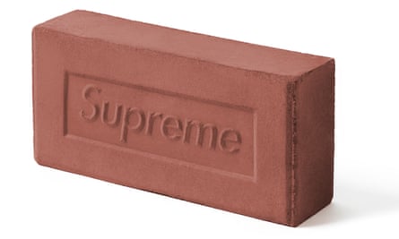
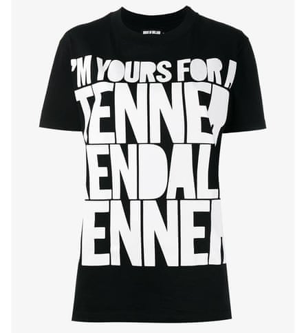
On one side, we have the anti-serif original streetwear purists – with Supreme as the shining example, using what looks like the clean, precise Futura Bold Italic originally inspired by artist Barbara Kruger, and recently immortalised in a brick. Other brands including House of Holland (Franklin Gothic Extra Condensed, apparently) and Moschino (Bebas Neue?) sit alongside them, along with countless slogan T-shirts proclaiming profundities like #thinkmoredoless on the high street.
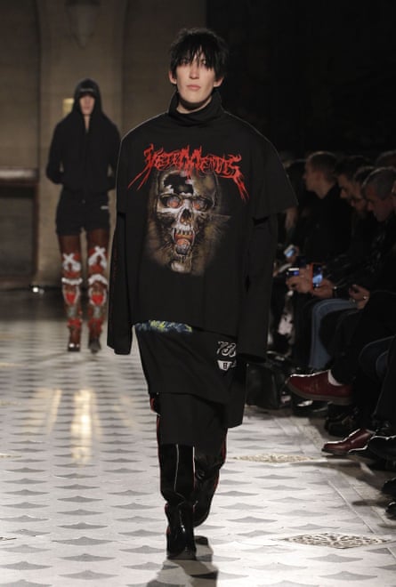
Vetements produced the DHL T-shirt that caused the internet to erupt earlier this year. With its clean and punchy font (similar to Gran Turismo Italic), it’s more in line with the Supreme gang, but the brand actually typically represents the other font team in fashion right now: blackletter – the gothic font originally used for German script – is back. Hoodies, with purple blackletter slogans and pentagrams are now highly prized beyond their familiar territory of London’s Camden market.
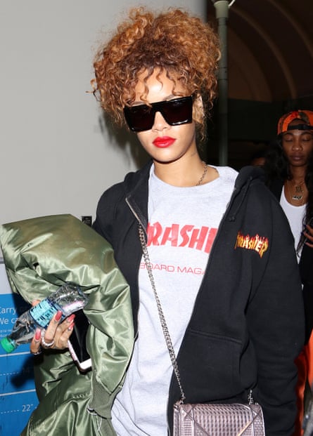
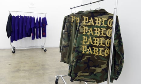
Blackletter has now made its way to pop merch, Kanye West’s Life of Pablo and Justin Bieber’s Purpose included. The result? Dropping a reference to it around any fashion-inclined dinner table will gain extra points rather than a change of subject. Anything heavy metal-influenced – the flaming letters of the Thrasher logo, the diagonally inclined Iron Maiden font (actually called that, apparently), both favourites on the front row – can also be filed here.
Perhaps these OTT, can’t-miss-them fonts moving to the foreground of fashion is down to the fact we now have so much screen time. Arial (Google), Helvetica Neue (Twitter) and either Helvetica or Arial (Facebook) have become the digital default via their use in logos, as familiar as the marimba ringtone for your iPhone or that greige backdrop to your Whatsapp messages. Anything different – including this, Guardian Egyptian – has a bang of impact. Blackletter has drama, it’s a bit fussy, something that contrasts nicely with the square simplicity of streetwear shapes. Or, maybe, it’s just a welcome relief from that most maligned font, Comic Sans.
Comments (…)
Sign in or create your Guardian account to join the discussion