Sometimes the best user interface elements are the ones we barely notice. They’re so subtle, so masterfully crafted, that we don’t even recognize how much thought, care and attention has gone into creating them – because we use them while we’re on autopilot.
It’s easier to spot the big, fancy UI elements – Path’s pop-out menu is an excellent example of that. It’s beautifully designed and fun to use – but it’s also obvious. Sometimes it’s the user interface improvements that aren’t as obvious, sometimes that you only pick up on subconsciously, that are the nicest to use.
Basecamp, the project management tool built by 37signals, recently launched it’s latest update (nicknamed Basecamp Next), which comes with an entirely redesigned user interface. There are quite a few subtle, beautifully designed improvements – but one of my favourites is the navigation bar.


When you’re on a project screen, it’s assumed that the most important thing to you is what you’re working on – not how to navigate to different screens, like the calendar – and so the top navigation bar fades out. When your mouse moves closer to the navigation bar, however, the text fades back in again to make it easier for you to make your choice.
It’s a slight change, but clearly a lot of thought has gone into it – and while you may not be able to notice it without looking for it, it’s something that makes the entire experience that little bit nicer.
Vimeo has also put a lot of thought into their menu bar – except this time, the issue they faced was how to style the drop-down navigation. Drop-down menus do serve a useful function, but at the same time it’s not always ideal for larger menus to obscure content.


Vimeo has tackled this with a simple, yet elegant drop-down menu that pushes the content below the menu further down when the navigation is expanded. The menu bar also remains open even if you move the mouse a bit further away (such as hovering over “Log in”), and doesn’t instantly disappear – which is a nice touch.
Twitter’s new user signup
When you’re signing up for a popular service, there’s always a good chance that the username you want will be taken. Twitter goes a step further in their new user signup form by validating your details live – so as soon as you move onto the next field, error messages or confirmations will appear next to the field without you having to first submit the form.
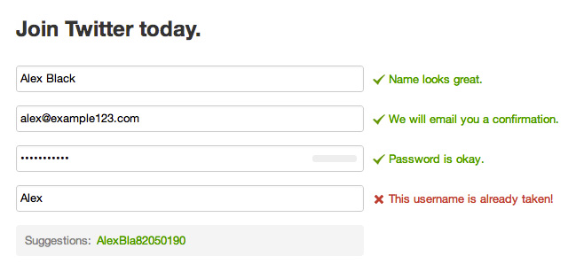
But the most useful part of their form, and the user experience decision that’s possibly the most thoughtful is the live suggestions it comes up with for possible usernames as you type. It’s subtle but useful – and clearly, a lot of thought has gone into it.
Google+, the search giant’s take on social networking, might have a reputation for being a bit of a ghost town – but they’ve clearly thrown some extremely talented designers and UX professionals at it because the entire experience is intuitive, clever and refined.
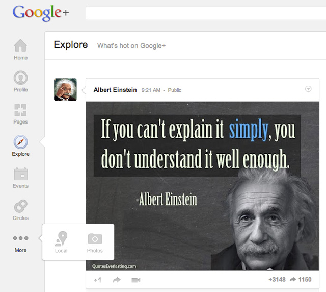
One of many subtle features is the fact that you can easily customize the side navigation bar to your liking by dragging any element onto the “More” button, creating a pop-out menu for your lesser used icons. It’s a very nice, and very thoughtful, touch that helps to make Google+ feel a little bit more personal.
Clear
It’s not just the web that is innovating with subtle UI improvements – many mobile & tablet apps are taking advantage of gestures to create interfaces that are surprisingly intuitive, elegant & simple. My favourite example of this is Clear, a todo list for the iPhone. While Clear is remarkable for being very simple, visual and usable, one of the most subtle UI improvements the app uses is harder to detect.
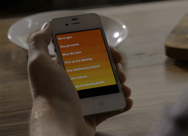
When you’re writing a todo, and you change your mind about what you’re writing, you can delete it entirely by swiping left above the keyboard. If you change your mind, you can swipe right above the keyboard to bring it all back again. It’s an incredibly subtle, but extremely thoughtful improvement – and it’s something that a lot of gesture based apps could do well to adopt.
Tweetbot for iPhone
Tweetbot for iPhone (also available for iPad and, now, Mac) is a beautifully designed Twitter client. One of the things that makes it so clever, and so popular, is the careful attention to detail that’s gone into it’s design.
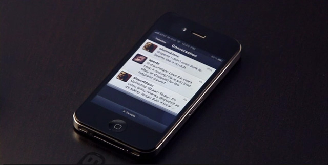
It’s great for new users and is intuitive and easy to use, but for power users, there are all sorts of simple, but creative gestures that help make the app useful. Swiping to the right on a tweet will reveal the entire conversation. It’s a feature that suddenly makes a tweet make sense, and it makes it much easier to make sense of conversations.
Paper by FiftyThree
Paper is an iPad sketching app that, like Clear, has also made use of gestures to create clever, more intuitive actions. Instead of using a back button, Paper allows you to “rewind” by drawing an anti-clockwise circle with two fingers – the further you turn the circle, the more that gets erased.
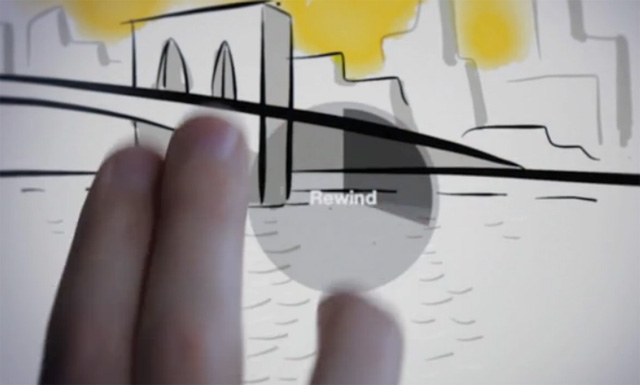
You could always use the eraser, but this method helps to undo any mistakes quickly and easily. And, just like Clear, it’s possible to redo anything you’ve deleted – this time by circling clockwise.
IA Writer
IA Writer is a replacement for Word, available for Mac, iPhone and iPad. A huge amount of care and attention has been placed on the design of the app – on the Mac version especially – it makes writing much easier, simpler and fun. It’s managed to make the entire experience noticeably better with the removal of features instead of adding new ones – and as a result it’s a polar opposite to Microsoft Word.
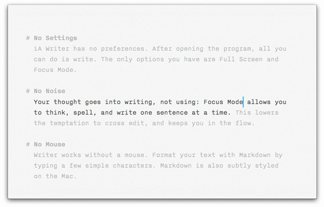
IA Writer is clean and uncluttered – but one of the smartest improvements is how the chrome is removed when you start typing. If you move the mouse, the header bar returns allowing you to minimize, maximize or close the app – but when you’re typing it quietly disappears leaving just a blank sheet for you to write on. They’ve realized that the chrome itself can be a distraction, so when you’re using the app they remove it to help you focus on writing.
Have you found any websites or apps that include subtle, thoughtful UI details that are worth mentioning? We’d love to hear about them in the comments.