

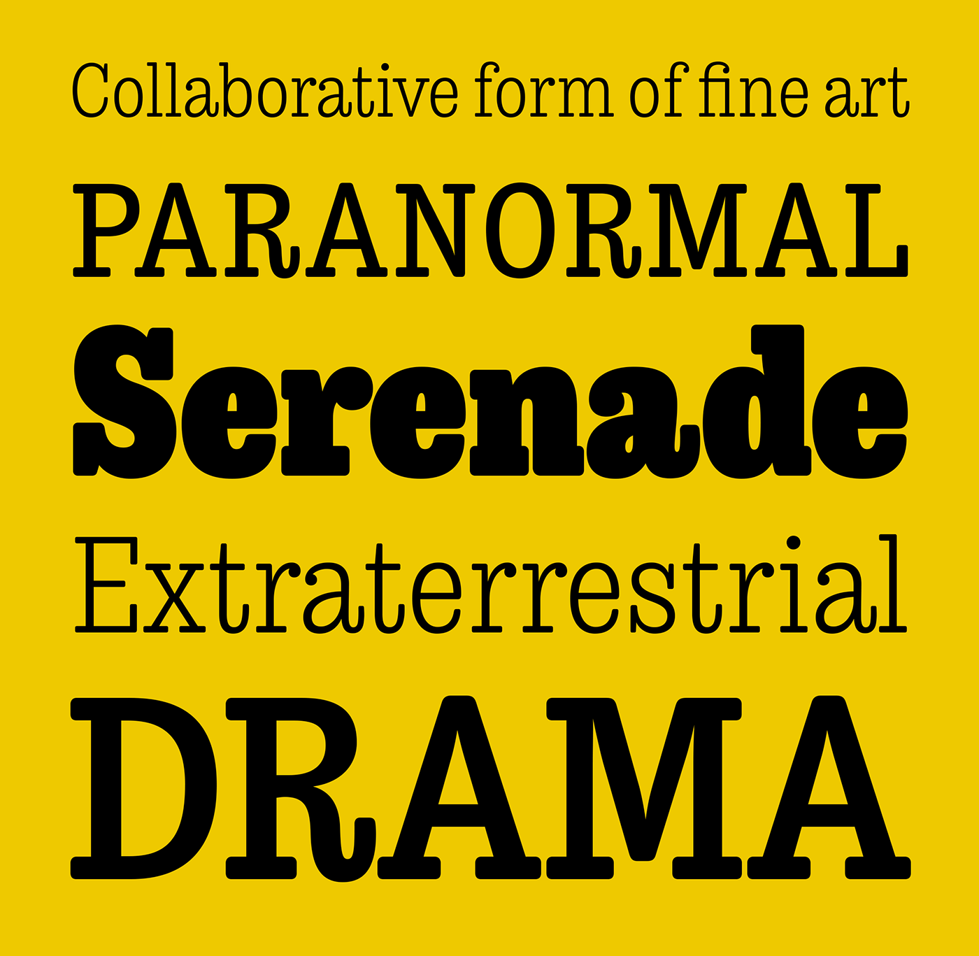
Trevor originally began as a revival of an unidentified typeface used in a dutch version of the play Tartuffe by Moliére. Because of the typefaces obscurity I had to make many design decisions without the use of an existing model.
These design decisions combined with a modern range of weights make Trevor an interpretation or homage to 19th century antiquas that’s been modernised for today’s users.
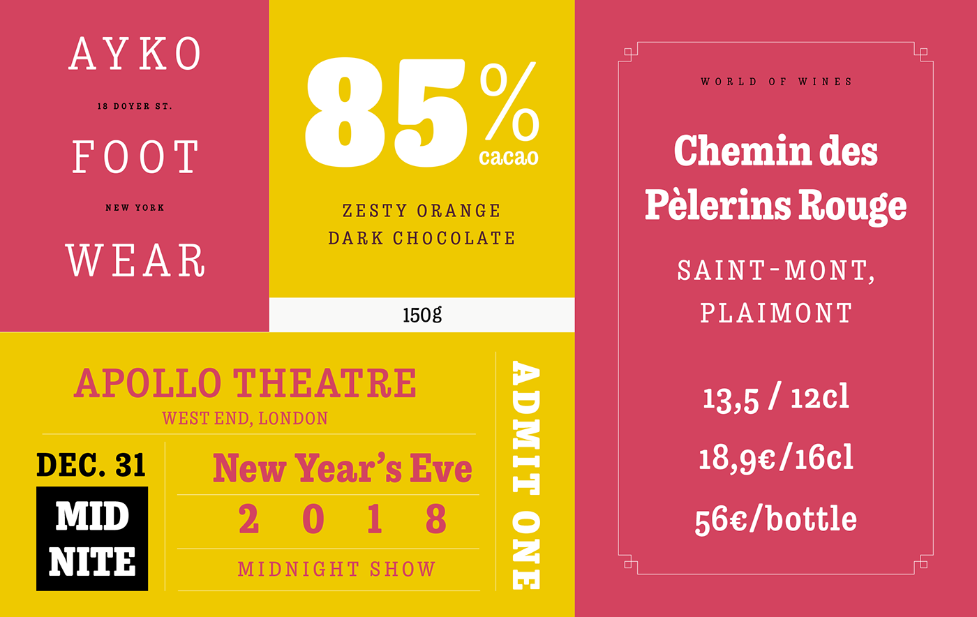
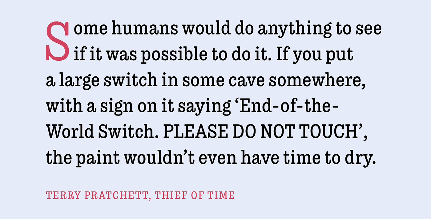
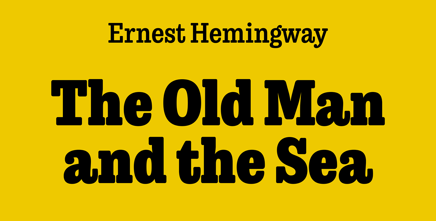
The low contrast combined with subtle rounding in the corners give Trevor a voice that’s both friendly and commanding at the same time. Some idiosyncrasies and design oddities give the otherwise modern typeface a slightly vintage flavour.
Trevor is available from
These design decisions combined with a modern range of weights make Trevor an interpretation or homage to 19th century antiquas that’s been modernised for today’s users.
The low contrast combined with subtle rounding in the corners give Trevor a voice that’s both friendly and commanding at the same time. Some idiosyncrasies and design oddities give the otherwise modern typeface a slightly vintage flavour.
Trevor is available from


Thanks for looking!
You can follow my work at
Portfolio website at
You can buy Trevor from


