8 Best Data Visualization & Charts WordPress Plugins 2024
Create the greatest content presentation by reviewing the best data visualization WordPress plugins.
It comes down to the fact that humans are better at processing visual data than reading reports or spreadsheets scattered with complex patterns.
And I’m one of them.
Thus, using a quality plugin to turn boring into fun is a MUST.
WordPress bloggers and business site owners can now enjoy using plugins’ data visualization charts and graphs to make more engaging content.
We went through 100+ reliable tools for data visualization.
But some lack responsiveness, some design and some are just TOO complex.
We decided to use user-friendly data visualization tools that create beautiful content displays and easily adapt to any niche or industry.
This post covers:
- 7 Examples of data visualization in WordPress
- Best WordPress charts plugins
- Frequently asked questions about data visualization in WP
TL;DR – Best WordPress Plugins for Data Visualization
- Visualizer: Best for creating, managing and embedding responsive tables, chart and graphs – anywhere.
- Data Tables Generator: Best advanced data table creator.
- M Chart: Best solution for controlling spreadsheet data and turning it into a chart.
- iChart: Best for adding charts and graphs with geo functionality.
- WP Charts and Graphs: Best and simplest chart plugin.
- TablePress: Best free and open-source WP data visualization plugin.
- WP Beautiful Charts: Best plugin for making animated charts.
- wpDataTables: Best all-around tool for data management with charts and tables.
7 Examples Of Data Visualization In WordPress
1. Charts And Graphs
We’re placing charts and graphs first on the list of examples because they’re one of the easiest to do.
If you don’t want to overwhelm your visitors with boring numbers, use any type of chart or graph to make it happen.
Some of the most common are:
- Bar charts are excellent for comparing various data and show highlights across different categories, topics, etc.
- Pie charts are a great way to display different (percentages of) parts of the whole “pie.”
- Line charts are ideal for connecting data points and change over a set time (show evolution).
- Column charts show information vertically (while bar graphs usually display data horizontally).
- Area charts are similar to line charts, just that the space between the x-axis and the line is filled with color. (Can work for multiple lines.)

I stumbled across the funniest pie charts by Bored Panda when searching for an example to add to this collection. I don’t know about you, but I was kinda similar to the chart above when someone asked me what I think about in math class.
2. Comparison Tables
Comparison tables are the best solution if you compare multiple items (products, services, etc.) against each other.
You can then tick the boxes and add pricing so users can quickly find which item suits them best. (Or do it like we do it below.)
Comparison tables are great user experience boosters because they allow users to skim through them quickly and find the answer they’re looking for.
In our case, comparison tables are useful when comparing plugins, themes and hosting.
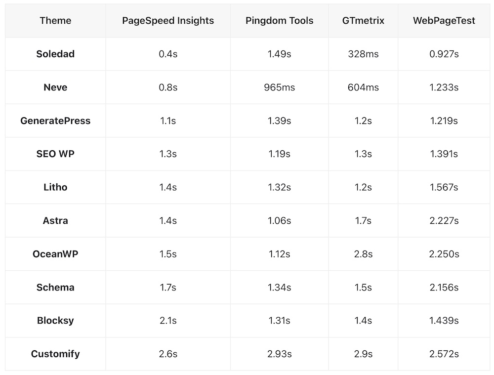
We use a comparison table when conducting reviews and tests of different themes and plugins. Here’s an example of comparing the best fast-loading WordPress themes.
3. Infographics
Infographics are a way to present data and information in a new way. (Hint: They’re also great for link building.)
They are fantastic for visual storytelling because the user can immerse into the content much more easily.
We advise adding content (or the written version of the infographic) at the bottom of the infographic if you’re sharing it in a blog post (don’t stick just the image in it).
Note: Unfortunately, there’s no good infographic plugin for WordPress, but we highly recommend using Canva’s infographic maker.
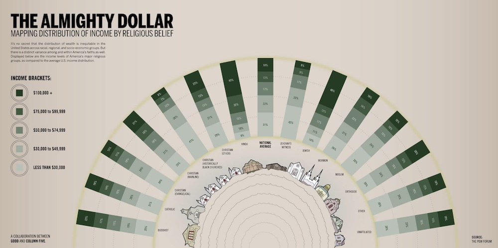
While infographics are usually vertical (and very long), I decided to go slightly against the grain with this infographic from Column Five, showcasing income distribution by religious belief.
4. Timelines
You can use timelines to create line or area charts that span a set time, with events marking special changes, improvements, or other events.
Another simple way of using timelines is for freelancers, professionals and job seekers, sharing their experiences, references, and more.
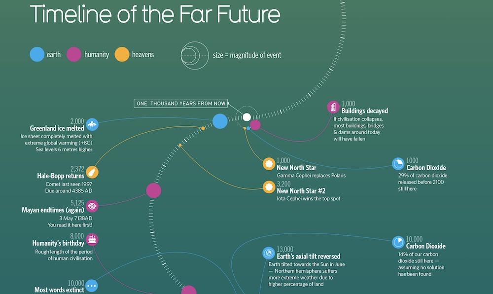
Have you ever wondered what will happen in the FAR future? I haven’t. But guys over at Information Is Beautiful did with this fantastic timeline of the far future with events. Will anything of this happen? I don’t know.
5. Maps
Maps are a popular way of data visualization in WordPress when you want to share information about a specific location. You can use local or global maps. (But maps don’t need to be geographical.)
Two of the more common uses of maps are bubble and choropleth maps.
Bubble maps are for sharing stats, data and other information specific to the area. (You can have multiple bubbles per map.)
A choropleth map (you’ve seen it but maybe didn’t know they’re called like that) divides an area into multiple sub-areas using different shades of the (same) color, each relating to a data variable.
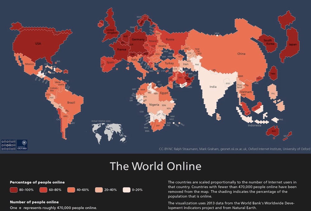
Since we’re all online right now I found this awesome choropleth map from Fossbytes, revealing where people use the internet the most. I didn’t know Taiwanese people are such heavy internet users. Or is it because of digital nomads?
6. Pictorials
Pictorials is a form of data visualization where its main feature are pictures. It’s storytelling through images without too much focus on the text.
It’s like an infographic, just very different – does this make sense?

I found this pictorial model on the Florida State University website, which displays a sketch of the situation. It’s mainly an explanation of what a pictorial model should look like. Because it’s physics, it needs a bit more info (numbers, calculations, etc.), but I still prefer pictorials that aren’t too heavy info/text-oriented.
7. Animations
While many avoid animations on their WordPress websites because they tend to be heavy and can slow down the website’s load time, they’re still an excellent way of visualizing data.
Everyone likes a good animation, even if it’s just a GIF.
And what we like about animations the most is their flexibility in adapting to anything!

Not many discuss using animation to present data, but it’s my favorite method. The Washington Post has an epic animation displays the number of solar eclips in a person’s lifetime. (Hint: It’s a lot better than the above GIF.)
Best WordPress Charts Plugins
1. Visualizer

1,000s WP users trust the Visualizer plugin to create dynamic, interactive, and beautiful charts, graphs, and more. Present your data in style.
Choose from any of the fifteen charts provided in the plugin’s core: line charts, bar charts, columns, pie, geographical charts, etc.
The technology used for rendering the charts combines SVG and HTML5. Therefore, you’re shooting two rabbits for the price of one.
HTML5 represents the latest browser technology, while SVG represents the best vector graphics format for the web.
You might have a heavy data set, but the SVG output will surprise you with its tiny size. Choose where to upload your chart data – from the web or your computer.
Customize font types, titles, tooltips, and general chart settings to make each data set unique.
Visualizer rocks!
Best for:
Creating, managing and embedding responsive tables, charts and graphs into any WordPress theme.
Key Features:
- 10+ chart types
- Interactive charts
- Chart export
- Periodical data synchronization
- Money back guarantee
Pros:
- Regular updates
- Fast support
- Many customization functions
Cons:
- Not the most user-friendly
Pricing:
- Free: 4 chart types
- Personal (99€/year): 1 site, 15 chart types, import data from an external database
- Developer (199€/year): 3 sites, 15 chart types, periodic data synchronization
- Agency (399€/year): Unlimited sites, 15 chart types, on-page data editor
2. Data Tables Generator by Supsystic
Data Tables Generator is an easy and powerful WordPress data visualization plugin with free and premium versions.
Native table support has existed in HTML for decades. With the evolution of CSS and JavaScript, tables can be reliable for displaying data to the consumer.
Data Table Generator gives you the tools to display your data without prior experience in data management.
Create charts, graphs, and data diagrams all from a single plugin. Manage your data entries to make them easier to understand for your readers and boost user experience.
Our favorite feature: You can also plug your Google Charts data into this plugin for that extra diversity.
Best for:
Creating advanced tables and data management.
Key Features:
- Built-in global search
- Highlighting elements
- CSS editor
- Live preview
- Table migration
- Restrict per role
Pros:
- Translated into 10+ languages
- Quick configuration and data editing
- A lot of documentation
Cons:
- Can be slow
Pricing:
- Free: Unlimited rows and columns, hidden fields, search, CSS editor
- Pro ($46/year): All free features, editable fields, diagrams, table history, print button
3. M Chart
Level up your online presence with M Chart. M Chart gives you plenty of options to add the information and details to the charts you want to create.
Installing, activating and configuring it is straightforward and suitable for all users.
Note: To make it fully work, you must first install the M Chart Highcharts Library plugin.
The plugin can manage all the data and statistics via a spreadsheet. Later, when you are done editing and preparing the content, you can use the convenient shortcode and add the chart to your posts and pages.
M Chart is the data visualization WordPress plugin that displays your data.
Best for:
Managing spreadsheet data and presenting it in a chart.
Key Features:
- Chart shortcode
- Import/export CSV
- Hooks for developers
Pros:
- 10+ chart types
- Fast and friendly support
- Quality documentation
Cons:
- Highcharts Library plugin doesn’t come integrated anymore (but it’s a must)
Pricing:
- Free: All the above and more.
4. iChart
As the name suggests, iChart is a free data visualization WordPress plugin for building charts and graphs. The design is responsive and mobile-ready, following modern web trends for a consistently smooth performance.
In addition, iChart’s shortcode generator lets you add your creation anywhere on your website or blog, displaying (loads of) data and stats beautifully.
The features of iChart are many.
It supports chart styles, like bar, line, pie, polar area, and doughnut (YUM!).
And once you are done creating the desired chart, copy and paste the shortcode to any page or post and see it appear on your site. As simple as that.
Best for:
Responsive charts and graphs with geo and Covid widgets.
Key Features:
- Easy integration with a shortcode
- Extensive customizations
- Hide and show chart information
- Live chart preview
- Allow embed so others can embed your chart
Pros:
- Regular updates with new features
- Pro version works forever (even if you don’t renew)
Cons:
- Slightly limited free version
Pricing:
- Free: Multiple pie chart styles, shortcode generator, live stats
- Personal ($19/year): 1 site, best for bloggers and personal sites
- Master ($58/year): 100 sites, best for power users
- Ultimate ($89/year): 100 sites, iChart Pro Max, iList Pro, best for agencies
5. WP Charts and Graphs
Crafting simple yet beautiful charts for your website happens in a little breeze with WP Charts and Graphs.
This data visualization WordPress plugin is set to get you going, even if you are not tech-savvy. You can create the chart you fancy from your admin panel and see the live preview before you go live.
If it needs any additional tweaks, now is the time to make them happen. However, you can always return to the drawing board and perform corrections or add more data and stats.
WP Charts and Graphs calls for a fully responsive end product that smoothly operates on smartphones, tablets, and desktops.
Moreover, it comes with different chart styles to find the right one right from the get-go. Now get that doughnut, radar or polar chart or any other going strong and decorate your website.
Best for:
Everyone who needs a simple and minimal chart generator for WordPress.
Key Features:
- Live preview
- Automatic shortcode generator
- Various chart types
Pros:
- Simplicity and minimalism (but can be a con for some)
Cons:
- Maybe too simple for some users (but that’s its specialty)
Pricing:
- Free
6. TablePress

TablePress is one of WordPress’s leading table generator plugins, with a whopping 800k installs!
Google Spreadsheets is fine, but why not manage your data directly from the admin dashboard? Table management can be overlooked if you work with only a few data pieces.
But TablePress can step up to the plate for more significant content projects and deliver that great experience you’re after.
A shortcode allows you to share your tables in posts, content pages, and widget areas.
The table has several features: custom content (text, visual, number, HTML, JavaScript), custom formulas based on Excel, individual row highlighting, import using traditional methods or external servers, etc.
Best for:
Everyone who needs a flexible, free and open-source plugin to create any table.
Key Features:
- Simple embed into posts, pages and widgets with shortcode
- Head and foot row
- Highlight hover
- Alternating row backgrounds
- Table preview
- Can add links and images to the table
Pros:
- Import data from multiple sources
- Free add-ons
Cons:
- Not ideal for large tables
Pricing:
- Free
7. WP Beautiful Charts
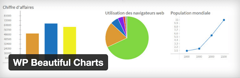
What do you wish to share with your readers? A pie chart, a bar graph? Perhaps a line chart to showcase your latest earnings reports?
For simple tasks, you won’t need more than WP Beautiful Charts. It’s a data visualization plugin that gets straight to the point.
But what we like the most about WP Beautiful Charts is the animation function.
Create cool charts and graphs with special effects. (But don’t expect too much because it’s still a simple plugin.)
Best for:
Users who want to add animated charts to their WordPress website.
Key Features:
- Colorful and animated charts and graphs
Pros:
- You’ll easily get the gist of it (quick work!)
Cons:
- Couldn’t find anything
Pricing:
- Free
8. wpDataTables
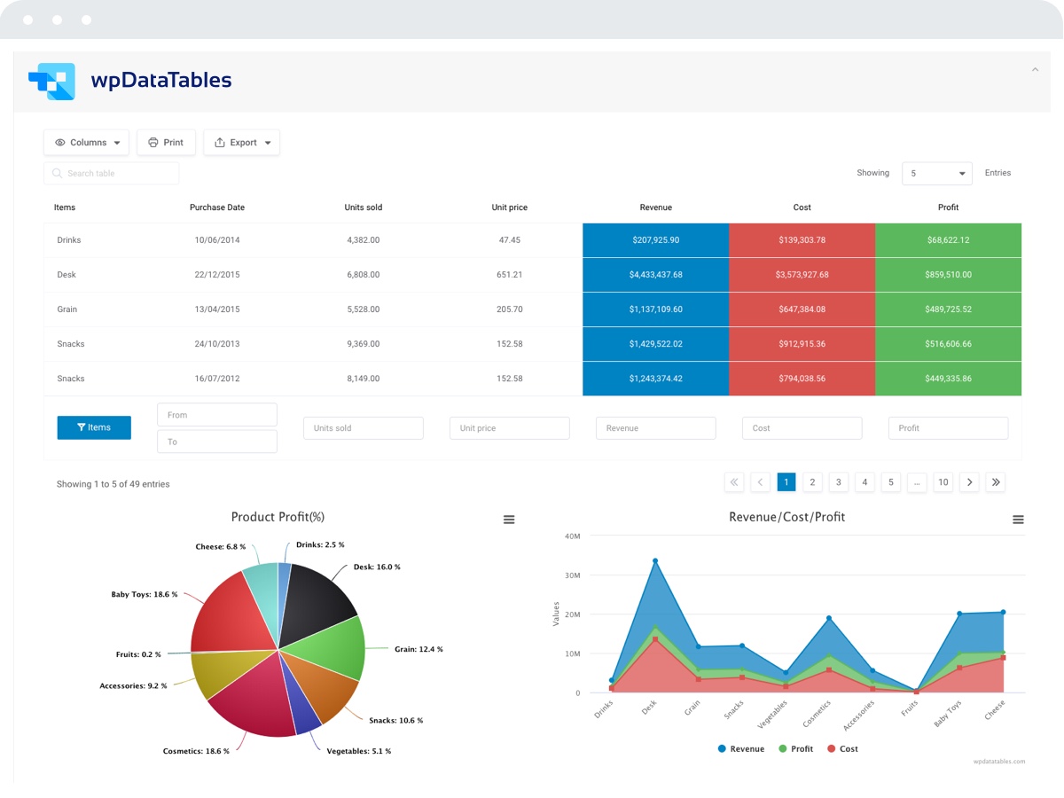
wpDataTables is a comprehensive plugin for visual data management on any WordPress website.
Fetch your existing Google or Excel Spreadsheets, and import them into wpDataTables to showcase your information on WordPress.
If that doesn’t work, plug your MySQL data directly into a data spread. You won’t need to know MySQL queries because the plugin supports query building with an intuitive interface.
Admins can edit visual data directly from the post or page (front-end) or manage it from the dashboard (back-end).
We also found wpDataTables to be a very secure plugin. If you’re working with sensitive data, you wouldn’t want others to play with it or even access it without your permission.
You can also start with its free version.
Best for:
Any data management through charts and tables.
Key Features:
- Advanced filtering
- Lazy load
- Private Google Spreadsheets
- Image columns
- Easy to use (beginner-friendly interface)
Pros:
- Many features and add-ons
- Extensive customizations
- Handy documentation and tutorials
- Great support
Cons:
- It can be heavy on your website
Pricing:
- Free: Simple (but customizable) tables, excel-like editor,
- Basic (65€/year): 1 domain, all features
- Pro (103€/year):3 domains, all features
- Developer (236€/year): Unlimited domains, all features
Frequently Asked Questions About Data Visualization In WP
With the popular Visualizer plugin, you can quickly and easily create a professional chart or table in WordPress.
We recommend using the user-friendly online infographic maker Canva and importing it into WordPress. Sadly, there aren’t any high-quality infographic plugins for WordPress.
If you create your content using Gutenberg, you can configure a block however you want. However, Data Tables Generator by Supsystic is also an excellent plugin for creating advanced data tables.
Visualizer is the best WordPress data visualization plugin because it supports charts, tables, animations, and live editing. Plus, it’s easy and quick to customize.
Related Posts


You can also easily integrate Shield UI Charts into all WordPress websites, just by copying and pasting some HTML configuration code.
Check out the samples at: https://demos.shieldui.com/web/all-charts
THUMBS UP! Polar Charts.. at last.
Hello,
I need a plugin to display complex stats about a blog and show them as graphs, piecharts, etc. Unfortunately I wasn’t able to find one to fit my special need. What i need is a plugin to allow me :
– display this data FOR ALL MY USERS in WIDGETS OR PAGES , not in admin, or member page
I want to display on my site front page some nice graphs (to be shown to all visitors and members) showing :
– number of posts evolution on a period
– a piechart with posts in different categories (if i have 4 categories, each one with different posts, i wanna see a piechart of this displayed on front page, on widgets, or in other pages of the site for logged users or not loged in
– a graph with comments : a top of users and theri comments (let’s say top ten commenters : user a:x comments, user b: y comments…and so on)
– evolution of comments / articles over a timeslice…show an graph of volume evolution by week, month, year, etc
– a graph showing evolution of new users numbers
..and other various graphs FOR ALL MEMBERS in ANY PAGE I WANT or / and in widgets
I would be very interested to buy such a plugin
Andrei,
Unfortunately, none of plugins will do that much by default. However, you can use any plugin as a base and hire a developer to create the rest of the tweaks.
Neil,
Those charts look like they were designed in 90s and haven’t had any updates since. Are you sure they are worth the shot?
Hi Aigars
I’m a developer, not a designer. Those charts are very very customisable, like very very. That’s the idea, some designer can build a chart anyway they want them. Are you a designer? You want to work with me to make some nice ones? be my guest? let me show you what they can really do?
Thanks
Neil
May i suggest the excellent MaxiCharts plugin : https://wordpress.org/plugins/maxicharts/
Charting both Gravity Forms entries and CSV datasources.
Thanks!
The graph lite plugin (https://wordpress.org/plugins/graph-lite/) that we recently developed might be very helpful. Unlike other plugin, it has an interactive graph builder to show you a preview while you are adding data.
Disclaimer: I am one of the developers of the plugin.
Hi! I’m a student and I’m kind of a newbie in wordpress. I installed it but I can’t seem to find the plugin in the dashboard. can you help me out?
In your WP dashboard go to Plugins -> Add New and search for the plugin you want to add. Or add it manually from there.
Just to be clear. M Chart does an active preview as you add data as well. I agree that’s a great feature though. 🙂
Why include infogram under free when it costs £67 per month for the level of usability most of us would want. I mean what is the point, you’ve just wasted half an hour of my life – i thought colorlib were better than that?
Nicholas,
I completely disagree with you. We use free version of Infogram on our website so does millions of other users. You might be among few who needs premium version.
I really enjoyed your article! Which of these plugins can be used to include a variable in a query on a MySQL database that filters results presented in a chart using the logged in user?
Peter,
Unfortunately, none of the plugins will do that by default. No mass plugins will ever support custom queries and variables as it imposes a huge security risk.
I think Peter was asking for something other than what you answered. It sounds like he wants the same thing as I do: A plugin that is access MySQL directly (especially an external DB) to display a chart or graph to the logged in user (like showing their stats in a nice bar chart). So far, I have found that wpDataTables and Sysuptics Data Table Generator are two that may achieve the goal. I am about to test them to see, but Sysuptics is quite a bit cheaper for similar-looking quality (at least for the basic charts/graphs to show my user’s their stats). Cheers!