

A faster website
One of the reasons that brutalism is seen as ugly is because there are no frills and gimmicks in the design. The appearance of a brutalist site goes way beyond minimalism and into something raw and almost unfinished-looking. While it’s not easy on the eyes of users, the thing is that a site with so few elements won’t take long to load its pages. As a result, a brutalist site becomes faster than an ordinary site with more elements to load. Think about it: Without high-resolution images or lengthy videos, a site isn’t bogged down and can therefore load quicker than usual. How does this impact conversions? Research show that faster sites increase conversions. Kissmetrics’ infographic establishes the following: • The longer it takes a page to load, the higher the abandonment rate will be• 79% of shoppers who are unhappy with site performance are less likely to purchase from the same site again
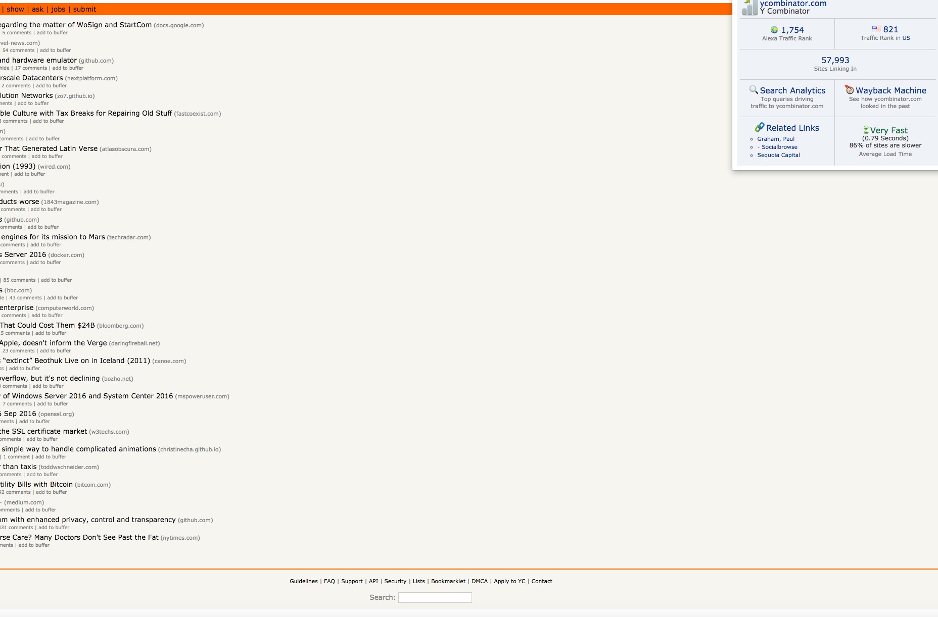
• A one-second delay in page speed can cause a 7% drop in a site’s conversions A study from Soasta reveals that mobile pages that are just one second faster produce conversion rates that are up to 27% higher. Brutalist sites provide your users and visitors with better, speedier performance because designers don’t have to work with a sophisticated and taxing content management software, nor do they have to bother with complex Javascript or CSS. From the back-end perspective, brutalist sites can be built with just a fundamental understanding of HTML and a text editor. A popular example of a brutalist site is Y Combinator’s Hacker News. When we check Alexa analytics to determine its site speed, we see that it loads “very fast” at just 0.79 seconds.
 While this ultra-simplicity may be minimalism to the extreme, it sure results in faster sites that provide a better UX, particularly for shopping sites, and therefore raise conversions.
Extremely easy navigation
The ease of use of any site’s navigation isn’t just a benchmark for the success of the site, but also determines whether the site has many conversions or very few. Depending on the navigability of a site—in other words, how easy it is for users and visitors to find the information they’re looking for on your site’s interface—usability will be affected one way or another. [pullquote]Say what you will about brutalist sites’ ugliness, but at least they are incredibly easy to use![/pullquote] According to the Nielsen/Norman Group, if site usability is low, thereby making the site hard to use, users leave, dropping conversion rates like crazy. One of the primary offenders of bad navigation and, consequently, bad usability is complexity, excess and clutter in the form of too many elements on any given webpage. Say what you will about brutalist sites’ ugliness, but at least they are incredibly easy to use! That’s directly owing to how relatively few elements appear on their pages, competing for the user’s attention, in comparison to today’s apparently UX-friendly, trendy and aesthetic sites that adhere to all the web-design best practices. When your users easily find what they want on your site — say, a product they’re searching for, along with prices, shipping info, and a bold and big call to action button — they’re likelier to stick around and complete an action. We see this on Apple’s site for this past summer’s WWDC16. The navigation is so easy to find in the header since there are only very few competing elements on the page. Budding designers who wanted to attend the conference and get advice straight from Apple experts could also efficiently request a consultation since the “Consultations” tab in the navigation menu was easy to find and led to a noticeable CTA.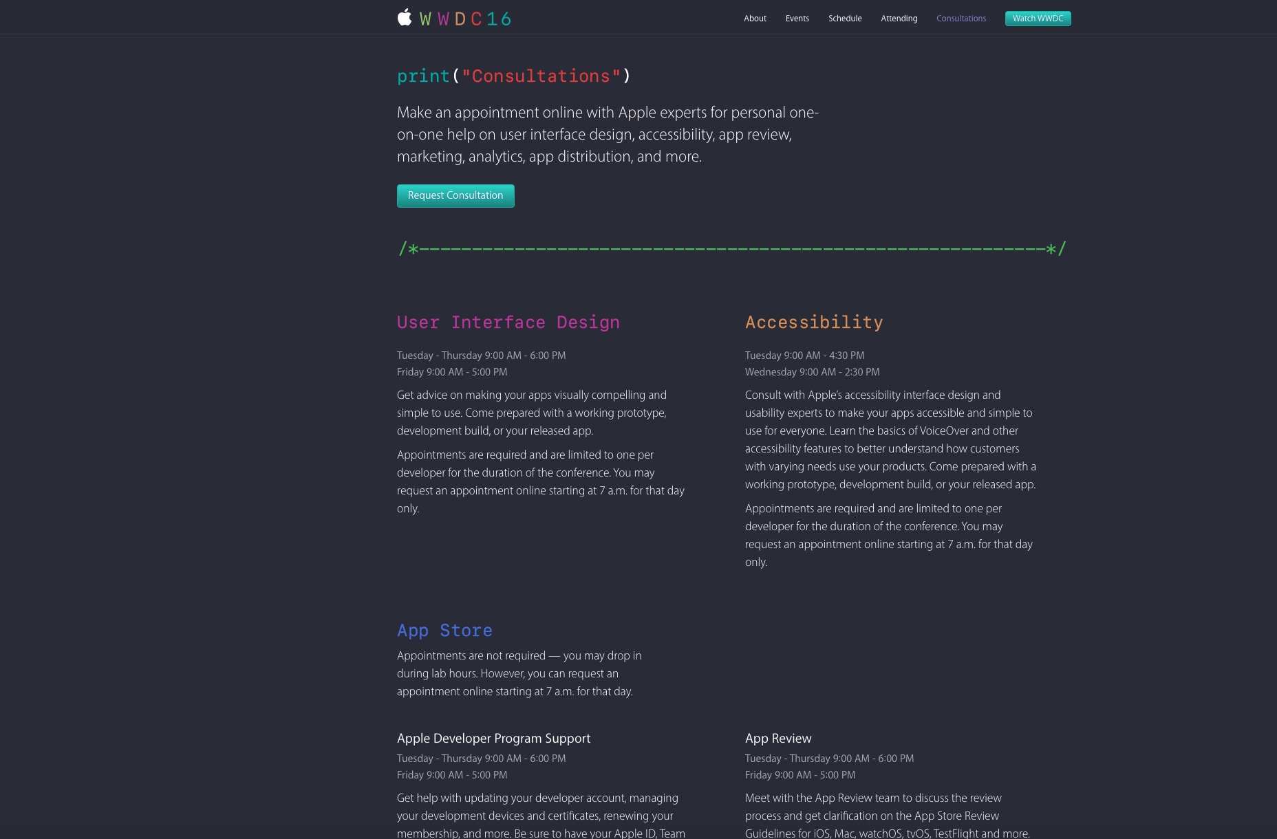
Fewer distractions and choices
We know that visitors and users are an easily distracted bunch. We’ve all heard of the notorious and frequently referenced jam experiment, where one tasting session with fewer choices led to more purchases or conversions, as opposed to another session dominated by more choices and fewer purchases. This old-school experiment — not involving sites, digital products, or anything design-related — shows us that human beings are easily affected by too many choices, which leads to choice paralysis. This applies to your site visitors and users, too. That’s why it’s unsurprising that studies show that landing pages, for example, with fewer choices lead to more conversions. Crazy Egg recommends removing the following distractions for better conversions:- The navigation bar
- Excessive form fields
- Multiple CTAs
Brutalism and conversions: a match made in heaven?
Before you write off brutalism as being unfriendly to conversions, think twice. Criticism of brutalism has been primarily based on its unorthodoxy and unattractiveness, which violates our current standards of what constitutes excellent design. However, when it comes to conversions, less is more and simpler is better—and the research backs this up. You don’t necessarily need a gorgeous site with all the bells and whistles that sports the latest design trend to optimize conversions on your site. Ironically, a beautiful site can include a lot of excess baggage, both in design and development, which can hamper conversions. So the next time you see a brutalist site, don’t be so quick to misjudge it! The site owner may just be enjoying his fair share of conversions, in spite of its unattractive appearance.Marc Schenker
Marc’s a copywriter who covers design news for Web Designer Depot. Find out more about him at thegloriouscompanyltd.com.


Read Next

3 Essential Design Trends, May 2024
Integrated navigation elements, interactive typography, and digital overprints are three website design trends making…

How to Write World-Beating Web Content
Writing for the web is different from all other formats. We typically do not read to any real depth on the web; we…
By Louise North

20 Best New Websites, April 2024
Welcome to our sites of the month for April. With some websites, the details make all the difference, while in others,…

Exciting New Tools for Designers, April 2024
Welcome to our April tools collection. There are no practical jokes here, just practical gadgets, services, and apps to…

How Web Designers Can Stay Relevant in the Age of AI
The digital landscape is evolving rapidly. With the advent of AI, every sector is witnessing a revolution, including…
By Louise North

14 Top UX Tools for Designers in 2024
User Experience (UX) is one of the most important fields of design, so it should come as no surprise that there are a…
By Simon Sterne

What Negative Effects Does a Bad Website Design Have On My Business?
Consumer expectations for a responsive, immersive, and visually appealing website experience have never been higher. In…

10+ Best Resources & Tools for Web Designers (2024 update)
Is searching for the best web design tools to suit your needs akin to having a recurring bad dream? Does each…
By WDD Staff

3 Essential Design Trends, April 2024
Ready to jump into some amazing new design ideas for Spring? Our roundup has everything from UX to color trends…

How to Plan Your First Successful Website
Planning a new website can be exciting and — if you’re anything like me — a little daunting. Whether you’re an…
By Simon Sterne

15 Best New Fonts, March 2024
Welcome to March’s edition of our roundup of the best new fonts for designers. This month’s compilation includes…
By Ben Moss

LimeWire Developer APIs Herald a New Era of AI Integration
Generative AI is a fascinating technology. Far from the design killer some people feared, it is an empowering and…
By WDD Staff