


Tour de Fonts
Australian Type Designer and Letterer, Dave Foster, has taken on the ambitious project of drawing a daily typeface concept to coincide with each stage of the Tour de France 2016.
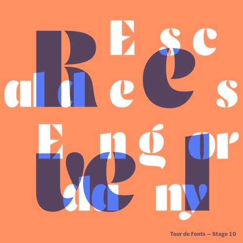
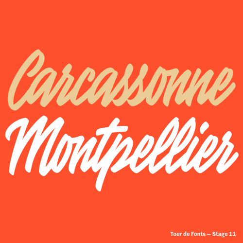
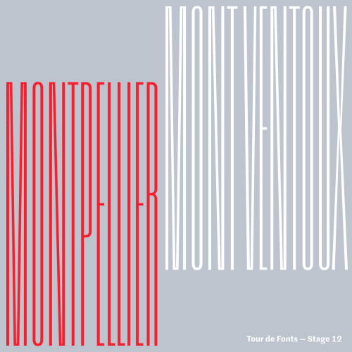
Much like Le Tour, this epic project is a daily marathon but takes in some beautiful sights. Each of the designs takes its inspiration from the individual stage. For example:
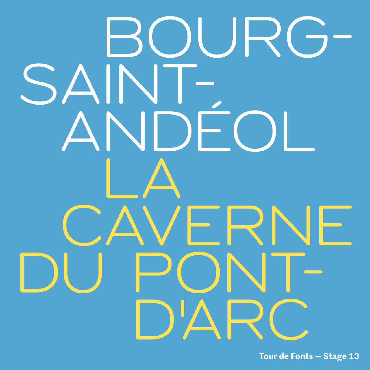
Stage 13 of #tourdefonts Today is the time trial and I wanted something light, lean and low to get that hunched, aerodynamic feeling. Inspired by the letters that were stamped and engraved into the steel of old group set components. I tried to approach the design as an engineer rather than a type designer.
Designing a typeface can be a long and arduous process but talking to Dave he said that it’s a great way to explore concepts and test them quickly. “It’s reignited my passion to produce more typefaces. I hope develop a few of the concepts into full families in the near future.”