


Magic mirror on the wall, what are the coolest design trends of them all?
2017 saw mobile trends become increasingly important in design: we are incline to think that in 2018 the tendency will continue, making elements such as responsive logos crucial for designers.
We will probably also see a predominance of dynamism and vibrant colors, of customized illustrations and more freedom in creativity.
2018 will be a year of colorful vibrations and movement: sounds exciting, right?

Back in the beginning of 2000s, future seemed to resemble what we saw in The Matrix: scrolling sequences of numbers, technology, robotics, pulsing lights.
This scenario lost its appeal when it appeared clear that movies went further away from reality, which was less futuristic than imagined. But lately we saw these robotic trends coming back, when speaking about Analytics or Big Data: even if numbers are less exciting than hacking the world, futuristic ornamentalism will be still present in 2018.
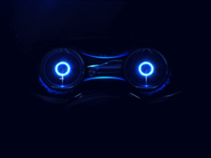
Project: Automotive cluster effects exploration process
Author: FΛNTΛSY
Author: FΛNTΛSY
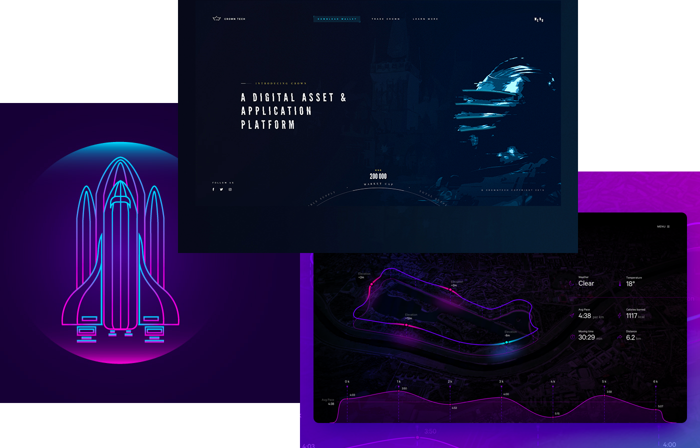
Project: Crown Tech | SpaceShip | Data Visualization Concept
Author: Jan Wolinger | Arif Rachman Hakim Yogyakarta | Mario Šimić
Author: Jan Wolinger | Arif Rachman Hakim Yogyakarta | Mario Šimić

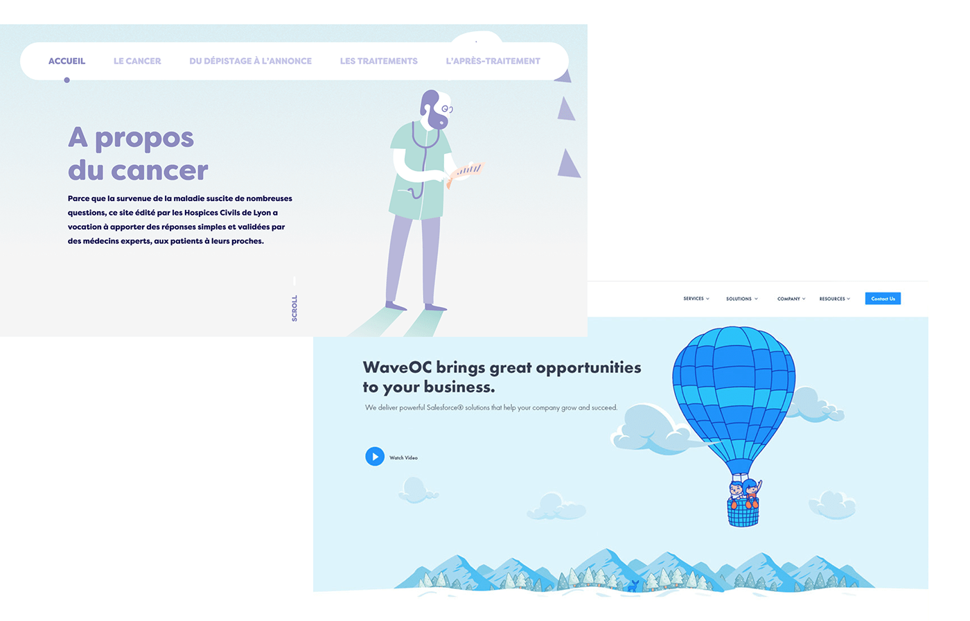
Less is more, a timeless trend. Where simplicity means cleanness, for a white-dominated, neat page in the name of minimalism. The space is the king: its optimization works for a multi-functional, versatile design.
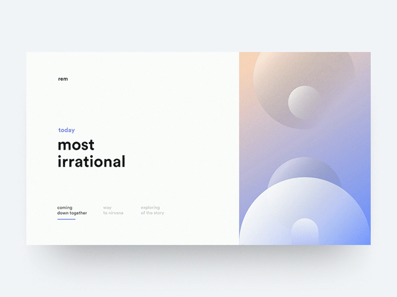
Project: Rem
Author: Alim Maasoglu
Author: Alim Maasoglu
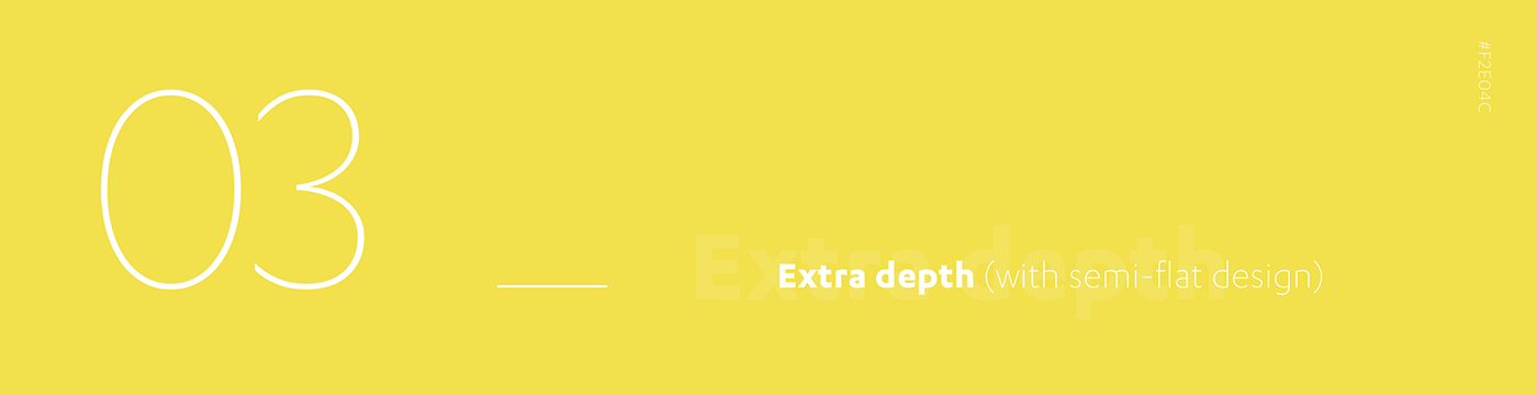
Adding some sauce at traditional flat design might be the right direction for 2018: a little bit of shadowing will help to give objects a more round dimension, while the minimal attitude that made flat a big thing is still dominant.
Spaces and depths will find their dimension, literally, within these extra-deep concepts.
When mobile calls, logos respond. In a future more and more oriented to mobile experience, where desktop is increasingly losing importance, the brand itself must adapt to its new contest, being it a smartphone, a tablet or a banner.
Responsive logos become crucial for designers: a brand must be able to present itself regardless of dimensions and spaces.
A stimulating challenge for designers, responsive logos will be a must have for 2018.
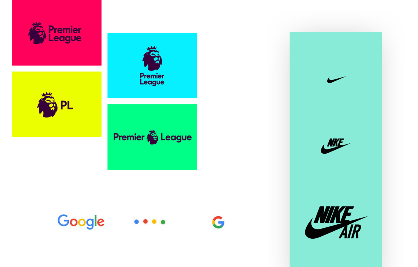
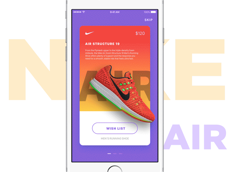
Project: Premiere League | Evolving Google Identity | Nike Air
Author: DesignStudio | Google Design | Nike
Author: DesignStudio | Google Design | Nike
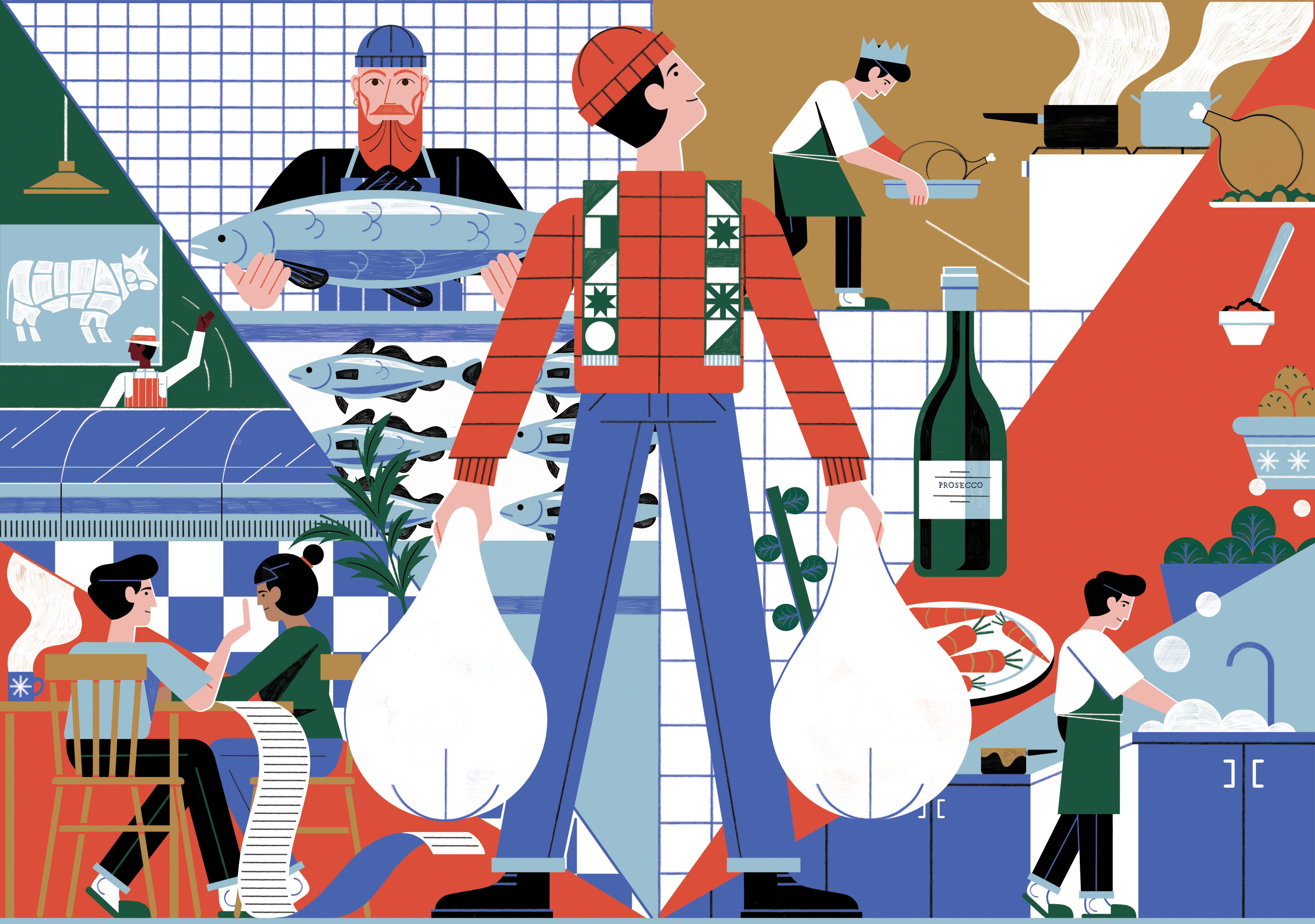
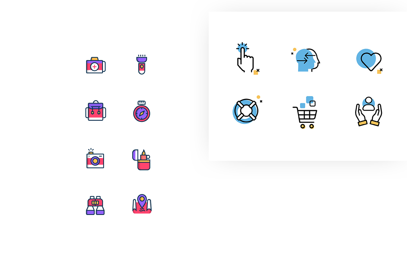
Stock doesn't rock. That’s why in 2018 we will see more custom design and illustrations and less homologation due to stock icons and artwork. The personalization of a brand starts from design and finding a branded language based also on drawings and illustrations will turn any website into a unique, unequivocal ID card that will speak with the brand voice from the very first landing.

We like to move it, move it! With the social explosion of GIFs, animation is getting big online. Using moving elements such
as banners or hero images guarantees an eye-catching strategy, valuable for newsletters and DEM, such as splash pages
or landing pages.
2018 will most likely see the return of the cinemagraphs trend (steady images with a single moving element, such as a cup
with animated smoke coming out of it). The important thing is never stand still!
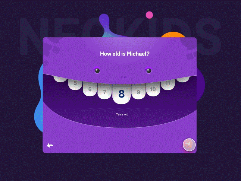
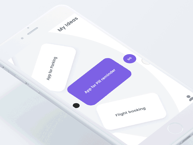
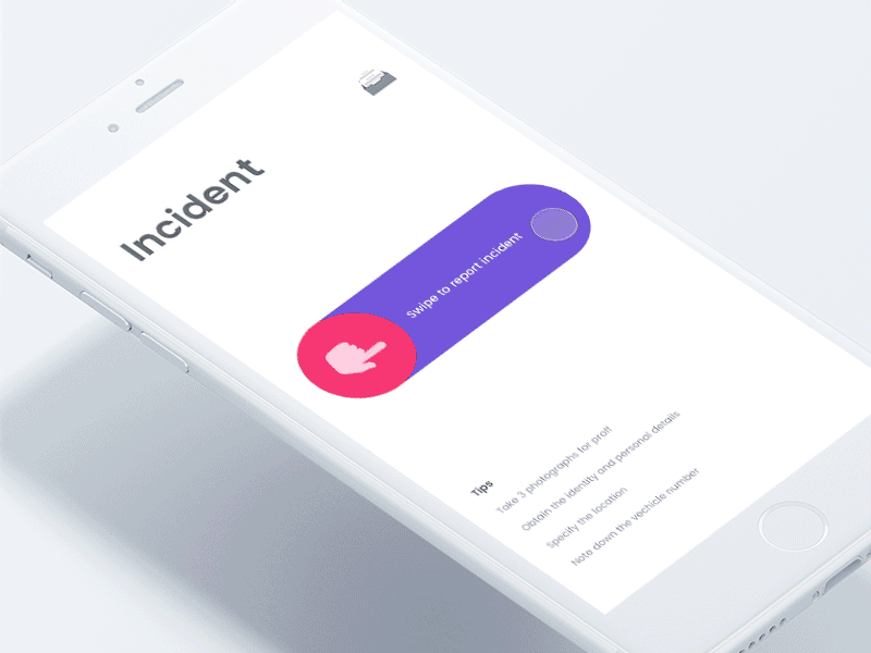
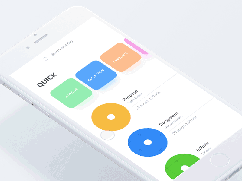
Project: Neo Kids - Onboarding Concept
Author: FΛNTΛSY
Author: FΛNTΛSY

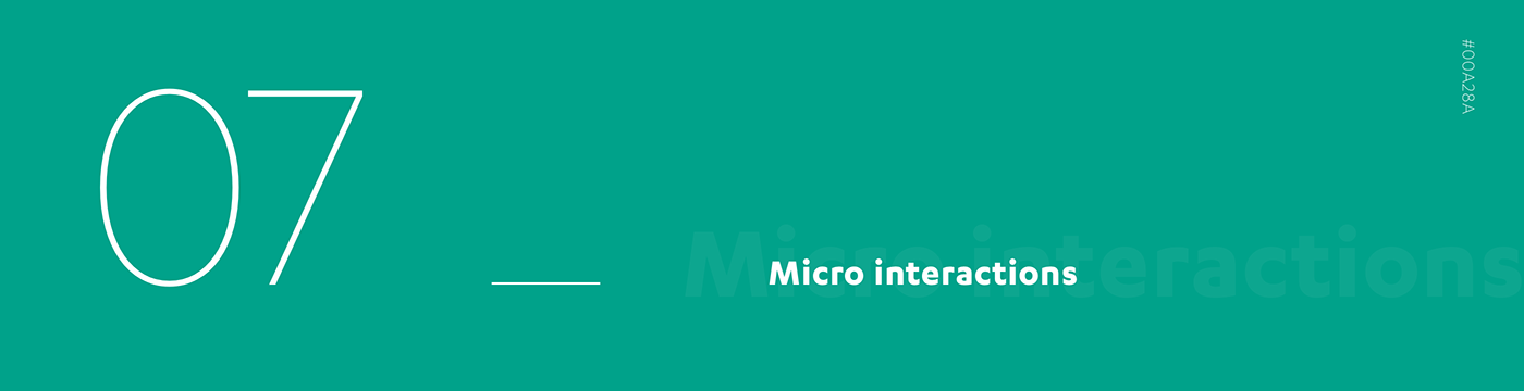
They are everywhere. Every time you like something on Facebook or swipe on mobile apps, you are engaging with micro-interactions. And they work pretty good, considering that their goal is to engage the user and guarantee a dynamic UX.
Elements become liquid: buttons can turn into something else and all surfaces become animated scenarios to touch and use.
We bet they will rule in 2018 as well.


Slight, but constant. The movement of integrated animations is never invasive but persistently guides users through their navigation experience, either by keeping them busy when the page is being loaded, or by interacting with elements and actions on the page, such as scrolling or focusing on a certain section.
The presence of characters can help users to find personas to identify with, enhancing the interaction with a website
and building an actual narrative path to be followed.


Sometimes They Come Back. Banned about 10 years ago and substituted by flat design, gradients are seeing their second glorious era starting with giants like Spotify and Instagram who brought them back in 2015. Gradients 2.0 are less messy than their old relatives: colors are well distinguished to create a dual tone effect.
More an enhancement to flat design than a dominant tendency, gradients are now becoming synonymous of freshness, coolness, digital generations.
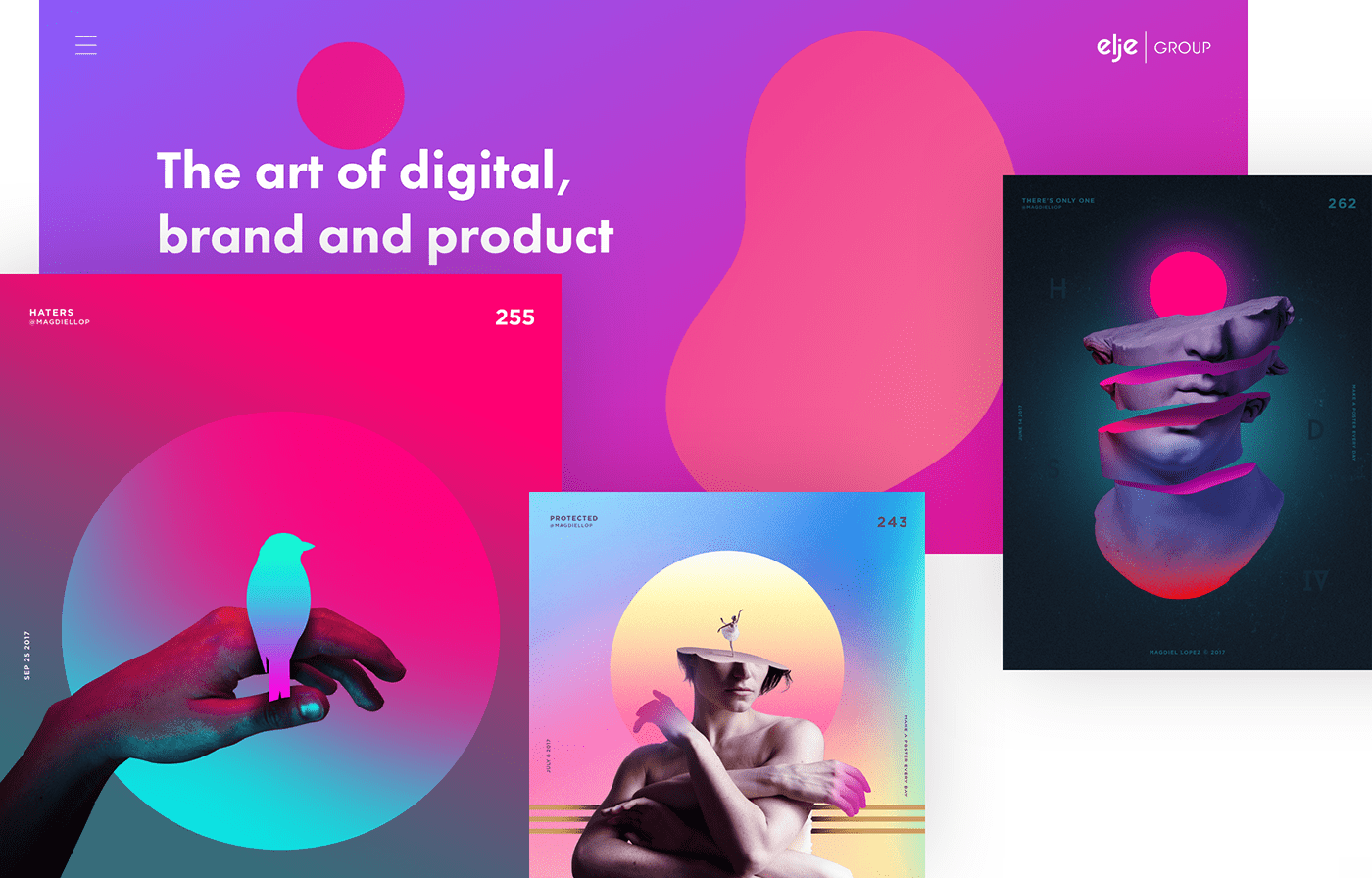
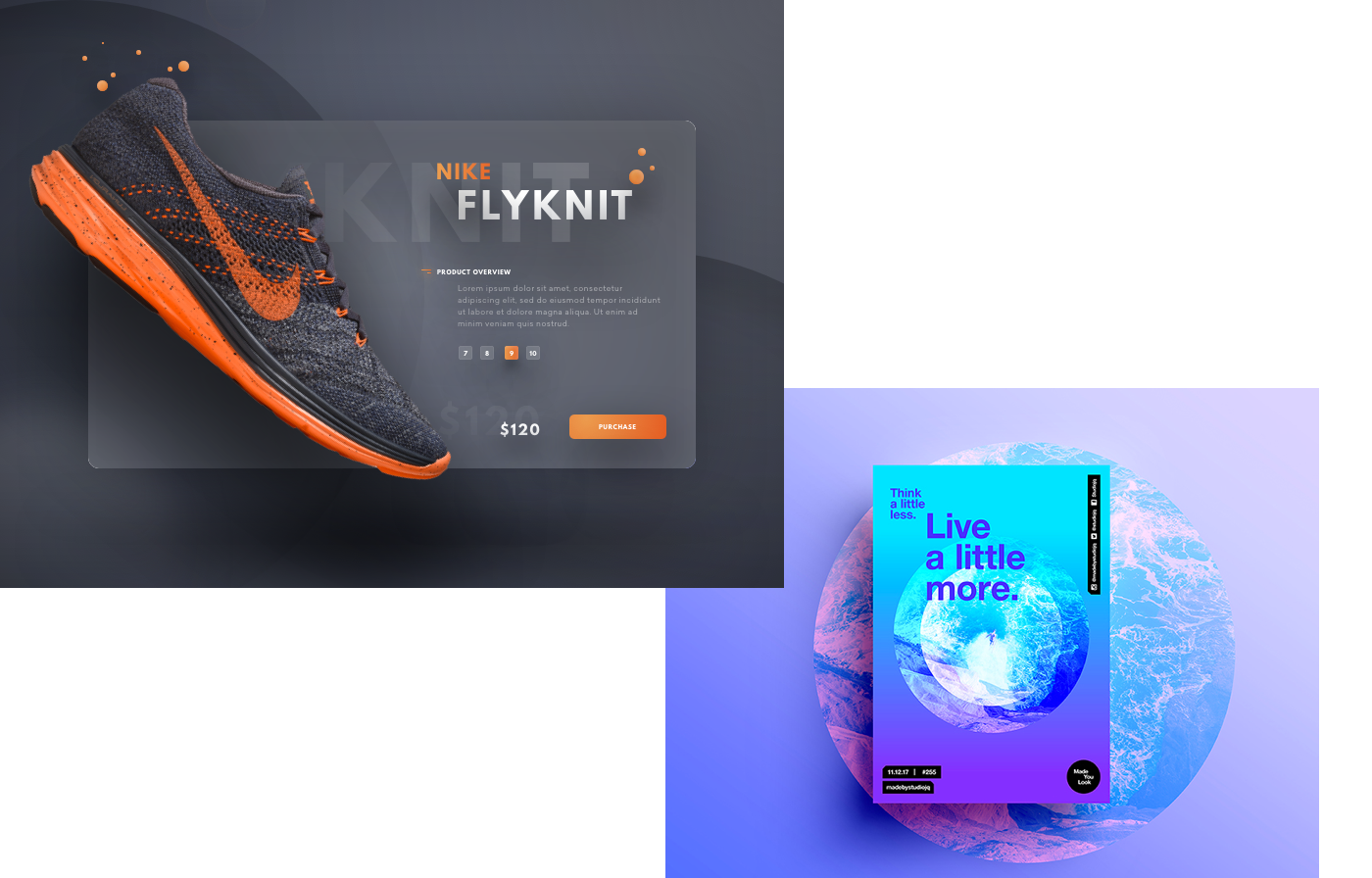
Project: A Poster every day - Collection 2 | Elje - group website
Author: Magdiel Lopez | elje-group.com
Author: Magdiel Lopez | elje-group.com
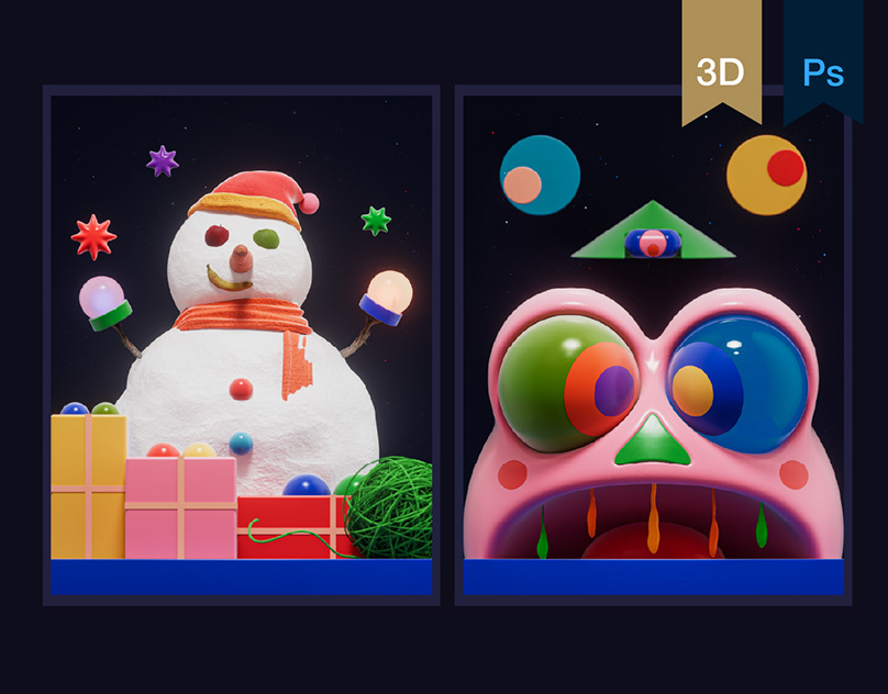
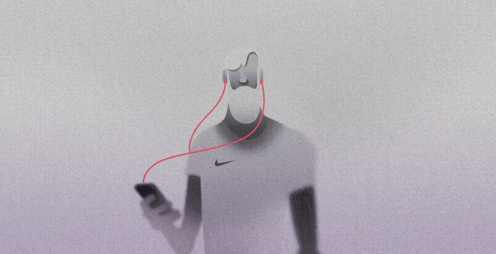
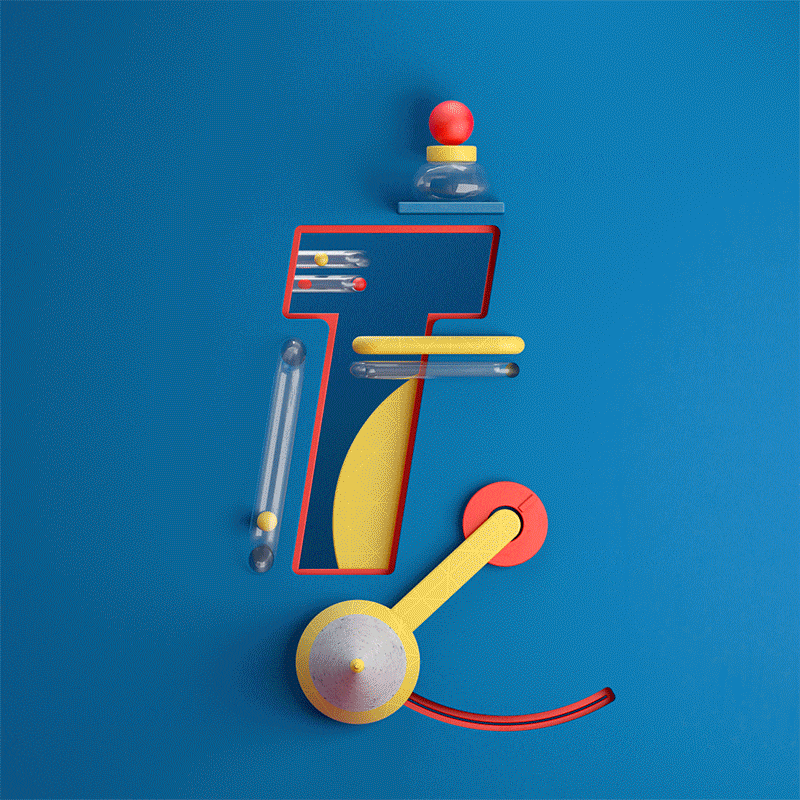
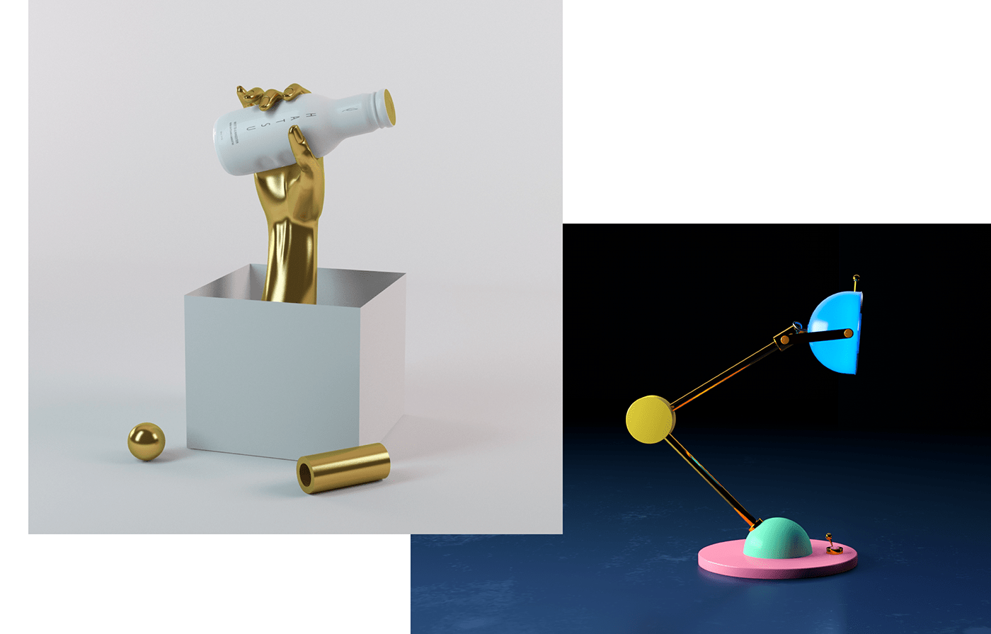
3D is always a blast and also in 2018 it will surely lead a huge portion of design trends. Its power is to play with fiction and reality in a manner so subtle that sometimes it’s impossible to tell the difference. Is it a picture or a render? The boundaries are getting thinner…

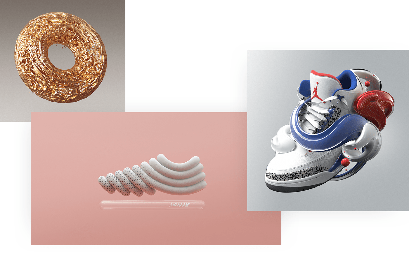
Project: Personal Collection | Air Max '17
Author: Peter Tarka | Berd ., Lukas Vojir, mark haley, Oliver Harris, Jeff Thomson, Fred Huergo, James Owen
Author: Peter Tarka | Berd ., Lukas Vojir, mark haley, Oliver Harris, Jeff Thomson, Fred Huergo, James Owen
As the play between reality and fiction gets more tough, the tough get going and 3D challenges future design trends with a game of matters. When organic and non-organic meet, design transforms shadows and colors into solid, metallic elements that literary pour out of objects and products. The effect is so concrete that you may want to touch and feel those liquid, cold, smooth surfaces and it’s almost hard to believe it’s only on screen. Can’t touch this?!


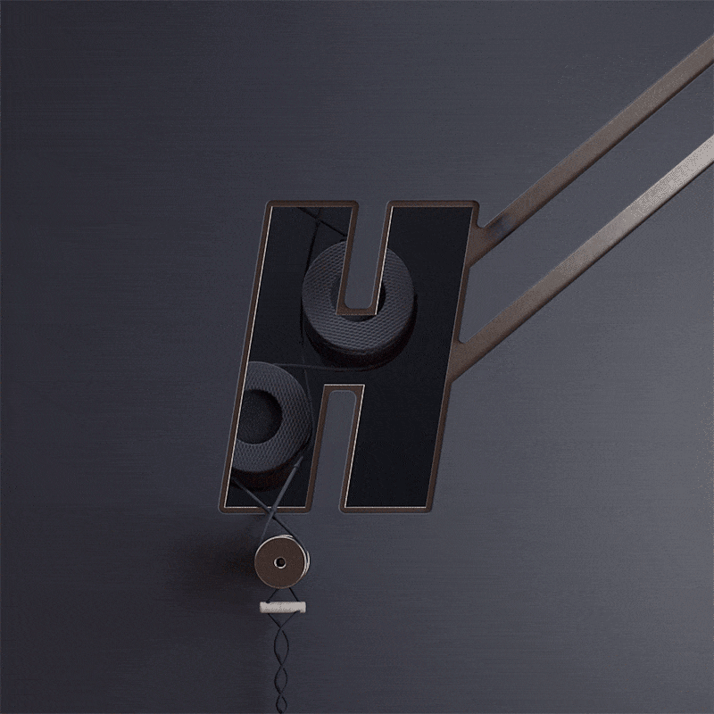
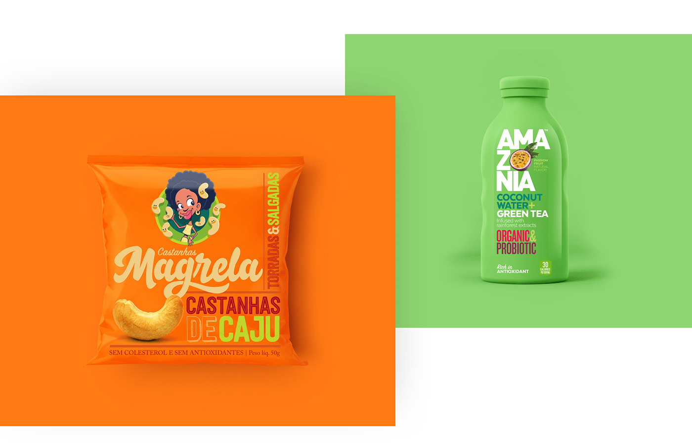
What happens when 3D plays even harder and gives birth to an object from a same-colored background? Using one color 3D, both offline and online, allows designers to tickle the eye of the audience with a trick of depths and shadows.
Despite the lack of contrast, the effect is smooth and full of volume, while we see the product popping out of the wall. A kind of magic that will be seen around a lot in 2018.
Did I see it somewhere before? Of course: colors and patterns from the 80s and 90s are coming back with their virulent pinks and brave contrasts. Is this nostalgic climate just a recurring trend? Or is it rather due to the children of those bright and crazy years that are becoming the designers of today?
Their old toys and their mums sometimes questionable attires are the inspiration for this vibrant, lively trend that brings back the chewing-gum flavored taste of good old days with more than a dash of contemporary vibes.


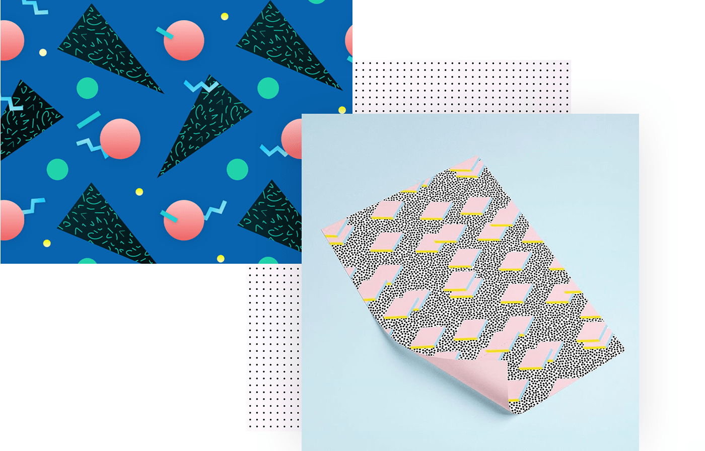
Project: 80's inspired Pattern | POINT //////// | W-1411 FLY
Author: Rahul Das | Álvaro Peñalta | WRITE SKETCH &
Author: Rahul Das | Álvaro Peñalta | WRITE SKETCH &
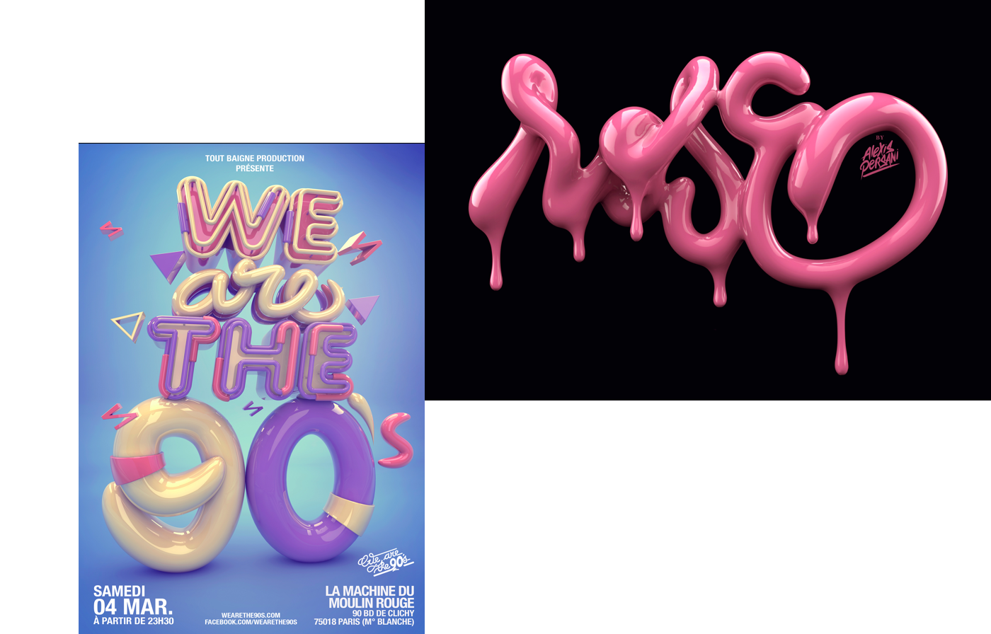
1. A character with character. One of the upcoming trends will see typos turning into the subject of design itself, working as a masque incorporating images. The letter becomes protagonist and frame at once, giving a literally irresistible appeal to any page.
2. Someone tried to shoot the serif, but they didn’t succeed and the old guys are back, on and off the line. Sans serif won’t be a must anymore, and the use of serif fonts will open more scenarios to creative layouts.
3. Jumbo sizes are the future. 2018 will bring big and bold typo into design trends. The letters will turn into modular elements to create exciting innovative artworks.
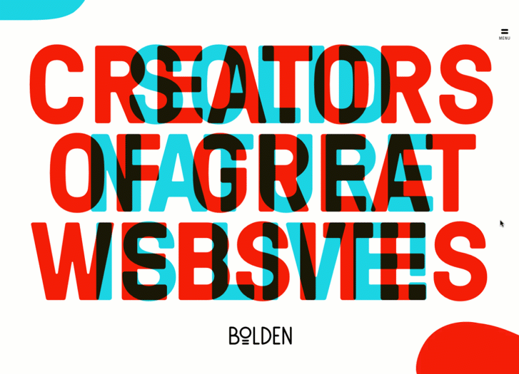

Project: Bolden
Author: Jeanne Bataille
Author: Jeanne Bataille
Seen around for a while, not only creative typography won’t be put aside in 2018, but it will surely be one of the leading trends of the upcoming year. «A world of pure imagination», as Willy Wonka said, is what a unrestrained use of this technique can build. Type to impress must be the guideline of the year.


"Drag me to read", is what a user implicitly asks to any designer. That’s why particle backgrounds seem the ideal solution for catching the eye’s attention without distracting it and without the loading problems that a video background can bring.
A slightly moving texture, a gentle animation, a bit of bubble effects: they can all become part of a bigger design,
whose final aim is to please the user. Even in 2018.
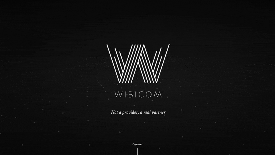
Project: Wibicom
Author: Wibicom Agency
Author: Wibicom Agency
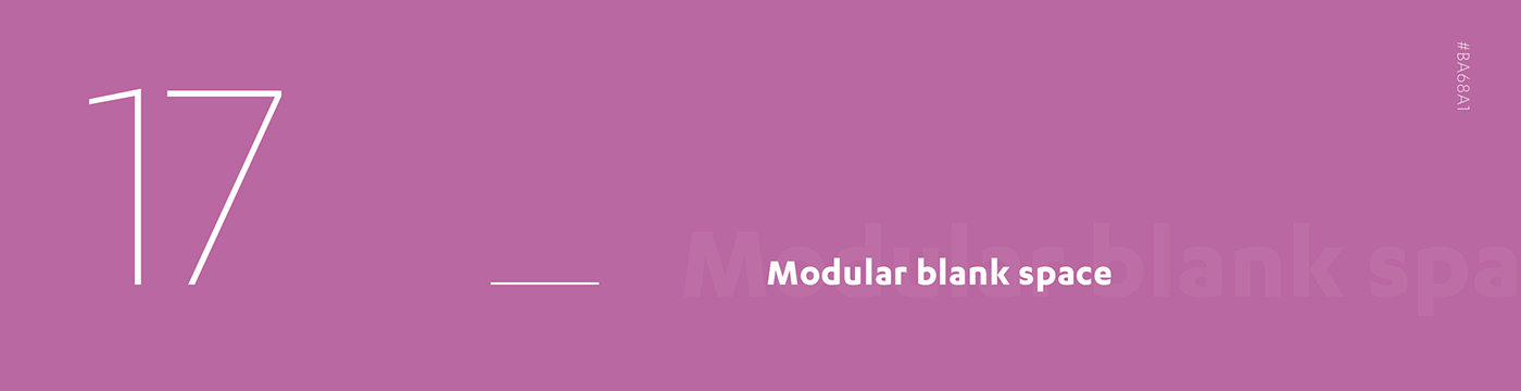
Some things are always trendy, such as a black cocktail dress or a modular blank space design. Why is it confirmed as one of the next year trends? The answer is as simple as the layout itself: clear, effective, neat, it allows to manage space and contents at the best, by using colors and shapes to enhance the most interesting sections.
A classic, like a jeans and white t-shirt combo, that can always play the protagonist part when it comes to terms of elegance and clearness, adaptable to every contest thanks to its modular nature.

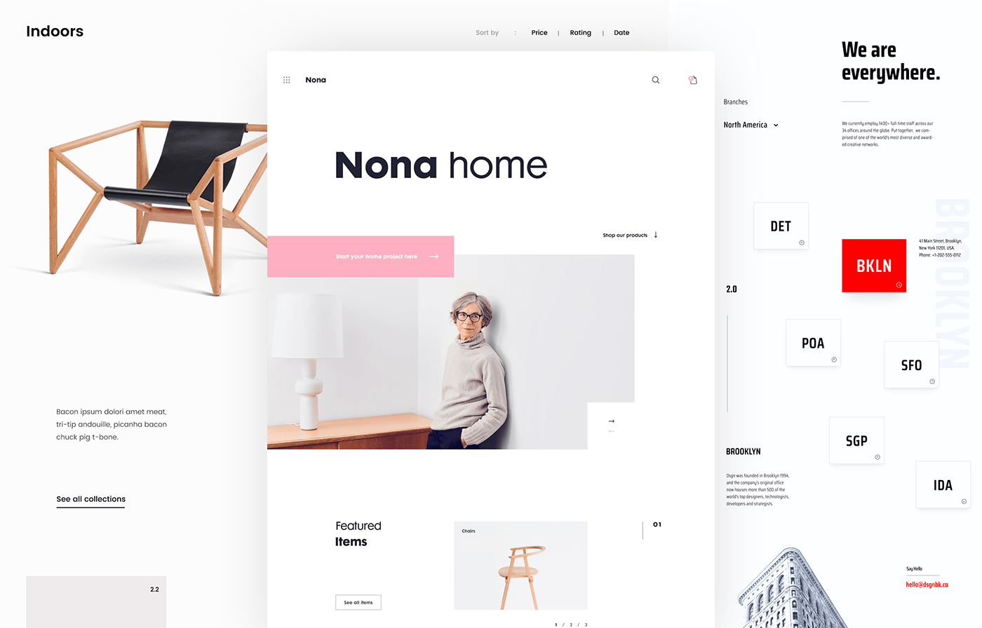
Project: Minim E-commerce Website | Nona Home E-commerce Website | Digital Agency Website
Author: Daniel Tan
Author: Daniel Tan
Pay one, get 2. Splitting the page in 2 halves allows to divide contents into semantic areas, for instance by separating text from images or by building a hierarchy of information. In 2018, when information amount is increasing and we don’t want to dive through crowded pages, to split will be a precious instrument for designers to fit all, without losing focus on UX and aesthetics.
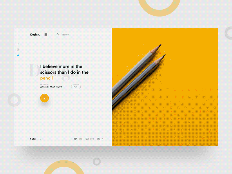

Project: Product Landing Page UI | Design Thinking | Split fold cards for blog
Author: Dinesh Shrestha | Radowan Nakif Rehan | Divan Raj
Author: Dinesh Shrestha | Radowan Nakif Rehan | Divan Raj
2018 will be the year of color. Let aside the fear of being excessive: excess is welcome in this new era, helped by devices which are more supportive than in the past in reading shades and vibrations. Any daring designer will be praised and encouraged to experiment with super-saturation and new shapes.
Let the clash happen: dual tones are no longer feared and eventually every brand can taste the danger of trying colors and matches out of the usual palettes. Let’s color the web!
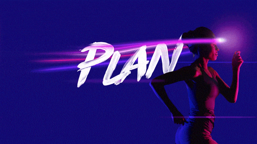
Project: Running on experience
Author: Adobe
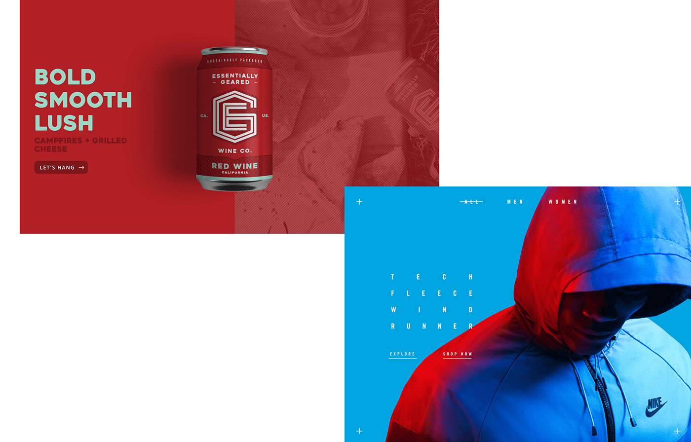
Project: Egwineco | Nike Tech Pack in-store app
Author: egwineco.com | Shakir Dzheyranov, Luis Liwag, Robo Inc.
Author: egwineco.com | Shakir Dzheyranov, Luis Liwag, Robo Inc.

While the rest of the page is filled with colors and gradients, the icons stick to the mono rule, their ultimate goal being to be easy to be read. A little fill tone sur tone will help the icon to be aesthetically pleasant rather than only informative and to integrate smoothly with the other design elements.
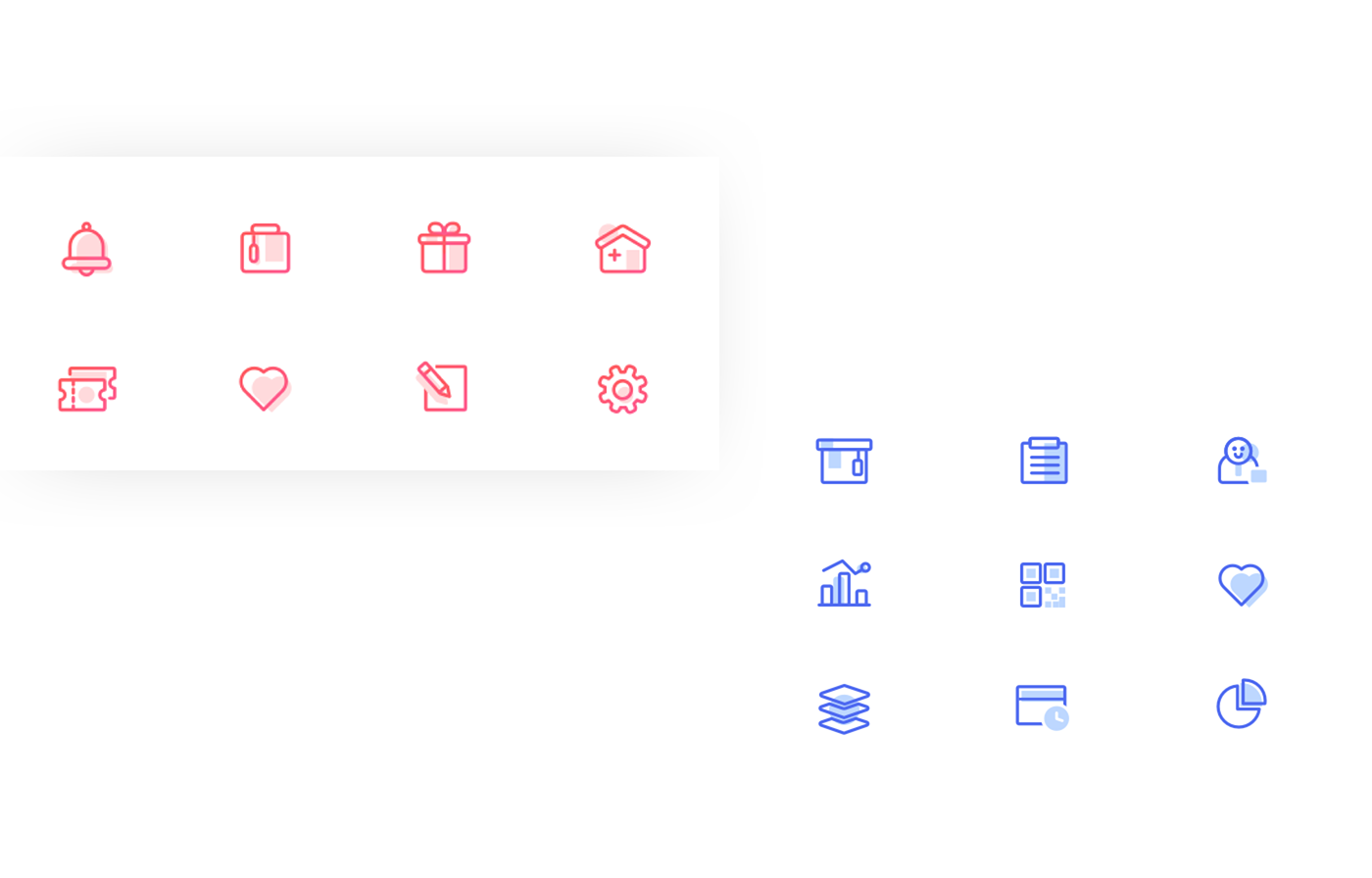
Colors can be also used, for outlined icons, where the line serves to put them in evidence. The filling is not however full, but only a little dash of color, leaving white parts, make the icon a little crafted element, not too heavy and always readable at a first glance.
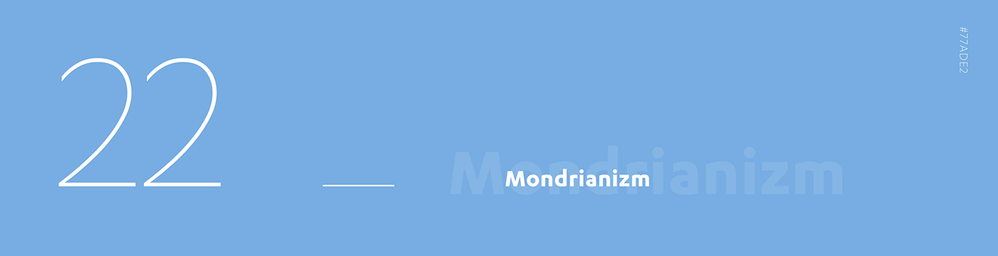
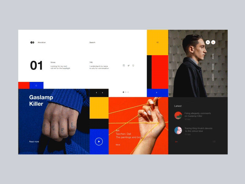
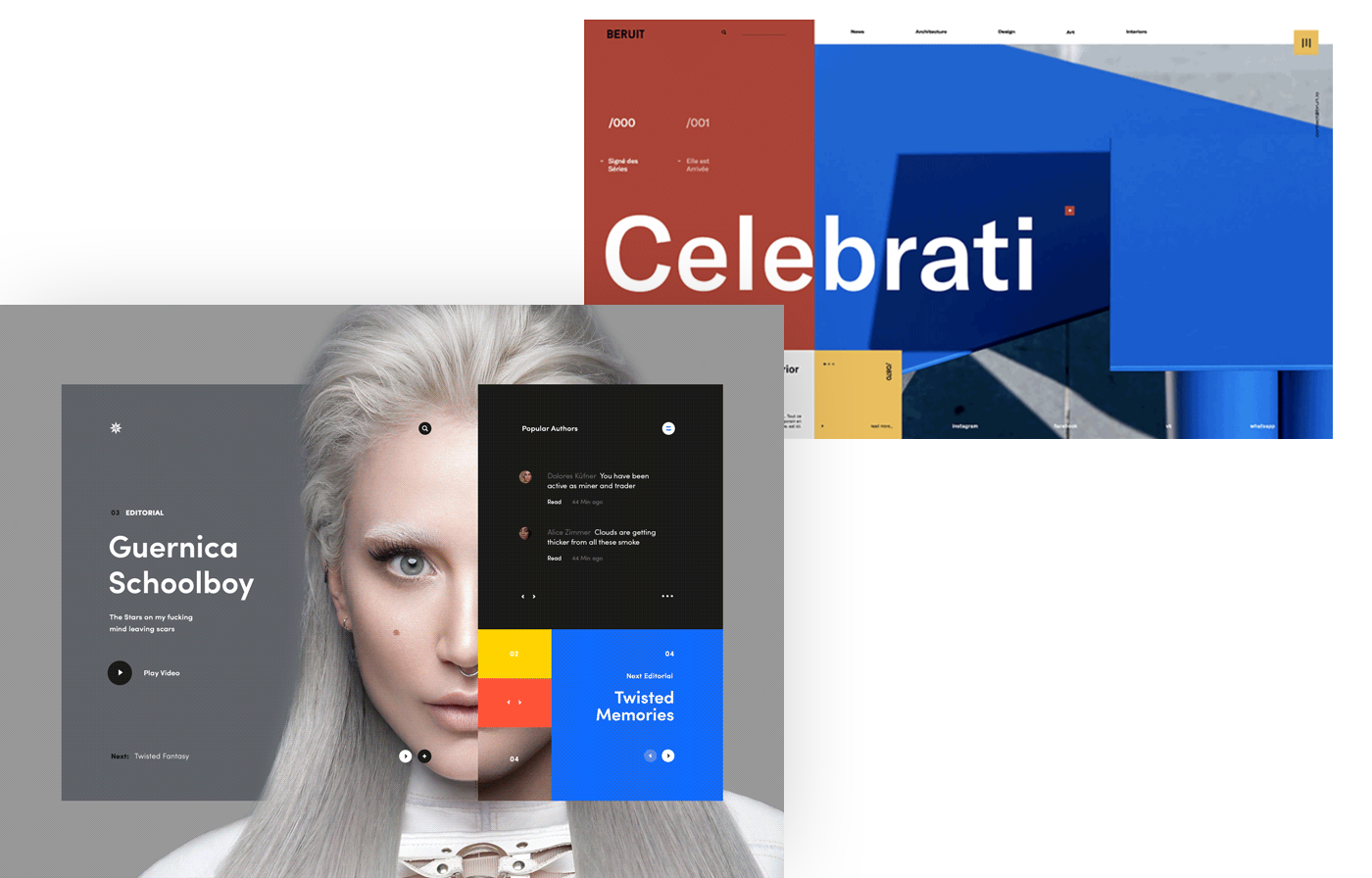
“The desire for freedom and equilibrium (harmony) is inherent in man (due to the universal in him)”, said Piet Mondrian.
That’s why Mondrianizm will be seen as a trend in the next year: a style where the basics red, yellow and blue meet and greet to build a clean, harmonic and balanced atmosphere.
An equilibrium made of squared shapes and essential colors, where contents and images can find their own space in the name of usability.

Copywriter: Camilla Maccaferri
------------
Thank you for watching our Design Trends 2018 and if you like please appreciate it
and share it with others.
and share it with others.