Cidrerie Milton branding & package design

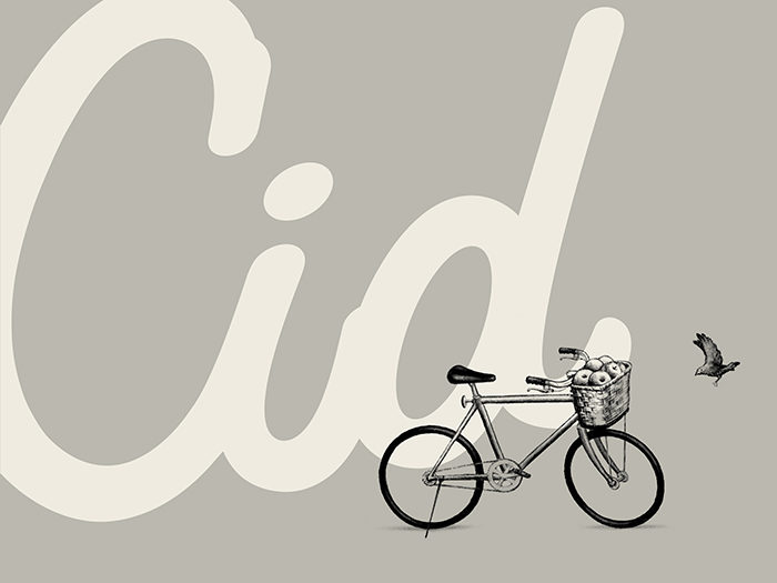
Cider is most certainly experiencing a renaissance and the Milton brand wanted to make sure they were up to snuff to continue to compete. They tapped LG2 to reapproach their brand with fresh eyes and an approach that pulled forward the heritage while challenging the market with a refreshingly contemporary image.

The result is a colorful identity that employs modern typography compositions melded with traditional illustrations. Grid systems and classic marks like a stamp-like seal root the brand in traditional and vintage aesthetics, while the pastel color palette conveys fresh thinking and a vintage-inspired visual experience.

Designed by LG2 Boutique in Quebec, Canada

The Forktales Podcast™: Interviews with restaurant industry leaders and visionaries

Restaurant and advertising industry headlines and thinking

Reviews of restaurant experiences from around the globe 

Reviews of our favorite design, business, & restaurant books

Our favorite typography and fonts

Inspiration in your inbox

Get the latest inspiration in your inbox every Monday morning, for FREE!

"*" indicates required fields

This field is for validation purposes and should be left unchanged.

Delicious Bits in your Inbox!

Get the latest and greatest content delivered to your inbox for free!

"*" indicates required fields

This field is for validation purposes and should be left unchanged.