Sketching Pole Dancers

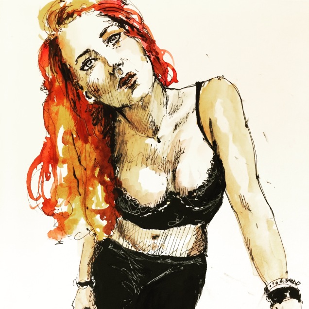
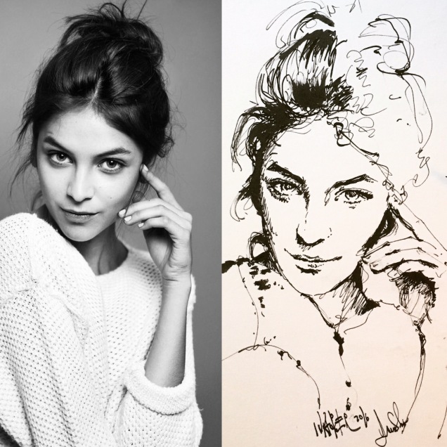
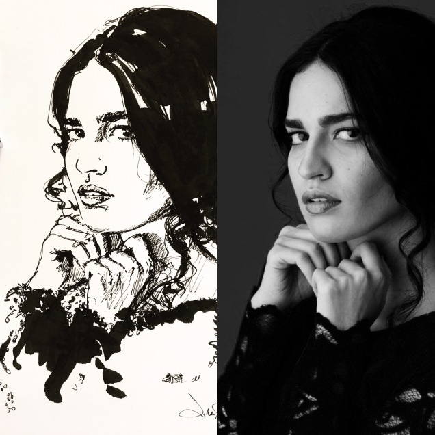
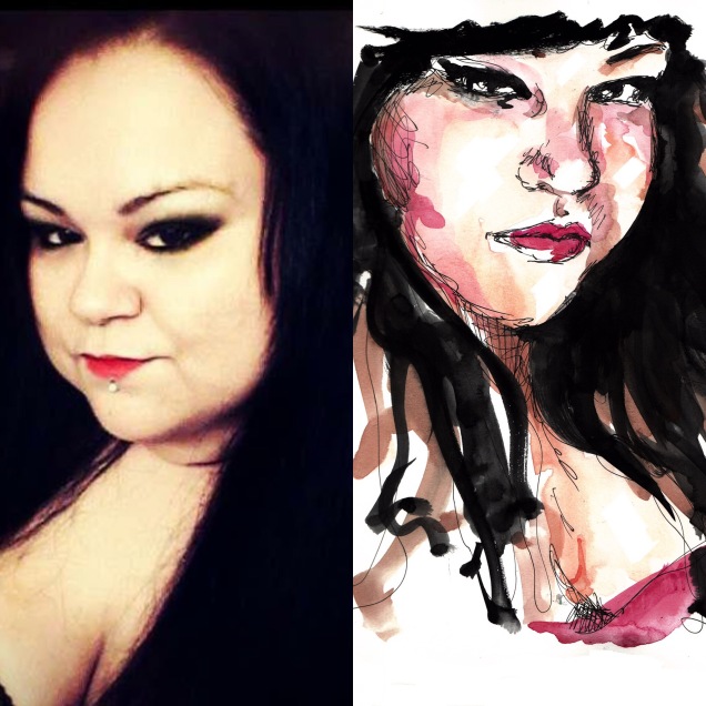
Pole dancers are very fun to sketch, the way they twist their bodies and do unusual poses and moves is very interesting and fascinating, like ballet, performance art. I did these from instagram friends. They are all done in ink with the carbon pen and the Lamy safari on a Stillman and Birn notebook.

For accuracy, I penciled first to resolve proportions, so that my line is cleaner when I ink rather than an spontaneous sketch that has many squiggly lines that fall around a ballpark approximation of proportion. I wanted to give justice to the beauty of these girls and their fabulous art.

Vikings 2nd Set

Continuing with the series here is the nect two portraits

Queen Aslaug

This portrait took me two attempts, the first one was overworked and I ruined it, then with more familiarity with her features the second one show here was more relaxed. I wanted to capture her beauty, elegance and sense of entitlement 


Then comes Athelstan, I looked at different pictures and could not find one that hadenough detail and at the same time express who he was. So I decided to base my portrait in one and take some artistic liberty


These are done in Stillman and Birn paper with highins and Deleter Inks. In the image above you can notice the dufference in the black saturation of the inks, the deleteris noticeably  darker in the final accents.

There is a reason why I enjoy portraiture above all subjects, every face makes me very curious, I try to find what makes the faces unique. It’s never an exact replica because I add/eliminate expression lines, and exaggerate the main features. When I was young, not so long ago 😜 I was very impressed by the work of Patrick Nagel from whom I learned after carefully studying his method, how does he render eyes. Years later it was Hajime Sorayama and his hyperrealistic girls, from him I tried to learn the natural beauty of the “girl next door” his women were not perfect (their faces) they were REAL relatable faces. 

Then I became very interested in the aging process of faces and how recurring expressions leave a mark. The face is totally asymmetric like two faces in one! I tried to understand what I call the light side and the dark side and enhance the best qualities of those features. The tilts of the head and the glances say a lot about character; lastly, the hair is an impression of mass, not detail, like creating a rhythm of blacks to balance and keep the viewer circling back to the face, like choosing a beautiful frame for art too. 
Ideally, if everything is blurred the contrasts should make a beautiful balanced abstract composition.

I enjoy very much this process, one can get away with adding an extra branch to a tree but it is unforgiving to add an extra line that ages people beyond their true age or creates a cinycal smirk instead of a subtle smile or adds 10 lb of weight. If the eyes or the mouth is misaligned people can forget everything else that is good in the drawing and focus on that ONE awkward mistake. We instantly recognize those mistakes because faces reflect back to us as humans and we know instinctively something is off.
For this and reasons of utter beauty I find in people across races cultures shapes and sizes and what makes them unique as a fingerprint of nature, how could I not keep trying?

Vikings

I decided to start a series of portraits of the chatacters in the Vikings TV show. The outfits and hairdos are stunning!

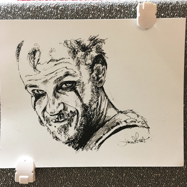
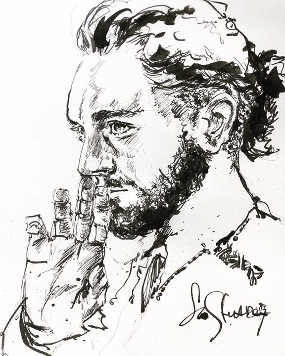
Ragnar had to be the first! 

After a trial that left me with the itch of wanting to do something better I was finally happy with the likeness. My first try was in regular paper here:


It was too “accidental”, the new ink I am using: Deleter dries very fast and it’s very opaque and permanent, which is great! But for the final I had to use better quality paper that doesnt warp and wrinkle as much.

Before doing a final, I tried  Lagertha, to refresh my eyes from Ragnar and go back to try again.


And here is Ragnar again, this time in Stillman and Birn Zeta Series paper that I cut from my large 9×12 sketchbook


I was really happy with this, ink flows nicely and smooth and wrinkle free! I specially enjoyed working the pattern in the clothing, and the beard. Scribbling is fun.

Very happy with the ink as well. I used nibs and holders for this drawing, the “blue pumpkin” and other Brause nibs. The ink dries to a rubber-like texture so it is very important to clean up the nibs very thoroughly!!  

Portrait of N. in Prismacolor

Back in the 90’s my main media was color pencil. I have done portraits since I was a teen. My main focus was understanding expression, if I could feel what the person in front of me was communicating through microexpressions, gesture, the way they glanced at things, the assymetry of the face -that is a result of a recurrent emotion-… the face would become a story that unveils in front of one’s eyes. 

The story speaks about a fire inside, a flame, the longing for something. When a person smiles often, the emotion becomes imprinted even when they are not smiling. In youth, this fire is intense and it glows. In adulthood, the most common emotions have created distinct marks, cues, a wrinkle here and there.

 Every face has it’s beauty, as it has the spark of life in it. One’s role is find the “constellation” which is basically the process of understanding what makes it unique, distinct. It’s not exactly making a replica of it but to find the “points” that can be  exaggerated to achieve the likeness. The funny thing is that if you look at the specific eye or nose or hair strand you realize it’s just enough close to the original subject but it’s not a visual replica, yet it has the effect of the sum of the parts. 

That is exactly my goal, that is not a photographic likeness but it is a likeness to the “real” feel of that person. One that they recognize and say “yes, I see myself in this portrait” 

For the portrait of N the intent was to attain the expression, yet also to practice blending and bring back my old medium (prismacolor); 20 years of portraiture in different mediums. Going back to my basics feels like when you have taken a long journey and then revisit your hometown remembering places, and you find yourself walking and recalling more and more… your memories come back, muscle memory as well. How to blend, how to use the tooth of the paper and the direction of the grain, how to hold the pencil and do layering. 

For this portrait I used the Stillman and Birn beta series. The texture is rough, which allows me to create texture to the skin, what would be an equivalent to pores. As this is a 9″ x  12″ sketchbook the effect is more visible. For a full scale realistic portrait I would use the art paper 22″ x 30″ working in bigger dimension woul bring the pores effect to a more realistic scale. This drawing is more of a study to see how it takes the layering proces and I see the potential to take more abuse without breaking the grain or tearing.  Erasing ocassionally and recoloring could cause that if the paper is too thin. I got impatient with this sketch, I spent significant time on the eyes  area and less on the hair and neck but I see the possibilities now. I got over excited to finish it. On the next one I’ll put in more time.

I Welcome back my old boxes of colors, that have kept very well by the way. I have a complete set of Spectracolors which is a brand that doesn’t exist anymore, they complement my prismacolors in range. The Spectracolors had the property of being dust free and become more vibrant with more pressure in the paper. It has a satin feel to it. It’s time to get out of that box after being dormant for so long, let’s get to work! I think after many years I must have learn a thing or two that I can do different today to make it better, and to perhaps achieve the elusive goal of  “perfect portrait” one day…Not yet…!

Inktober 2016

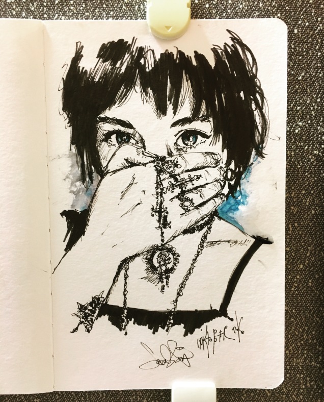
Some of my works in ink for this month. One sketch/day following a trend started by artist Jake Parker http://mrjakeparker.com/inktober

Many artists follow this globally every year and it’s nice to see so many sketches in social media all in ink for one month. There are some prompts but I usually do what I feel like. This month I have been having fun with an app: Sktchy where people upload their selfies and you can pick one to draw. The cool thing is that there is a slider and you see the before and after to compare picture vs art and people can comment and “wow” it.

All of these are done in my new Stillman and Birn softcover betaseries and using a Lamy pen, the Pentel Brush and several inks from Goulet Pens

All About Trees

The Arboredum in Forrest Hills is a great source for drawing and learning to represent the characteristics of different trees and they are identified by label! They also have an enclosed section with beautiful Bonsais as well

I recently did a demo video on a generic tree. Here it is:

Here my test collection of trees in different inks:

Botanicals

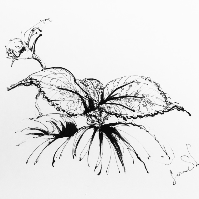
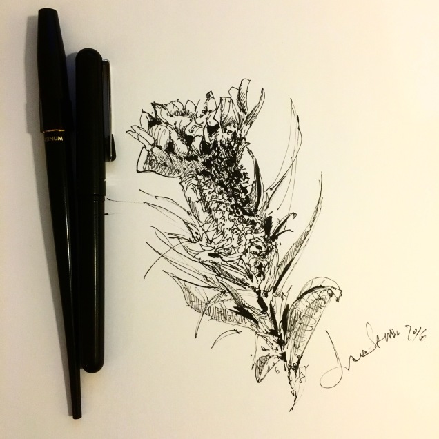
I decided to try a new subject series: Beautiful flowers, with a little more precision than my usual sketches. 

For this series, which I plan to sell as notecards I used permanent ink and some, I colored them but I prefer black and white as the watercolor hides my lines because I like to paint heavy on the tint. I’ll try to so a softer more transparent wash next time.

Yet.. I still prefer black and white illustration. 

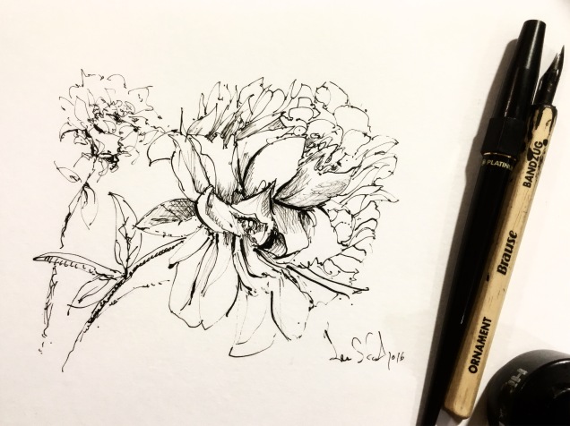
As usual my favorite paper Stillman and Birn notebooks and Higgins permanent ink. The platinum carbon pen is the best for fine lines and it never cloggs. I am becoming very fond of sketching with nibs too.

Here the drawings: