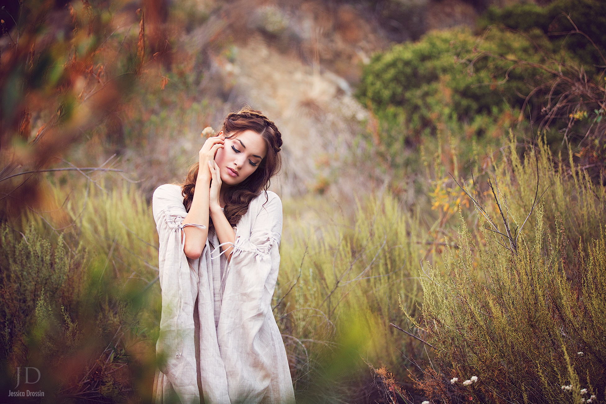
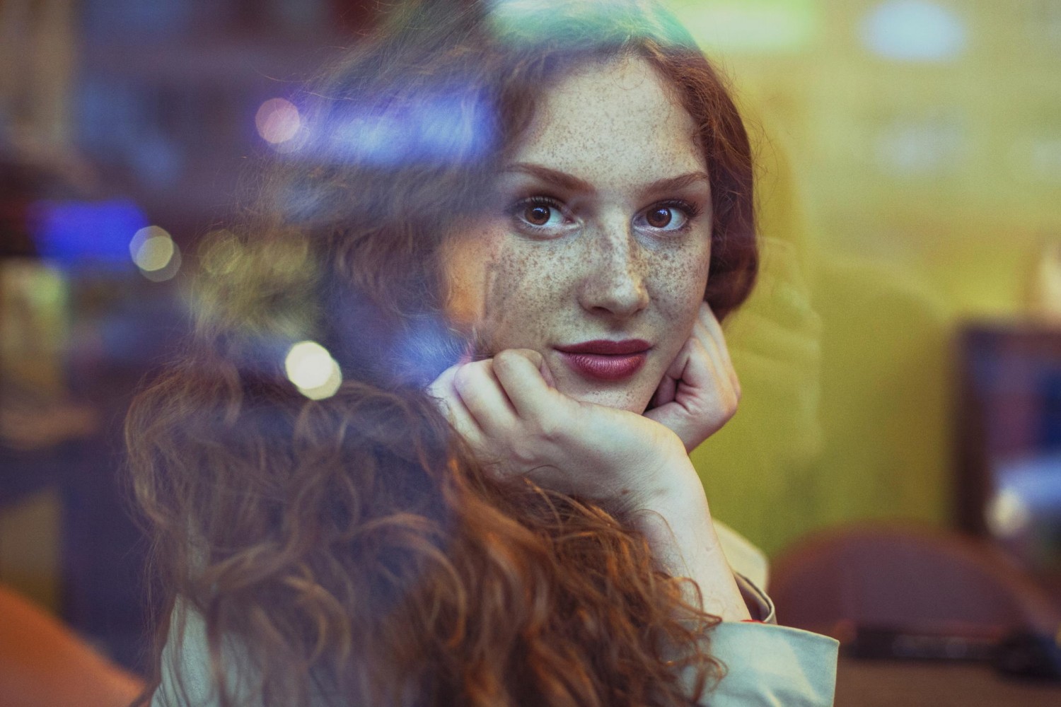
Jessica Drossin is an internationally-published, self-taught, fine art portrait photographer based in Los Angeles. She has a Bachelor’s Degree in Fine Art (Painting), and has worked for video game companies such as Blizzard Entertainment. A professional photographer for five years, she has won numerous awards, including the 2013 Emerging Professional Fine Art Photographer from Digital Photo Pro Magazine. Her projects range from documenting a scoring session for the film, “Red Tails” in Prague to creating book cover art worldwide. Her work has been featured in issues of Digital Photo Pro, Wedding Nouveau, and Practical Photography magazines. She shoots with a Canon 5D Mark iii, and specializes in capturing and retouching portraits with natural light using her own actions and textures. In this tutorial, Jessica will give you a glimpse into her shooting setup and process, so you can create images just like the ones below:


by Jessica Drossin
I believe that the most important thing to consider as a photographer—and particularly a natural light photographer—is the quality of the light you will be shooting in. Understanding how to use light and shadow to your advantage is critical. Finding soft, even light is what I always strive for when I want to create a flattering portrait, as it helps to avoid having my subjects squinting, and it avoids the issue of “contrast-y”, harsh shadows falling on their face. I even prefer the SOOC (Straight Out of Camera) color tones when I’m working in softer light.
Whether you choose to shoot on an overcast afternoon, during the golden hour, the blue hour (if your camera’s ability to deal well with a higher ISO permits) or in open shade, finding flattering light is a must for portraiture work.
The second thing I consider when I shoot is what lens I will be using and what my settings will be. While great shots can be accomplished without an expensive professional camera and/or lens, having these tools help immeasurably because they allow you to carefully craft how you interpret your subject matter, including the depth of field, shutter speed, and how much visual information you wish to include in your shot. I use my 85 mm 1.2 and 70-200 mm 2.8 lenses most often when I am outdoors have have ample space to work with.
SHOOTING PROCESS
I’m going to show you a few examples of what I’m talking about, demonstrating just how much natural light conditions matter. All these examples are shot at the same spot, using the same lens, at the same f-stop. The big difference (model aside) is the quality of available light.
The photo below is the SOOC jpeg image shot with my Canon 70-200mm f/2.8L lens, shot at 75 mm at f/2.8. This was taken about 45 minutes before sunset:
The model is facing South. A little of the soft Western light is softly shaping the highlights and shadows on her face.
To compare, below is a photo of my son (and unwilling model) standing in the approximate area, but taken at a different time of day—around 3:00 in Los Angeles, on a sunny day, approximately 3.5 hours before the Golden Hour:
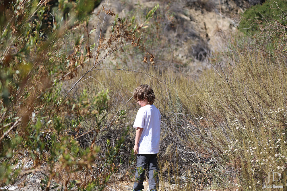
This is the SOOC jpeg, shot at the same 2.8 f-stop, but with a slightly different lens distance of 70 mm (instead of 75 mm). Obviously, this is not a perfect example because he is shorter, but hopefully you get a sense of just how much balanced, soft light helped to make this portrait more beautiful before ever doing any post processing.
Below is another example, just closer up:

This is the SOOC jpeg, shot at f-2.8 with my 70-200 mm lens, at 170 mm. It was taken during the Golden Hour, approximately 45 minutes before sunset.
Now below, take a look at this SOOC jpeg, also shot at f-2.8. But this time it was shoot at 200 mm, taken during 3:00 p.m.
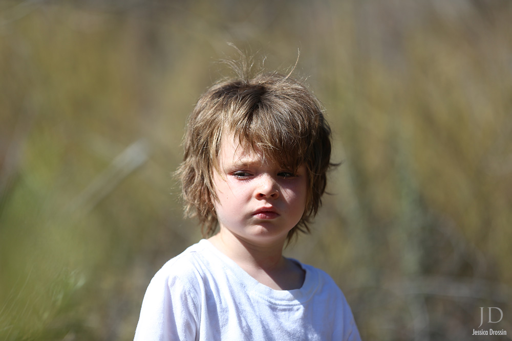
Clearly, my son’s facial expression and pose is not as good as my model’s. But can you see how much easier the images shot in softer light are to capture and process in a more flattering way?
If you’re wondering why all my tutorial images are shot at the lowest available f/stop, it’s because I find that shooting portraits at a lower f-stop helps me to to keep the focus on my subject, separating them effectively from their background and ensuring they are the undisputed focal point of the image.
I think it also adds a dreamy, otherworldly feel to the image. Sometimes, I like to shoot through leaves or grass (as I did in this shot), so that the leaves or grass are out of focus, but add a soft blurring effect.
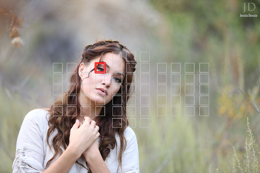
My eyesight is not perfect and I don’t trust myself to manually focus using this shallow an f-stop. So I use my camera’s AF points and select one directly on my subject’s foreground eye to make sure I have sharp focus and detail on my subject’s face. Just see the example below:
EDITING PROCESS
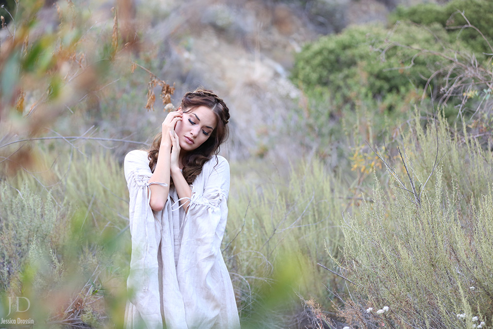
Depending on your own artistic vision, this image could be finished “as is” because the colors and detail are already nice. But while I truly love shooting photos, so much of my joy and personal satisfaction comes from taking the image into Photoshop and re-interpreting it in a way that makes it feel more like a painting. I do this by changing the color, contrast, adding vignettes, and often textures.
To demonstrate this, I’ll walk you through how I edited both these photos.
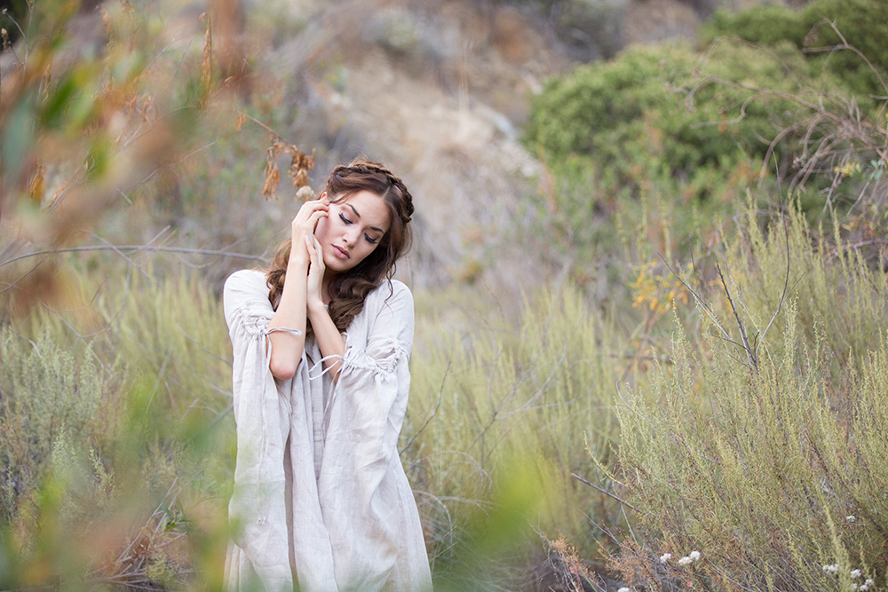
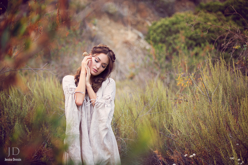
Let’s start with the SOOC jpeg below:
First, I did some basic cloning here to remove a few distracting objects, such as the leaves and a branch behind my subject. In these situations, sometimes the patch tool works really well to quickly remove and blend. But sometimes, cloning from surrounding areas at lower opacity levels works best, particularly if you are close to the edge of your image, or if you are close to details that you want to remain unaffected, such as the edge of a person’s body, etc.
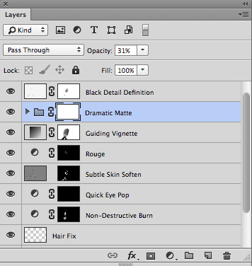
I typically like to create some sort of vignette to lead the viewer’s eye toward my subject. In this case, I created a deeper tone in layers and simply masked out the areas I did not wish to be darker.
To speed my own workflow, I created Photoshop actions, which I also make available to others through my website. This action is called Non-Destructive Burn from the Foundations set. You can also do this on your own, simply by creating a deeper tone in layers adjustment by using curves or levels, and then masking out areas you do not wish to be affected.
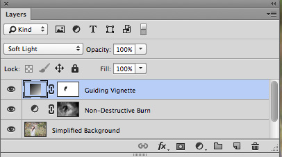 Once I’ve created my initial vignette, I discovered that I loved the tones that were being naturally enhanced by deepening the background colors. I also liked how the soft bokeh from the leaves combined with the deeper tones was framing my subject. I decided to reinforce this by using an action from Vignettes called “Guiding Vignette” in order to once again deepen the edge tones, but also to lighten the interior to shape the path toward my subject with light.
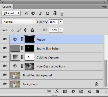
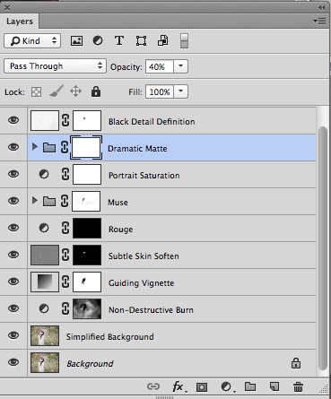
As you can see in the screen capture of my layers palette, I masked out the center lightening effect on my subject’s face so it appears only on the background to add a little separation between her and the background.
 At some point in the process, I typically do some subtle retouching. Obviously, my subject is a very beautiful person, so I don’t absolutely need to do this on her—or anyone else for that matter. But I have a very sharp focus and I often bring out details and contrast in my editing. So I like to gently soften any facial lines or shadows.
The subject of retouching has become a bit of a hot button topic in the portrait community, but I absolutely believe in doing a light amount of retouching as a sharp lens—like my 85 mm 1.2—captures an incredible amount of detail that you would never notice in a person were you just sitting across from them in a cafe. In real life, we don’t freeze and stare at people close-up to examine the little imperfections at our leisure. I consider subtle retouching no more of a “cheat” than wearing make-up for a shoot. The action I used to do this is called “Subtle Skin Retouch” in the Foundations set. It also adds a bit of a glow to the skin. I simply softly paint over areas I’d like to soften and make them subtly glow.
Additionally, I sometimes add a hint of pinkish-toned color to the lips and cheeks. When done in a subtle way, this action really makes the skin tones come alive. For this, I used the action “Rouge” from my Foundations set:
 As a fine art portrait artist, I seek to create tones that feel more ethereal than what you might see in real life.
In analyzing my image, I felt that it seemed a little too cool for the soft and romantic look I wanted to achieve with this series. For this image, I decided to use a tone called “Muse” from a tint action set I created called “Vivid Tints”.
Next, I added some subtle saturation that was targeted to pull out more saturation from green and blue tones, but leave warm tones less affected.
I often love how a little saturation can bring out the color in an environment, but you need to be mindful to not oversaturate skin tones or people can tend to look a little sunburnt—or worse, radioactive.
 The final steps in my editing process are pretty subtle.
Just to polish it off, I added the Dramatic Matte effect from my Matte + Haze action set, and added some additional depth and crispness to the black detail with the Black Detail Definition action from my Foundations set. You can see that I masked out a bit of this action’s effects on my subject’s face.
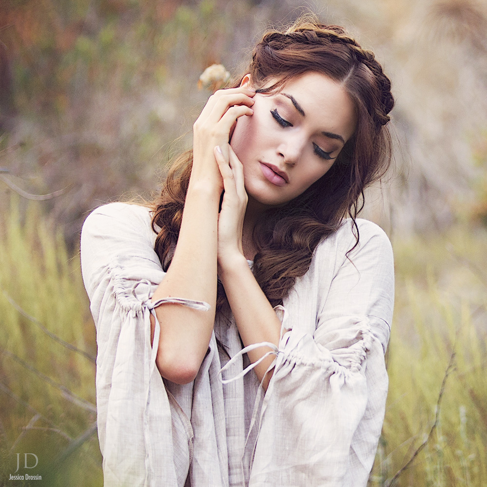
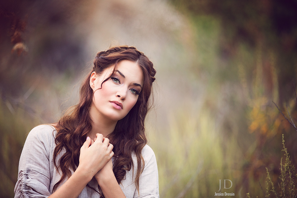
Here is a close up of the final image to show portrait detail:
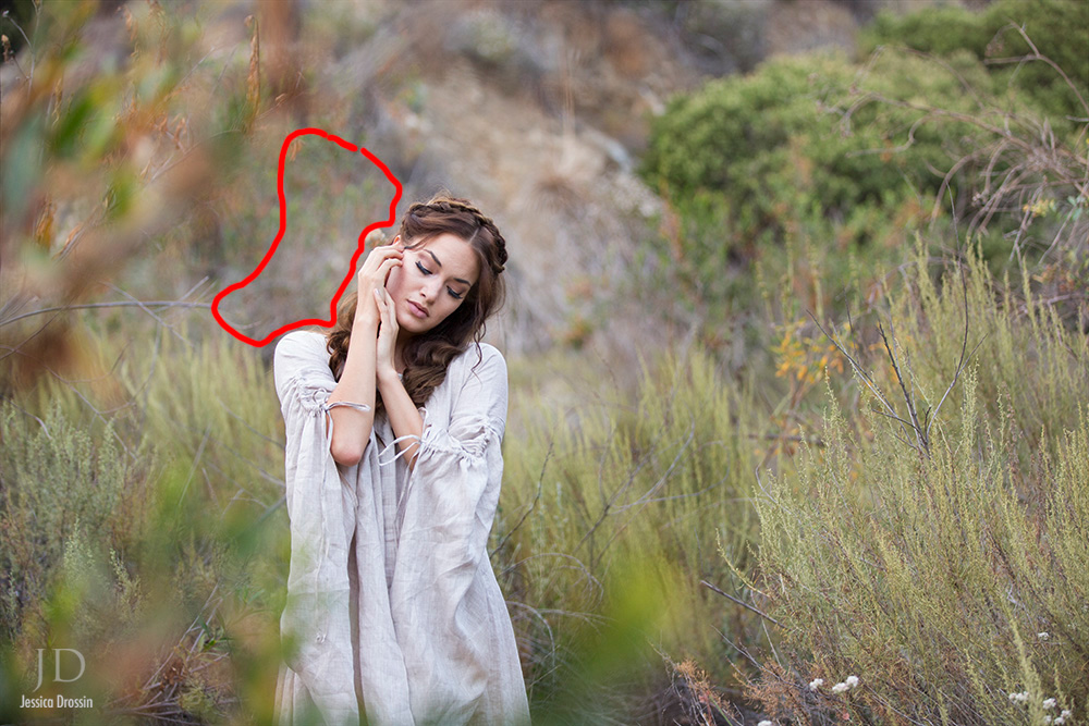
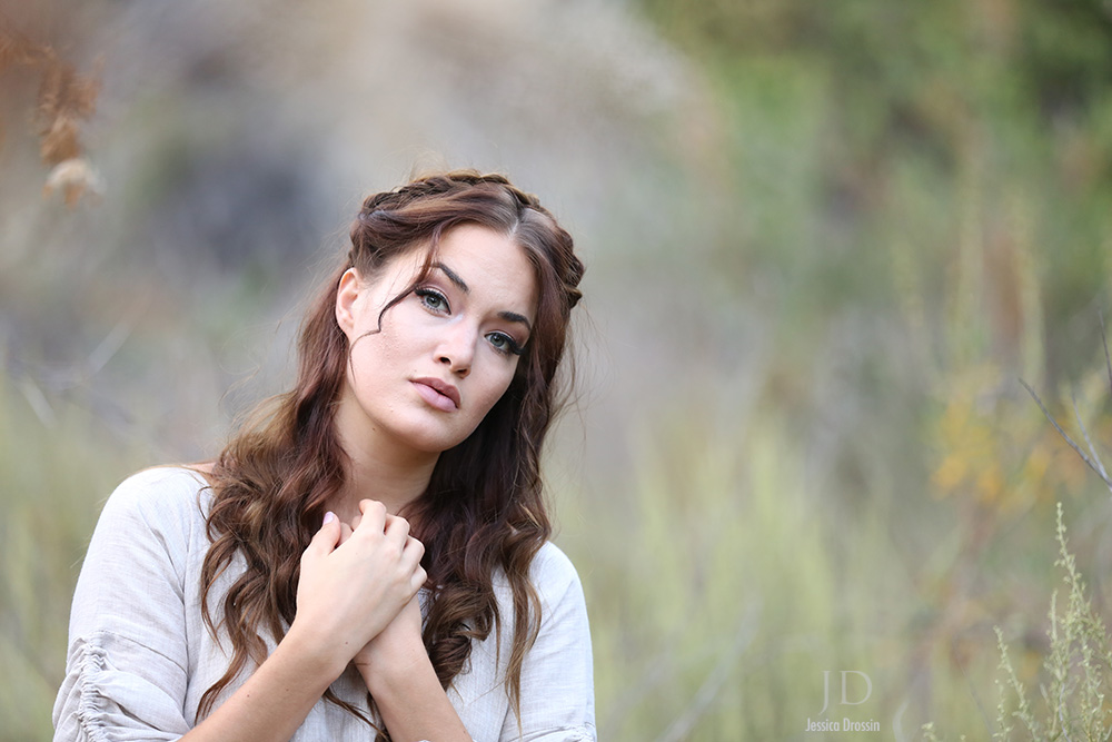
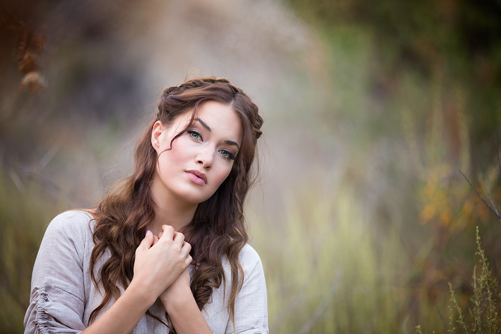
Here is a second shot—taken at the same location, same time—but zoomed in a bit on my subject:
My first step in post was to deepen the tone of her hair at the roots, where some of the color had grown out:

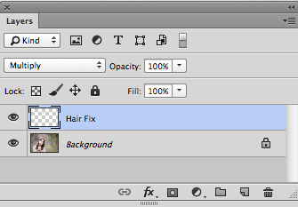 To do this, using the eyedropper tool, I simply clicked on the deeper color shade in her hair. Then, I created a new layer and painted directly on the lighter area with a properly sized brush at a low opacity. Once I’d covered the area, I changed the blending mode to multiply.
Additionally, I copied my background (original) layer and cloned out a few minor distractions on her left arm and hand. I always make fixes on a new or copied layer, never to the original as it makes it much easier to make simple adjustments later if you want to mask out a portion of your fix or lower the opacity of the fix for any reason.
Next, I wanted to darken the side of her face that was receiving the most light:
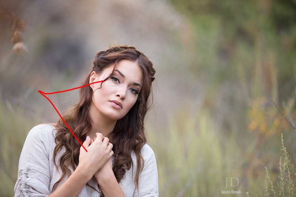
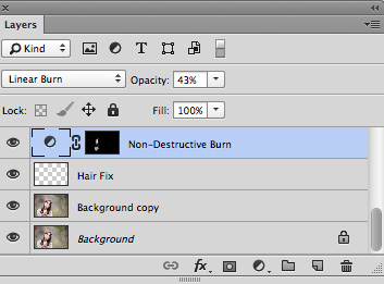
There are many ways you can accomplish this, but again, I used the Non-Destructive Burn brush from my Foundations action set and carefully, in low-opacity, painted in areas where I wanted her skin tones to appear a bit deeper. I did this because I felt that in the SOOC version, this side of her face was becoming too washed out and was losing some of its natural shape.
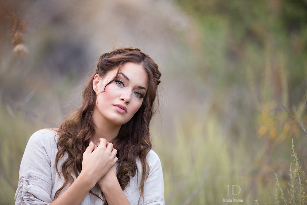
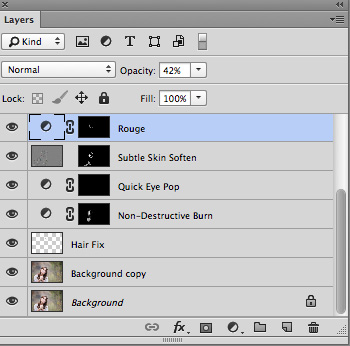
At this point, I did some quick skin/eye retouching. Again, using the Subtle Skin Retouch action, I painted into the areas I wanted to add a little softness and glow to. I used the Quick Eye Pop action here and painted into the iris of the eye only, using a soft white brush, set about 35% opacity. Lastly, I lightly tinted her lips and cheeks with a bit of the Rouge action.
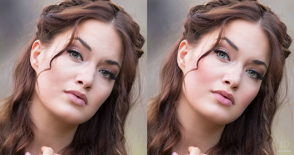
As you can see from the close up, I am only interested in subtly enhancing or retouching what is already there, not radically altering my subject’s appearance.
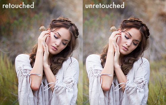
Below is a close-up. On the left is before retouching, and the right side shows the detail after retouching:
As in my previous image, I also wanted to add a vignette to spotlight my subject as well as draw out some of the richer tones in my photo. To do this, I used the same Guiding Vignette action from my Vignettes set that I demonstrated in the last image. It is a gradation layer that makes the edges darker and the interior subtly brighter. I made sure to mask out the the darkening effects on her forearms and also eliminated much of the lightening effects on her face so her skin tones remained unaltered. I really liked how her face separated from the background with this subtle background brightening.
 For these images, I subtly polished them with the Dramatic Matte action in my Matte + Haze action set, which simulates printing on matte paper substrate. In both images, I lightened the action’s default opacity slightly. Then I decided to punch my fine black details, again using the Black Detail Definition action from Foundations.
You can play with creating your own versions of matte effects by adjusting the shadow tones in either levels or curves in Photoshop.
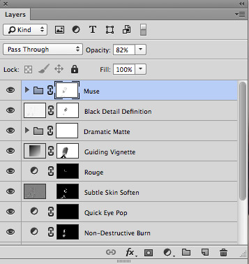 Lastly, as a personal preference, I added a tint to warm up the image and add a bit more dreaminess to the tones. I often prefer to edit a little warmer when I’m creating a romantic feel for an image. As in the previous image, I used the tint “Muse” from my Vivid Tints set. I very lightly masked a little of the tint off the face (10%). You can also experiment with creating your own tints and tones by adjusting the individual RGB tones in levels, curves, channels, or a variety of other methods.
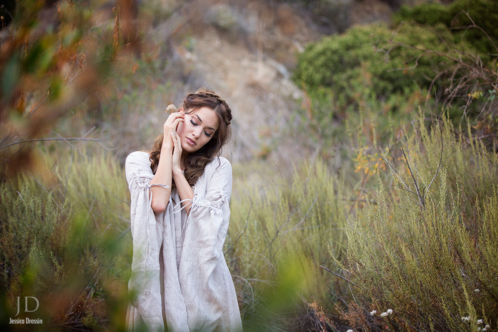
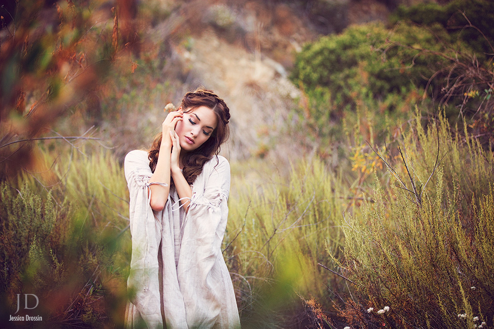
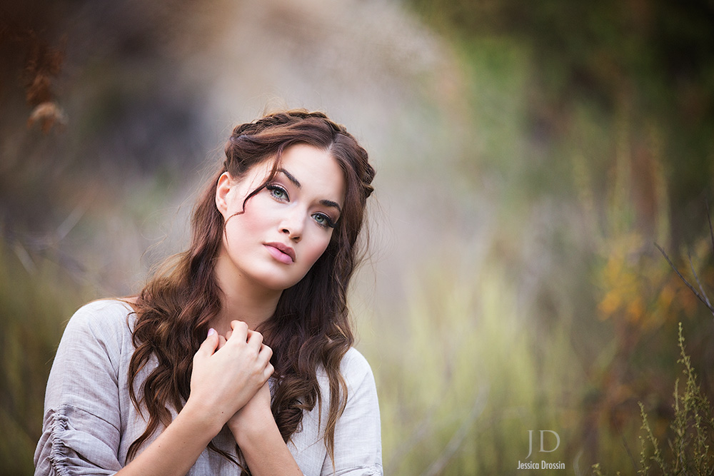
At this point, I might opt to crop in a bit, or simply leave it as is so you can see more of the environment. Below is the finished shot:

The great thing about photography and creative processing is that the possibilities are endless.
Thank you for reading this tutorial. You can also see and follow the rest of my work on 500px. I love being a part of 500px’s community of photographers. I am constantly inspired by the high-quality, gorgeous, and imaginative work being showcased there.
You can also follow my work in the links below:
My website
Facebook page
Instagram
Google+
Twitter
Tumblr
My actions and textures are available here.
If you have any questions for me about my photos and process, please leave a comment below.

Leave a reply