


10 Pretty Ways to Refresh a Gray Palette
Energize your favorite gray shades with pick-me-up accents as fresh as a spring day
Lara Sargent
April 5, 2015
Houzz UK contributor. Freelance interiors journalist with over 20 years' experience writing for national magazines, newspapers and websites.
Houzz UK contributor. Freelance interiors journalist with over 20 years' experience... More
Gray has proved to be one of our collective favorite color picks for the home in recent years. We’ve been strutting our gray stuff for a few seasons now, and the trend shows no signs of slowing down anytime soon. But with the spring sunshine, it’s definitely time to uplift our beloved palette of charcoal, pebble and dove with a few dashes of color and print. Be inspired by these 10 gray refreshes, guaranteed to put a spring in your step.
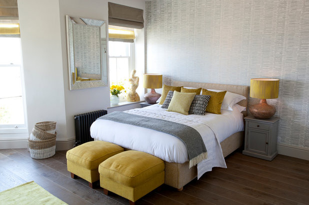
1. Bring in some sunshine. Gray and yellow have long been a clever color combination for fashion and our homes. Adding this sunshine shade is a really simple way to pep up a palette of gray and white in the spring, reminding us of daffodils, primroses and sunny days to come.
Choose any hue from the yellow spectrum — from citrus lemon to earthy mustard — for an instant interiors lift that’s sure to put a smile on your face.
Choose any hue from the yellow spectrum — from citrus lemon to earthy mustard — for an instant interiors lift that’s sure to put a smile on your face.
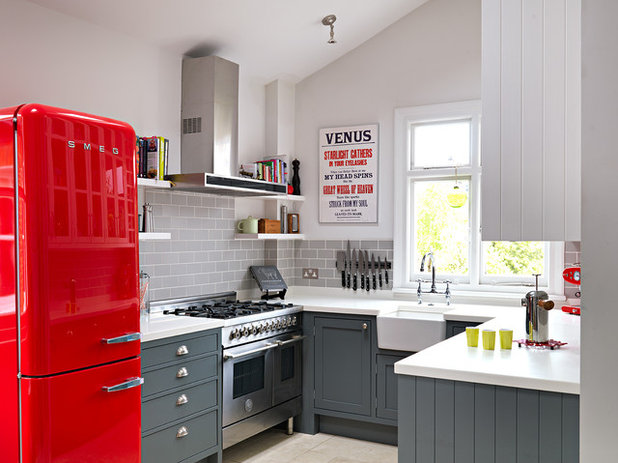
2. Add a bolt of crimson. It’s fair to say that gray can be a triumph in every single room, and it’s a winner in the kitchen. These Shaker-style rich gray units anchor the bottom half of this cooking space beautifully, letting the white upper level max out on light and airiness.
What makes it, though, is the bold blast of crimson in the form of a curvaceous fridge-freezer. If that’s too much of a commitment, try a scarlet backsplash, an artwork or even just a kettle or tea towel.
What makes it, though, is the bold blast of crimson in the form of a curvaceous fridge-freezer. If that’s too much of a commitment, try a scarlet backsplash, an artwork or even just a kettle or tea towel.
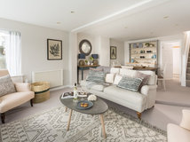
3. Soften with pastels. Pale, barely-there gray can be an ideal backdrop for an open-plan living zone where lots of different functions need to blend harmoniously into one space. This room is freshened, though, with a smattering of pretty pinks and lilacs on rugs, cushions and artworks; the pastel palette offers a taste of springtime sweetness.
How to Work with Light Gray
How to Work with Light Gray
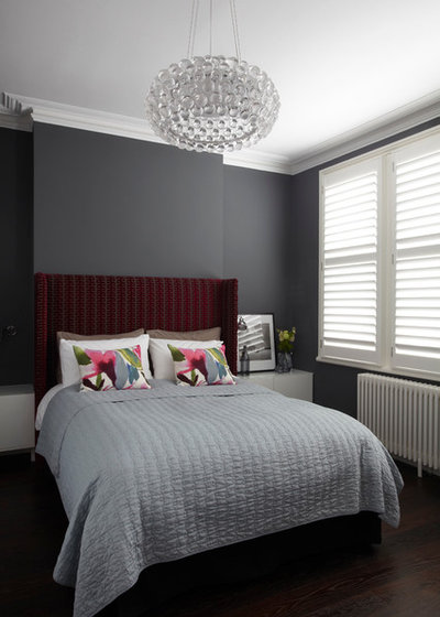
4. Flip out on florals. One of the simplest and most effective ways to lift a gray palette for spring is with a pile of floral-inspired cushions or throws to bring a taste of the blooming outside world into your interior.
This foolproof design trick — which can be used in the bedroom, living room and dining area — allows you to let loose on wild colors and flamboyant prints, as the gray will temper the overall vibe.
8 gorgeous gray bedrooms — and paint colors to get the look
This foolproof design trick — which can be used in the bedroom, living room and dining area — allows you to let loose on wild colors and flamboyant prints, as the gray will temper the overall vibe.
8 gorgeous gray bedrooms — and paint colors to get the look
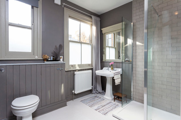
5. Soften with vintage. Gray might be associated with urban grit, but it can also conjure a certain sense of faded grandeur with very little effort. I love the earthy gray tone of this bathroom, which hits just the right vintage note with the classic pedestal basin, tongue and groove paneling and antique mirror. For spring, lighten up the look even further with some striped cotton hammam towels and a billowing sheer at the window.
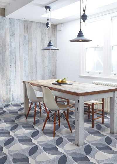
6. Pick a patterned floor. Break up blocks of gray with eye-catching patterns and prints. This leaf design nods to the emerging spring greenery outside and turns the “plain floors, patterned walls” concept on its head with great style and masses of confidence. It also shows how all things gray blend beautifully with a mix of weathered and silvery woods.
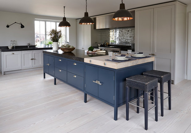
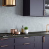
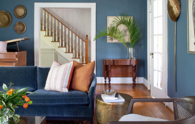
7. Be bluer. If you want to be totally ahead of the game designwise, this is definitely the kitchen for you. Mixing two of the hottest colors on the interiors calendar this season, it teams pale gray cabinets with a rich indigo island. The flash of copper in the pendant lights adds warmth to the scheme, giving it a sunny mood.
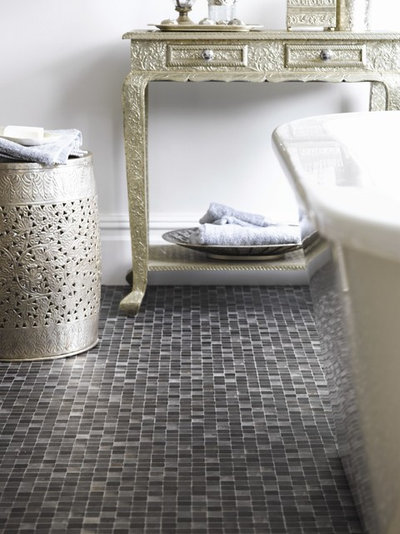
8. Mix in metallics. Using pewter and silver is the perfect way to harness the glamorous side of gray. The glint and gleam of these gray-toned metallics is spot-on for this bathroom, where mirrored mosaics, pearlized furniture and silvery accessories create a magical, Moroccan vibe that’s hard to beat. If you feel like warming the gray further, introduce brass fittings.
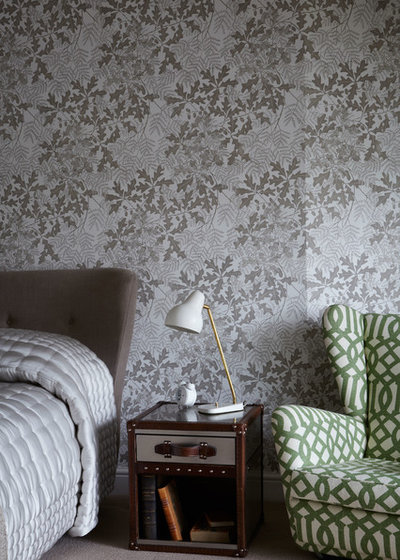
9. Brave a pattern clash. Have fun with gray, as it’s such a flexible neutral color with which to decorate. This pebble- and charcoal-colored leaf wallpaper offers a soothing backdrop, while the geometric-print chair adds energizing color and pattern. The pattern mix is startling but works thanks to the leaf-green color against the leafy motif.
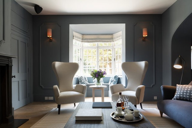
10. Accent with white. Dark, saturated gray is my current color crush. It looks especially elegant, striking and modern when used from floor to ceiling on baseboards, walls and doors.
For spring, highlight the moody tones with a few lighter pieces of furniture, sticking to a monochromatic theme for simplicity at its very best.
Have you glorified your gray palette lately? Please share your ideas and inspiration in the Comments below.
More Houzz guides to working with gray
For spring, highlight the moody tones with a few lighter pieces of furniture, sticking to a monochromatic theme for simplicity at its very best.
Have you glorified your gray palette lately? Please share your ideas and inspiration in the Comments below.
More Houzz guides to working with gray
Scott Davidson founded Davidson Builders in 1998. Scott graduated from Michigan State with a BS in Construction... Read More
What are you working on?
Related Products


Related Stories

Decorating Guides
Design Pros Share 10 Favorite Creamy White Paints
By Becky Harris
These off-white color choices include versatile tones, warming hues and pleasingly soft shades
Full Story

Kitchen Countertops
What Kitchen Countertop Colors Should You Choose?
By tidgboutique
Consider these popular colors and styles to get the look you want — no matter what material you use
Full Story

Colors of the Year
Pantone Picks a Peach for Its 2024 Color of the Year
By Jennifer Ott
See how to use this juicy hue to create calm yet flourishing spaces inside and outside the home
Full Story

Decorating Guides
5 Ways Designers Are Working With Rich Warm Tones Right Now
By Becky Harris
Interior designers describe their strategies for using rich warm colors to create an inviting home
Full Story

Colors of the Year
10 Paint Colors Ready to Take Over in 2024
By Jennifer Ott
Blue is huge, but dark hues and warm tones also find favor among major paint companies’ 2024 Color of the Year picks
Full Story
Decorating Guides
How to Mix Colors and Make It Work
By tidgboutique
Don’t want to confine yourself to neutrals but lack the confidence to embrace colors? Check out this pro advice
Full Story

Events
7 Color Trends for 2024 at Maison & Objet
By Claire Tardy
New harmonies and unexpected pairings at the fall 2023 trade fair set the tone for next year’s interiors
Full Story

Decorating Guides
9 Ways to Layer Warm Neutral Colors for Comfortably Refined Rooms
By Becky Harris
Design pros share advice for building an inviting palette, introducing high contrast and mixing textures
Full Story

Decorating Guides
How to Create a Cohesive Color Flow Throughout Your Home
By Erin Carlyle
Designers share eight techniques for avoiding a choppy feeling in your spaces
Full Story

Decorating Guides
How to Get Your Ceiling Paint Color Right
By tidgboutique
Here’s how to tweak the shade of your ceiling paint to get the effect you want
Full Story
We Love grey - its a fantastic colour for designing and fitting kitchens it can look amazing with the right contrasting colours La Medida Kitchen Ideas has a great selection to look at