
Make Your Website Responsive on Mobile Devices

Wiki Info – Responsive web design (RWD) is a web design approach aimed at crafting sites to provide an optimal viewing experience—easy reading and navigation with a minimum of resizing, panning, and scrolling—across a wide range of devices (from mobile phones to desktop computer monitors).
There are many professional websites online that may look great on a desktop or laptop computer, but once someone opens them up on their mobile device these businesses may actually be losing visitors simply due to the fact that their landing page is not optimized correctly. Google in particular is favorable toward a “responsive design,” which means your website will look great and be easy to navigate on any platform.
If you have a .mo mobile website, make sure it is viewable both on a tablet and on a phone.
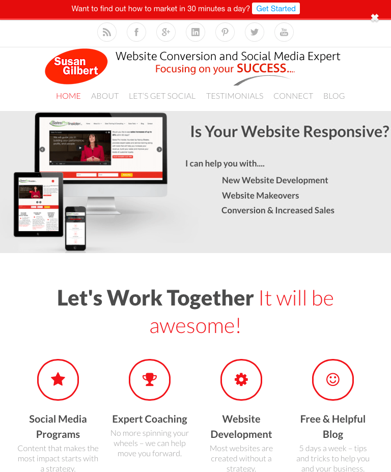
Take a look at my website on a computer (versus a tablet) for example:
Desktop View:

Here is the Tablet view:
Now a Smartphone View:

How does your landing page look on a smart phone or tablet?
Your website should read the same way on all devices, which means when a visitor views your domain on multiple devices it should be “responsive,” and automatically adjust for optimal viewing. Google now defines mobile-friendly website as “a critical part of website management.” It’s more important than ever for your website to be optimized in order to reach the most people.
According to the Google Developers definition, a mobile website can be broken down into three areas:
• Responsive – Your URL utilizes the same HTML and CSS configurations on all platforms free of redirects, which is the preferred setup by Google.
• Dynamic – For different HTML configurations Google recommends to web developers to use “the Vary HTTP” in your header. This just means that if you are using a hidden URL, to use this method to let its search engine know where to find your website, especially on mobile devices.
• Separate mobile or a redirect – When users are sent to a different URL your web developer needs to set up a “bidirectional link annotation” in order to show the relationship between your domain and the other URL.
The most simple and effective way to redesign or setup a new website would be to do so with a “responsive” design. If you are using WordPress, there are hundreds of new responsive templates available that can quickly and easily help you to optimize your website correctly. It’s best practice to make your domain easy to find by both mobile users not just computers.
Just because your website may be ‘mobile’ it does not truly mean that it is a responsive web design and can be viewed correctly on all devices.
If you are not certain whether your website is a mobile-responsive one, simply load it into a computer then check it out on a smart phone or tablet to find out how it is being viewed by your visitors along with any differences you see.
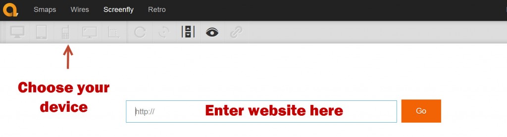
Here is a great tool you can also use: Screenfly
Enter your domain name, then choose from the options above – desktop (size also), tablet, phone, etc – click Go and the site will simulate what your visitors see.
How did your website measure up?
A redesign or even a new WordPress template may be necessary in order to bring your homepage to the current standards needed to be successful in the online world.

0 Comments
Trackbacks/Pingbacks