Web apps: bringing the advantages of native apps to a web browser
Native apps have always enjoyed a bit of head start in terms of user experience and functionality over mobile web, but that gap is rapidly narrowing thanks to HTML5 and the evolution of the web-based app.
The advantages of mobile-friendly web in terms of greater reach, accessibility from multiple device types and benefiting from linking from search, social media, email, affiliates etc. – as explained in the previous column – has always been tempered by native (download) apps delivering a better user experience (UX) and functionality.
However, armed with a combination of new web technologies, including HTML5 and the ability to tap into device features, such as location, camera and the ability to work offline, developers can now deliver an app-like interactive user-experience via the web browser to rival many native apps – hence the name web app.
This is encouraging companies to develop web apps, sometimes as an alternative, sometimes in addition to native apps, this includes critical applications – such as Saxo Bank’s new multi-platform trading app (full details below).
As native apps are software applications written solely for one type of device e.g. Android or Apple iOS, developers have been able to take full advantages of the capabilities of the latest devices without needing to wait for industry standards.
The web, on the other hand, has to work on all platforms, so web developers have had to wait for new standards to agree and implement by all parties – browsers, devices, operating systems etc. – before they can take advantage of the raft of innovations that have occurred in both web development and devices over recent years.
Developers are no longer restricted to creating websites with text and images to be browsed, they can now build interactive apps that perform tasks.

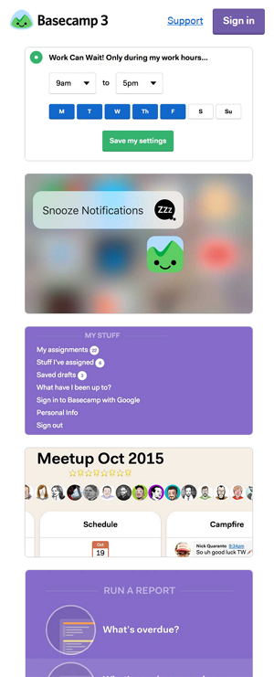
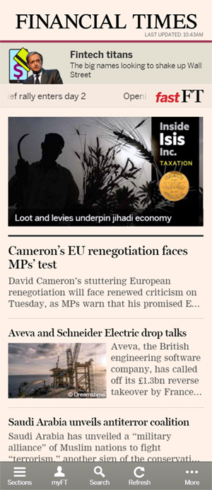
Common examples of web apps include Gmail, Paypal, Basecamp, Quartz and Financial Times Two things have enabled the coming of age of the mobile web app:
Daniel Appelquist, co-chair of the W3C Technical Architecture Group, explains:
A lot of these [features] can be used already in Chrome for Android and desktop, Android Browser, Opera, Firefox and most of them are coming to Edge [Microsoft’s new browser], according to the published roadmap.
Apple’s Safari is the laggard, prompting people such as Nolan Lawson, to say “Safari is the new IE. As Safari hasn’t published a roadmap for adoption of these new features and because it is the only browser you can use on IOS devices, this limits the universal adoption. I’m hopeful we will see a Service Worker implementation on Safari soon, especially as more new web features are built on top of Service Worker.
Some of the most notable web-app innovations, and status as of December 2015, according to Appelquist are as follows
Follow the links above to the excellent Can I use to check the current status of browser implementation, for these features.
The term ‘mobile app’ is usually associated with the consumer-focused social media, messaging, games, music, shopping and so on.
Here, problems with connectivity, latency, user experience are an irritation to the users, but whatever customers say about you on social media it isn’t a life-or-death experience.
A lot more important are the mobile apps that are used in the business world to give workers, clients, suppliers, distributors etc. real-time mobile access to the ‘real’ applications that run businesses – often called enterprise (mobile) apps. This is where the readiness of web-based applications is really being tested.
Examples of companies that use enterprise mobile apps include Citibank, MasterCard and Fidelity Investments, according to Gautam Agrawal, senior director of product management at Sencha (a web app development tool).
Few services are more mission critical than financial trading – if merchant banks and their clients can trust the mobile web for dealing in shares, commodities and currency then any business can.
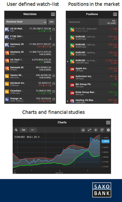
Saxo Bank has clients in 180 countries placing a total of 170,000 FX trades per day – hitting 1,400 trades per second at peak times.
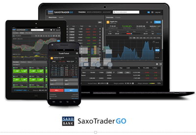
The average number of concurrent users of the trading systems is 15,000. The entire SaxoTraderGO trading platform, launched in May 2015, is web-based, written in HTML5 with using standards-based Open APIs, allowing corporate clients to easily integrate it into their own desktop/mobile trading applications, while retail clients can access the system using a browser-based application on desktop, tablet or smartphone.
Benny Boye Johansen, senior director and enterprise architect at Saxo Bank told ClickZ:
SaxoTrader proves beyond any doubt that HTML5-based applications are ready for mission critical services like financial trading. Financial traders are very concerned about latency and application responsiveness. When designing our new SaxoTraderGO trading applications we set targets for acceptable performance – some of which are quite challenging if the user is in Sydney and our data centers are in Copenhagen.
One design goal was startup time: currently we’re aiming for the time from pressing the app icon, logging in, until the application is fully visible and to be ready to trade to be less than 5 seconds. Perhaps more important is the time it takes from pressing the trade button until the user sees an order or trade confirmation.
Our internal target for this is below the one second mark, but we are actually well below that number from most locations around the world on a modern mobile phone.
Another important factor is the application look and feel. To the largest extent possible, we’ve tried to match the performance of any native trading application. One example of this is our chart module, which is very responsive. And remember, because we only had to write it once (as compared to several times for each native platform) we have been able to add a lot of functionality.
It is important to remember this is an application: the HTML5, CSS and JavaScript is initially downloaded on to the mobile device, and from there on this code connects to our API’s in exactly the same way a native mobile application does.
We also make ample usage of data streaming. When the app contacts our servers to, say, get a list of client positions, we first send a snapshot of all of the data related to these positions; from then on we open a WebSocket connection and just stream any delta values [price changes].
This significantly reduce data latency and bandwidth usage. Another important factor is using a content delivery network with SSL offloading. Not only does this provide caching and speeds up content delivery, it also ensures a shorter time to initially establish the secure SSL connection at remote locations.
Saxo Bank has not entirely dispensed with download apps. For clients that prefer to download an app rather than use a browser, there is an iOS or Android app. But these are the same browser-based app with a “very thin” native wrapper.
This hybrid app approach enables Saxo to use push notifications and touch login – which are not available in the pure web app – but without needing to develop native apps for each platform from the ground up.
“We have spent a very small part of the total development budget to create these wrappers. And, since all the core/important functionality is in the web application, we don’t have to spend any more money on extending the native part when we introduce new business functionality – we don’t even have to submit a new version to the app stores,” says Johansen.
In mobile development, there is only one argument that is more political than native v web and what type of web development is best.
Whereas native apps are individually developed for particular smartphones or tablets, running particular operating systems e.g. Android and Apple’s iOS, websites are designed to work with all types – feature phone, smartphone, tablet, desktop etc. all makes of device, via multiple browsers. This is less clear cut with web apps, which may be cross-platform or just designed for mobile platforms.
This doesn’t mean delivering a lowest common denominator website which will work on every device. It means delivering a variation of the same site tailored to the capabilities of the recipient device.
Thus an Android smartphone with a more advanced browser e.g. Chrome, Android or Firefox, may receive a more sophisticated user experience (UE), using the app-like features above, while the iPhone user receives a lesser UE that Safari affords. All smartphones will receive a slightly different UE from a desktop, tablet or feature phone.
Daniel Appelquist:
In general, web developers can take advantage of responsive design techniques when they want to take advantage of a feature which is not implemented on all browsers. This means designing it so the application works without the feature in question, but will only take advantage of the feature if it’s present.
For example, a web app that wants to provide offline support through Service Worker [see above] for Android smartphones, will function online-only on an iPhone, or can make use of the older AppCache technology in HTML5 (supported in Safari for IOS) to provide a less sophisticated level of offline support.
There are three key methodologies. These are:
There are pros and cons and a fair amount of politics and misconceptions associated with each. In the real world publishers often blend the approaches.
The key differences are as follows:
Responsive design is perhaps more in vogue today, perhaps helped by the perception that it is Google search’s preferred approach – but it does have some draw backs for web app development.
Where companies wish to serve an experience that is more tailored to the platform, as is often the case with web apps, or a mix of web site and mobile app, there is potentially a considerable amount of PC assets that won’t be required by a mobile device, or vice versa.
As responsive design in its pure form sends all assets to the device, whether they are required or not, there may be compromises with latency, which will be a concern where optimum speed is essential, as is the case with Saxo Bank.
Johansen explains:
We decided to compromise a little on responsive design. In SaxoTrader we use initial server side device detection to direct the user to one of three URL’s. These three URLs serve up three different layouts (HTML/CSS), but the underlying application logic – the JavaScript – is the same.
This is contrary to traditional RWD what you have the device download the full site, and then also task it with removing the parts that are not needed. A traditional RWD approach not only results in a too large download, it also requires extra work on the devices just to hide/re-layout content that should not be shown anyway.
In the real world, a hybrid approach to web design is increasingly common.
This is the fourth part of the DNA of ClickZ mobile-friendly web series. Here are the others: