Banner blindness is a long-known web user behavior: it describes people’s tendency to ignore page elements that they perceive (correctly or incorrectly) to be ads. And, while webpage patterns and types of advertisements have evolved, banner blindness is still prevalent, our recent research shows.
Banner blindness is an instance of selective attention: people direct their attention only to a subset of the stimuli in the environment — usually those related to their goals. This behavior is a consequence of our limited attention capacities. If we were to attend to the enormous inflow of sounds and patterns that surround us, we would be overwhelmed and behave inefficiently.
On the web, UI elements and different pieces of content all fight for users’ attention. To complete their tasks efficiently, people have learned to pay attention to elements that typically are helpful (e.g., navigation bars, search boxes, headlines) and ignore those which are usually void of information. Ads are perhaps the most prominent member of this last category. Hence banner blindness.
Legitimate content elements that have certain ad-like characteristics are ignored, too. Here are the traits that signal an ad:
- Ad-specific placement, like the top of page or the right rail
- Ad-like visual treatment, such as animation
- Proximity to actual ads or promotions
1. Location
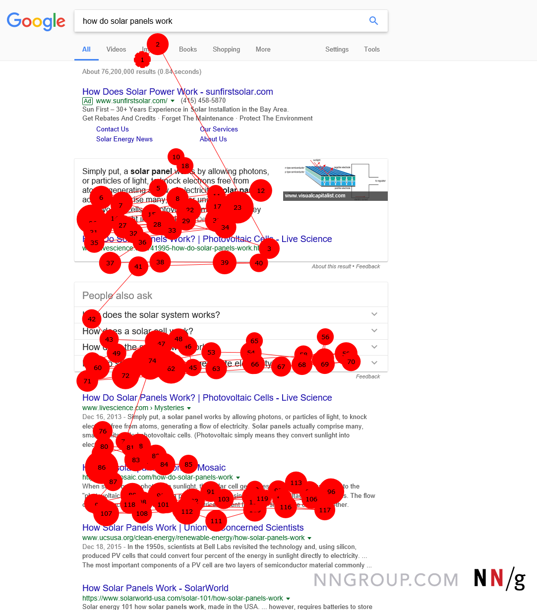
Ignoring ads is a learned behavior — like many other user behaviors on the web (classic examples include seeking the company logo in the upper left corner of the page, or looking for the global navigation across the top of the page). In our latest eyetracking study, we observed that some participants have learned to skip past the ad presented at the top of the Google search results, even though its visual design is far from the traditional banner ad.
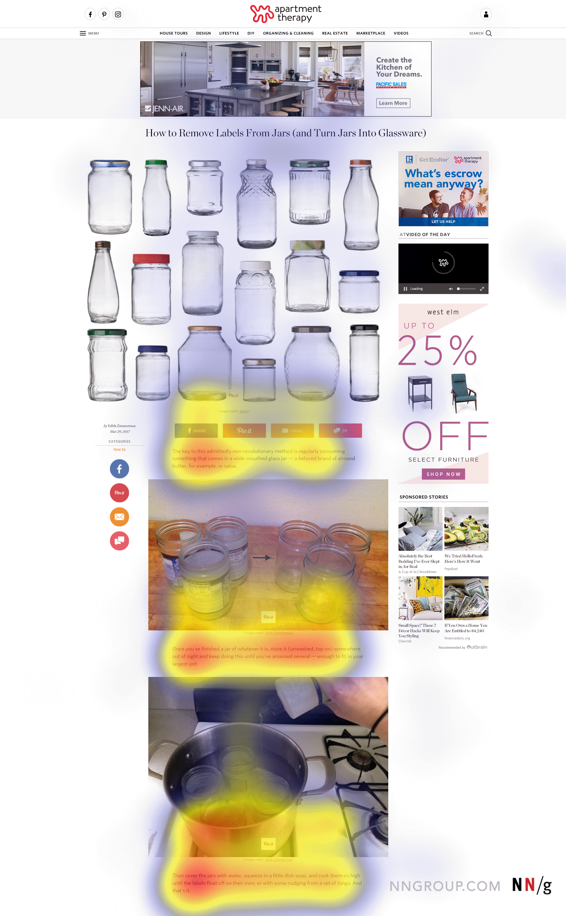
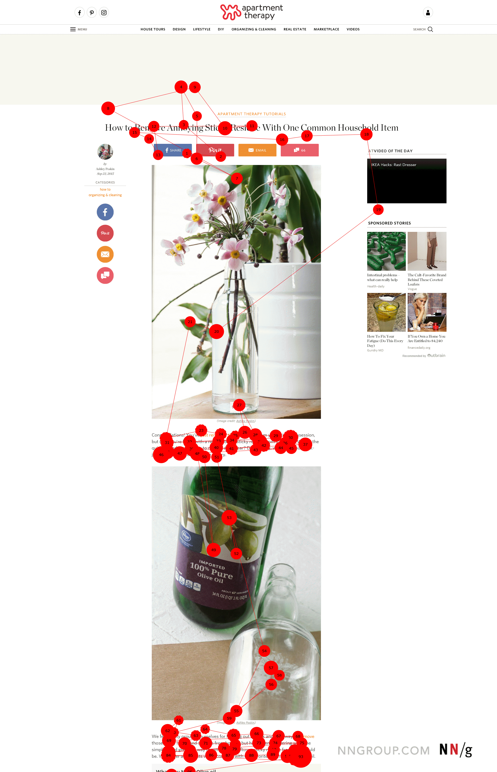
Because desktop ads typically appear at the top of the page or in the right rail, web users sometimes ignore the content placed there. In our most recent eyetracking study, 26 test participants visited the same webpage as they worked on a task to find the best method for removing a label from a jar. The page included a small amount of text, some images, and advertisements in both the top banner and the right rail. Users read the text on the page, but they looked very little (if at all) at the ads, as shown below.
2. Visual Treatment
An ad doesn’t have to appear at the top of the page or in the right rail to be ignored. Today’s ads can appear anywhere within a webpage, and users are aware of this fact. Thus, they are careful not to waste time on ads, even when the ads appear within content areas.
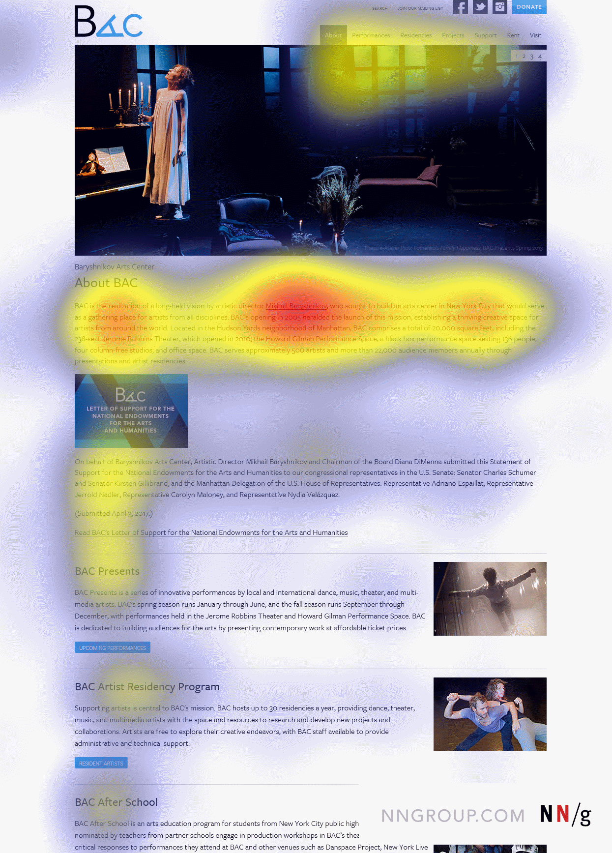
On desktop, inline ads are relatively easy to ignore because they are very different from the surrounding page elements. For example, in our recent study, 26 participants who were trying to learn about Mikhail Baryshnikov’s dance training ignored the promotion that appeared within the text. The main reason they could do this? The promotion looked different from the text and the photography on the site. Specifically, the ad stood out because of several qualities:
- Small, rectangular shape in the middle of text
- Fancy formatting
- Colored (blue) background against the white page
- Text embedded in the image
Each of these traits warned users that the rectangle was a promotion, so they could confidently ignore it.
3. Proximity to Ads: Ads Poison Adjacent Items
Content placed in the same part of the screen as an advertisement is often considered to be an ad and is also ignored. This is a simple consequence of known principles:
- The Gestalt law of proximity: items that are close to each other are assumed to be part of a group and thus related in function.
- As people inspect various items within a region of the screen, they form a mental model of the content available there based on the information scent of the items they attend to. Thus, if one of the items seems completely irrelevant, they will often assume that the entire section is not related to their goal and will stop scanning the rest of the items.
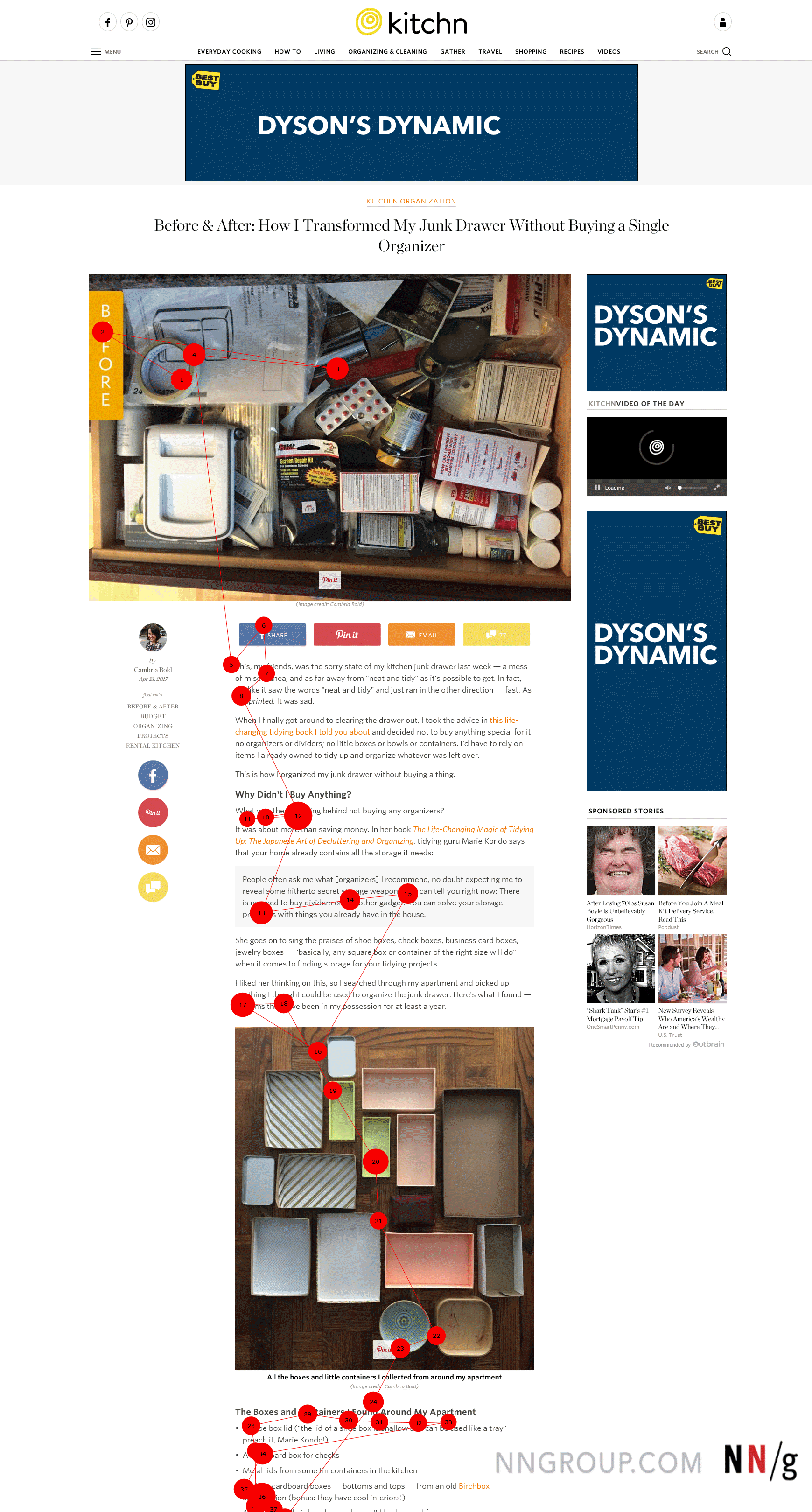
A study participant who was learning how to remove a jar label looked at the right rail just once, presumably deciding that it contained only ads. The right rail did indeed contain sponsored stories, but also housed helpful, fun videos demonstrating how to do various craft projects, such as crocheting a rug or making a magnetic frame. The user was put off by the ad positioned in the same page section and examined no other content in the right rail.
Hot Potato
As seen in the example above, ads can cause users to look away from an area and not return to it again. Such an experience may change not only their local behavior on that specific page, but can also influence their general web behavior: they may not look at the same area on other pages or even on other sites. This is an instance of the hot-potato phenomenon, which Jakob Nielsen and I defined in our book Eyetracking Web Usability. The hot-potato metaphor comes from a game that I used to play in elementary school: in this game, the kids sat in a circle and tossed a ball to one another, while the teacher played music. The teacher would unexpectedly stop the music, at which point whichever kid was holding the ball was out of the game. So, whoever caught the ball wanted to get rid of it as quickly as possible and never have to touch it again.
Definition: On the web, the hot-potato scanning pattern occurs when users gaze at an item in which they are not interested, then look away and avoid fixating on that area on that page, and sometimes on other pages on the website, and even on completely different websites.
The hot-potato behavior is a defense mechanism to avoid wasting time and fixations on irrelevant elements. It’s also an example of the availability bias: based on one or a few examples, web users assume that the same type of content will always appear in that same location on other pages. But, this assumption is not always right. For example, although in the early days of the web, the right rail, was reserved for ads, its function changed later to include related links. Today, the right rail can be used for pretty much anything.
When content resembles ads and appears in the right rail, users tend to ignore it. In the following example, the user was looking for hikes in the Andes. That information appeared throughout the site, including within the right rail. She fixated once on the right rail, and since the items there appeared to be ads, she never looked at the right rail again.
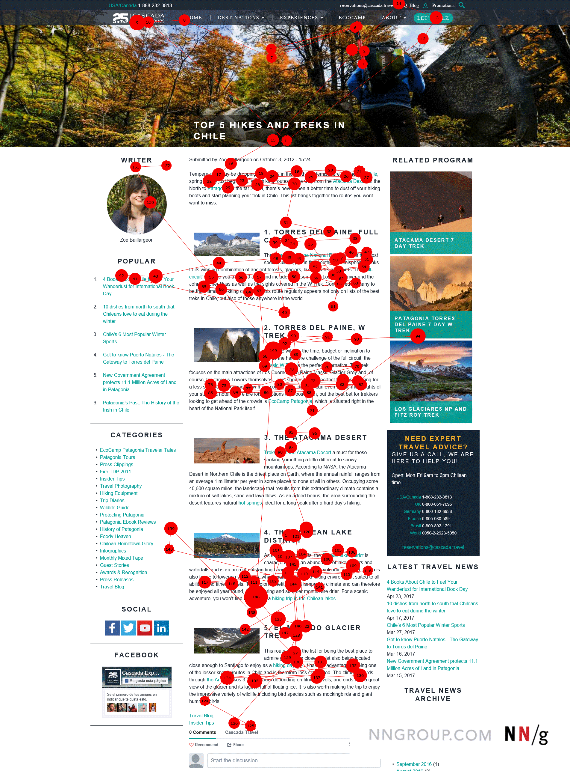

Let’s focus for a moment on just the content area of the page — the area that does not include the hero. There are 148 fixations on the page, out of which 132 are within the content area. Out of those 132 fixations, only one is within the right rail: that’s 0.8% of the user’s attention within 25% of the content area. The immense mismatch between these two percentages shows the poisonous effect of the hot-potato phenomenon: the number of fixations in the right rail was 33 times smaller than its size might have warranted.
Inline Ads on Mobile
Like desktop users, mobile users try to avoid advertisements. Although on mobile there are some standard locations for ad placement (e.g., top of an article, bottom of the screen), many web pages embed ads within content. Inline ads on mobile are hard to avoid for multiple reasons:
- There is less information visible at a time, so it’s harder to identify elements that look different from the main content (because so little of the page content is present on the page).
- A mobile inline ad is so large in proportion to the screen size that users cannot avert their eyes from it as they swipe down. So, the ad inherently catches some gazes even though people know it’s an ad and may not specifically want to look at it.
In this gaze replay, a study participant uses www.medicenet.com to research for signs of contagion when you have a cold. He swipes quickly past the two Nordstrom ads. His eyes pass over them, but he doesn’t pay attention to them. (In most browsers, hover over the video to display the controls if they're not already visible.)
Faux Ads: Easy to Mistake Visual Elements for Ads on Mobile
Because the phone screen is so small visual treatment plays an important part in whether people assume an inline element to be an ad. Anything that stands out from immediate surrounding context is likely to be considered an ad, although its presentation may be consistent with other elements on the page that are not visible at the time.
Thus, people can sometimes mistakenly assume that big images, graphics, or other elements that stand out are ads. (This happens on desktop also, but we noticed it on mobile for the first time in our recent study.) For example, an experienced mobile user might see the top of an image and then quickly scroll past it before examining it, assuming that it’s an ad.
How to Prevent Ads from Poisoning Your Content
We first documented banner blindness among web users in 1997, through traditional usability testing. Then, we replicated this finding in more detail in 2007 when we conducted a major eyetracking study. We just completed a new major eyetracking study and found that banner blindness is still a common behavior, as discussed in this article. Banner blindness has now been documented across 3 decades. It’s a strong and robust phenomenon and, like advertisements themselves, is not likely to go away any time soon.
Ads are a survival mechanism on the web: many businesses won’t last without ad revenue or advertising themselves. And ads can sometimes benefit users. So, getting rid of them is not my recommendation at all. But designers should be smart about how they present site content. In particular, follow these guidelines:
- Do not make content look like ads. Choose colors, type, background, and overall content style carefully. You may think that making it look different from the rest of the site will increase its salience, but it often has the opposite effect.
- Run usability tests to make sure that users actually see important content placed in the top banner or right rail.
- Do not mix content and ads in the same visual section.
Reference
Wertheimer, M. (1923/1938). Untersuchungen zur Lehre von der Gestalt II. Psychologische Forschung, 4, 301-350. (Excerpts translated into English as 'Laws of organization in perceptual forms' in W.D Ellis (Ed.), A Source Book of Gestalt Psychology. New York: Hartcourt, Brace and Co., and as 'Principle of Perceptual Organization' in D.C. Beardslee & Michael Wertheimer (Eds.), Readings in Perception, Princeton, NJ: D. Van Nostrand Co., Inc.).