


Layered Type
Over the last couple of years, layered typefaces have appeared in bestseller charts and found their way into a variety of decorated headlines where more elaborate or colourful typographic styles are required. Each layer is generally a separate style designed to compliment or construct the core type design. Layers might be drop shadows, outlines, inlines, 3D extrusions, stripes or other textures.
When applied using more than one colour, the resulting effect is referred to as chromatic. Chromatic type became popular in the second half of the 19th Century as efficiencies in printing enabled greater creative freedom. Traditionally it was achieved by printing each colour from individual blocks, usually wood. Each layer would be carefully designed to abut each other, overlap, or be completely cut away to achieve a variety of colourful, eye-catching effects.
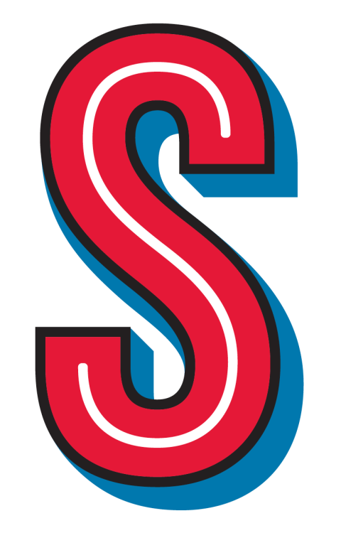
It’s hard to pinpoint where the recent popularity of this style stems from, but advancements in web font capabilities plus the general trend for designs that look hand-made seem likely sources. With new typefaces appearing regularly, I was curious as to how chromatic type was constructed. I asked my friend Terrance Weinzierl, a type designer at Monotype, who has recently completed an award-winning layered, custom typeface in this style for Domino’s Pizza, called Pizza Press.
Were there any typefaces or sources that particularly inspired you?
The ad agency I worked with, CP+B, had very tight illustrations as to how they wanted the striped shadows, so that was a solid starting point. I studied my 1901 ATF catalog for other shadow designs with that fine of detail. There weren’t really any specific designs that I followed. I focused on more general observations, the direction of the stripes, their spacing and weight, and how long the shadow was. Obviously, the intended size influences the details and hairline weights.
I remember hearing Erin McLaughlin’s TypeCon presentation about Landmark, which was a reminder of things to lookout for such as elements that would need optical adjustment which break the logic of the shadow extrusion. I also studied Gill Sans Shadowed and Light Shadowed for the same kinds of adjustments. Really, there would be different challenges and different adjustments depending on the direction and severity of the shadows.
Was there a specific process for designing a layered typeface and how do you ensure the layers all line up etc.?
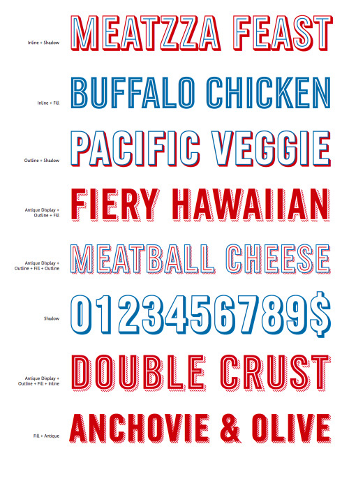
My process started with the Regular weight to get the design and weight dialed in before expanding into the other layers. In this phase, I made suggestions to the client, like making a G without a spur, so that it would hold the Inline better. An inline inside of a small, tapered area like a spur or serif would make an optical blob, so faces designed for inlines are usually very low stroke contrast, especially in the joins.
Once the Regular design was approved, I worked on the Fill and Shadow weight. The length of the shadow (how far it comes away from the letter) would determine the spacing for all of the others. I worked on some action set formulas to do the heavy lifting for the initial shadow and outline weights (based on the Fill). The Outline weight is 1/1000 larger than the Shadow’s outline, so it overlaps a tiny bit. Without the overlap, you might get a tiny white crack when printing, depending on the size and rasterization from the printer.
The most difficult piece was the Antique weights, the striped shadows. I tried a number of failed prototypes where I was relying too much on automation: for example, making a clipping mask with the Shadow weight. None were quite right. I had to manually place and adjust the spacing of the stripes to ensure they hit the letter shape consistently (especially at the corners). Because they are stripes, and not a solid shape, they needed optical adjustments to the angle so they appear to be the same direction. Characters like the K, N, and M, all have optical adjusted stripes. On top of that, we did two stripe weights! The Antique Display weight has thinner stripes.
How long did it take you?
It’s a small character set, but a pretty complex system. I think the majority of the font production happened within two or three months. The agency had been working on the campaign for some time before that though. They had excellent direction for me, which resulted in fewer revisions.
What are your thoughts on the ongoing trend for layered type?
I guess I noticed it in late 2012, and the Domino’s project started in early 2013. I think maybe the renewed interested in chromatic designs came from people playing with CSS tricks, and an explosion in headline web font usage. It was finally easy enough to layer fonts in a browser as it was in page layout apps.
I try not to focus too much on the fashion trends of type. Things come and go. I’m trying to make type that will look good in ten years from now, or longer. I think a lot of the distressed, printed, and hand-drawn aesthetic is part of a larger reaction to our computer filled lives. You can see that hand-made appeal in clothing and food trends. Many faces that mimic chalkboards, letterpress, modern calligraphy, or hand-painted letters, appeal to that idealism of craftsmanship and personalization. Something made by a person who cares, not generated by a computer.
On the other hand, these sleek geometric sans serifs are popular too. Maybe it’s a 21st Century modernism thing (akin to ditching skeuomorphism). It’s like we want our craftsman pizzas served on a reclaimed wood table using a distressed script, but we want our mobile apps to have bright colours, a minimalist UI, and a geometric sans. Sounds good to me.
Above Images, Top down:
1-5: Pizza Press, Terrance Weinzierl, Monotype / CPB
6 & 7: From the Specimens of Chromatic wood Type, Borders &c. William H. Page &c.
8: Brandon Printed, HVD Fonts
9: Surto Deluxe, Jim Parkinson
10: Trend, Latinotype