

What is readability vs. legibility, and why are they important? You might be considering font readability, or whether or not serif vs. sans serif readability impacts your work. In this article, we'll define legibility and readability and show you why you should be aware of them.
Legibility vs. Readability
Readability and legibility are both ways to gauge how easily text can be interpreted or read. However, they focus on different aspects of the viewer's experience. Here's a quick cheat sheet to explain readability vs. legibility:
Legibility
How easy is it to read the letters themselves? This could be anything from the font itself to design principles that impact the type.
Readability
How easy is it to read the content? Things like how the paragraph is presented, line spacing, and even the copy itself could affect this.
As you can see, the two can certainly influence each other. They are, however, different concepts that work hand in hand. You can have a very legible font in a paragraph that is difficult to read, and you can have a very illegible font that is set in a way that would normally be quite readable. Let's break this concept down.
What Is Legibility?
Let's define legibility. Define this as something easy to visually understand. Different scenarios can warrant different kinds of type. For example, let's say we're working with a longer paragraph. This would not be the place for decorative display type because it probably would lose legibility at smaller sizes.


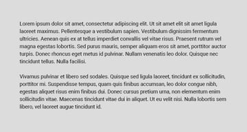
Strong Legibility—a lean and highly legible font at smaller sizes and with larger quantity.
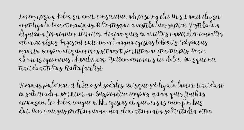

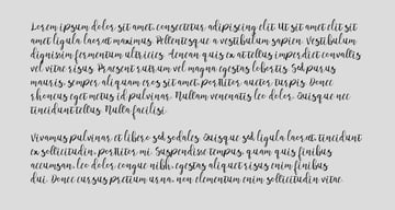
Weaker Legibility—a decorative font, harder to distinguish at this size and quantity.
What Is Readability?
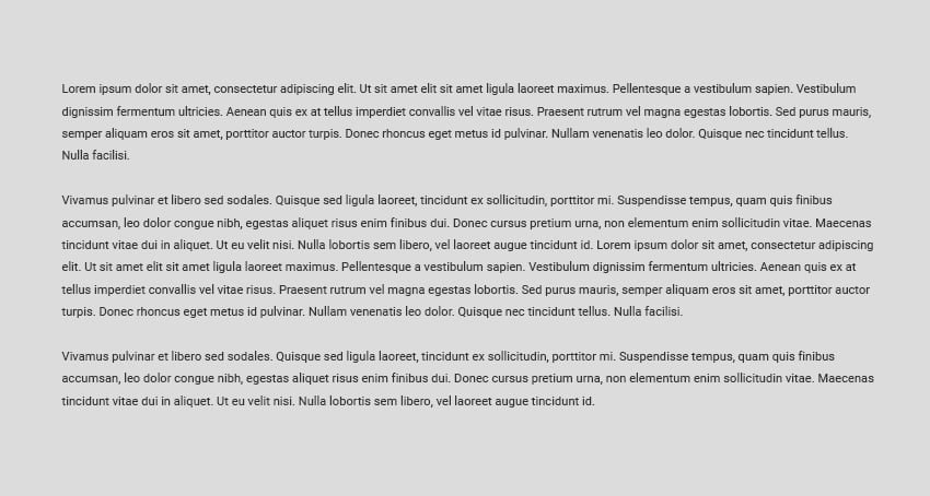
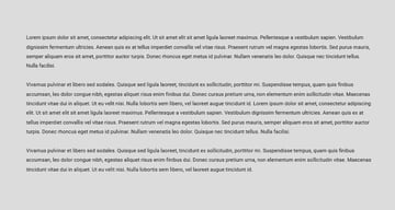
Now you have a basis in legibility. We can define readability, then, as the comfort level when reading your content. This is particularly important when dealing with content like paragraphs. These are conditions where the viewer is potentially sitting down to read a lot of content. If the reading experience isn't seamless and comfortable, it's not going to serve its purpose.
Stronger Readability—moderate line length and spacing.


Weaker Readability—note the very short, choppy line length.
Exploring Typographic Legibility
Let’s talk legibility first. It’s important to understand what makes one typeface more legible than another. When choosing a typeface, it all depends on how you plan to use it. Ask yourself some basic questions:
- What size will the text be used at?
- Will it appear as body copy or a headline?
- Does it need to be a workhorse or will it be used more as eye candy?
- Will it be paired with another font?
- Does the appearance of the typeface complement the subject matter?
It’s also important to keep in mind that different typefaces were designed for different uses. For example, the original Garamond was designed to be highly legible when printed in a large body of text. Some also say it was the most eco-friendly font of its time, conserving ink usage. Bell Centennial is a typeface commissioned by AT&T in the 1970s, designed to be used in telephone directories. These directories were made from cheap paper, and for this reason Bell Centennial was designed in a way to accommodate ink spread during the printing process. On the digital side, there are fonts that have been designed specifically for the screen, such as Georgia and Verdana.
In short, it helps to know the intended context of the typeface you are considering. Some fonts are quite flexible, include several weights, and can be used in several ways. Others are more constrained, designed to be used very specifically.
This leads us into the first of a few things to remember concerning a typeface’s legibility:
Display vs. Text
Some typefaces were designed to be used large, such as in headlines. Usually these typefaces are less readable at smaller sizes and should not be used for body copy. These are called display typefaces. Here are some examples.


Other typefaces are designed specifically to be used in large areas of smaller body copy. These are called text or body faces. Notice how they're more simple and clean. They scale well and would be easier to understand when used in larger quantities and at smaller sizes. Here are some examples of this kind of typeface.


There are many variations in between. Typically, what I do is find a typeface that I think is appropriate for the task, keeping in mind that I plan to pair it with another font, and try it out. I’ve already filtered out all of the fonts that I don’t think are appropriate for the task, but if you’re just beginning, it may take some trial and error.
Serif vs. Sans Serif
So which is more legible: serif or sans-serif typefaces? History tells us that serif faces have always been regarded as more legible, as they were almost always used in print for large passages of text. The serif faces allow the eye to flow more easily over the text, improving reading speed and decreasing eye fatigue. Here are some examples of serif fonts:


That said, there are many readable sans-serif faces. Online it seems sans-serif faces are being used more for body text than ever. I think there are several reasons for this. The simpler letterforms seem to work better with current design trends and can feel more modern. Also, we typically don’t read large passages of text on a website, so sans-serif fonts do just fine in shorter chunks of copy. Here are some examples of sans-serif fonts.


It should be noted that there is debate on this subject – one viewpoint is that serif faces don’t reduce well on-screen, essentially decreasing legibility. There's continued debate on serif vs. sans serif readability too. Some believe that there’s no difference. The position I always take is, does it feel right? Would I read a section of type set the way I designed it?
X-Height
Another characteristic to note is x-height. This typically applies to using type at body text sizes. The x-height is the measurement of the height of the lowercase “x” in a given font. It doesn't take into account the height of the ascenders or descenders. You may be surprised to know how much difference there is in x-height from one typeface to another. When used small, typefaces with larger x-heights are typically more readable.


Exploring Typographic Readability
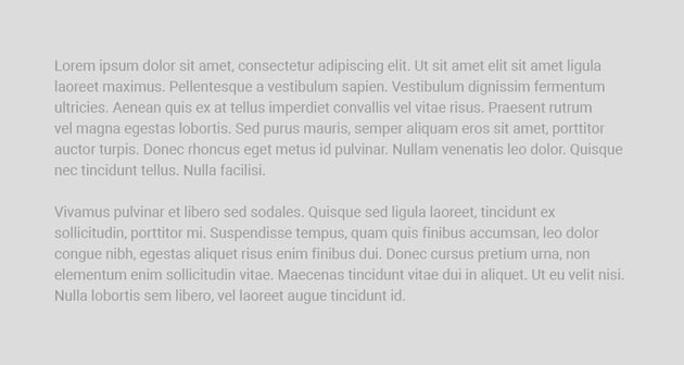
Readability is about arranging words and groups of words in a way that allows the reader's eye to access the content easily and in a way that makes sense. It’s really an art form that is honed over time as successful combinations are found.
In my experience, this tends to be one of the hardest concepts to grasp for beginning developers and designers alike. Even seasoned designers sometimes struggle with how to best arrange typography in a layout. Here are a few things to keep in mind:
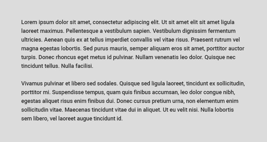
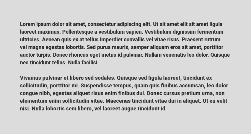
Spacing/Line Height
One of the most common typographic “mistakes” I've seen is improper type spacing. What I’m referring to here is instances where a block of text isn’t given enough margin, subheads, and correlated body text which aren’t visually grouped together, and so on. Proper spacing (combined with hierarchy) allows the reader to scan the text and access it at the desired points.
It’s not a hard-and-fast rule, but it seems to me that the relationship of paragraph spacing (additional spacing placed before or after a paragraph), the space around a block of type, and letter spacing can be related proportionally to the line height of a paragraph. Line height is defined as the vertical distance between lines of text. So for instance, if the line height of one paragraph is set to 2em and a paragraph with the same size text is set to 1.5em, the first paragraph will require more paragraph spacing and probably more margin around it.


Much of this is done by eye rather than an exact formula, but I do use a good rule of thumb when it comes to the relationship of paragraph spacing to line height. I typically make my paragraph spacing (which on the web translates to margin or padding placed at the top or bottom of a paragraph) around half of the line height. This tends to help passages of text “hold together” rather than using a full hard return between each paragraph, creating large amounts of space between paragraphs.
Size or Scale
Obviously, you should make sure that text is not presented too small. It’s also important to remember that the age of your audience may vary, hence the quality of their eyesight. Generally, it’s good to stay around 13px or .813em at the smallest. Currently, with the wider implementation of responsive websites, there’s a trend moving toward larger body copy, for example. It’s also important to keep in mind that different text sizes for different devices may make sense. For instance, it may make sense to increase body copy size on a mobile phone width as opposed to a desktop width.


Print design is a similar case. No one wants to read a book where they're straining to see the copy on the page. It should be at a comfortable size. However, if the copy's too big, it might look more like a children's book or fit the page strangely. 12pt type is often common in printed books.


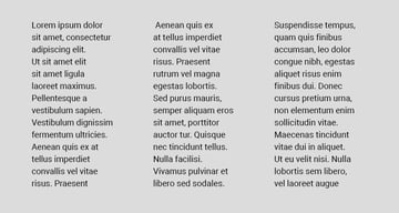
Measure
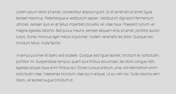
Another common practice that hinders type readability is allowing the horizontal lines of type on a page to become too wide. This distance is referred to as measure (also sometimes line length). If a line of type is too long, it’s a tedious read and a stretch for the reader’s eye to return to the left edge of the text block for the next line. It’s also intimidating to see a block of text arranged this way, and some readers may not even attempt to read it. Likewise, if the horizontal length is too short, it might seem very choppy and disjointed.

Longer horizontal length can be tedious to read, so judge according to your medium.
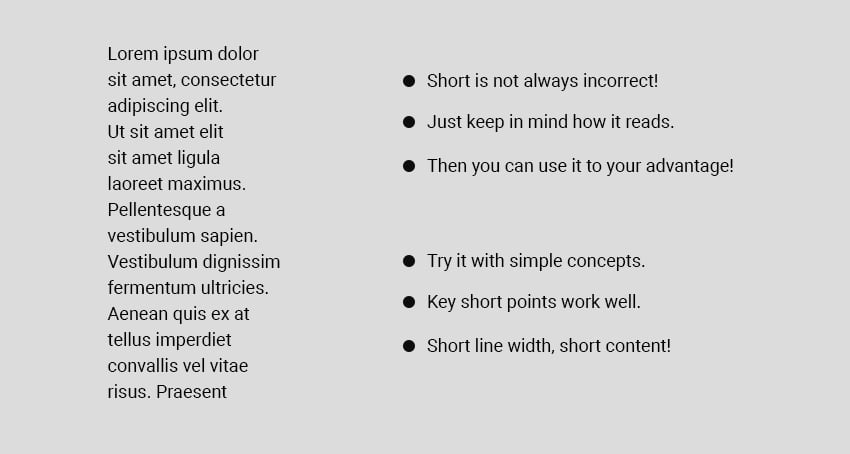


Short horizontal length can be choppy to read. Reserve shorter lengths for things like key points.
So what’s the maximum width a text block should be? Well, it all depends on the size of the text. The larger the text, the longer the line can be. In my opinion, generally around 70 characters is as long as you want a line to be.
Letter Spacing
Letter spacing (also referred to as tracking) is the consistent increase or decrease in distance between the letterforms in a word or block of text. It’s not to be confused with kerning, which refers to adjusting the distance between individual characters. Letter spacing can be used to adjust the density of a block of text or an individual headline or subhead.
Obviously, letter spacing does affect the readability of text. Too much or too little, and readability will be compromised. However, there are times when, in my opinion, letter spacing is needed. As you can see in the graphic below, I like to add generous letter spacing to subheads or phrases of uppercase text. I find it's easier to read uppercase text when the characters have some additional space around them. Also, depending on the typeface used, I like to increase letter spacing slightly in body copy.


Contrast and Value
It may sound obvious that good type contrast is essential for readability. The fact of the matter is that designers (myself included) are always pushing the boundaries of contrast. It might be that we want a certain section of text to be less prominent, or to create “layers” of hierarchy in our design. Whatever the case, keep in mind that on-screen contrast, especially when it comes to small, fine shapes like body text, can vary greatly from screen to screen. It’s best to err on the side of a bit “too much” contrast.
Here's an example of some high-contrast copy vs. some low-contrast copy. Notice which is easier to read:
High Contrast


Low Contrast
Hierarchy
As we’ve already discussed in this series, hierarchy plays a big part in the readability of content. A successful hierarchy organizes the content into digestible parts and allows the reader to scan and access the text easily.
Start thinking about employing these legibility and readability concepts in your projects. The more you do it, the better you’ll get.
Typographic Color
Typography color isn't quite what it sounds like. It's not related to color in the traditional sense. Instead, it's about the way the block of text appears on your page. Think of it like an overall visual impression, influenced by things like your copy's density and the distribution of the text. Things like font size and letter spacing can affect the overall typographic color.
Let's look at a simple example. Each of these paragraphs has a different typographic color.


Notice how a bold weight with tight line spacing is quite dense on the eyes, whereas a light weight with a lot of line spacing feels airy and even disjointed. Keep an eye on how the overall paragraph looks, as this can affect readability.
Widows and Orphans
Typographic widows and orphans are a little like how they sound—these are bits of type that have been "abandoned" in your body copy. We want to avoid this because it can hurt the way your paragraph reads.
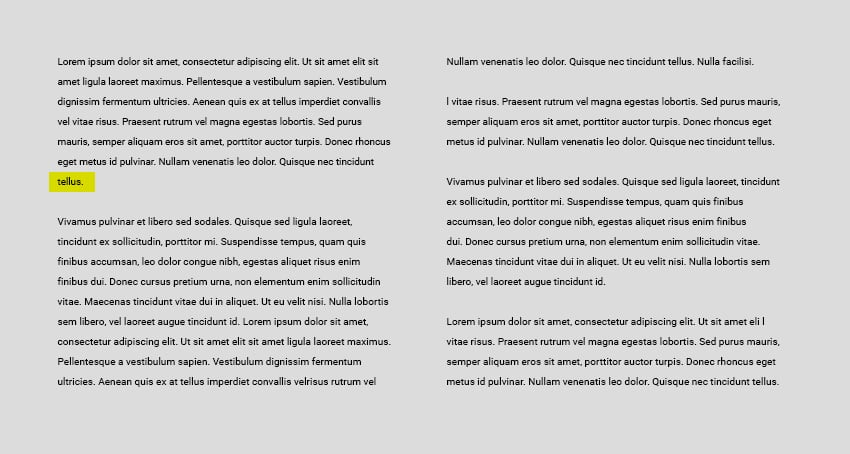

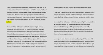
The typographic orphan is highlighted in yellow. It's a word left alone on its own line, after a paragraph. Notice how it reads quite disjointed.


The typographic widow is highlighted in orange. It's all on a line of its own, very disconnected from its original paragraph. Notice how it affects readability.
You'll want to avoid this when setting your type, because it can make the reading experience disjointed. Notice how these two scenarios can interrupt the flow of your text. Note that this tends to apply to print design—web design can be a trickier beast when it comes to these concepts, as many devices will display and permit users to adjust the text size.
Typographic Rivers
Typographic rivers are visible gaps in your typesetting. Like typographic color, you'll want to "step back" and take a look at your paragraphs as a whole. Rivers can sometimes be distracting. This issue most commonly occurs when your text is justified and the line width isn't quite generous enough. Notice the continued gaps, emphasized in orange.


To fix a situation like this, you can adjust aspects like sizing and spacing to make the paragraph more visually cohesive.
Hyphenation
Hyphenation is often necessary when setting text, but you want to proceed with caution. If you have too many hyphens in a row, it's sometimes called "pig bristles". Silly name, but take a look at how this looks:


It starts to get distracting, right? Our goal with readability is to keep things seamless and effortless to read, so avoid situations like this. Again, you can adjust the type and the hyphenation to accommodate and remove unwanted aspects.
Learn More About Typography
If you're looking to learn even more about typography, make sure to check out the wealth of resources right here on Envato Tuts+. These free tutorials and articles would be an excellent next step in your typography learning.

 What Are Cap Height and X-Height in Typography?


 The Ultimate Guide to Typography


 How to Combine Fonts, How Not To, and the Best Font Combinations

 What are Ascenders and Descenders in Typography?

 A Brief History of Type


 Typography: The Anatomy of a Letter

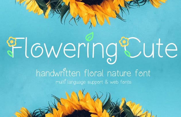
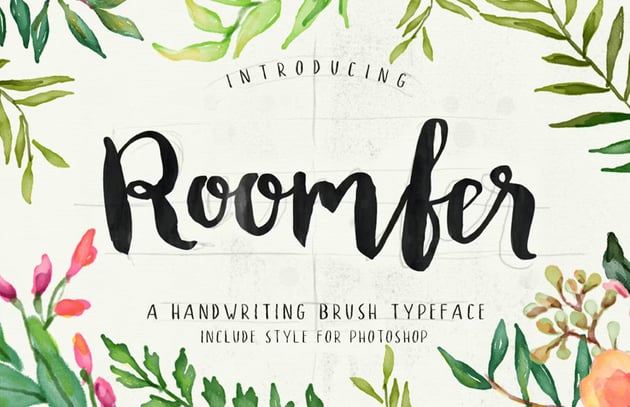
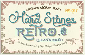
Find Your Next New Favorite Font
Looking for fonts? We've got plenty of awesome font collections here on Envato Tuts+ too. They're perfect for design inspiration. Check them out today.

 25+ Best Grotesque Fonts (Typefaces Ready to Download)


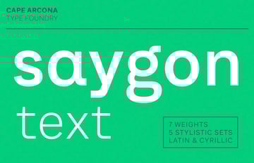
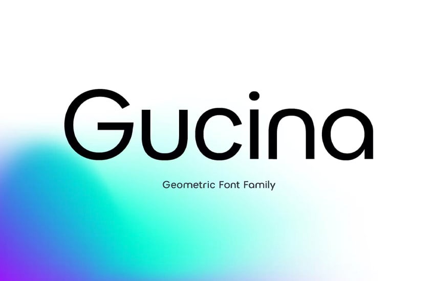
 32 Best Geometric Fonts (Geometric Sans Serif Typefaces to Download)

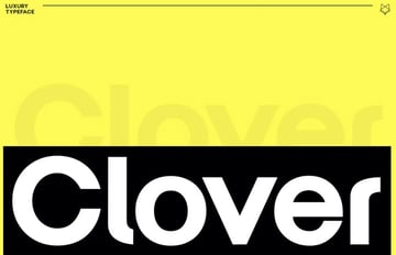
 44 Most Elegant Luxury Fonts (Stylish Classy Fonts to Download)

 The Best Alternatives to the 10 Most Popular Fonts

 Display Fonts


 36 Best Transitional Typefaces (Fonts to Download)
Editorial note: this post was originally published in 2013 by Jeremy Loyd and has been rewritten and updated with contributions from Daisy Ein.

