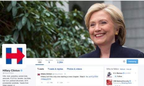
What’s blue and red and ridiculed all over? Hillary Clinton’s campaign logo, of course. On Sunday Clinton announced she was running for president and the internet promptly went nuts discussing the finer points of her campaign. Namely why does her logo look like it has been designed on PowerPoint, by a three-year-old, in the dark? The big blue H, struck through with a big red arrow, has drawn numerous humorous comparisons and even spawned a new font: Hillvetica. In summary: people’s eyes are burning and they are appalled.
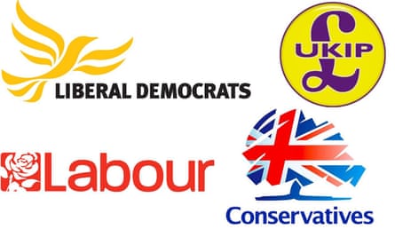
What the Hill? You may be thinking. Why all the fuss about some block-lettering? After all, the American economy will not rise or fall on Clinton’s use of sans-serif, will it? Perhaps not. Nevertheless you shouldn’t underestimate the power of logos in politics. A picture may paint a thousand words, but a logo helps makes sense of a thousand policies. Designed well, a logo can help condense the complexity of everything a politician or party stands for into a clear visual identity that resonates on an emotional level. Obama’s 2008 logo is often cited as an example of how some astute branding can help voters buy into your messaging. All of which is food for thought when it comes to the political party logos at play in Britain’s upcoming elections. What do they signify? Why don’t they incorporate any arrows? And is it, perhaps, time for a rebrand?

When it comes to rebranding, the Conservatives seem to have had the most practice. Their logo has gone from “flaming torch” to “bunch of broccoli” to “bunch of British broccoli” in the span of about 30 years. This all began with Margaret Thatcher who, after becoming prime minister, brought in a number of marketing men to help create a new identity for the party. These included a former executive from Mars (the chocolate company not the planet) who introduced the famous “torch of freedom” logo in the early 1980s.
The torch of freedom shone on and on unadulterated until 2004, when Michael Howard decided it needed a man’s touch and added a rolled-up sleeve and a bit of muscle to the logo to demonstrate he was all about “getting the job done”. Unfortunately the job did not get done. Two years later the Tories spent £40,000 replacing the torch with an image that would make them look more green than mean. The result was a scribbled tree that a former party chairman described as resembling “a bunch of broccoli”. The bunch of broccoli now appears to have transformed into a Union Jack with a blue trunk. I imagine this says something profound about Great Britain’s perennial plant life, but I’m not sure what.
In comparison to the Tories’ torches and trees, the Labour party’s logo is rather boring. The last major refresh happened in 1986, when Labour replaced the red flag as its party symbol with a red rose. This seems like a fairly logical evolution, considering the rose has long been a symbol of socialism and Britain. But this is not to say that there wasn’t some deeper thinking behind the design. Indeed Neil Kinnock once explained the sophistication of the creative process in an interview with Radio 4: “I talked to a … marvellous designer, and I gave him an idea of what I wanted. The one I wanted was from a rose catalogue given to me by my father-in-law, and I showed it to the guy: ‘This is the one I want, this kind of red.’ And he went away and he designed. It was marvellous.” So, there you go, Labour appears to have nicked their logo from a gardening brochure.
While Labour and the Conservatives have both channelled botany in their logos, the Liberal Democrats have gone for a “bird of freedom” called Libby. Introduced in 1989, the bird was dismissed as “an ex-parrot’’ by Thatcher. Nevertheless in 2015 the Lib Dem bird still seems to be very much alive. The bird probably represents the best of all the party logos in that it is distinctive, has clear connotations and doesn’t mix colours in a way that makes you feel nauseous, like the purple and yellow of Ukip. And indeed there appears to be some evidence that the logo does its job. In a discussion on a Lib Dem supporter blog about whether the party should ditch the bird, one commenter wrote: “I’m for keeping it. When I canvass ethnic minorities who don’t always know the name of our candidate, I tell them ‘vote for the name next to the bird’. It works!” Whether it’ll work in 2015 is yet to be seen.

