
Design for Mobile UX (don’t just resize things)
Mobile is a fundamentally different experience to desktop so you’ll need a different UX approach and possibly even an updated design language to accommodate mobile users.

Image Source: Oneplus.net
Think about it; mobile users tend to be mobile and are interacting with your webpage with their thumb. Desktop users are sat at a desk and interact with your site using a mouse.
Taking heed of mobile UX conventions like the Thumb Zone (original research: Steve Hoober) will help you place important call to actions like add to basket:

Image Source: How to Design for Thumbs in the Era of Huge Screens
When you’re in design mode, rather than “shrinking” what you have start by removing the excess. Put the important stuff in easy reach of your users.

Aside from the UX convention, Material Design is just really pretty
Producing clean and clear design work in a design language mobile users understand is a smart starting point. Those tempted to investigate Google’s Material Design might be tempted to experiment with Polymer or Material Design for Bootstrap.

A nicely designed mobile product page example from Harrys via Ometria
Optimise for mobile page load performance
During development, consider the smaller, underpowered devices as a starting point and provide responsive images for various viewports.
Tom recently gave a brilliant presentation on the topic of site speed for content marketers at BrightonSEO.
While there’s an awful lot more to page speed optimisation, some of the most impactful improvements in page load can be achieved through proper image optimisation and a few assorted best practices.
Look out for any opportunity to reduce the image file sizes served. Avoid heavy or slow loading JS that slows render time or moves content around the page after initial render (this can be a nightmare on mobile – ads heavy publishers I am looking your way, angrily).

In his testing, Tom achieved a 240% page load time improvement by implementing a series of performance enhancements, with a further 1 second of performance gained on mobile with responsive images.
Avoid app install pop ups / mandatory registration / email collection pop ups
Email capture or app install interstitials might seem like a quick win to grow your subscriber list; but aside from alienating your users (and losing their custom entirely) you’ll also incur the wrath of Google’s ranking algorithm (see: Mobile friendly pages using app banners).
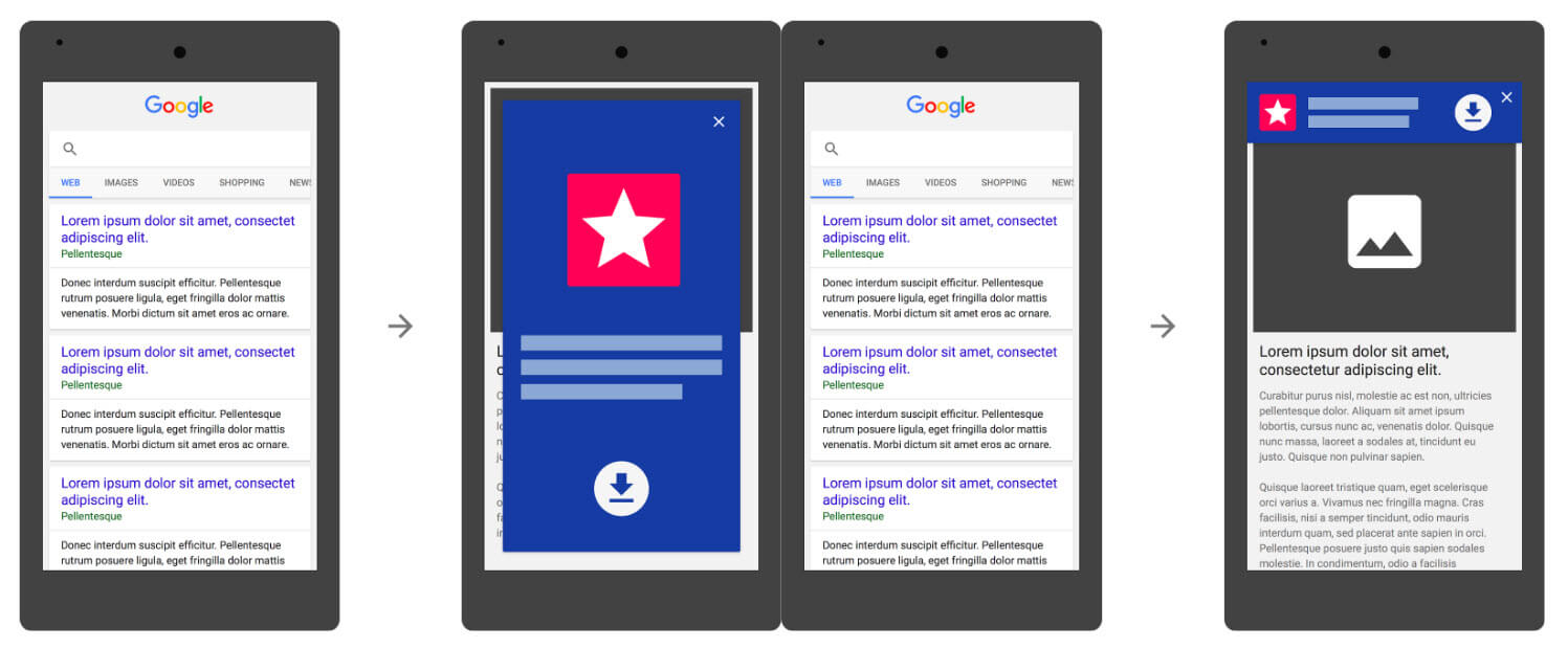
App install ads (or multiple pop up ads) which block a large amount of content from users and prompt them to install various applications or perform a particular action are frowned upon somewhat. While the last update targeted pop ups that appeared more or less immediately and aggressively blocked content; I’d put my money on them targeting delayed pop ups too.
Optimise your internal search with good search suggest
User search is a potential pain point in your mobile UX but only if you make it that way. As Google themselves suggest, high quality search indexing gets users targeted, effective results.
Filter your internal site search results by Device Category as a secondary dimension; you may see something important (unlike the weird things that people search for on Builtvisible)

A sample of the unique range of search queries we see in the long tail of our internal site search
Link seamlessly to web version of your site
If you’re still running an “m dot” version of your site (I feel horrible for you, I really do), then check the “view desktop version” links across your pages. I still see the view desktop version links dumping traffic back to the homepage – often at the expense of a logged in session (now logged out).
Use UX conventions familiar to mobile users for images and interactivity
Assuming you have high quality images on your product pages (if not; why not?!) then you might want to respect the convention that all shoppers expect: the ability to zoom in and manipulate an image to take a closer look.
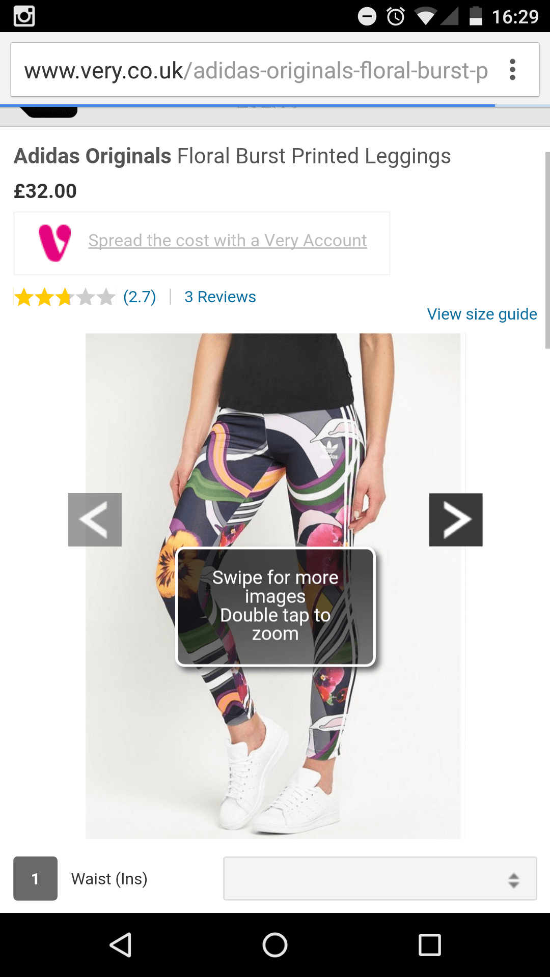
Image Source: Very.co.uk
With the exception of touchscreen laptop users, desktop users expect a click to zoom. Not so on mobile, with a double tap, single tap or pinch and zoom being among the conventional UX options.
Read how Cloudup optimised pinch and zoom on mobile using CSS3 and JavaScript.
UX conventions specific to mobile users are there to be exploited. This product page offers some tap to expand interactivity on a product diagram:

Image Source: Heveya
We created a tap and swipe action for mobile users interacting with this interactive piece:

Image Source: Colourising the Past – Builtvisible
Use responsive images
Images consume almost all of the download bandwidth for a webpage; so in a perfect world, you’d optimise your file sizes (I think TinyPNG is very good). The impact of using properly optimised images in Tom’s pageload testing was 1 second. You’d be quite mad to ignore this optimisation.
Optimise for voice search
According to the author of this post;
We are already seeing SEOs creating pages specifically for the longer voice style queries and many are combing through their mobile Search Analytics to attempt to identify likely voice queries to ensure those pages meet users needs.
I wouldn’t want to “create pages specifically for the longer, voice style queries” in fact, that goes against a lot of established best practice and seems like bad advice to me. You should, of course develop your content carefully, and the best piece of advice I could give you is publish common user generated FAQ’s on the product page.
For the most part, “optimising for voice search” entails nothing new or beyond the basic on page and technical SEO we should already be practising. With that said; it never hurts to test your own search results by carrying out voice searches yourself to look at the results.
Choose your KPIs
By the KPI stage of the journey; we really should be treating mobile, table and desktop separately. Aside from the obvious need for a performance dashboard; I would always pay special attention to the funnel performance of your site, checking that each device behaves as expected. Do expect different behaviours by platform, device and browser but be sure to investigate anomalies or unexplainable drops in performance. Always test checkout on the hardware itself.
