The menu icon has a long and storied history that long predates mobile devices. Designers have used menu icons, in one form or another, since long before touchscreen smartphones gained dominance. Plus, there are hardware menu buttons—often with iconic representations of menus similar to that shown in Figure 1.
Champion Advertisement
Continue Reading…
Figure 1—A three-line menu icon on a TV remote control
The symbol that is now in most common use for representing a menu—the three lines that supposedly look like a bun and patty and which some refer to as the hamburger icon—even has a Unicode character (U+2630) that you can type to insert a simple glyphicon on your Web site. On mobile devices, we most often see a menu icon in the upper-left or upper-right corner of the screen, as shown in Figure 2.
Figure 2—The three-line hamburger menu in a mobile application
But as much as I love history, in this column, I want to talk about the use of menu icons today, how they have become ubiquitous on mobile devices, and how some of the current thinking about them is wrong.
You Should Never Use a Menu Icon?
It’s easy to find articles that expound on someone’s reasoning on how the whole concept of an expanding menu is just wrong, and you are a bad person for even considering it. There is a bit of truth in these. One key contention is that such menus are bad because they don’t work for people trying to find product categories or navigate around a Web site.
The thinking is that, if we replace the reliable navigation bar on our desktop Web site with a menu of links, people will be disappointed because it’s hidden away behind a single icon or word. As one article says, “out of sight, out of mind.” Which is totally true. So, don’t do that. Of course. What else can we do?
Don’t Hide the Menu
When you are trying to find your way around a strange, new building, your sense of place and ability to navigate do not rely entirely on signage, but also the shapes of hallways, your position relative to places you’ve been, exterior cues such as things you see by looking out of windows and the direction of the sunlight, types of doors and doorknobs, and simply following where everyone else is going.
Now, think back to the last time you got lost in a designed space. It was probably something like a parking garage, where everything looks the same, and you had to rely on signs, your memory, and the internal jargon for the garage to get around. You might remember that you parked on Level B, but is a sign for B2 the same thing?
Web sites that rely on navigation bars of any sort are the digital equivalent of the parking garage. Your car is in there somewhere, but how do you find it without already knowing the garage’s internal language and structure?
Reliance on almost any strict navigation structure is flawed. When we discard all other cues in favor of trying to make users read road signs in passing, in the dark, the content seems irrelevant.
Center Important Information
Not too long ago, I was observing a test in which the subject was a mechanic in a truck repair shop. He didn’t have a computer at home, had no access to a smartphone, so had no base of knowledge. But we gave him a smartphone and an app to try out. He did fine with the big, obvious bits on the screen and performed every task. Then, we got to the tricky part. We asked him to reconnect the phone to the IoT (Internet of Things) device we were testing, then refresh the display on the screen.
“Hmm… I don’t see it. Maybe in here?” he said, tapping Menu, where he found the Refresh button. He said, “Ah, there it is,” as he tapped it.
I’ve experienced this sort of observation over and over again. Why? Well, first because of a fundamental behavior of mobile-device users, who do not scan a page top to bottom and left to right, but always gravitate toward the center. In Figure 3, you can see a chart showing where users tapped when presented with a scrolling list of selectable items.
Figure 3—People prefer to view and touch the center two-thirds of the screen
The same preference for the center applies to tap accuracy, speed, and comprehension. When designing, I assume users view and read the center, then move outward if they do not find the information they need.
This is actually starting to become a design principle of mine. Assume that users focus on and interact with things at the center of a page, and make sure that you can live with their missing or ignoring things at the top and bottom edges.
Emphasize Information, Not Navigation
This leads to the next principle of interaction design that I try to follow: if your process relies on users reading, then selecting, you are doing it wrong. Whether it’s a navigation bar across the top of a page on a desktop computer, a product hierarchy hidden in a menu, or a list of the functions that your application performs on a landing page, this reliance on deliberate selection burdens users with discovery and choice.
What to do? First, give them information—front and center. Most of the apps and sites we use lead with the key information, then put secondary functions off to the side. For example, both Twitter and your email client show the most recent messages, and a single icon at the top or bottom edge of the screen lets you compose your own.
Icons or links on title bars or at the bottom of a screen and small sets of tabs are the most common ways of providing secondary functions on Web sites for mobile devices and in mobile apps.
The Weather.com mobile Web site organizes information by importance, as shown in Figure 4. The most important information to which the user has navigated is in the center of the screen. Secondary functions are along the edges. Plus, there’s a button at the end of the list to load additional times and a search function to change locations at the top of the page.
Figure 4—A central list dominates the hourly forecast page on Weather.com
Android Material Design apps, such as those shown in Figure 5, use a new, even more robust method of making secondary functions more visible, while they’re still to the side, so clearly secondary.
Figure 5—Note the location of the compose button in Gmail and the center and direction buttons in Google Maps
I consider functions that people use even more rarely to be tertiary. These can reside on a menu, where getting to them takes one more level of difficulty, but the likelihood that the user will deliberately seek the functions is also reduced, so it’s fine.
YouTube is filled with information—people add 300 hours of new video each minute. With categories, channels, ads, and more, YouTube clearly is a very, very complex product. But you wouldn’t know it by how focused and simple the core user experience is. As Figure 6 shows, its primary function is to present a recommendations list on the home page.
Figure 6—YouTube—a recommendations list, with secondary functions at the edge, and tertiary functions on a menu
Since I don’t work for YouTube, I don’t know for sure what their business model is, but I think it’s safe to assume that most viewing is from casual use and recommendations. Look around the edges. There’s a Music link for a new service they’re pushing, then search, and some menus on the title bar.
This layout should be familiar to anyone who designs apps or Web sites—or even optimizes them or manages projects. Search is important. We can assume that YouTube’s second highest rate of discovery is via search, can’t we?
Architect Your Solutions
That last principle of mine could be better stated as: design from the center outward. Decide on a hierarchy of tasks, then stick to it. And make the user interface reflect the hierarchy.
As Figure 7 shows, it’s best to place one primary task or function in the middle of the page, make two or three secondary tasks immediately available along the edges, and stack all of the tertiary functions in a menu of some sort.
Figure 7—YouTube’s hierarchy is based on task likelihood and importance
Most importantly, design for actual devices and users. Don’t hold onto old assumptions or standard practices from other computing environments. Don’t try to turn your Web site into something mobile friendly simply by changing its navigation bar into a menu. Instead, re-architect them, and design solutions that work for users experiencing the unique user interfaces of tablets and mobile handsets.
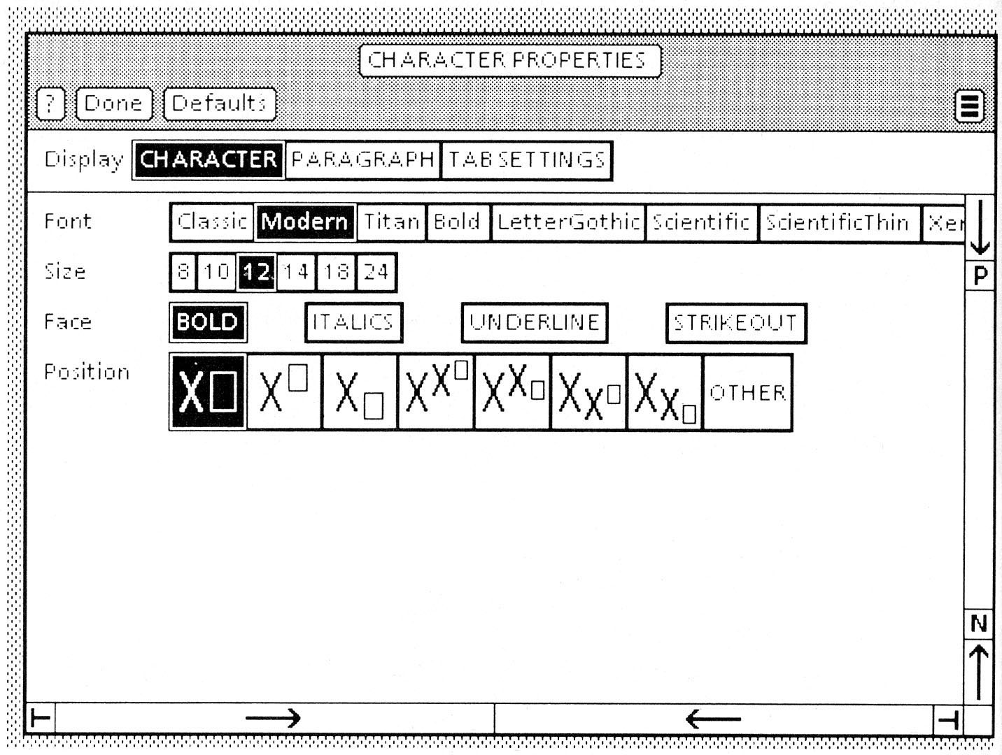
As a historical note: the first use of “hamburger” menu symbols that I am aware of was in the Xerox 8010 Star workstation’s GUI. In this screen image of a text property sheet, the menu is at the right of the window’s titlebar. Star displayed a menu icon whenever the window wasn’t wide enough to show the commands on a menu bar across the top of the window.
Wonderful and useful advice on how to get to menu / information, etc. Nothing on how to get back. This is the important part of the journey. Is there any data on how many users end up in the wrong place? In an unfamiliar building, you go through a door and then hear the dreaded click of the door latching behind you, and there is no handle on your side. You really don’t want to be doing this.
Given that the UX on navigation is going to be uncertain at best and is designed by people who simply do not get that maybe other people don’t see the world as they do, what you really, really want is a GBFO clearly marked Back button that takes you unerringly back to the last safe place you were in—preferably highlighting the button you just clicked, so you know not to do that again.
Personally, I tend to abandon sites where I can’t be confident on getting back to the Home page or Start screen as and when I have been led astray by poor design. Their loss of my custom, not mine of their questionable UX.
I have never seen the hamburger icon on a remote control before. Is that a common thing? I just looked at a couple dozen modern remotes, and they all just had a prominent button that says Menu.
Your remote example also has the label Menu, which helps a lot. The icon is still misunderstood by many users due to its abstract nature and differing applications—list view, drag affordance, etc.
Jeff, thanks for the link. That’s the best Star screenshot I have seen for years. Normally, we get stuff like this history.
I did know the history and have myself been using menu icons for over a decade. Menu always seemed suboptimal—especially because I used it as outlined in this article. I really don’t need to yell about it, so a little icon seems more suitable. Though I preferred the list icon, with the little bullets in front of each line.
For anyone else who is so young that they wonder why old stuff like Xerox computers matter, the icon seems to have been popularized with the Facebook implementation a few years back—so much so that I recall everyone calling the drawer menu a Facebook Menu for a while there. I do think that the hardware menu keys on Android must have served as some inspiration as well—even though the menu itself was either a dialog box or an iOS-like bar of icons—but who knows anymore.
Anyway, I had tried to be less nerdy about my fascination with history, this time, so thanks for giving me an excuse to rant about it.
The big idea I got here was that different media—smartphones versus larger screens—demand different mental paradigms. I wasn’t aware that eyetracking with a smartphone is different from eyetracking with a computer screen, for example.
Thanks for sharing this post. It is very helpful for me. I am designing my app and Web site at the same time. This article on the hamburger icon answered all my questions.
This is an interesting exploration into the merits and proper usage of the hamburger menu. This menu is a very common pattern that is applied in all sorts of different ways across Web sites and apps. I think the issue is: when does the menu become a dumping ground of a site map rather than a useful navigational function?
Other less common patterns are swipe from the left to show the menu and the use of other symbols.
Hugh Thompson—Back is critical. Probably the most important and used control on any site or app. Web sites can rely on the browser to do that for them mostly, and I think Android wins here on the grounds that the OS provides an escape that is not just a big Eject button.
Your note about home is not as simple as it sounds, sadly. It’s not just that people arrive at your site via SEO—or your app page via notifications—but that this means many of them seem to have no understanding or expectation of a traditional home page. Up to a section or category may help, but the more typical escape—aside from leaving—is search.
When designing for myself, I actually use right-side menu icons and menus just to make sure the left is totally free for Back or any labels.
Mike Ryan—I didn’t get into this, but my observations are that icon + label is the winner. I always, always use it like that. Label alone gets lost, I think, in a sea of words, so is no better than icon alone. Yes, though, I also had to dig around a bit to find the right icon. Even in my collection of 100+ phones, too many use the list-like icon, but this remote had the classic three line one so was a great example for the article!
Bernardo Doré—Thanks, familar, and some of the data he quotes on use rates and so on is actually mine.
Michael Sun—I tried to answer that in the article, but could have well used terms like “do not make it a dumping ground.” Ideally, you follow the IA steps and every task has a clear need, with no extra “toss it in there” steps. If it’s not going to be used, remove it or hide it. For example, I often fight not to include menu items for things like Report a Problem. It is most often found under Settings, and the nerds who will use it will poke around there anyway and find it.
Much like labels, I also didn’t get to interaction methods in this article. I am not sure I have solid data on how well gesture works, but I say tap is safe, so make sure that always works. I do worry about gesture on gesture on gesture. Sideways gestures can delete line items, reveal options on line items, change tab view, and more. Where does sliding to get to the menu fit? I really do not know, since I have tended to like peeking-out menus on tablets, but am not comfortable with the gesture interference now.
@Hugh Thompson—I think the author wanted to keep things simple and on point. Navigating to the previous page is a whole other story. Maybe this article will give you more information.
If you want to talk more about this, please contact me as I’m really interested in this problem, and maybe we can share information that could help us both in the long run.
Maximilian, thanks for the link. And the reminder! I talk about Back use, but just realized, never really in a public, linkable way.
My book continues to be a pretty good resource because it’s fundamental patterns, so isn’t dated. But I do not really mention Back robustly. So, I’ve just added an outline of sorts for this pattern.
I have lots of thoughts and some data, so chat with me offline if you want to talk more about this, or get the stuff I’ve hinted at in advance of my actually writing up the wiki page.
My Samsung tv remote has it for menu actually, but with an i next to it. They use it a lot on other buttons as well, but to indicate there is a list of options there.
Steven, you’ve missed the point here. The debate about hamburger icons has absolutely nothing to do with whether menus should be present. It’s about the suitability of three lines as an icon for a menu, when used on its own, without any text saying Menu, as there is on both the TV remote and the app.
So the title of your article is totally misleading. That’s not actually what your article is about. The title of your article should be “why it’s totally okay to have menus in apps.”
I agree with Ian Hamilton. It’s bad UX to hide something behind bars, or hamburgers. Don’t make users think. Let them see it. Why not use the word Menu?
For his entire 15-year design career, Steven has been documenting design process. He started designing for mobile full time in 2007 when he joined Little Springs Design. Steven’s publications include Designing by Drawing: A Practical Guide to Creating Usable Interactive Design, the O’Reilly book Designing Mobile Interfaces, and an extensive Web site providing mobile design resources to support his book. Steven has led projects on security, account management, content distribution, and communications services for numerous products, in domains ranging from construction supplies to hospital record-keeping. His mobile work has included the design of browsers, ereaders, search, Near Field Communication (NFC), mobile banking, data communications, location services, and operating system overlays. Steven spent eight years with the US mobile operator Sprint and has also worked with AT&T, Qualcomm, Samsung, Skyfire, Bitstream, VivoTech, The Weather Channel, Bank Midwest, IGLTA, Lowe’s, and Hallmark Cards. He runs his own interactive design studio at 4ourth Mobile. Read More


