Updates to the Google Maps interface bring rider info up front
Google has shown a lot of dedication over the years to keeping the presentation of transit options in Google Maps looking current, and providing quality information in an easy to use format. Trillium is happy to say we’ve made a few suggestions that have been incorporated.
The changes released today brought a lot more key information to the fore, and did so in a way that remains easily readable.
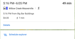
- Fares are presented immediately
- Total walking time is presented immediately
- First stop name and time of departure is presented immediately
- The “More options” button now reads “Schedule explorer”, reflecting the ability of the rider to dig in to the full menu of transit possibilities.

That departure time information is really useful when you have a bit of a walk to the bus stop. Up front frequency information let’s you know what the setback will be if you miss the scheduled ride.
Thanks, Google! These changes are a big win for key transit service information online.