Rule one of moving to a new area is: get some local knowledge. That’s what Leonieke Kormelink was thinking, anyway, when she described the house they’d found to a friend who, as luck would have it, had grown up in the very same Surrey village. But she got more inside information than she bargained for, “Oh, those houses,” her friend replied blithely. “Everyone used to call them the Toilet Blocks.”
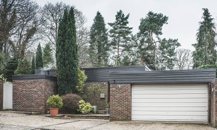
Back in the 70s, Kormelink’s home was one of three that stirred up quite a fuss in leafy Surrey. When they fronted up with identical, uncompromising facades – no windows, only bricks, a solid door and a slab of garage – and not a sniff of mock Tudor beams (a more favoured local vernacular), the brutalist bungalows were deemed as desirable as car park conveniences.

Today it’s a different story, and Kormelink and her husband, Richard Wise, have brought out the beauty of their misunderstood Surrey brute with shades, textures and shapes that tap into the cooler side of its original era. The house was built in 1973, a year after west London’s (now feted) Trellick Tower and the year before Birmingham’s (now flattened) Central Library. That said, it represents a softer, suburban version of brutalism, with floor-to-ceiling windows at the back, glass panels at the tops of the internal walls and a long, bare brick wall that punches out into the garden, linking inside and outside. But these architectural delights are revealed only once you step through the door: “From the front, it’s very stark, but the beauty of this house is all on the inside,” Kormelink says.
Looking to move out of London 10 years ago, with their sons, Jacob and Harvey, then aged eight and 10, the couple could see how the freed-up, one-level layout would work perfectly for family life. The house is made up of three squares: one for sleeping (split into four bedrooms); one for working (with a study); each of them linked by the largest, central square, containing the living room and kitchen. “It’s as if the architects thought, ‘Right, what three things do people do in a home? Sleep, work, refuel’, and applied that to the spaces,” Kormelink says.
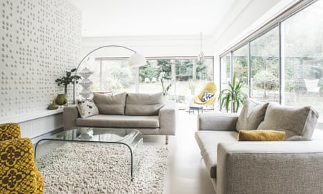
What breathes life into this functional framework is the way glass lets light flow through all the areas. “The rooms never feel isolated,” Kormelink says. “Everything feels part of the same space, one room linking with the next, the inside with the outside.”

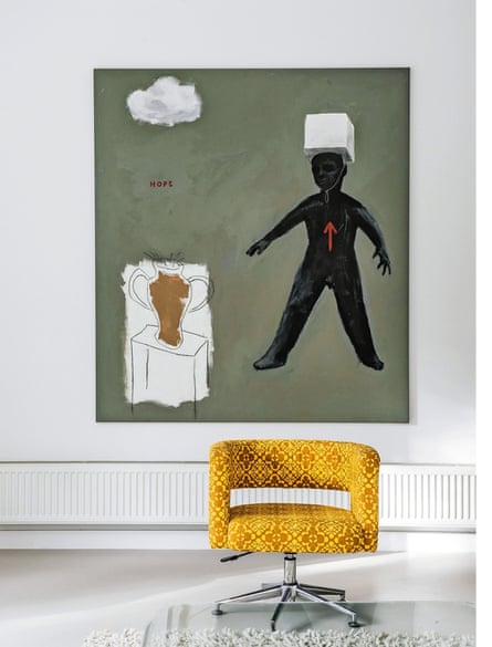
As the boys grew up, the couple were tempted to extend, but are now glad they held their nerve: the house retains the integrity of the architect’s vision. The decor was another matter, and they stripped out a medley of flock wallpaper, swirly carpets and pine-clad ceilings, replacing these with a more considered palette drawn from a futuristic 70s spectrum. They then added interesting textures, imaginative artworks and splashes of mellow colour to keep it fresh.
Both have an artistic eye (Kormelink has worked in fashion and styling, while Wise is a creative director), so no decor decision was rushed. “Sadly, we could spend months mulling over swatches of subtle variations of the same colour,” Wise says. “We’re both very picky and precise.”
They settled on a poured resin floor from Spectrum Flooring and custom-mixed Dulux paint shades, while the braille wall was sourced via an American site, inhabitliving.com. “As there’s no fireplace, we wanted a focal point that felt similarly calm,” Kormelink says. “It’s simple but effective,” Wise says. “My philosophy is to put brands and labels aside, and just choose with emotion.”
In fact, barring the art, most pieces in their home are inexpensive repurposed finds, or were sourced online from mainland Europe and beyond.
Kormelink re-covered the sofa (in its previous life, a white leather one that got trashed when the boys were young) and reupholstered a kitchen stool from a charity shop with a sparkly green sweater. “It won’t last for long,” Kormelink says, “but I love the effect for now.” Finishing touches come in the form of vintage ornaments and fabrics: “They are a good way to add colour without it being for ever,” she says.

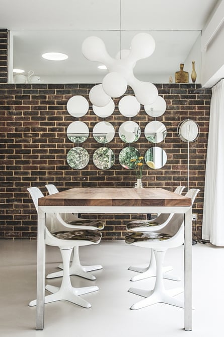
The couple also got rid of most of the central light fittings, swapping them for dimmable LEDs that wash the walls and ceiling in the living room, and flush circular orbs in the kitchen to warm up the cool colours.
The kitchen was another canny buy, made from Ikea carcasses and MDF doors custom made and sprayed for a professional finish. At one stage, Wise was all for having a bright orange kitchen, but Kormelink vetoed it. “The 70s wasn’t just about crazy colours,” she says. Neither, it’s now easy to see, was it about cold-hearted architecture devoid of beauty.
House rules
Favourite artwork A coffee pot print by Klaas Gubbels in the kitchen.
Favourite room The living room, because of all the light. Whether it’s raining or the sun is out, you almost feel as if you’re outside.
Best buy An early-70s Italian lamp we bought from Spitalfields market before we moved here – it fits in perfectly.
Biggest extravagance Not compromising on the lighting.
Favourite detail The glass-topped walls: they make everything flow.
