Animating Content Visibility with jQuery: A Step-by-Step Tutorial
Over the past few years, I’ve observed a wide variety of portfolio website layouts. The diversity of techniques available for such a staple interface element is vast. Even in larger design firms or agencies, many common UI aesthetics prevail. A prime example of innovative navigation is seen on Riot Industries.
In this tutorial, we’ll explore how to create a similar sliding navigation interface using jQuery animation. These straightforward codes are adaptable to any fixed-layout website, offering a seamless blend of hidden and main content throughout the page.
Our focus will be on leveraging jQuery animations, enhanced by jQuery UI easing effects, to craft an engaging user experience. I’ve prepared a live example featuring a navigation bar fixed to each corner of the webpage. Dive into my demos to discover how this interface could enhance your next design project.
Starting Our First Project
Let’s begin with crafting the left-hand navigation menu, using it as a foundation to build out further demos with similar code structures. I’ll include both the jQuery and jQuery UI libraries from Google, complemented by a custom Google Webfont. All navigation-related scripts will be consolidated into a separate JavaScript file named nav-left.js for neatness and modularity.
<!doctype html>
<html lang="en-US">
<head>
    <meta http-equiv="Content-Type" content="text/html; charset=utf-8">
    <title>Vertical Page Navigation Demo</title>
    <meta name="author" content="Jake Rocheleau">
    <link rel="shortcut icon" href="https://www.hongkiat.com/blog/favicon.ico">
    <link rel="icon" href="https://www.hongkiat.com/blog/favicon.ico">
    <link rel="stylesheet" href="global.css">
    <link rel="stylesheet" href="http://fonts.googleapis.com/css?family=ABeeZee">
    <script src="https://ajax.googleapis.com/ajax/libs/jquery/1.8.3/jquery.min.js"></script>
    <script src="https://ajax.googleapis.com/ajax/libs/jqueryui/1.10.0/jquery-ui.min.js"></script>
    <script src="js/nav-left.js" charset="utf-8"></script>
</head>
This technique is especially effective because it allows for easy swapping of the JavaScript file to vary the sliding effect across different sections of the webpage. However, achieving this effect also relies on precise CSS configurations. The background content, intended to remain hidden, should be positioned behind the main content area, ensuring it starts out of view.
<div id="about">
    <h2>Lorem Ipsum Dolor</h2>
    ....
</div>

<div id="mainpage">
    <nav>
        <h1>Webpage Title</h1>
        <ul id="navigation">
            <li><a href="#">Home</a></li>
            <li><a href="#about">Click Me</a></li>
            <li><a href="#" class="hovertrigger">Hover Me</a></li>
        </ul>
    </nav>

    <div id="content">
        <!-- Your main page content here -->
    </div>
</div>
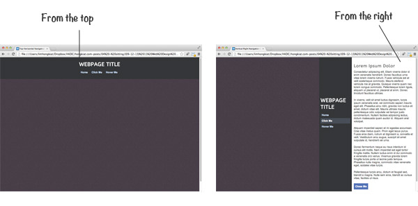
The layout is segmented into two primary divisions: the #about div for hidden content, which should be aptly named to reflect its contents, and the #mainpage div for everything immediately visible upon page load. Our demo showcases a simple layout with a floating navigation menu and a content division. This layout strategy is advantageous for efficiently utilizing available space and enabling content reorganization in a user-friendly manner. Additionally, it accommodates users by aggregating all content on a single page, catering to varying visitor interests.
Crafting the Page Structure
With our foundational HTML in place, it’s time to delve into the CSS stylesheet. Our design involves more than just the usual resets; we specifically position the two divs (main content and hidden content) relative to each other. The goal is to keep the main content div prominently above the hidden div, ensuring it remains visible within the confines of the browser window.
#about {
    display: block;
    width: 350px;
    padding: 8px 11px;
    padding-top: 35px;
    position: absolute;
    top: 0;
    left: 0;
    height: 100%;
}

#mainpage {
    width: 100%;
    height: auto;
    display: block;
    background: #473d47 url('https://assets.hongkiat.com/uploads/jquery-sliding-navigation/bg.png');
    min-height: 800px;
    overflow: hidden;
    position: relative;
    z-index: 2;
    color: #fff;
}
The key to overlaying the hidden div directly onto the page, beneath the main content, is absolute positioning. This approach ensures the hidden div seamlessly integrates into the layout, moving beneath the main content area. The width is constrained to 350px, aligning with the navigation menu’s expansion to reveal new content. Additionally, applying overflow: hidden; to the main container prevents any excess content, such as box shadows, from extending beyond their intended boundaries.
#mainpage nav {
    position: absolute;
    width: 180px;
    min-height: 100%;
    padding: 0px 8px;
    padding-top: 220px;
    background: #343638;
}
#mainpage nav h1 {
    font-family: 'ABeeZee', 'Trebuchet MS', Arial, sans-serif;
    font-size: 2.85em;
    line-height: 1.3em;
    font-weight: bold;
    text-transform: uppercase;
    margin-bottom: 11px;
}

#navigation { list-style: none; }
#navigation li { display: block; margin-bottom: 2px; font-size: 1.4em; font-weight: bold; }
#navigation li a { display: block; padding: 8px 6px; width: 100%; color: #d1e0f8; text-decoration: none; }
#navigation li a:hover, #navigation li a.open { color: #fff; background: #484e57; }
For the navigation menu, we utilize a root <nav> element with an internal UL identified by #navigation. This outer container defines the background, padding, and dimensions of the menu, aimed to be 180px wide and extend the full height of the webpage.
Anchor links within are styled as block elements, facilitating a new line for each link and providing generous padding for easier interaction. The specifics of these navigation styles are detailed further in the document, employing absolute positioning to strategically place the navigation menu.
Exploring jQuery Animations
For those new to JavaScript, the upcoming code might seem complex. However, the jQuery documentation offers comprehensive explanations of the logic checks and animation functions employed. For clarity, we’ll dissect the code into segments for individual actions.
$("#navigation li a").on("click", function(e){
    e.preventDefault();
    var hrefval = $(this).attr("href");

    if(hrefval == "#about") {
        var distance = $('#mainpage').css('left');

        if(distance == "auto" || distance == "0px") {
            $(this).addClass("open");
            openSidepage();
        } else {
            closeSidepage();
        }
    }
}); // end click event handler
This initial code segment attaches a click event handler to navigation links, preventing default href loading to instead evaluate the clicked link. If the href corresponds to #about, it triggers an assessment of the current CSS “left” position of #mainpage. An “auto” or “0px” value indicates a closed navigation, prompting it to open, while any greater value suggests it’s already open, necessitating closure. The openSidepage() and closeSidepage() functions manage these states.
function openSidepage() {
    $('#mainpage').animate({
        left: '350px'
    }, 400, 'easeOutBack');
}

function closeSidepage(){
    $("#navigation li a").removeClass("open");
    $('#mainpage').animate({
        left: '0px'
    }, 400, 'easeOutQuint');
}
These defined functions streamline future scripting by negating the need for redundant code replication for similar effects. Notably, the animations utilize distinct easing functions, showcasing jQuery UI’s potential to enhance the customization of page animations.
Activating Menu on Hover
The following jQuery snippets address user interactions with the “hover” link and the “close” button, applying the same functions previously outlined. First, we examine the hover effect implementation:
$("#navigation li a").on("hover", function(){
    var classval = $(this).hasClass("hovertrigger");

    if(classval == true) {
        var distance = $('#mainpage').css('left');

        if(distance == "auto" || distance == "0px") {
            $(this).addClass("open");
            openSidepage();
        }
    }
}); // end hover event handler
This code scrutinizes each navigation link for hover events, specifically identifying those with the .hovertrigger class to unveil the menu, without closing it — a function reserved for the close button. This ensures users have multiple, intuitive ways to interact with the navigation.
$("#closebtn").on("click", function(e){
    e.preventDefault();
    closeSidepage();
}); // end close button event handler
The repetition in these scripts underscores their importance for a flexible layout, accommodating various user interactions. In the nav-right.js file, similar logic applies, albeit adjusted for the navigation’s position on the right side, by checking the CSS right value.
My additional demos showcase navigation bars positioned on the right or top of the screen, with a fixed bottom navigation that scrolls with the page. This adds a pleasant effect, given sufficient bottom padding to prevent content cutoff. Download my source code for further exploration and customization.
Concluding Remarks
For developers new to jQuery, the variety and complexity of these functions might seem daunting. Yet, they are straightforward and require minimal time to master. Beyond the sliding effects, this vertical navigation design offers a robust foundation for creative layouts.
I hope this tutorial serves as a valuable resource for designers and web developers. The codes are compatible with all modern, standards-compliant browsers and ready for download and customization. We also welcome your feedback and discussions on this tutorial.